![]()
Our first project of this size as a studio, Lane7 is a piece of work we are immensely proud of. Beginning the project way back in July with just a building shell and a business concept to go from it seemed a daunting task. Whilst high-class restaurant/bar/bowling alley hybrids exist in other parts of the country, this was brand new concept for the North-East and for all involved; everyone was anxious and eager to make it a success.
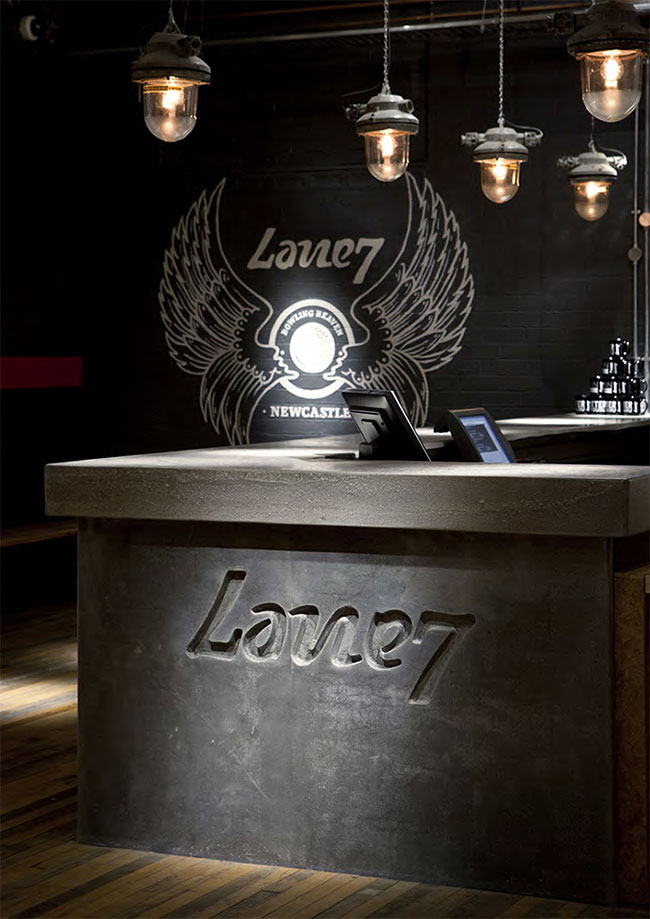
That said, we began as always with the beating heart of any successful business; its personality, its character, its brand. As a leisure destination we understood that the main manifestation of this was going to be in its interior, its service and its communications. Impressing the importance of these aspects on our client we started the project by pulling together a mood-board of venues from across the world.

A New York warehouse style look and feel settled upon, we progressed to name generation. With the brief to come-up with something edgy, flexible and distinct that would marry up to the proposed interior style, we came to Lane7. ‘Lane’ gave us an obvious reference to bowling and a sense of geographical location, whilst the ‘7’ came from the 1,024 possible outcomes of a game of bowling (1+0+2+4=7) but remained non-specific.


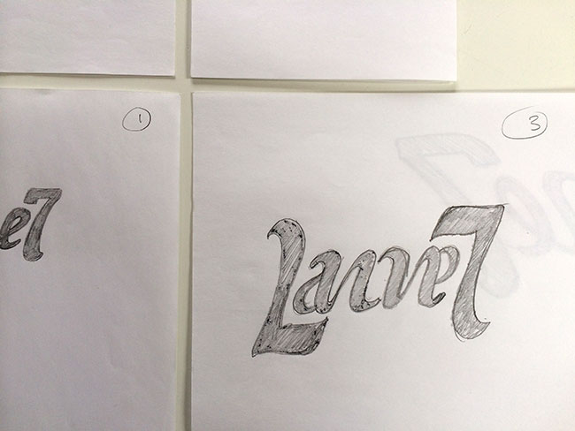

Using the joyous relationship of the ‘L’ and ‘7’ we created a bold and confident, ambigramic identity inspired by the constant movement of a bowling ball.
![]()
![]()
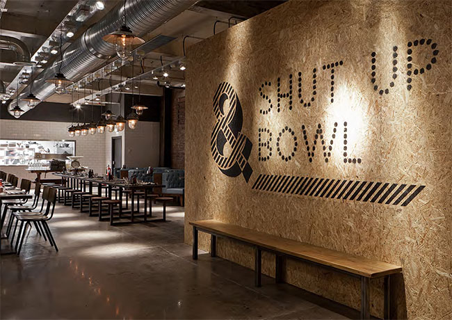
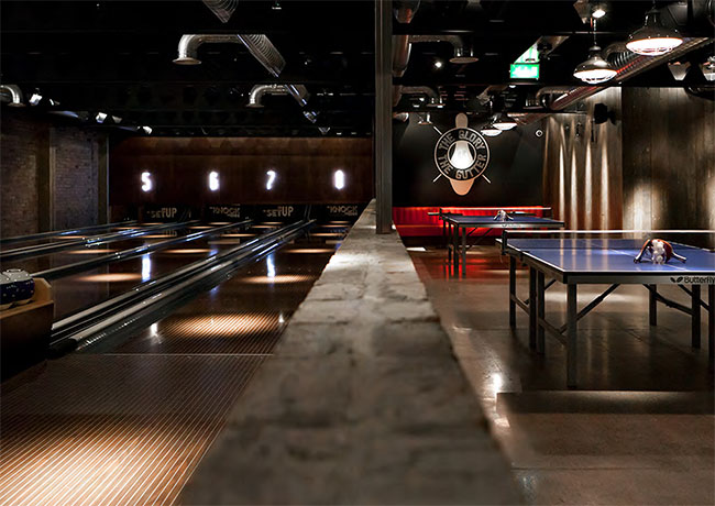
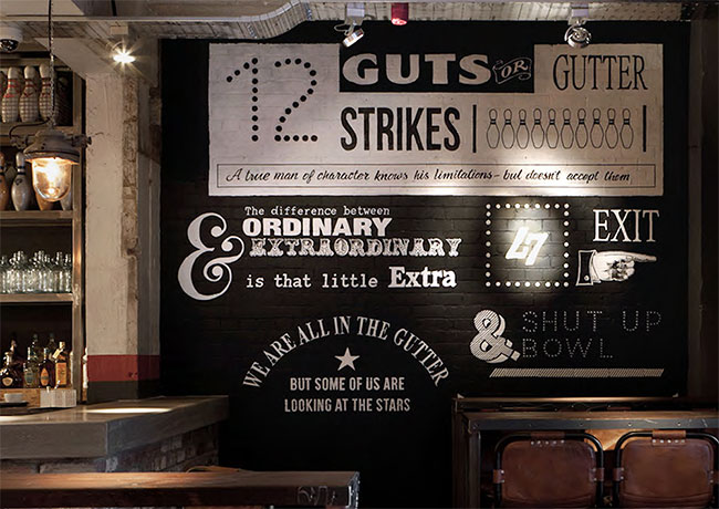
Stylistically, we referenced the vintage styling’s of ten-pins 1950s hey-day with a hand-drawn typographic approach, which we developed into an all-encompassing brand identity system. With the mark as our measuring stick, we designed the full-range of required print collateral; from letterheads to leaflets, business cards to badges, and mugs to menus, crafting an identifiable and characterful tone of voice for the brand in the process.


This personality became crucial as we began developing the brands digital presence. With a young and edgy target audience, social media became a focus for us early on as we sought to get the brand exposure. This rolled into the design and build of the website, and subsequent range of emailers, all of which were integral parts of the brands viral launch strategy that we coordinated.


When it came to the brands physical presence we were no less involved; regular visitors to the development, we worked alongside a local interior designer to ensure brand, and not budget, dictated the build, and designed internal/external signage, printed and digital posters, and a range of graphics to fit the venue as required. We were also able to ensure that staff could live up to the brand, advising both on the staffing and uniform policy.


Following a successful first few months which saw Lane7’s name and reputation travel across the UK, we are now looking towards next year and venues expansion to include a basement and even more ball-based fun. We continue to have an integral role in this process, the wider business and the ever-strengthening brand.
View more identity design on the Wonder Stuff website. Follow Wonder Stuff on Twitter.


Comments
Well done. I love the symmetry of the seven repeated as an “L”. I must admit I saw Lame7 in a couple of the drawings. A challenge I’m sure you faced, then overcame nicely.
Thanks Andy. There were a few challenges with this one, but we got there in the end. If it was easy, then everyone would be doing it. ;)
I like the softness and fluidity from the logo. Stylish with a strong personality. I also really like the selection of materials in the interior design and graphics applications. Very elegant work.
I had wondered who designed this – I was there for new years and really loved the concept, thought everything about the visuals at the place was pitch-perfect. I had been away from my hometown for some time, so wasn’t aware of what it was like and it was described to me as “hipster bowling” by a friend which sums it up succinctly I think – and I have to say I like it despite the negative association it connotes. It’s rare you see a piece of prominent branding so beautifully executed up here, so a big well done to all involved at Wonder Stuff :)
Thank you Ash, Lauren and Andy. Lane7 is a great project to be involved in. We’ve had the fortune to work with a client who had a great vision and trusted us to help him deliver it. It’s a great example of how design can work for a business – giving it a real position and standout.
The L & 7 is a great combination to use them how they did. This is a place that I would love to bowl. Because you can tell they took every detail into consideration. Also it reminds me of how Shake Shack is beautifully designed down to the last detail.
The ambigram works especially well on the glass doors—whichever way you’re approaching you’ll be able to read it. Form and function.
I’m curious about the name and why Lane 7 was chosen. A bit of background to this would be Interesting. Did the owner come to you with the name or did you have a hand in the naming process?
H Ross – Thanks for the comments. We worked on name generation too:
‘A New York warehouse style look and feel settled upon, we progressed to name generation. With the brief to come-up with something edgy, flexible and distinct that would marry up to the proposed interior style, we came to Lane7. ‘Lane’ gave us an obvious reference to bowling and a sense of geographical location, whilst the ‘7’ came from the 1,024 possible outcomes of a game of bowling (1+0+2+4=7) but remained non-specific.’
Beautiful work, love the level of detail throughout and the humour across the interior signage, digital posters and website.