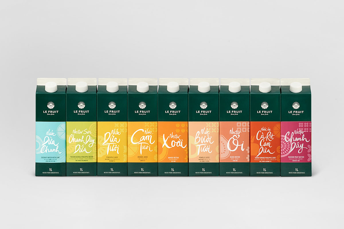
For the past 15 years, the Le Fruit brand has carefully produced farm fresh juices and jams from locally sourced fruits, operating from the rich, fertile Mekong Delta region of Vietnam.
We were invited to rebrand the corporation and their full range of products. Our objective was to showcase the brand’s core difference — their dedication to preservative-free locally made natural products. This would support Le Fruit in competing with an array of foreign products currently dominating the market.


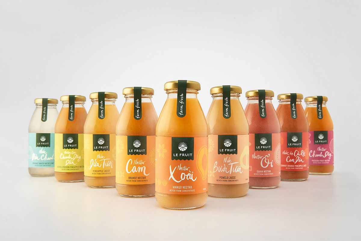
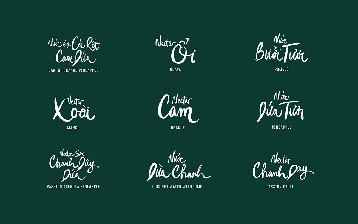
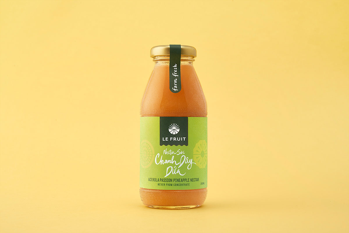
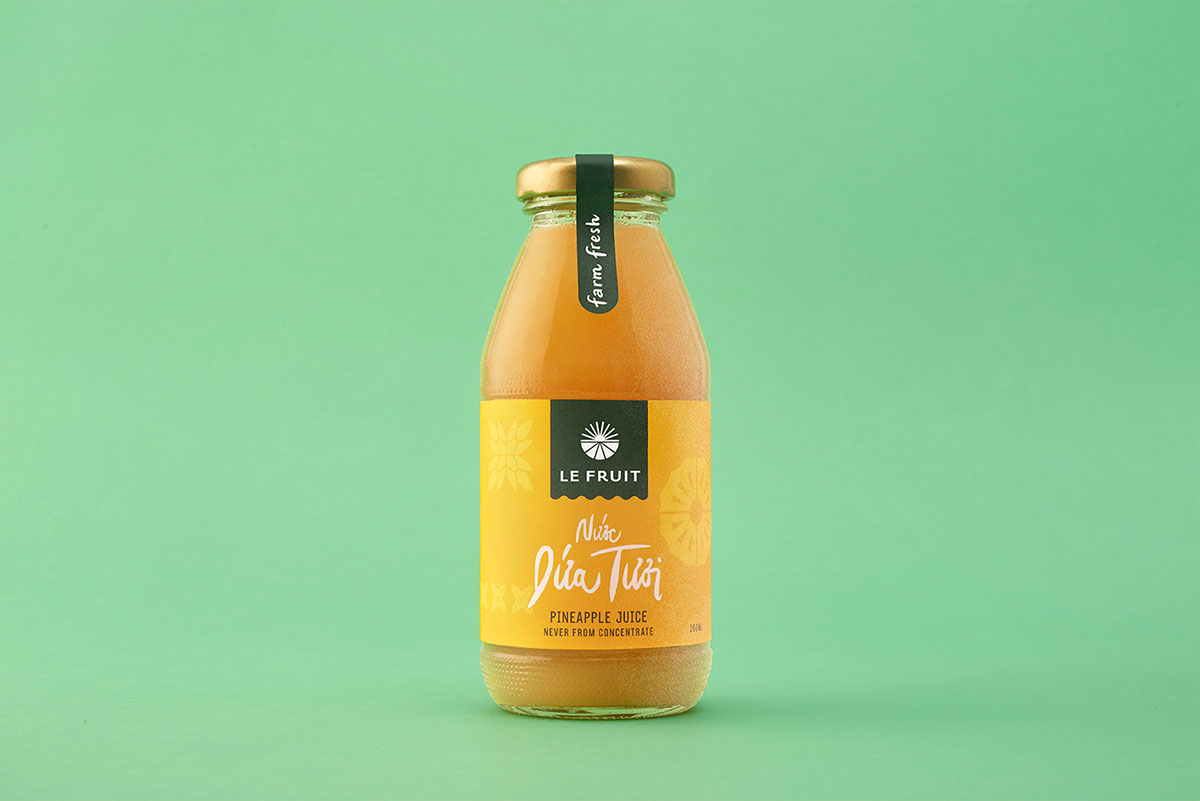
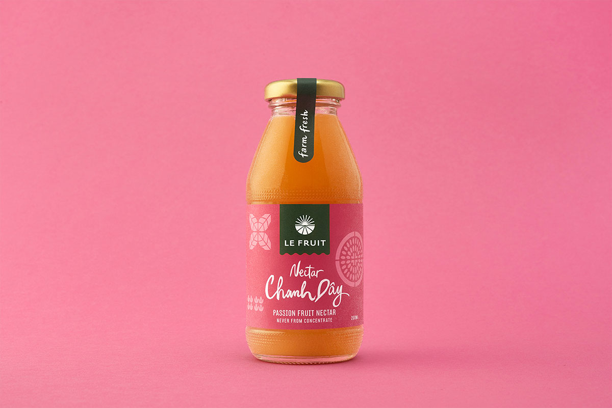
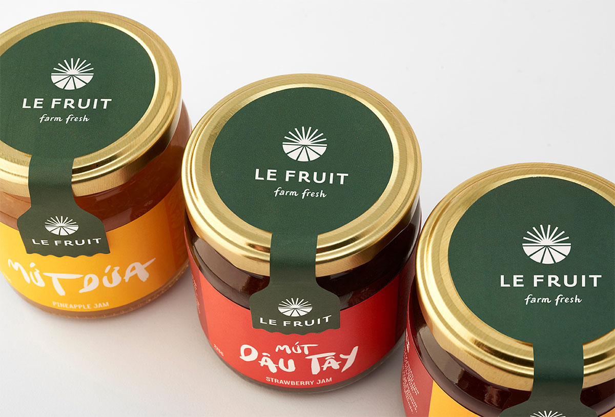
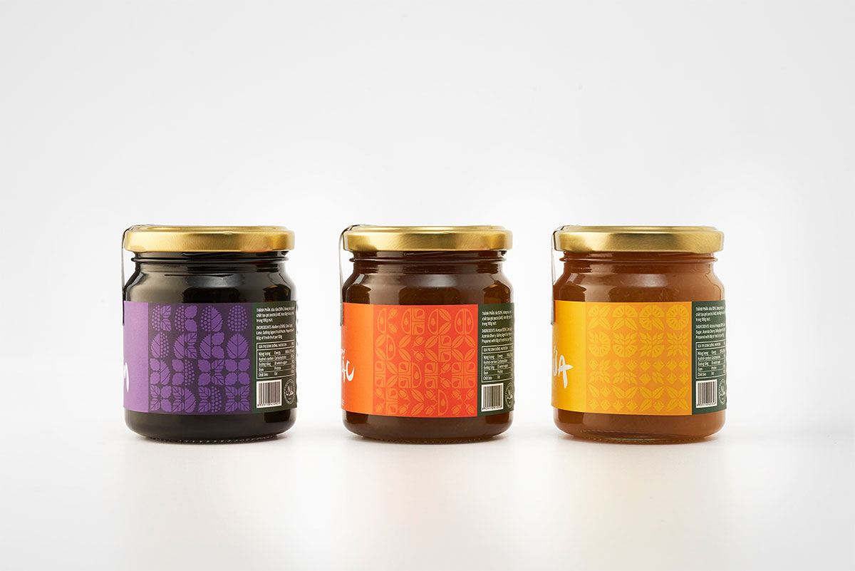
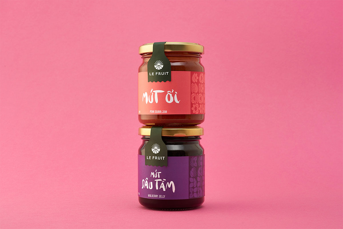
Accompanying carefully crafted custom icons derived from the tropical fruits and plants of the Mekong Delta, our studio developed a juicy, hand-drawn script for each product name. While the majority of the packaging gives the brand well qualified look of expertise, the script helps the brand communicate it’s hands-on approach.


The Interborough typeface by Giang Nguyen is also in use.


![]()
The rebrand helped Le Fruit tell their story, and jump off the shelves through vibrant colour and iconography. The full range of products billboard into a bold, eye-catching spectrum.


The results have proven successful as the brand is not only taken more seriously, but it is one that marketers love to give prominent space to. Le Fruit has gone on to enter previously inaccessible retail environments including high-end supermarket chains, international airports, and franchises such as Starbucks. The brand is also finding shelves in foreign markets such as Japan, Korea, and the United Arab Emirates.

All featured Rice Creative projects.
More from Rice Creative.

Comments
Nicely done, love the custom brush work for each name.
I love the process for generating the icons, and the colours are so appealing!
The creative process is so inspiring! I wonder, what is the name of the font that says “Le Fruit” as it’s not same one as for the descriptions please?