
For anyone growing up in the UK it was almost impossible to not have been to Little Chef. And most of these experiences are remembered warmly, especially the famous lollipop.

Little Chef’s old signage (photo credit).
It was a British institution and no holiday was complete without a tactical stop. Over the years though, travelers’ needs changed, and Little Chef didn’t. Somewhat neglected and underinvested in for years, Little Chef lost its place as the nation’s favorite place to stop. Then RCapital bought the business, and are very serious about revitalising this great British brand. As part of this, they undertook an intensive agency selection process and chose to work with venturethree on the Little Chef brand development.
“The team from venturethree have worked closely with us to completely reinvent the Little Chef brand, bringing our new food, service and design together. We believe all of this will refresh the brand and attract a new generation of customers.”
— Tracey Mulligan, managing director, Little Chef
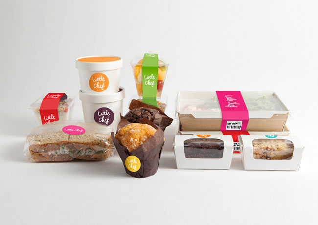
The essence of Little Chef is more relevant today than ever. Great quality food, made just for you. And now there’s the added bonus of a Good to Go range, so if you’re in a rush, you can get the best of Little Chef to take with you.
It’s this essence of Little Chef that has guided the entire rebranding exercise. We call it “Wonderfully British” — it’s the spirit that runs through everything we do, from the food, to the service, interiors and the new brand.
“Who else truly stands for eating out British? It’s something that Little Chef can own, and in so doing, take back its rightful place. A great chance to become the best in British food and hospitality.”
— Philip Orwell, CEO and strategic director, venturethree
With a rich history and 93% brand recognition, this rebrand was about evolution not revolution. Working to make Little Chef fresh, new and energised. At the same time, we had to respect its heritage, and loyal customer base of over 10 million people. A fine balance, and one that’s been helped by keeping Charlie. He’s been updated — he’s friendlier and more refined, with new energy and purpose. But still instantly recognisable. He’s the bridge between the old and the new. A symbol of our service heroes, he welcomes each customer into new Little Chef. He’s used with respect, as a mark of quality.
![]()
“Everyone has a childhood memory of Little Chef. It’s a national institution. So there were certain things that we wanted to keep, like the lollipop, and Charlie.
“The new Charlie icon positions Little Chef ready for the next part of its journey. He’s more contemporary; he’s got purpose, and new movement and energy. He feels quality. Yet he’s still unmistakably the Charlie that we all know and love.”
— Stuart Watson, creative director, venturethree

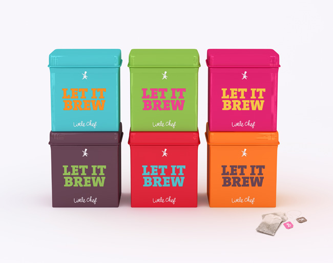
We took a similar approach to colour. Little Chef and red go hand in hand. But why stop at ketchup red when you can have mushy pea green, raspberry ripple pink, English mustard yellow and baked bean orange?


We introduced a fresh new Wonderfully British colour palette to punctuate the famous red and brighten up your break. In creating a Wonderfully British brand we’ve tapped into the one thing us Brits are famous for the world over: our very special sense of humor. And this plays a big role in all new Little Chef communications.

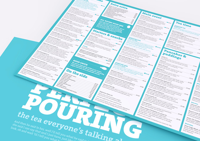
We tell stories based around provenance, our unique way of doing things, our iconic dishes, and, of course, the weather. We don’t use photography, we let people imagine their own pictures through our rich tales. We use quirky headlines to grab people’s attention, followed by a little story, and always signed off Little Chef — in our new, informal, hand-drawn logotype. It all comes together to reveal the warmth and excitement of the new Little Chef.
![]()
Welcome to new Little Chef. Fresh, fun, quirky, individual, and Wonderfully British. The best place to stop, whatever your journey.

And what did v3 do?
We created an idea that brought together the food, service, environment and brand. A positioning that could underpin every area of the business. Giving Little Chef a rich territory to own and to build their future on.
We created a powerful look and feel that establishes Little Chef as a thoroughly modern British brand, allowing them to sit comfortably and confidently alongside the competition.
We created a unique tone-of-voice that captures the essence of Little Chef and allows them to express themselves as individual independent rather than corporate consistent.
We created a series of Wonderfully British ideas to enhance the brand. Like the iconic signage project, where we build giant models of key Little Chef/eating-out-British icons (lollipop, ketchup bottle, mug of tea, etc.) and take them on tour around the UK, stopping off for display at Little Chef restaurants around the country. As well as exciting product ideas and ways to create the best Little Chef experience.


Along with the new brand identity, we’ve developed an internal and external signage system, a series of new menus, and designed the packaging for the new Good to Go range.


We’ve worked collaboratively with Little Chef, Ab Rogers Design, and Cake, to bring the brand to life across every touchpoint, from cups of tea to social media. Making Little Chef ready and relevant for the next 50 years.

More from venturethree.


Comments
This is a welcome and vastly superior improvement in all aspects, but it’s still Little Chef and I almost think that it’s too late especially with the increase in other brands road side such as M&S and Costa etc where quality is an established brand proposition.
I agree that this is maybe a little too late, but it looks great, and from what I’ve seen of the menu the product looks vastly improved too. I’d pop in on my way past but the Chester branch has recently been closed after many years of struggling to make ends meet. I hope that little chef, being a British institution, sticks around for many years to come. I’d hate to see it go the same way as Woolworths. Good luck to them, and congrats to venturethree on the re-brand, it all looks great.
I love the new look, and I think it can compete with M&S and Costa as more of a family oriented environment. Personally I haven’t seen an open little chef about for quite a while, but I’d welcome more branches in my area.
Fantastic job by Venturethree!
We really like the new look. It is such a huge improvement, Little Chef now looks like a quality brand. The whole branding package from logo to menu look great!
Is it too late for Little Chef? Time will tell, but this new branding will certainly revitalise the whole chain. Great job, well done!
(the interior looks too much like a McD’s to me though)
What I’m loving is that the essence remains intact. Just amazing work all around.
There’s something almost elementary about this rebrand, and certainly in terms of design the images above certainly show a dramatic revitalisation. Hopefully, this will be the injection of life, personality and spark that Little Chef has been missing for too long.
wow, this is great. The only sad thing about it is that the color palette cannot be perfectly consistent due to the use of different mediums. ex: In the first poster it looks as if the red is the same pale red used for “intelligentsia coffee,” amazing color, but when used with a glossy finish–such as plastic/ceramic–the color changes a bit. But that is by no means the designers fault. This brand is fresh, fun, clean and consistent, exactly what breakfast needs to be. Great work!
A fantastic rebrand for a brand that has become staler than the toast it serves. The vivid colour palette and freshness of the fonts used gives it a modern and fun up date that would attract a new generation of customers.
I wish I new more about Little Chef, being as we don’t have them in the States, but after reading all your comments it seems like it is a dieing brand. My comment would be kinda invalid(haha) because of me never seeing the original brand but this looks fun!
Little Chef was dying, but then Heston Blumenthal (he of the Fat Duck Fame) was drafted in as part of a TV program. He rolled out one flagship store (at Pogham on the A303, worth a look if you are nearby…but it gets busy) and a few others followed. I went to one (it looked just like the interior above) and the staff were well trained, service was excellent, the food was really good, well cooked. It was leaps and bounds above any service station.
The question was. will they do this to all their stores. Now it looks like they are (how much of Hestons influenced food remains will be interesting, they would have been mad to ditch it).
Whatever is going on, they are now making profits in the millions and have recently opened 20 new stores.
Certainly not a dying brand. More a case of ‘how can M&S and Costa’ catch up, which are pretty dire at service station level.
As for the branding, it’s all good stuff and should enable this classic British brand to influence the next generation. Make mine an Olympic!
It’s playful and inviting. I’m not familiar with this food chain, but I love what they’ve done with the re-brand. Looks great and I’d certainly eat there just to experience the new environment.
Fun, clean, inviting and contemporary.
This is a shot in the arm for a dying brand and if the quality and service match up I think they may well have just rescued it, I’d certainly consider stopping by now.
This is awesome to see, not least because my favourite meal growing up was always a Little Chef beans, chips and sausage. I hope they’re not going to update the menu too much to make it too healthy….
Also, who designed the scripty lettering?
The rebrand is long overdue, it looks much better and more inviting.
It makes me want to give Little Chef a chance, I’ve never been inside one.
The problem is we look at businesses like Little Chef through rose-tinted glasses here in Britain. Look at Woolworths, the minute they started to close down, we mourned them as a great institution that would be lost forever, what a sad day. The truth was they had no real position on the high street anymore. The British public knew that everything Woolworths sold could be grabbed on the internet for a cheaper price and delivered to their door or it would in the Pound Shop around the corner.
Little Chef lost its position a long time ago. Poor service, rubbery food and overpriced. No amount of lollipops are going to make up for that.
A rebrand will give a short term boost to business as people stop by to see what all the fuss is about, but personally I doubt it will bring their loyal customer base back or attract a new generation. Why? Because the days when going out in the car on a long journey being an adventure have gone. Other brands have established themselves for those who need a quick stop.
As far as the rebrand is concerned, it doesn’t grab me at all. The printed menu looks garish, the menu boards highlight how expensive a breakfast would be and the restaurant area looks uncomfortable. A Little Chef is supposed to be a break from the monotony of driving, somewhere to relax and a place to entertain the kids who have been asking “Are we there yet?” for the past 2 hours. The rebrand is not family-orientated at all and £3 for two slices of toast? Seriously?
V3 are banking on a design approach that appeals to the city-dwellers and the trendy, neither of which would frequent the locations of the majority of Little Chefs regularly enough. Although if the price of two slices of toast is anything to go by, perhaps the odd passerby buying the modern day equivalent of the Olympic breakfast would fund the running of a Little Chef by itself?!
I visited the Little Chef on the A1 at Doncaster yesterday and was looking forward to the Crispy Chicken Plater only to find it had gone as had ham and eggs and the Pate.We have eaten at Little Chef over the last sixteen years from Lands End to John O Groats and have always found the food good, staff pleasant and the premises very clean.
I had to have steak and ale pie, but found when the bill came that chips are an added extra. Why would anyone order steak pie on its own? All other mains came with chips and salad etc inclusive, if i had been told at point of order that chips were extra I would have changed it. The steak pie was very stodgy as it was in a suet casing.
Please bring back the three favourites I have mentioned. If the menu stays the same, then I am afraid we won’t be back.