
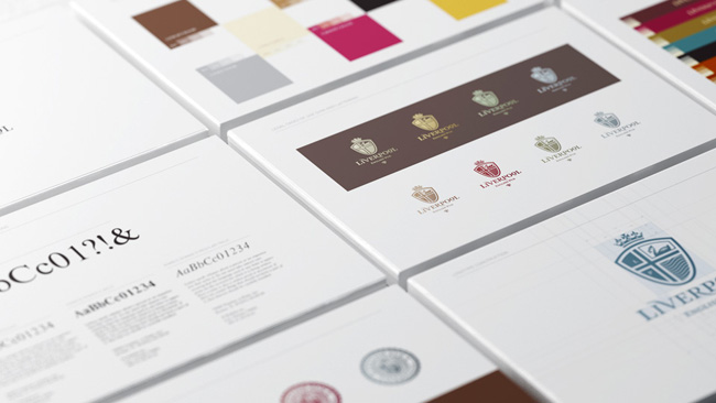
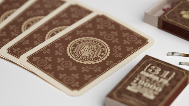
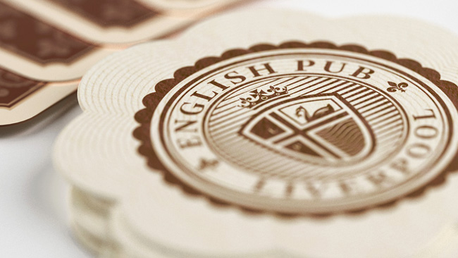
Liverpool English Pub is the first classic English pub in Ukraine. It was important for us to show the connection between the brand identity and traditional England, especially with its famous city, so we started with an analysis of the history and key elements of the Liverpool name and logo.
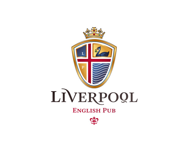
“The symbol of Liverpool is the Liver bird. This bird is like the legendary Phoenix and Sirin birds — there were no such a things in real life but scientists still argue what kind of extinct birds could be their prototypes. By itself, Liver is a symbol not only of Liverpool, it’s also a main part of the logo of the famous English football club. The second part of the city’s name relates to the water because the city is located near the sea.”
— Alexander Andreyev
“After the analysis stage we found three main elements that needed to be combined in the logo: the Liver bird, location near the sea, and a heraldic style used in Britain during the birth of Liverpool. This has become the basis for the logo and the entire brand identity.”
— Artyom Kulik

The project was created in collaboration with marketing agency Pure.
“The objective of positing objects that carry roots from other cultures is to bear in mind the mentality of the audience. This is an interesting and exciting job that involves a synthesis of elements previously unimaginable for coexisting. It is vital to maintain balance on the edge between the image in the consumer’s mind and the need to create quality and unique product. I believe, in the case of the “Liverpool” pub we have succeeded in achieving this.”
— Roman Matys, Pure
“Each brainstorming session is a battle between two concepts: “like” “appropriate”. There were always plenty of feisty arguments from both sides of the table but in this particular case the marketing’s “appropriate” and the designer’s “like” have come to an early agreement which led to such an amazing result.”
— Andrew Mykhashula, Pure


More from Reynolds and Reyner.


Comments
Really awesome branding! Few things I would like to add here is about its ‘logotype’. I’m not sure what you all think but I feel the left ascender of letter ‘V’ in Liverpool hardly goes with the smaller letter ‘O’ (8th letter from left). There the symmetry seems to be broken. So ‘VERPO’ stands out more. But the symmetry could have been well established if the second letter ‘I’ would have been the same height to that of 8th letter ‘O’. Plus, in the insignia the major pitfall would be the letters (L & P) incorporation. The font and the size of the font chosen – that diminishes the weight and the style of the English flag appearance. I think if the left two rooms would have been kept blank then that would have worked even better.
Why the hell did they choose Liverpool of all places?!
An English Pub? Clearly their research didn’t extend to actually going into an english pub in Liverpool. That identity is a million miles away from an English pub anywhere let alone Liverpool.
1/10 Poor effort.
Not sure why they chose Liverpool as the name of the pub, but other than that this is a brilliant piece of identity work. From the logo, though I prefer it in one colour than full, to the menu and playing cards this is a well thought out and executed identity. Fantastic work.
I love it. Even the sketches look polished. The fact that the mark ties in so well with tradition, and in many different ways without becoming too complicated, makes it all the more incredible.
Awwwww yea, that’s nice.
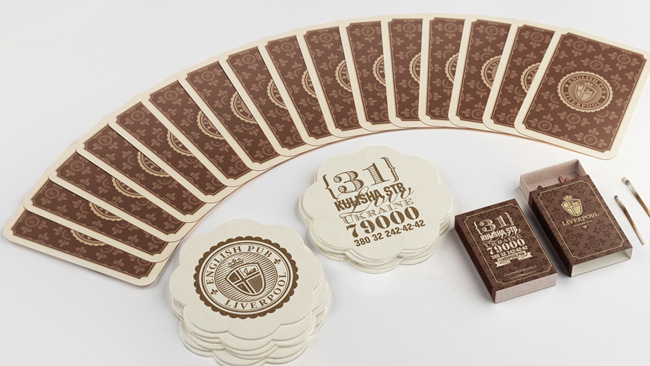
It’s got wonderful variation in the pieces, they aren’t all exactly the same
Quite beautiful, but I’ve never seen anything less like an English pub in my life.
I think maybe Mr Andreyev and Mr Kulik should have paid a visit to Liverpool and also to a pub. This is so far wide of the mark it’s in the Irish Sea. Or maybe that should be the Black Sea.
Beautiful, but according to all the designers living in England this is far from correct. Not sure but I still love this, great identity work.
It’s not necessarily problematic that the identity isn’t reminiscent of an actual English pub. The point of the identity is to signal an English pub to Ukrainian punters, so it makes sense to appeal to their archetypes, not mirror reality. Whether this identity does that effectively, I can’t say – I don’t know anything about the Ukraine.
Beautiful system, but am I the only one that prefers the one-color brown identity to the color version?
Oops – sorry Stephen Dyson – just saw you’d already mentioned preference for the 1-color version…
I could be wrong, but I’d be surprised if the archetype of an English pub involved wax seals, luxury stationery, small caps, “omlettes” or “eggs benny”, in the Ukraine or anywhere else.
This is an interesting identity discussion, and an example of why I, as a strategist and definitely *not* a designer, frequent this blog.
I’d submit that a broad range of elements associated (by the target audience) with England in general, not just English pubs, could provide effective points of departure for the identity, the décor, the menu, etc. When I studied in Atlanta, we used to frequent a wildly popular Irish pub called Fado (http://www.fadoirishpub.com/atlanta/home). It wasn’t until I lived in Cork that I realized just how contrived the design (graphic and interior), the fare and the entire experience had been.
Anyway, my point isn’t that this identity is perfect, only to point out that looking exactly or even a lot like a real English pub is not *necessarily* the right thing to do, a priori.
I think Paul has hit the nail firmly on the head on this one. The elements have an English feel, even though we wouldn’t see them in our local pubs here, the wider stereotype and english associations is what they are going for.
If they had transported the local “Red Bull/White Lion/Wheatsheaf” pub from near me I guarantee it wouldnt appeal to the Ukrainian Audience.
Paul, Stephen
I think we can agree that a wholesale reproduction of the traditional English pub would not necessarily be the right way to go. I’m just having trouble finding anything in the typography, wider design or implementation that relates uniquely to traditional English culture. If you covered up the words “Liverpool” and “English pub”, you might think it was an identity for a luxury hotel in Oslo.
Beautiful!
There’s one TINY thing I don’t understand about the word-mark (maybe I missed something)….that little tilde under the second “O.” It seems to be just visual fluff.
“I’m just having trouble finding anything in the typography, wider design or implementation that relates uniquely to traditional English culture.”
What, the Liver bird isn’t good enough for you? ;)
“While working on the project it was very important to show the connection between the brand identity and traditional England”
Really!? – FAIL!
That should read:-
“While working on the project it was very important to conjure up an identity which we can sell to the Ukraine, so we made up an identity and justified it with some pretentious nonsense about a traditional English pub.”
As an Englishman who frequents English Pubs; this is ridiculous.
If you are going to create a traditional brand experience research is paramount and although the Ukrainians may not have had the opportunity to visit Liverpool the designers should have, this is far from an authentic representation. It may not be important but I think when you are creating such a proposition there has to be a degree of honesty within the brand, it’s slightly misleading.
Saying that, the design work is very well executed, I agree with the comments about the ‘V’ and the single colour version being much nicer.
Something else I just noticed – shouldn’t the identity and words read backwards on the stamp itself, so that when sealed the wax reads properly?
Very fine art! Seems it will be a pub for upper class only — a bit snobish all around?
At first I thought … yuck, ugly old traditional logo, I never like this sort of thing.
Then I saw it actually in context in the following photos, and WOW. Stunning work!
You’ve taken traditional and made it work in a modern way, but retained the traditional feel. It’s like magic!
Simply gorgeous effective brand experience. I, also, liked the logo in one color but the way it was executed throughout the campaign makes that minor complaint moot. Awesome and thanks for sharing!
I love the branding, and as an Englishman, I don’t give a fig if it authentic or not. It’s clearly for different establishment from what we would think of as a pub in England. Great stuff, high class.
One observation: there is a spelling difference in the surname and email address surname on the business card. Little things like that are so important, surprised to see it missed.
Although I’d don’t 100% love the identity itself, the way its run out and other materials and the overall design of those elements, is, wow.
It’s nice, but I keep seeing the norwegian flag in the logo. Thank you :)
Can anyone explain how it’s NOT like an English Pub to a guy who’s never been in a pub in England?
I think the identity is quite well done. If it’s disconnected from a true English Pub experience, then here’s a solution: drop the name and the argument dies with it.
Well done.
I love the color scheme that was used in this identity. The brown and gold work so beautifully together.
in 1680 maybe, in 2012? Heritage overload. Great looking, executed like an unwanted royal wife but it’s a bit like Dick Van Dyke’s chirpy cock-er-neee chimney sweep, god ‘elp em, Mary.
On the plus side, this is out in the wilds of europe, it will be a smash and sometimes, being too authentic can be a major bore. Spoon full of sugar anyone?
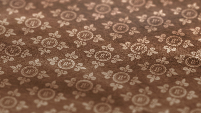
Why have they used a fleur-de-lis pattern? Not an immediate English association surely.
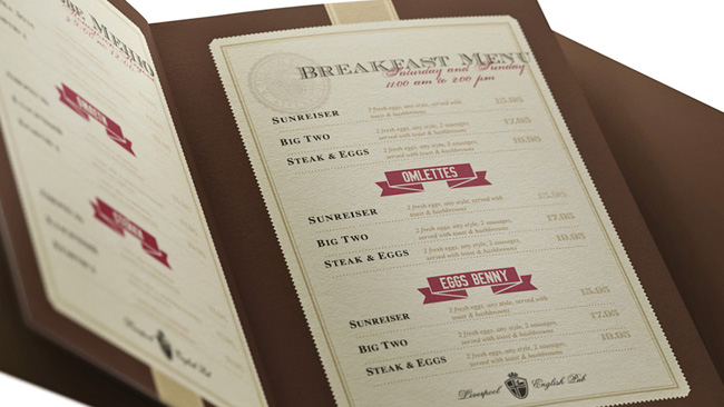
The menus look like they were found in a diner, not a pub.
And it should be “British Cuisine” not “the British Cuisine”.
Sloppy.
Let me ask you guys who seem to know, what’s so special about an English pub anyway that someone would want to “import” it, so to speak, into Ukraine? Because if I understand that, then perhaps I might understand the criticism about lack of authenticity blah blah blah. You know, like an English pub has all this nice stuff going on, that stuff is missing here, this design job is a rip-off, etc. If someone made Landrover rip-off, I’d see where you’re coming from. But here all I can think is, so it isn’t representative of what an English pub looks like? Ok, so?
@David, really good question. I think it’s probably because it is an identifiable ‘thing’, nothing more, just culturally part of the UK’s identity. The Landie analogy is not quite right though, a copy of a Landie would be a fake but in this case, it’s more like going to a French restaurant in, for example, Brisbane. Fakes are done to disguise their true identity, like a good fake Rolex is hard to spot because the important thing is not to realise you’ve been had, where things like this are all about importing bits of culture, like collecting stuff from your holidays, but on a grander scale and showing others that you are traveled, cultured and connected to the the wider world (and want to make money).
It’s like those weird housing estates in China, they people living in them know that thy are living in China, they get up and go to work every day and are chinese from top to tail but they want to live in an imagined cliche of an english mock tudor 3 bedroom detached from Essex (god ‘elp em). I don’t think it’s disingenuous in any way, more just a little odd, like all of us sometimes. The sad thing is when it gets out of control, and like the terrible AIDS and rah-rah skirt plagues of the 80’s we have Irish ‘pubs’ all over the place. I’ve been to a few pubs in Ireland, they all differed in so many ways, no two were the same but the ‘idea’ of the irish pub probably has a few main themes, just like the ‘idea’ of a French restaurant or an English boozer. This design work isn’t a rip off, it’s an homage, a cover version, a little bit of cultural Trompe L’oeil. And it’s nicely done.
I’m Ukrainian and I’m pleasantly surprised that so many people tried to point out the mistakes of this design. Sometimes it’s really funny to notice such fails in foreigners’ works. For example, in Michael Jackson’s clip “Black or White” the dance of Russian men in front of the Kremlin Palace. This dance is called “kozachok” and it’s never been Russian, it’s one of the important elements of Ukrainian culture. And the way it was made was ridiculous and wrong. So the same I see here. I’ve never been to England and the real English pub. And I really want to understand, what these designers had to do to make it right. I looked through all the replies and didn’t notice any good explanations. Everybody says “it has to be different, not like this” but I can’t catch, like what. The description in books of design history didn’t give me clear understanding. I believe that only real English can feel and explain this in the smallest details.
I don’t agree with those who say “the nice picture and design is all right and enough”. It’s not because designer has to make not only decoration but communication. Designer communicates ideas with one’s design. And each idea (and therefore design) is well done when it is clear and correct. English style design wasn’t recognized as English by English. So it means this design wasn’t done well.
Hey Tetyana,
I think what you have done is very good. There is nothing wrong with any of it. The end result looks great. There’s a few elements that are very ‘WEB’ feeling, like the red ribbon banners, but these are tiny details. What you have done is your version of a British Pub in a foreign country and it works. The overall feeling is consistent, well considered and, I would imagine from a consumers’ POV, very enjoyable and that is the real point isn’t it. People have to enjoy it and I believe they will.
On trying to understand the subtleties, it’s almost not worth worrying about (we have enough trouble understating each other at the best of times). As long as most of this is correct then it is correct. You’re not making an English pub, you’re making your interpretation of one and that is where how we should appreciate this work from. Now, have a pint on me. Cheers.
Gareth, thanks for your answer. I didn’t make this design actually. But I’m a designer and I was asked to make a design for website in an English style. So it was important for me to understand the reason behind the mistakes in these works. And it’s not such a simple thing, you know. When you are English, you don’t need to think, you just clearly feel the wrong details of this design. As for me, I’ve been living in another cultural atmosphere so I can’t feel it freely. And I have to use not my heart but my brain.
Thank you very much about the subtitles idea. I think you are right – often the correct meaning that doesn’t give heart-touching emotion can’t give great design.