
Meraki is a new contemporary Greek restaurant in Fitzrovia, London, inspired by island life but with a refined execution. We were commissioned by the Waney family to come up with an identity for their new restaurant.

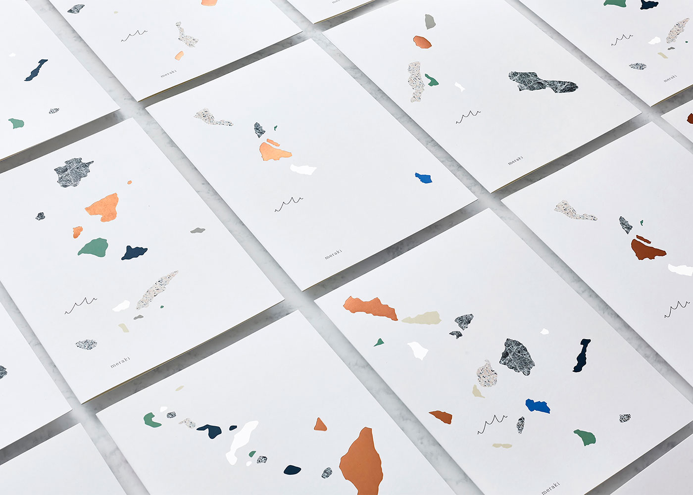
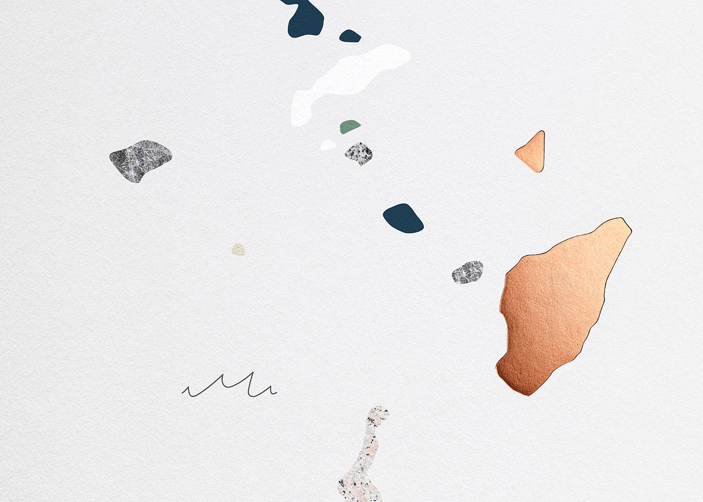
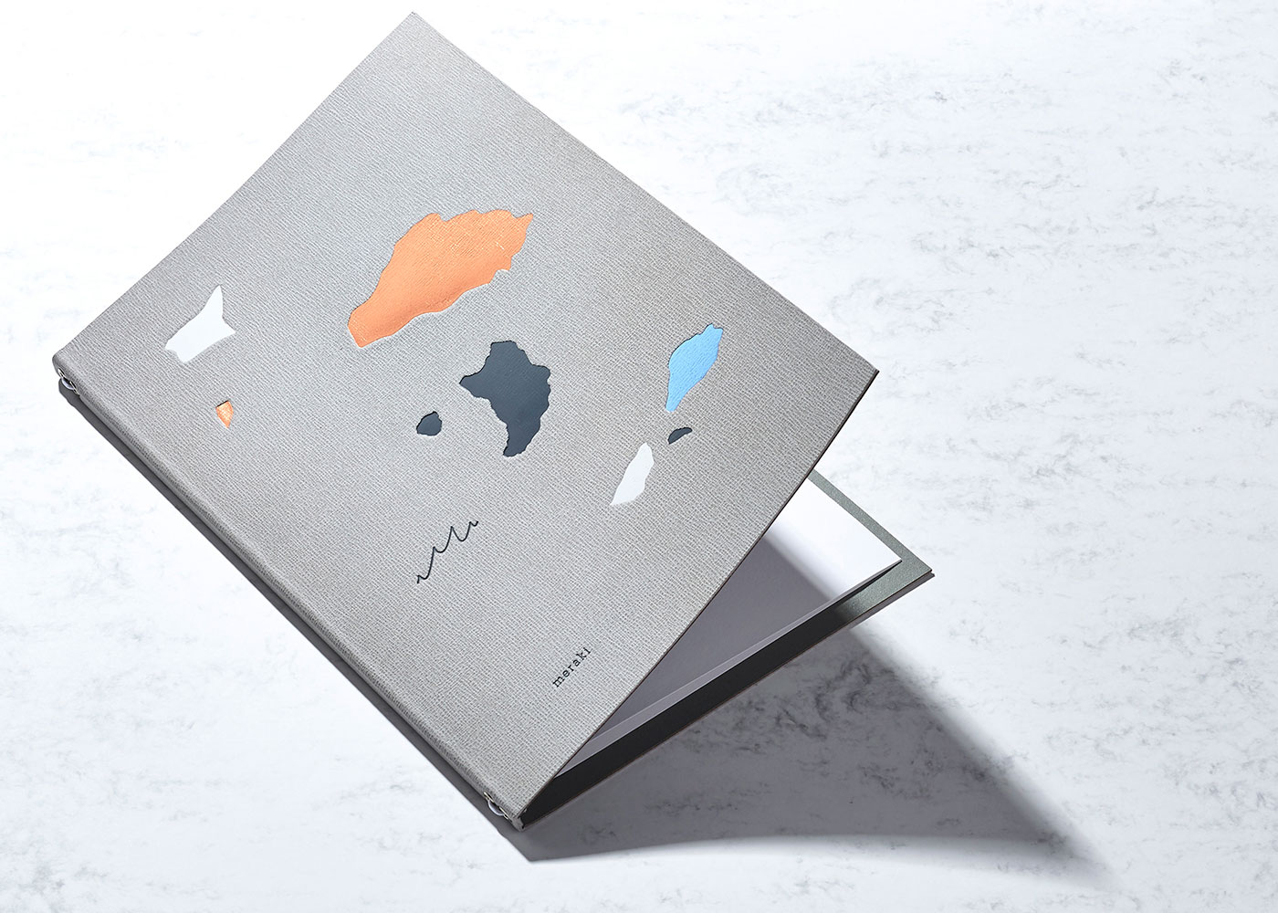
There are six key island formations in Greece and this became the inspiration for the menu designs, created using a medley of finishes and textures. Five of the formations are used on the food menus with the sixth being used on the wine menu.


Painting the island shapes gave a nice sharp yet handmade feel that we enjoyed. We wanted it to look a bit terrazzo in style because this was a material used in the interior, and is a classic Mediterranean texture. It took a little while to get there without just drawing the shapes in Illustrator.
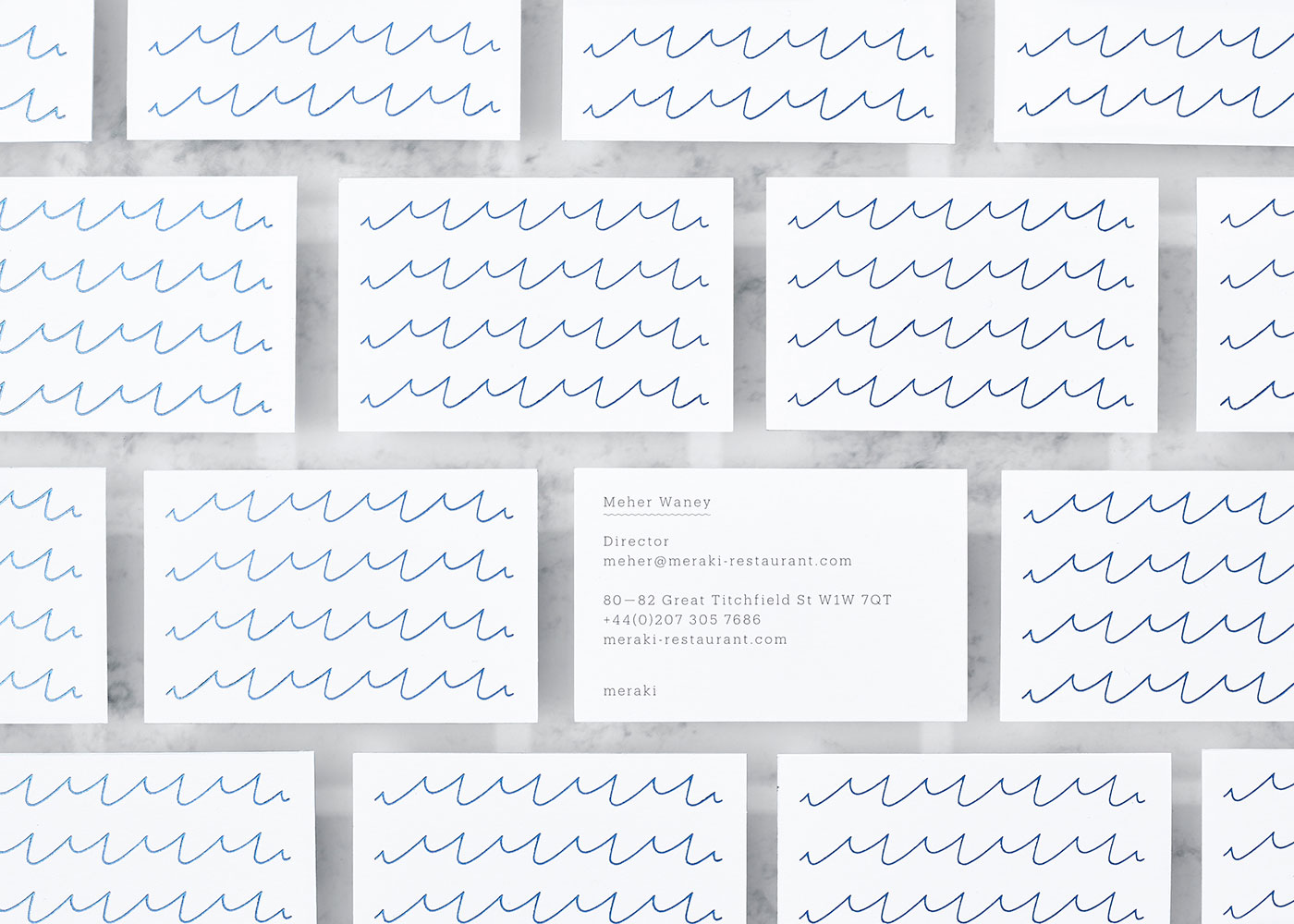
As a predominantly fish restaurant the emphasis on the sea was important, and the M of Meraki lent itself to relevant symbolism. It works in the context of the islands but also as a pattern in its own right.
![]()
The drawings of the M wave show a form of designer madness where we kept drawing it over and over (also in different mediums) expecting a different result. We’re sure all designers can relate! One of the sketches showed wavy text but sometimes simpler is better so we pared it back, combining the M with the brand name set in Produkt by Commercial Type — we liked its attractive but functional quality.

The restaurant exterior is a dark navy and has traditional architectural elements, so for contrast we commissioned Spectrum [now Global Brand Solutions] to make the Meraki M out of bright white neon.
Materials were key, from the bright white textured menu paper (Zen from G F Smith) which emulated Greek architecture to the vibrant blue paper used on the bar menus, evocative of Greek church roofs and the mediterranean sea.


A pale, grey leather was used for the wine menus, with raw edges and lined with coated Buckram book cloth. White elastic was fitted through nickel eyelets, and the outer was then foil-blocked in four colours.
We worked with Boss Print for the majority of the menus, with Progress Packaging for the leather wine menus.


Comments
Cool how the “M’’ works both as the waves and the name of the restaurant. Clever design decision to use the islands in the identity, it made it unique and unforgettable.