It’s not everyday you get to work with a client as exciting and energetic as this, so when Monkey Baa Theatre Co. approached us for a rebrand, we knew we were in for something fun. In need of a visual and verbal identity that could live up to the invigorating and imaginative nature of their offering, we worked with the team to create a brand that’s as rich in emotion and character as their performances and resonates with audiences both young and old alike.
Monkey Baa’s brand wasn’t doing justice to the fun and creativity at the core of who they are. They needed something that would not only express their brand positioning of the power of imagination, but also encapsulate the storytelling that oozes throughout their offering. It also needed to talk to a range of audiences — from children as young as 5, up to young adults of 16 and, of course, the credit card holders, caregivers and decision-makers who guide and organise their activities.
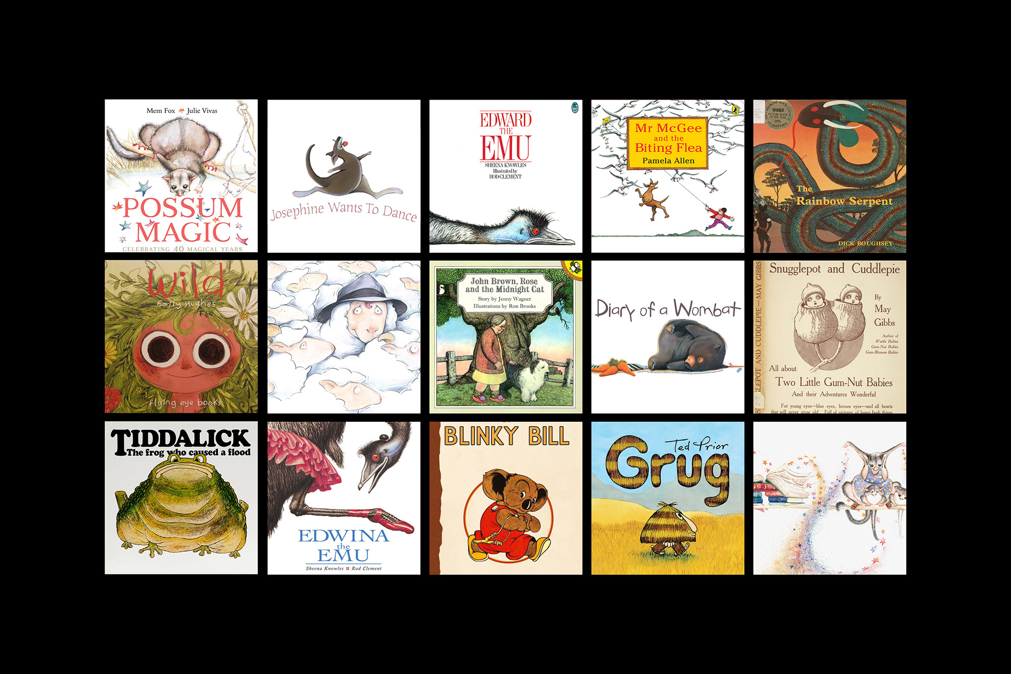
Many Monkey Baa shows take inspiration from familiar Australian children’s literature and characters, so we began by immersing ourselves in the classics. Considering how these stories can spark imagination, nourish minds in all young people, we established the creative idea of “at every stage” — a nod to both the literal stage their shows are performed on and their ability to speak to audiences at all stages of life and development.
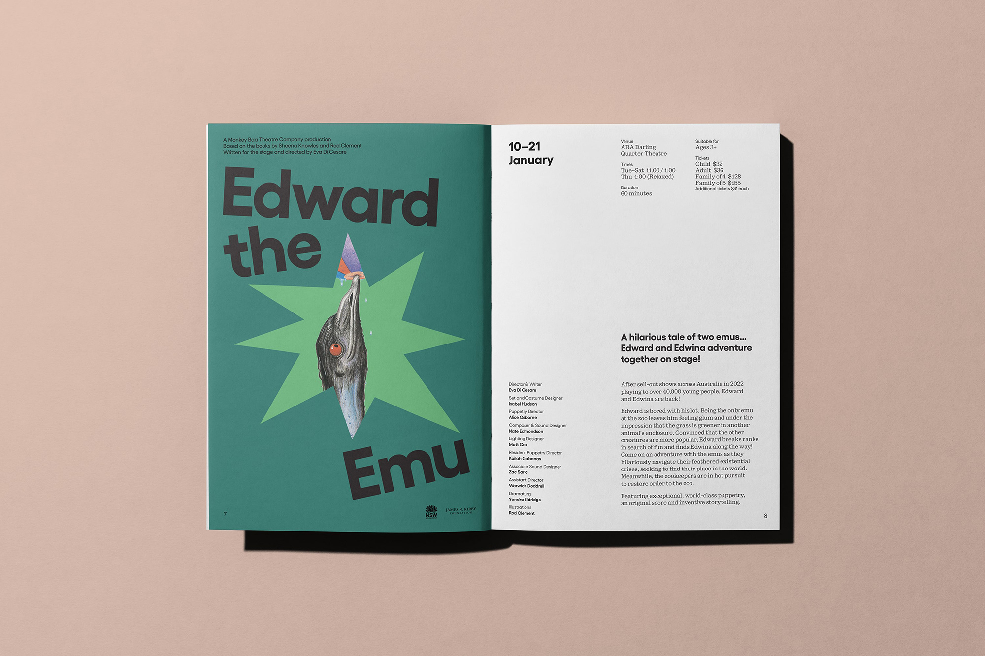
The world of classic children’s literature has a rich, magical and timeless aesthetic. From playful layouts to bold shapes, papercut to screenprint and a huge range of hand-drawn textures, inspiration wasn’t hard to come by, especially given the hand designers like Saul Bass and Paul Rand played in forming it. We took to the tools to create a visual system that reflects the unlimited imagination evoked by a Monkey Baa experience and brings literature to life in the same way their shows do.
The logo heroes Sebenta — a contemporary slab-serif in a style often seen in these books — and the lockups are playfully put together, creating a mark that’s grounded yet lively, like an excited child trying to stay put in a theatre seat. The simplicity of the wordmark not only celebrates the heritage of the company but acts as a confident, professional anchor for an otherwise energetic brand. It’s paired with Gellix for headlines and body copy — a modern, bold, geometric sans serif that’s easy to read but still holds character and quirk.
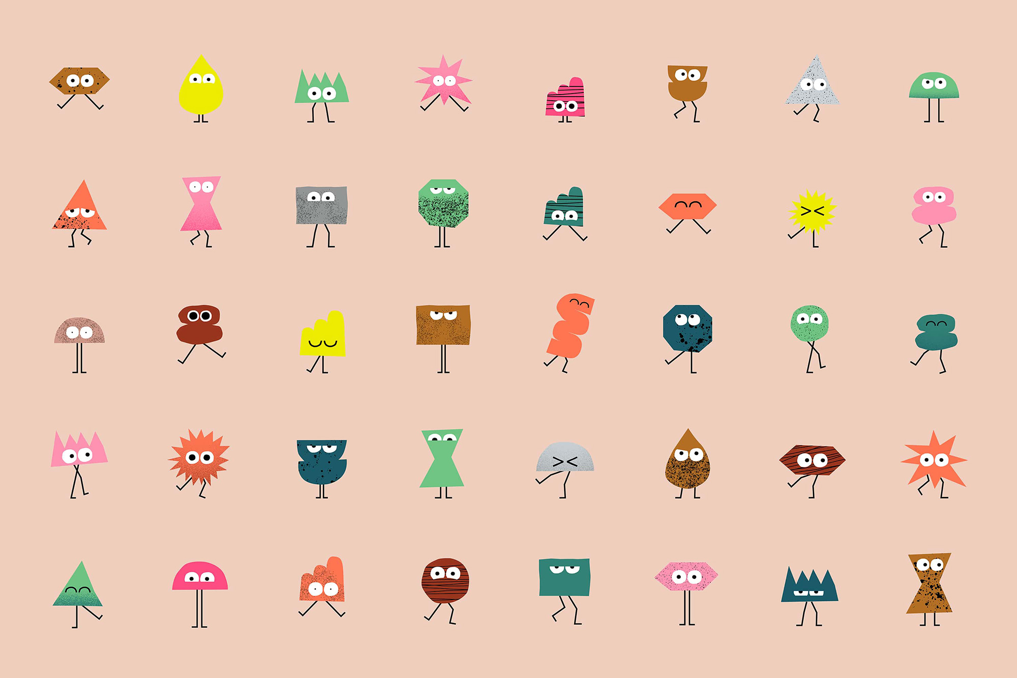
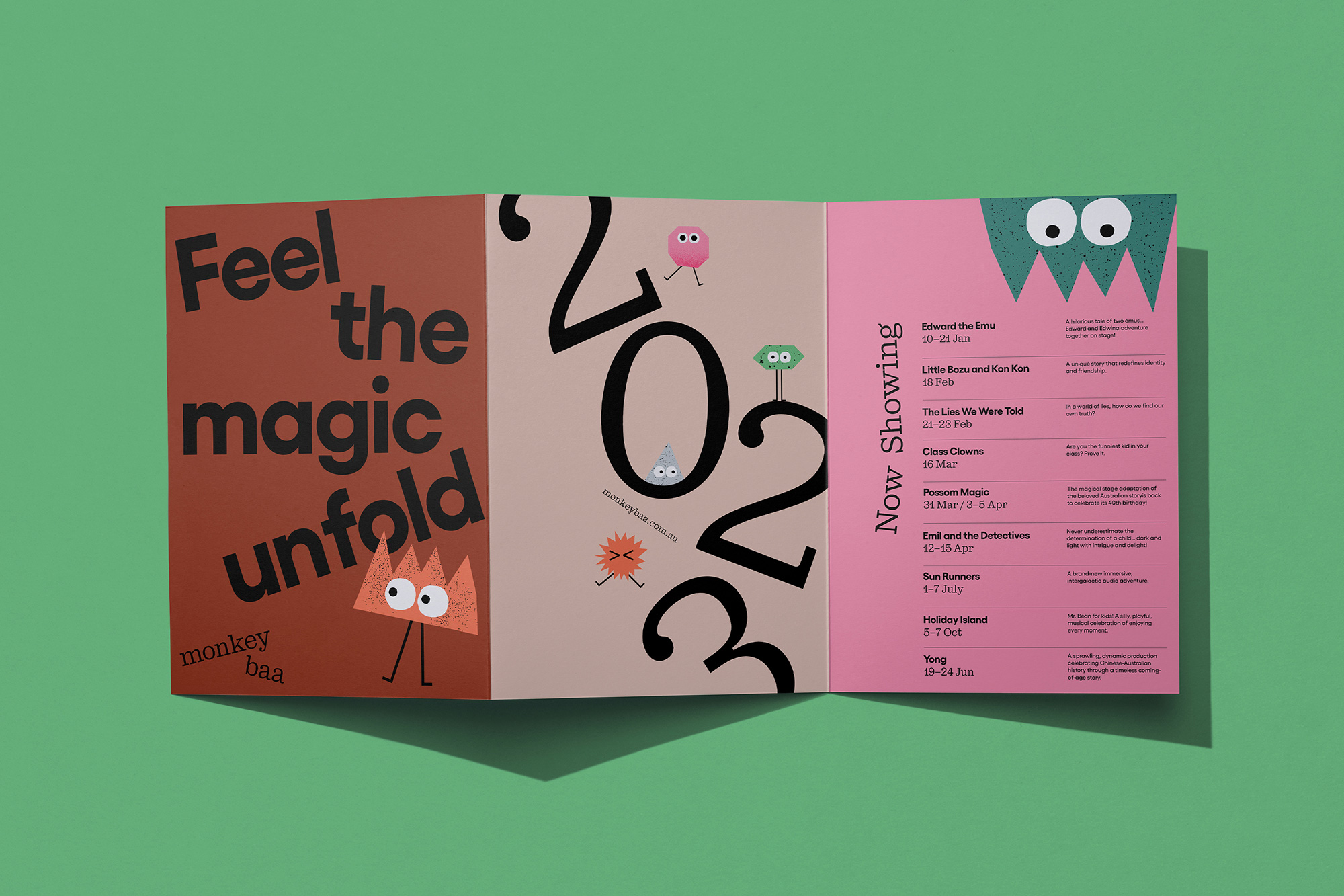
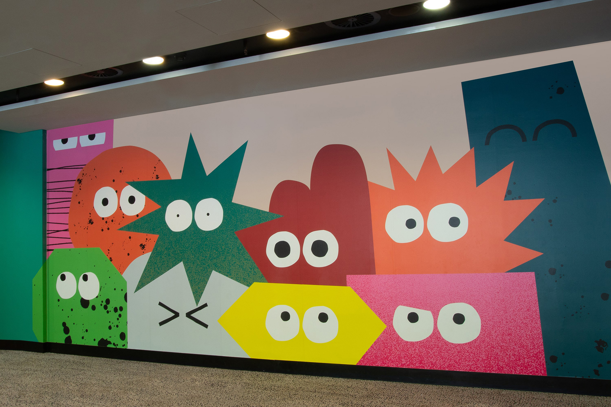
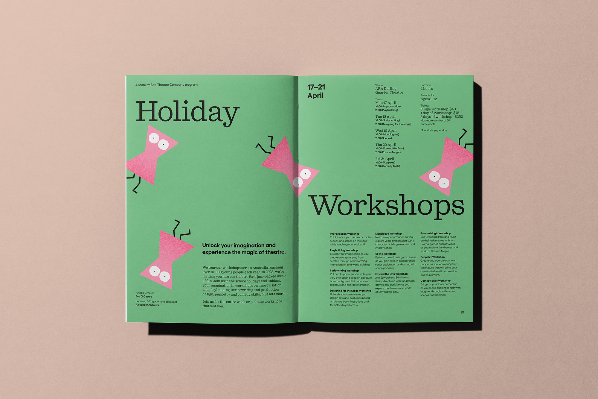
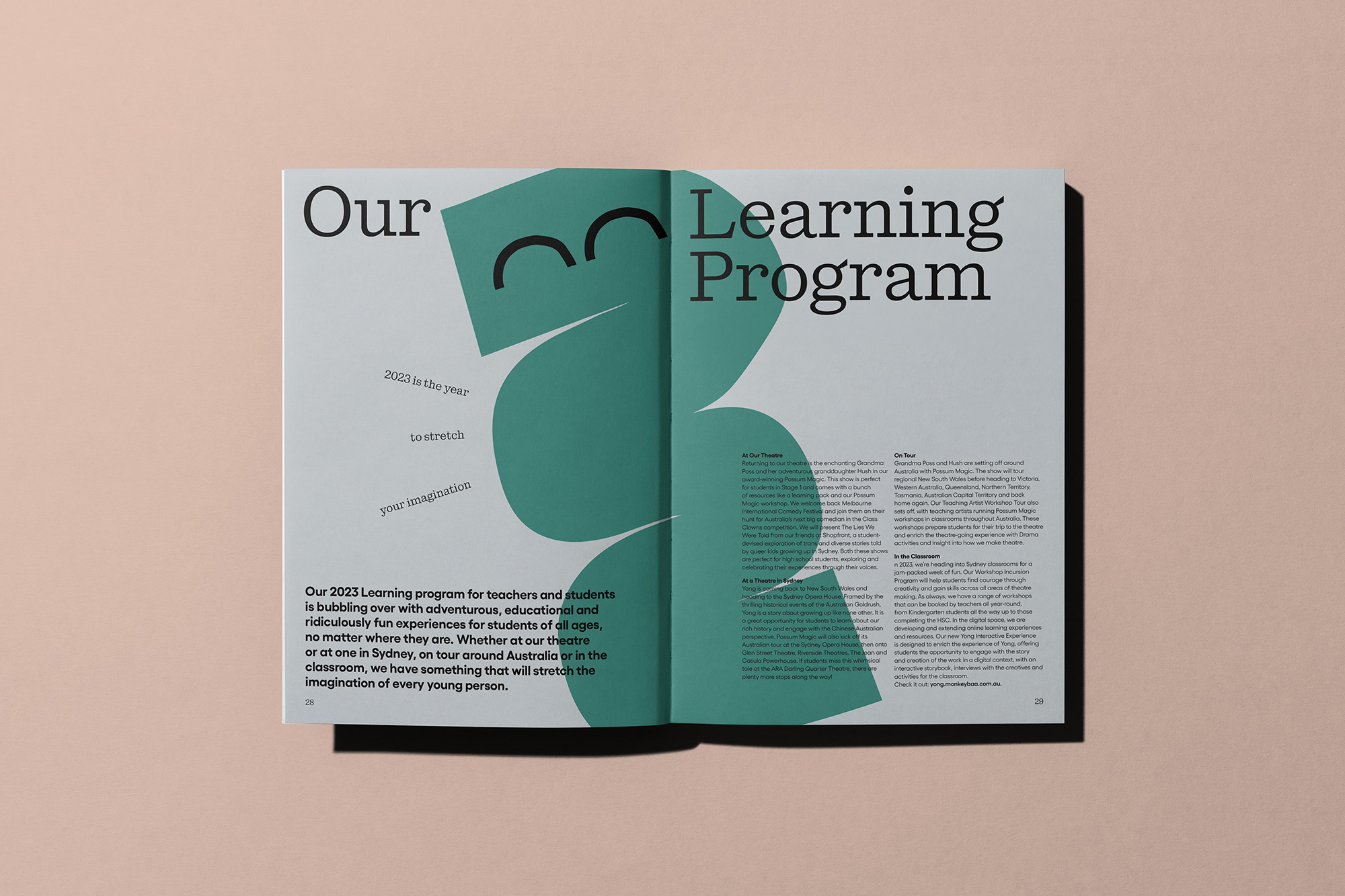
Monkey Baa productions spark so many different emotions in their audiences, some of whom are so young they can’t yet put words to their feelings. We created a suite of simple, playful and expressive brand characters to give the team an ownable asset that could easily evolve and change over time.
Not only can the shapes and expressions be mixed and matched to create diverse and wonderful audiences, but the paper-cut styled shapes can house content and images, ensuring consistency across the brand. The logo can be shortened to a “Monkey Baa” masthead, adding impact to applications that advertise theatre shows.
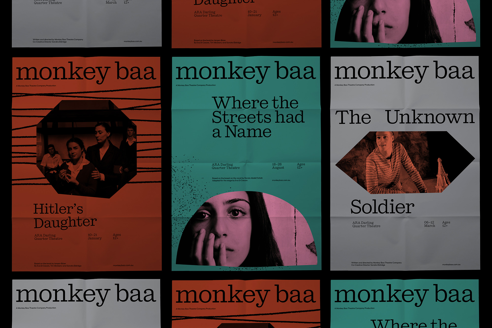
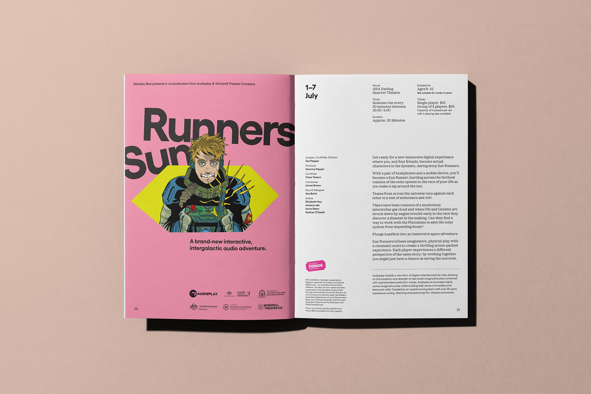
The same shapes and textures can also be used to create a more sophisticated visual language that speaks to an older teen audience. The diverse colour palette was designed to be flexible and adapt to suit different audiences and emotions.
We worked with copywriter Cat Wall to create a verbal identity and tone of voice that could run the gamut from nursery to nursing home when it came to communication. The outcome is a personality that’s rich in charm, warmth and wonder and can be dialled up and down in volume and complexity depending on who it’s speaking to. To demonstrate its flexibility, we scribed a suite of messaging for each audience component that communicates Monkey Baa’s offering and positioning in a way that’s exciting and inviting to everyone.
From wireframes through to design we relaunched the Monkey Baa website. Alongside the development team at Ten Two, we brought the new brand to life with a site full of fun interactions and cheeky characters.
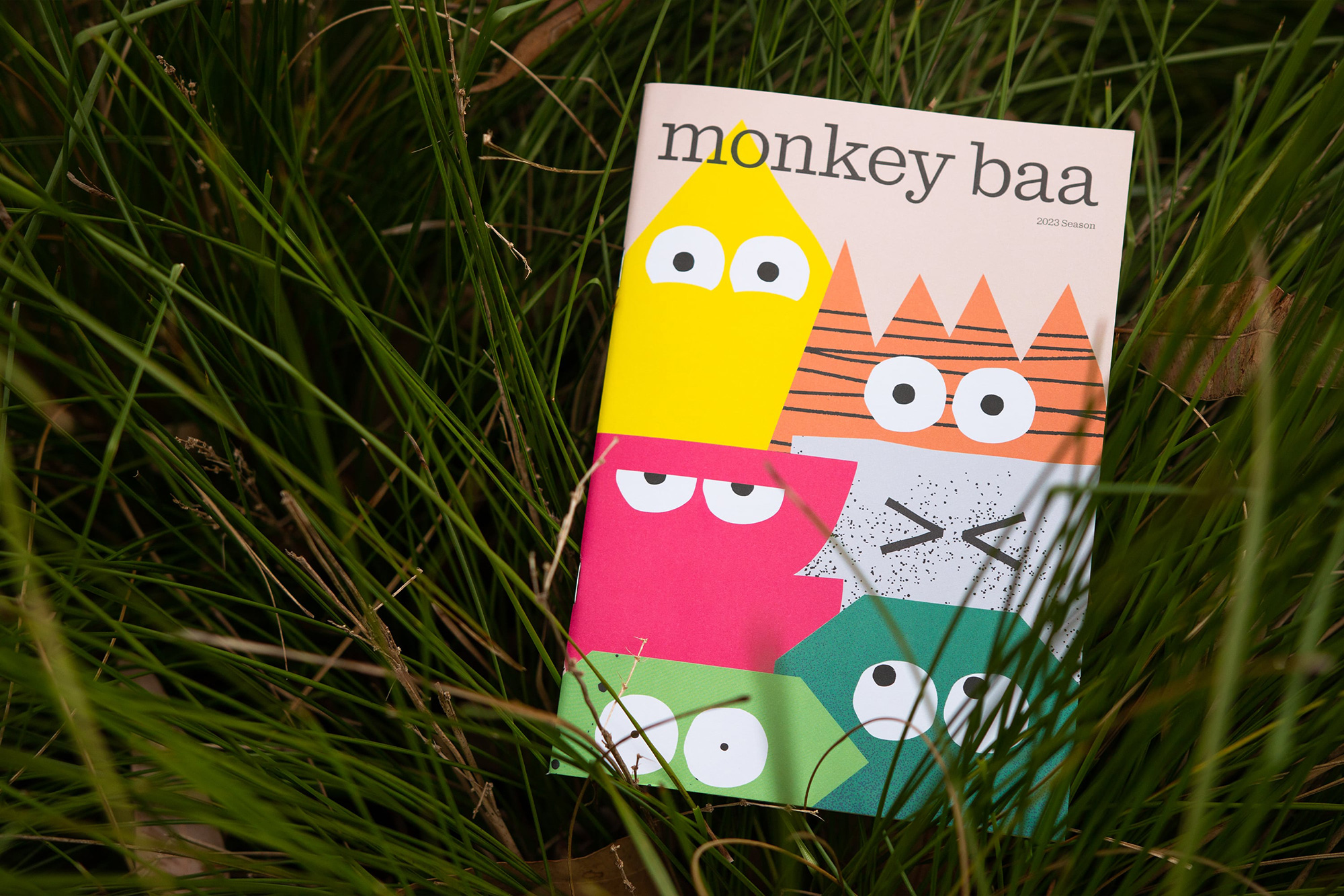
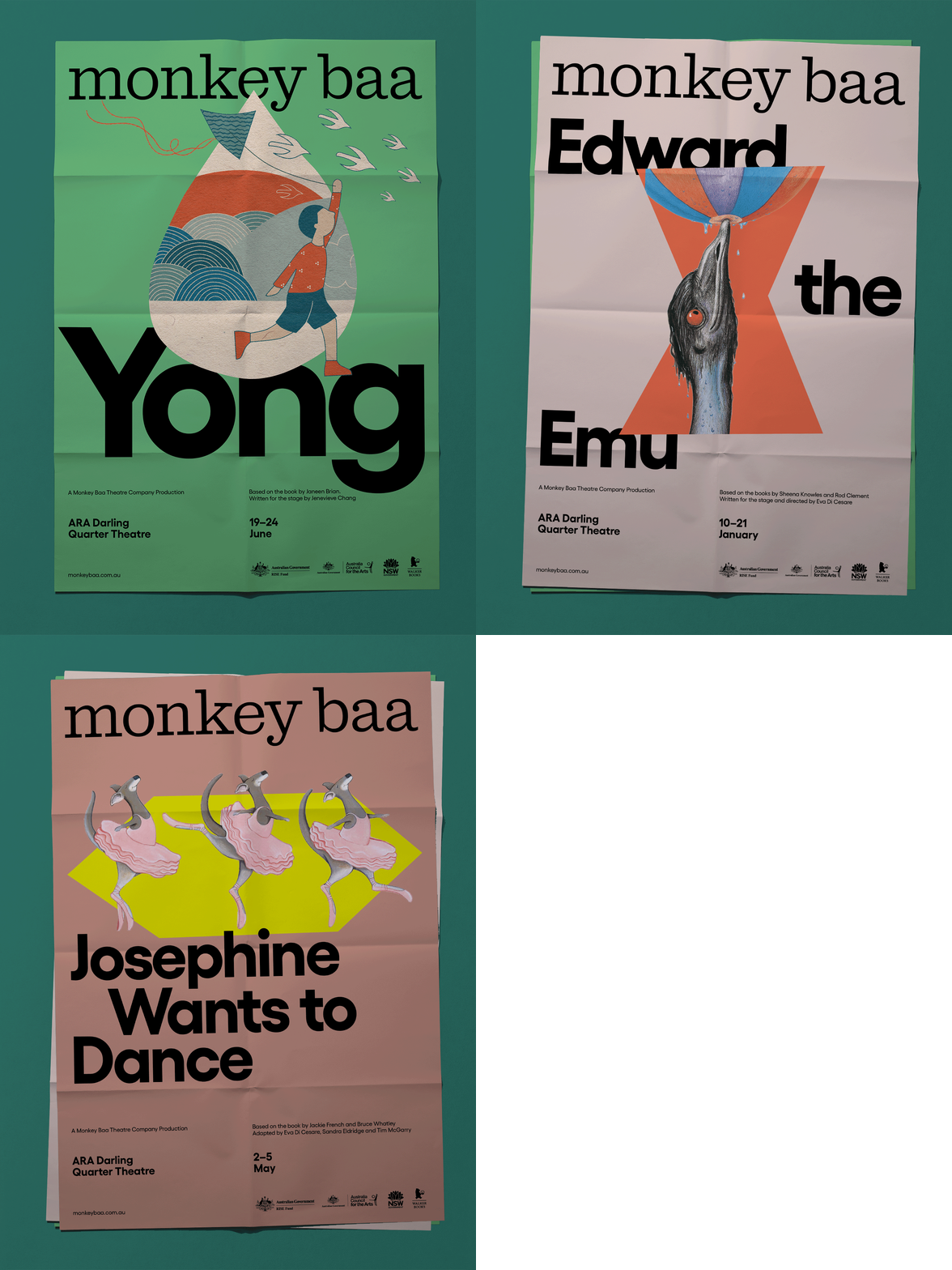
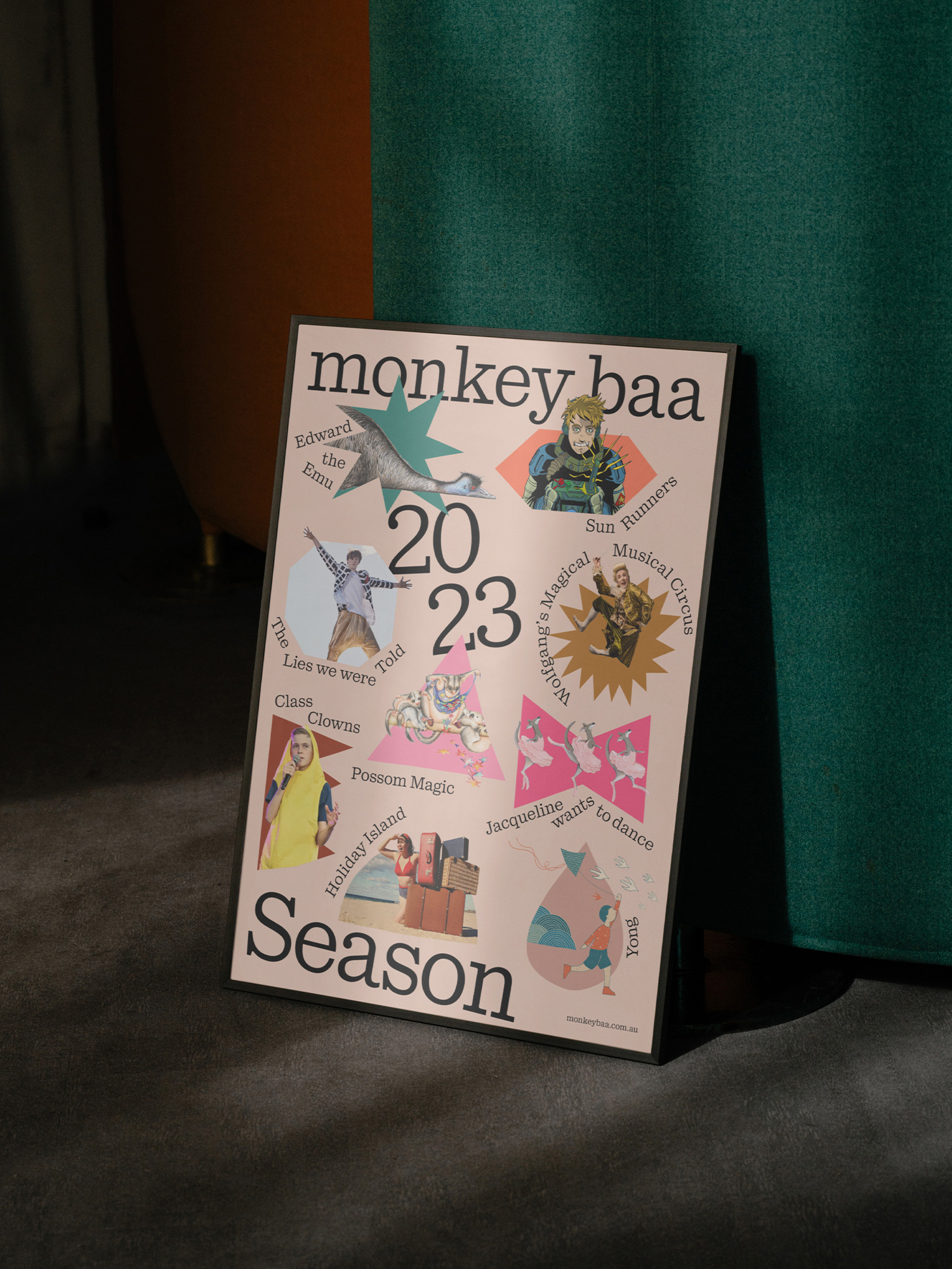
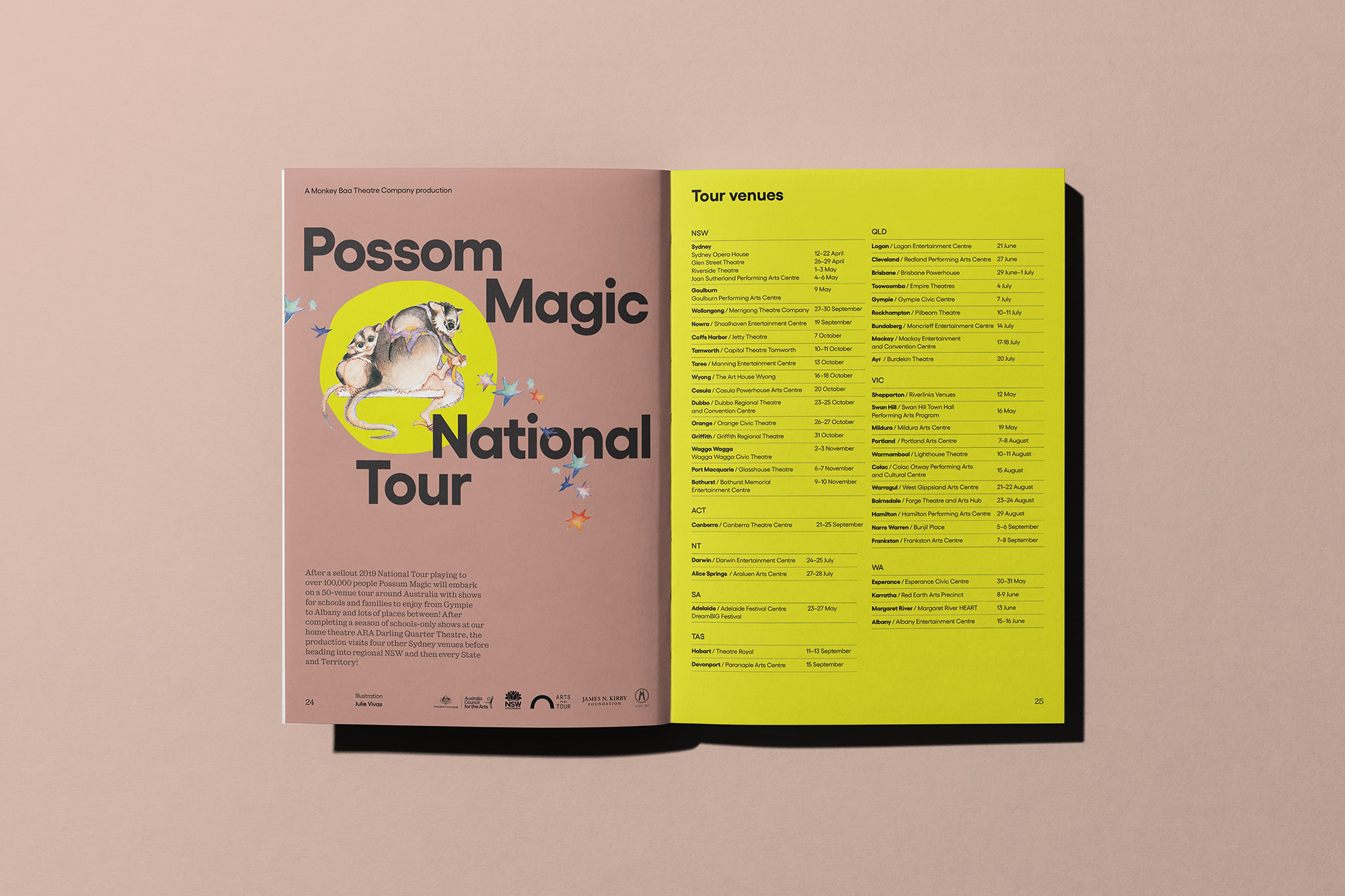
Given the physical nature of the brand, there were also a number of environmental applications. We explored how we could use scale for impact while incorporating our new characters into the theatre space, driving home the emotion and excitement of the Monkey Baa experience. Across posters and brochures and promo materials, the rebrand also made its mark in the world with the announcement of their 2023 season.
Monkey Baa believes in bringing you the best in theatre. From their performances to their scripts, sets and, now, their visual and verbal identity, they’re steadfast in their refusal to compromise on quality. For a quarter of a century they’ve played a vital role in expanding the imagination of young people and empowering them with new perspectives, emotions and ideas and now they have a brand that both recognises their heritage and celebrates their vital, vibrant and inevitably successful future.
More from Universal Favourite.











Share a thought