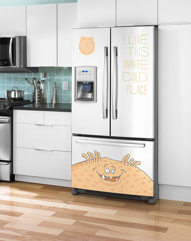
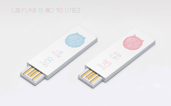
This is a promotional identity and packaging project. The main idea was to create an original image among milk packaging design. To realise my idea I mixed the product with funny characters.
There’s also a newly established history for the product, where it has arrived from another galaxy to give you monster’s force all day long.
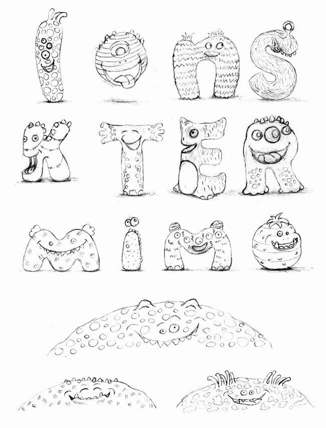
Four main colours are used to indicate the milk fat content with four different monsters for each one. Communication is based on the short phrases about monsters and aliens.


Design and illustration by Pavel Emelyanov (Murmansk, Russia). More from Eskimo design.

Comments
Wow! I love this! I haven’t drunk milk since I was 16, but after seeing this i’d kill for a glass of that monster milk! Props!
I think Ricky Gervais and his mate who created Flanimals might have something to say on the distinct look of the characters…
I think the characters are absolutely adorable and would be very appealing to kids. I don’t like milk but I’d wear one of their t-shirts.
I love the characters and the overall look, but I find the font a little hard to read at times (perhaps it’s just me getting old).
And not to sound pedantic, but the copy is in bad need of editing if the English copy shown here is to be used. Poor grammar in marketing/advertising copy doesn’t reflect well on the company and it would be a shame for this to spoil what is otherwise lovely work.
I think this is really playful but with a smart subtlety that confidently mixes light type and heavy illustrations. These illustrations appear fairly unique and their width well utilised across the base of the print work and while the typeface is very familiar (see Where The Wild Things Are and various indy films) it is appropriately hand drawn and the content friendly, fairly witty and conversational. The pale colour palette buck the conventions of vivid and synthetic children’s cartoons and subtly draw in the qualities of milk.
They are very subtle for characters aimed at kids which is a smart move, great light colour palette, like the typeface used and how it’s used. Overall great work and fairly timeless too.
I like the idea because it’s very playful and it makes milk attrative to the influencer. The name Monster Milk has been popularized by CytoSport, so I’d be careful.
Richard: I agree with you: the grammer and sentence structure of the copy, make it difficult to read. At this point, though, I’m not sure if it was intentional, it seems to me that it could have been a play on the fact that the aliens do not speak English as a first language, but I think that might get lost in the whole of the campaign.
Aaron: I may not have mentioned it if the monsters were the ones ‘saying’ all of the the slogans, but as you correctly point out, it’s unclear whether or not it was intentional. I completely agree, if it was intentional the meaning may be lost.
Apart from that, I love the characters.
Super!
I love the playfulness of it all and the concept!
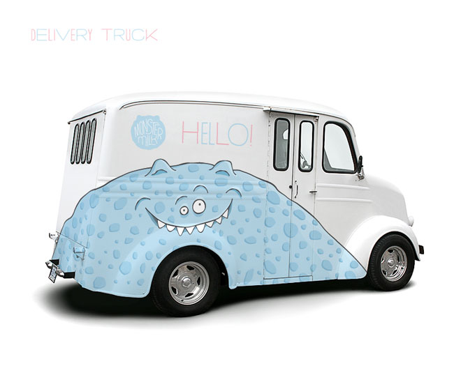
Great execution and application! Love the usb “liters” and the fridge. As far as the copy goes, I think it’s designed to appear as the monster is saying it, so the grammar and sentence structure makes sense.
Overall, I love the playfulness. So very often I see design aimed at kids that is really just condescending. This is certainly not.
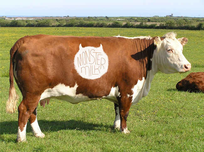
One issue I have however, is the image at the beginning with the name “Monster Milk” on the cow. As a Mom that idea scares me — makes me think of the drugs (antibiotics) and hormones that are in most cow’s milk today (not to mention GMOs that get into the milk through what the cow eats). The name itself is gutsy but it’s application needs to be more mindful if it’s to succeed.
Very cool looking (I really like it)…. very Flanimal character meets Where The Wild Things Are typo. Very, er, very 2 ideas screwed together in a nice way.
Funny isn’t it, when I was a kid we didn’t have to dress milk up like a tart to get it drunk by kids, it was milk, it’s what we drank, it was either milk or water, pop if we were good. Now, now we have to brand up milk to make it ‘work’. Or do we, do we brand it up just because we can? It’s like the recent craze for putting an apple in a nice plastic bag and branding it a a ‘school lunch apple’ or a ‘fun size super sweet apple’ or, you get the picture.
Back to the product though, whilst it’s nice I’m having trouble with the characters. Great characters use difference to stand out and communicate things. Colour can do this, as can shape, perceived sex and a host of other things. These visitors all appear to be the same sex, the same size and wear the same countenance. The net result is a bunch of characters that I have great difficulty taking any notice of in any meaningful way. This seems like a missed opportunity when so much effort has been put into the work to make it look so nice. As a child I liked crisps, I especially liked Monster Munch from Smith’s (later Walker’s). Now, as a grown up I can still tell you what the different characters looked like for each flavour. I had a favourite flavour (pickled onion), but the characters were so well done I have hauled their image around with me since I was 5 or 6. It was the difference, the interest in each character that make them so attractive to a child. So attractive that I rememebr them now. This is what’s missing, I feel, in these characters, I won’t remember them as an adult. Why miss the chance to do this? What miss the chance to really create a difference between the fat contents.
There’s also the matter of what the design overall is actually doing. It’s doing very little in a very big, lovely way. It looks (really) great, it’s attractive but it’s also lying it’s arse off. It’s creating a completely synthetic reality for one of the most natural and basic food products, further distancing the child from the reality of the product (obviously designers don’t control this – it’s business – but we need to be aware of what out work does). Or perhaps it’s not for kids, it’s for guys with skateboards who with buy it in an ironic way? Who knows. What I do know is that this milk on the shelf will undoubtedly be monstrous but its likely to be the price that’s scary but I’m sure it won’t scare the type of people destined to buy it for their little ones..