Since its inauguration in 1976 Montréal’s Olympic Park has welcomed more than one hundred million people who visited one or several of the four installations: the stadium, the tower, the esplanade, and the sports centre. As we approach the eve of 40 years of existence, the Park has undertaken a major shift of both its vision and its vocation.
A plan to relaunch and revitalize the site was set up in 2011 with the goal of enhancing the profile of the Park and increasing visitor/user traffic. The objective was to define the site as a choice destination for Montrealers, Quebecers, and tourists generally.
![]() The old Park logo.
The old Park logo.
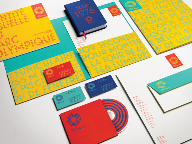
lg2boutique was assigned the task of repositioning the Olympic Park by creating a new brand platform with the required communications tools to rejuvenate its image.

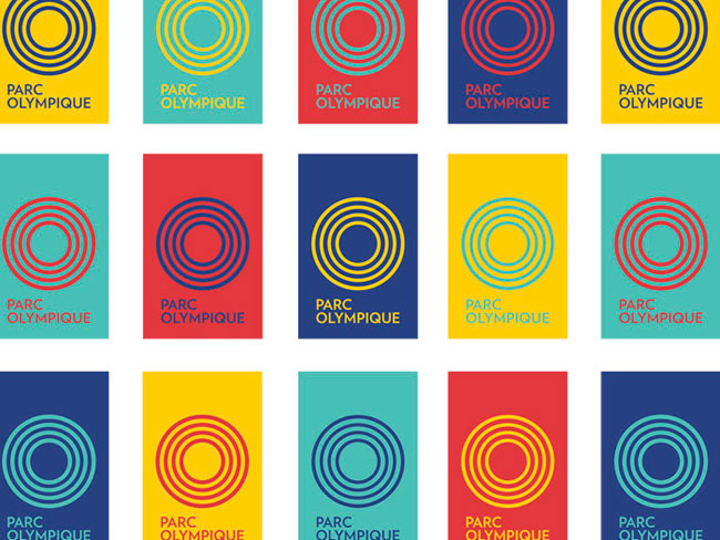
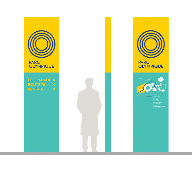
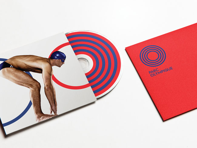
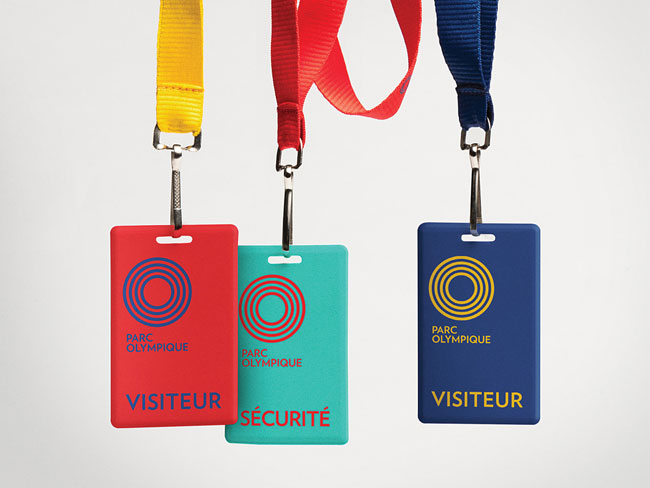
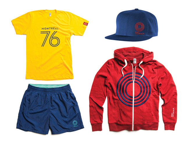
Taking cues from the world of sport, the logo is inspired by both athletic corridors as well as the oval of the Olympic Stadium, the symbol of the Montréal. The circles in the logo and the choice of the four colours in the platform symbolize the different installations in the Olympic Park. The entire platform reminds us of the first calling of the Park and helps us relive the Olympic history that took place there.
 Montréal Olympic Stadium, 1976.

Montréal 1976 Olympic identity, designed by Georges Huel and Pierre-Yves Pelletier
 The Park from above.
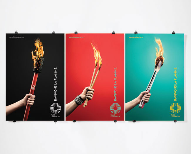
lg2 gave itself the task of producing a publicity campaign using the elements of the new platform and ensuring it effectively communicated the four distinct locations, as well as the Olympic fervour of bygone days.


Client: Alain Larochelle, Parc Olympique
Creative directors: Claude Auchu, Serge Côté
Creative team: Serge Côté, André Rouette, Frédéric Tremblay, Christian Letendre
Strategy: Maryse Sauvé
Account services: Catherine Lanctôt, Noémie Martin
Photographer: Alain Desjean


Comments
It definitely looks 1976.
Those original 1976 posters are wonderful! The current ones – except for the ones with the Olympic torch – feel like they’re trying to assault my retinas.
I quite like the logo, I just can’t look at it for very long.
I think this is a very well done branding and graphic design. As others have remarked, the new design references design elements from the seventies (colors, slim lines) and I think it is done in a clever, tasteful and modern way that ackknowledges the history of the Olympic park. I like many of the details: signage, icons, t-shirt. Great work.
You know what, there must have been something wrong with my eyes yesterday, because I love this today.
It’s great, the kind of design I wanted to see for the London games, similar to Eatock’s Olympic logo.
I can’t see any quotations of the great original look from 1976!? It’s not often, but here I can say: I’D LIKE TO SEE HELVETICA!
Also similar to Lance Wayman’s 1968 Mexico Olympic Games design. Good Job, though.
Anyone know the font used?
Thomas, I think it’s Landmark typeface by Hoefler & Frere-Jones.