
Móra Ferenc Ifjúsági Könyvkiadó (Móra Ferenc Publishing) is the largest youth publisher in Hungary. It was founded in 1952 and although it was a part of every Hungarian’s childhood the company never had a brand identity. If you ask anyone here in the country, they can recall a large number of Móra Ferenc books that became favourites in their childhood.
The only brand identification was that on the book covers they put the name Móra set in the title typeface of the book. The old solution was playful, was always somehow fresh, but the identification of the publisher in the market failed. The changing financial and political circumstances forced the publisher to move to a more unique form of identification. Many new youth publishers came to the market and Móra started to lose market-share.
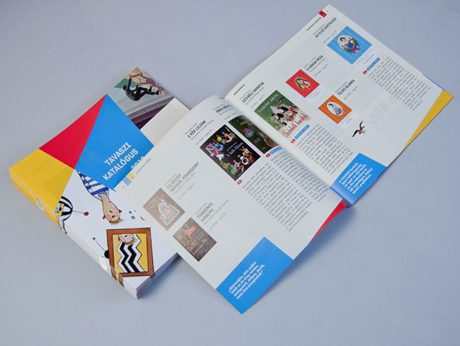
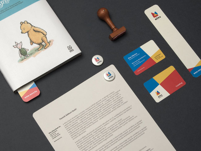
The new identity is a strong mark that changes from book cover to book cover, from business card to business card. The idea behind the emblem was to present Móra’s “M” letter as two triangles, with a size and position that can be vary but only inside strict rules. We created a large number of variations for the Móra emblem, with each a little different, although always the same.

![]()


Zwoelf elsewhere on Identity Designed: Kaviart.
More from Zwoelf.

Comments
I like it.
I find that I’m asked to do identities of this size probono, the only fees to be earned by implementation.
A few things stand out for me:
“If you ask anyone here in the country, they can recall a large number of Móra Ferenc books that became favourites in their childhood.”
I’m guessing this would be the equivalent of maybe Penguin or Puffin books in the UK. I never gave a flying toss about the brand identity of anything when I was a kid.
“The only brand identification was that on the book covers they put the name Móra set in the title typeface of the book. [T]he identification of the publisher in the market failed. ”
I can’t help but feel the new identity – with the varying images – is following in its footsteps.
“The new identity is a strong mark that changes from book cover to book cover […] to present Móra’s “M” letter as two triangles, with a size and position that can be vary but only inside strict rules.”
People like us perhaps understand the ‘rules’, but an average consumer doesn’t. The penguin on Penguin books isn’t a bit scary on horror novels or all come-hither on romantic novels – it’s always a penguin.
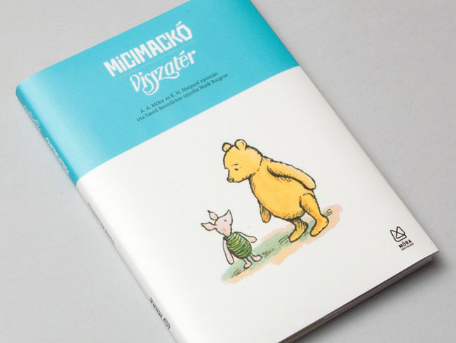
I like the line drawing of the two triangles on the Winnie the Pooh book, but I wish that it looked the same on every page. As it is, I’d probably think it was a printing error. Sorry.
If there was one version of the ‘M’ logo, I’d feel this would be much stronger.
Richard Knobbs wrote “If there was one version of the ‘M’ logo, I’d feel this would be much stronger.”
I concur, a single choice will always be stronger and more recognizable. Perhaps some designers and clients believe that this is no longer the goal, but I do. Aol has a fixed overlay design, MTV had a definitive logo, etc.
I’m going to start with some positives, its appropriate, it’s powerful, it’s visually attractive, I don’t know the market well, but I’m hoping it’s reasonably innovative for the sector and territory. Overall, good job, I can’t help but agree with Miles and Richard.
The multiple versions of the logo just feel a bit unnecessary. I know it’s very fashionable to have logo systems that morph or change according to context or are personalised by the user, but I’m not sure it’s in the best interest of the client on this occasion – especially if an ambition of the rebrand was to counter the emergence of new and stronger brands.
I could understand it moving when it has cause to, as an ident to a promo film, at the start of a presentation, on a website or an app or as part of a brand film with which to launch the new identity and gain traction and engagement with an internal audience. Movement would add to its playfulness, it could bounce, wobble, spin in all kinds of attractive, joyful ways – but always resolve itself to single mark.
Leveraging the appeal of the symbol as a supergraphic expands the visual vocabulary sufficiently, it brings the symbol to life and allows it to interact with its context. I feel anything more over-eggs the pudding.
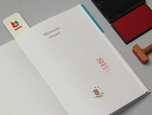
Things are also complicated by the line version. Why use that on the Pooh bear cover – to reflect the black line-work of the illustration perhaps? But the cover looks to be printed 4-colour, why not employ the cmyk version – especially on your new brand launch editions. I can appreciate the necessity for a line version, the rubber stamp provides evidence, but I’m not sure the outline version was the best solution – even though I like it very much. Could it not have been solid with the overlap as a non-printing area. Could they have introduced a coarse dot or line screen to differentiate the two triangles? Perhaps. I’d have certainly explored the options.
Lastly, what about the visual identity management considerations. Given too many choices or options, it can be the case that the client always falls back on personal favourites, or ‘the one we used last time’, just to expedite the situation when a publication deadline is approaching. Then you get a ‘by default’ approach which is likely to be satisfactory to no-one.
So lets also end on a positive, for all the professional misgivings about the structure of the identity system, the logo made me smile, think about my kids and engaged e enough to spend time writing this. :-)
It’s lovely, but how could a firm that cares about its work allow that ghastly GIF to be seen in the wild?