
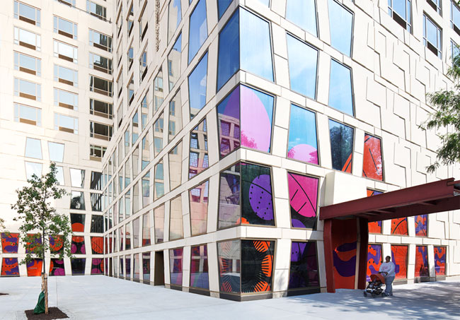
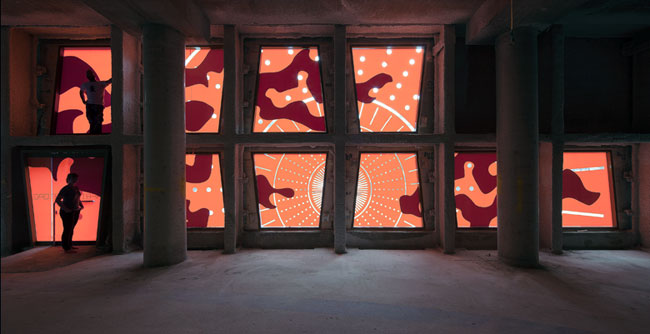
During construction, the Museum for African Art (MFAA) wanted to conceal the work in progress, while teasing what’s to come and allowing full access to the public space near Duke Ellington Circle, as well as preserve the views of the park from the interior. Even under construction, the sight line from the second floor to the Harlem Meer was not to be missed.

Robert A. M. Stern developed a window pattern based on African textiles and domiciles. To conceal without concealing, OCD layered on a second, third and fourth application of African patterning. These were translated into the MFAA brand colors and modernized a bit. The effect is a peek-a-boo teaser that lets the light shine in and out.


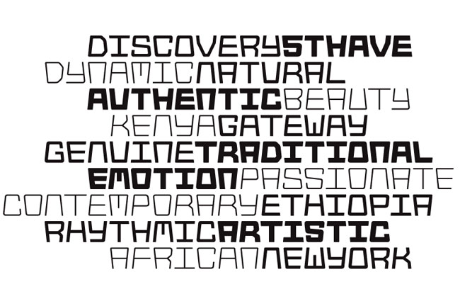
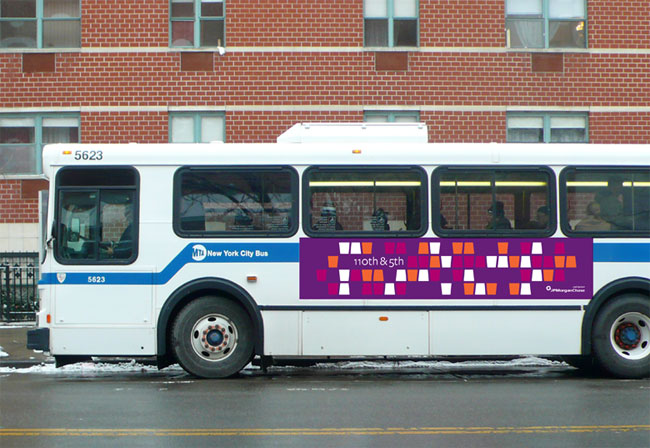
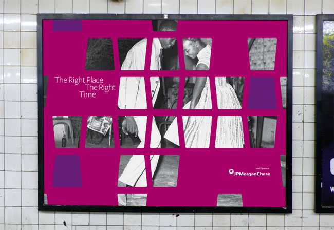
The AfriSans typeface is the core of the MFAA identity system. Inspired by the building’s architecture, each letterform locks into the figures around it. To build a fully integrated system, every letterform had to be drawn and programmed twice: opening up and opening down. Each headline makes a uniquely Museum for African Art tesselating statement.


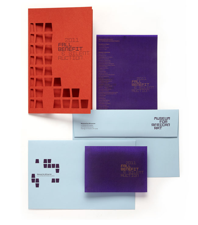 Fall Benefit & Silent Auction, invitation system

 Capital Campaign, customisable consistency.

Design: Jennifer Kinon, Bobby C. Martin Jr.
Typography: Jesse Ragan
Photography: Ari Burling
![]()
More from The Original Champions of Design.
Visit the Museum for African Art website.


Comments
It’s really nice that the color pallet doesn’t go for the usual brown and green. Also the AfriSans is an amazing type family.
I like the window patterns which are based on African textiles and domiciles. But I am a bit unsure about the rest of the profile being so heavily influenced by the building instead of Africa.
Wow that is one serious piece of typeface design, I love that they saw typography as the most appropriate way of communicating their values. A good example of a well thought out and strategic approach.
Really impressed by their thought process behind the typeface. Crazy genius to have two alternate letters for every letter so that they open up or down depending on how they sit next to one another.
Rod +1
I get why designers appreciate the typeface, but as a non-designer it just looks weird to me. Distinctive, but difficult to read fluidly.
Love this typeface design and the colors, I think this is very well executed.
Wow! This is great work! That typeface is amazing.
Africa? I don’t see it. Great work but this could be the Musuem for “any sort of” Art in my opinion.
I agree. Great design, but as South African I don’t necessarily identify with it.