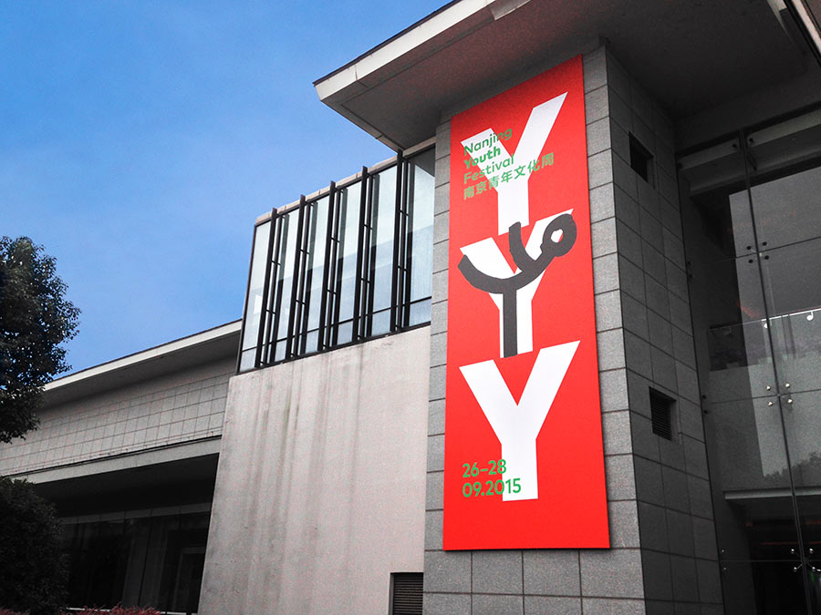
After the Nanjing Youth Olympic Games took place in 2014, the city of Nanjing (China) and UNESCO initiated a youth festival providing young people with a platform to show, dialogue, and communicate on sports, culture, and peace. We were asked to design the identity, with the first edition of the festival running from 26-28 September 2015.
The assignment brought us a unique opportunity to work with the city of Nanjing and UNESCO. The aim of the Youth Festival was to bring multiple cultures together in collaboration and with a shared purpose and theme, and this triggered our concept.

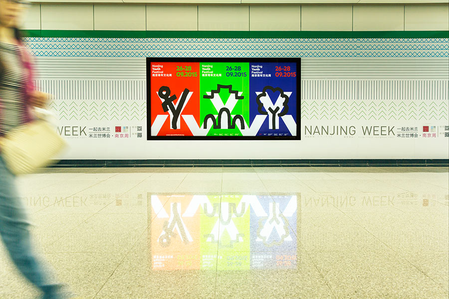
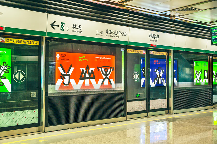
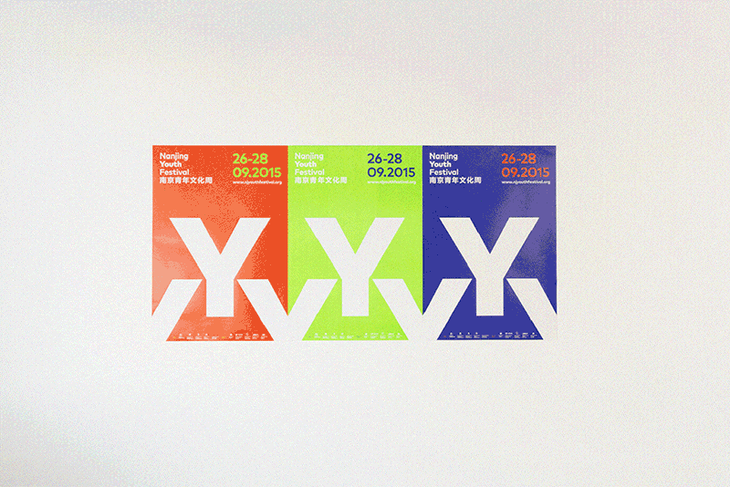
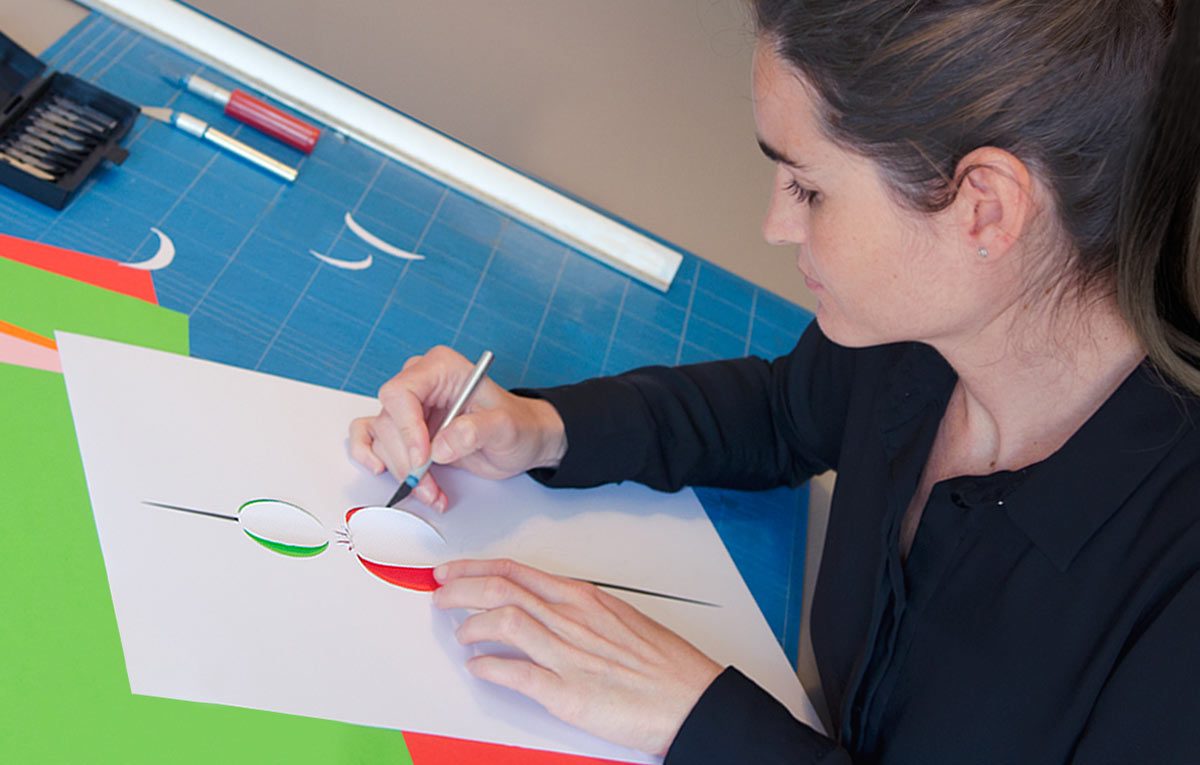
For the design we departed from the idea of collaboration between people and cultures. In the overall identity and communication we choose the “Y” of Youth as a recurring character and building component, shown in bright colors with clear typography. We designed the identity with the intention that the youth of Nanjing would be able to further elaborate on it, making it theirs, and even more unique. They took the posters, flyers, flags, banners and stickers, and used our black paint concept of handwritten symbols that referred to the themes of the festival.
It was the first time we created a design that was intended for others to build upon, not having a hand in what the outcome of their input would be. But any little hesitation that we might have had was completely taken away when we saw their results.
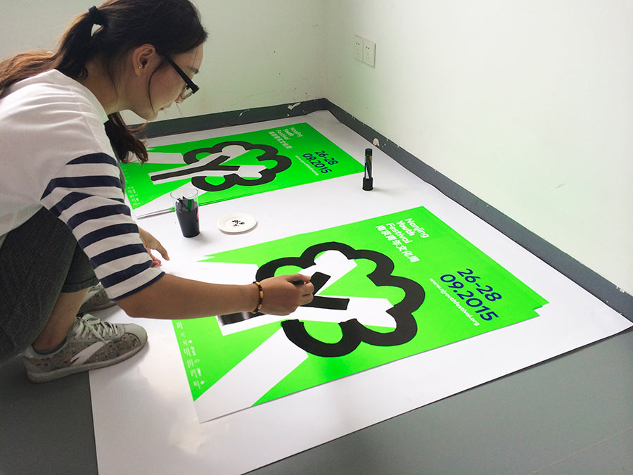

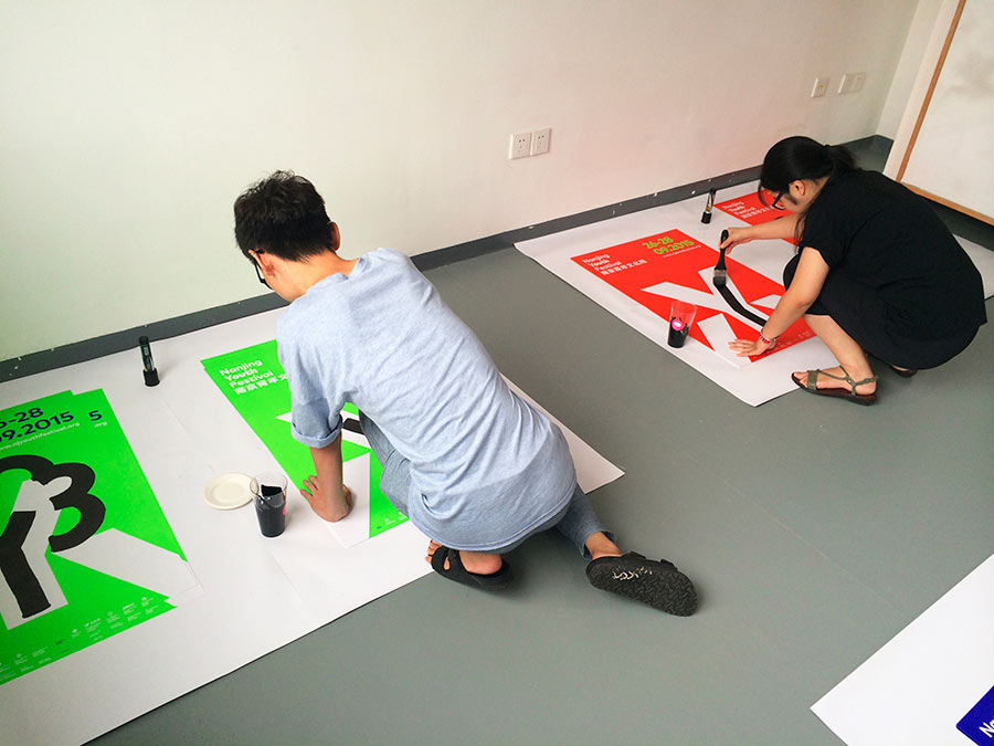
They really made our design their own, taking it further and creating new ideas with the concept — ideas that we would have not thought of ourselves.
The interaction in the design brought a visual expression to the festival; creating a space for involvement and collaboration.


View more identity work on the Thonik website.
Photography by Thonik/Fin Zhao, 2015


Comments
This is a great idea and deployment. Engaging audience to make their own things, for me is a great achievement. What I’m trying to say is the true essence of design is to communicate with people, letting people involve or giving feedback on what we have designed. It’s a two-way communication; understanding each other. Very social in artistic way. Good job.
An amazing concept and interactive result with the students at Nanjing. At a time when we all need some positive input about the world, this sends such a great message of hope and love. The design concept by Thonik and the design additions by the students are sensational.
Thanks for some inspiration right now when we all need it.