Appointed as brand strategists and identity consultants following a four way pitch in April 2010, London branding practice SomeOne has created a comprehensive new brand identity for the Royal Museums in Greenwich:
- The National Maritime Museum (the largest maritime museum in the world)
- The Royal Observatory (the Home of Greenwich Mean Time — GMT)
- Peter Harrison Planetarium (London’s only public planetarium)
- The Queen’s House (The birthplace of British architectural Classicism)
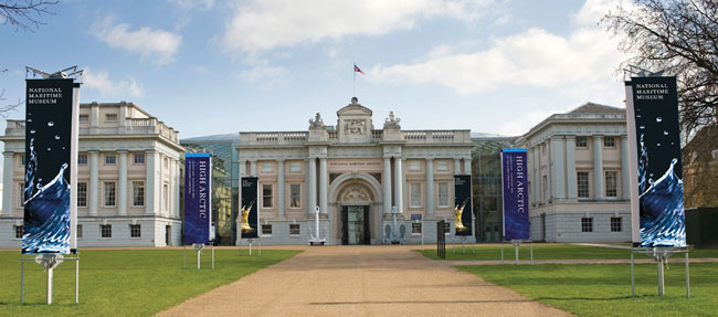
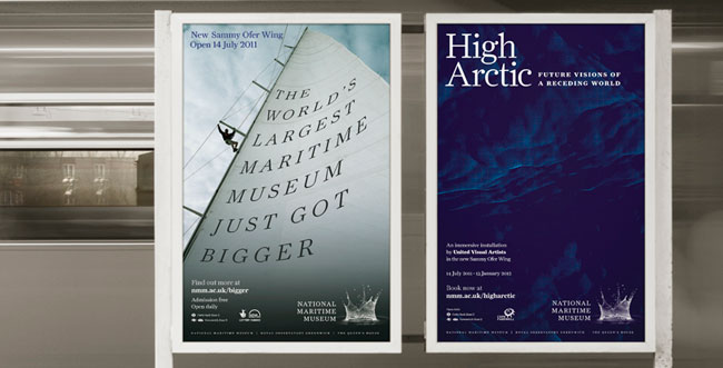
On July 12th 2011 the new Sammy Ofer wing of the National Maritime Museum opens its doors with an impressive new set of offers for visitors. The branding will be launched with a high-profile campaign supporting the opening of the new wing.
The new Wing and the rebranding come at a time of renewal and greatly increased profile for the Museum, for Greenwich and for the World Heritage Site as a whole. In 2012, Greenwich Park will host the equestrian events for the London Olympic and Paralympic Games. In addition, to tie in with Her Majesty The Queen’s Diamond Jubilee in 2012, Greenwich is to be given the rare honour of becoming a Royal Borough in recognition of Greenwich’s global significance as the home of the Prime Meridian, Greenwich Mean Time and a UNESCO World Heritage Site.
Kevin Fewster, Royal Museums Greenwich Director said, “This is the most important year for the National Maritime Museum since it opened in 1937. The new brand identity sets out to reflect these dynamic changes — that will run across all the four sites and programmes.”
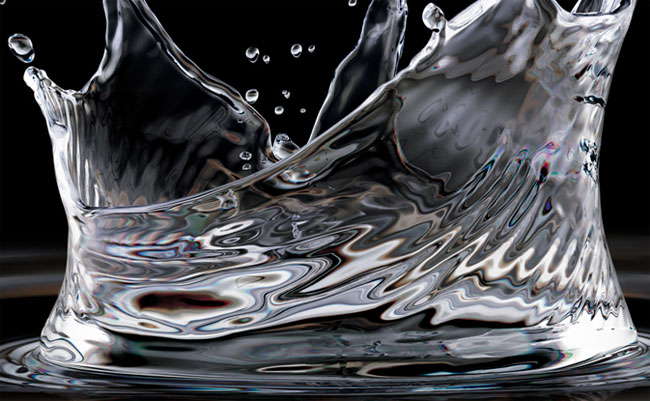
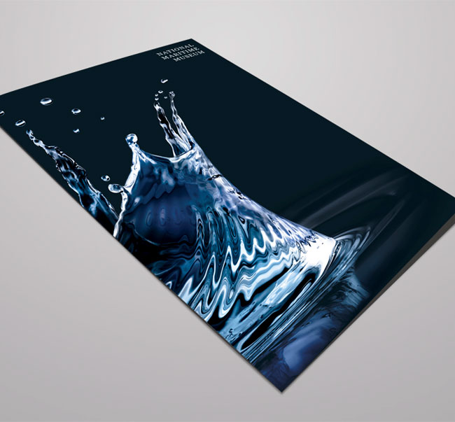
As for the visual identity, David Law, co-founder of SomeOne explained, “Our inspiration was the idea that the achievements and discoveries made in Greenwich in navigation, time-keeping, astronomy and technology, resonated and echoed around the globe, like the ripples from a stone dropped into a millpond — the National Maritime Museum naturally has to be the splash.”
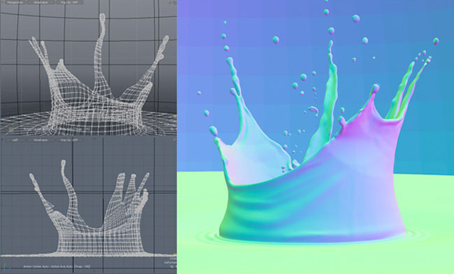
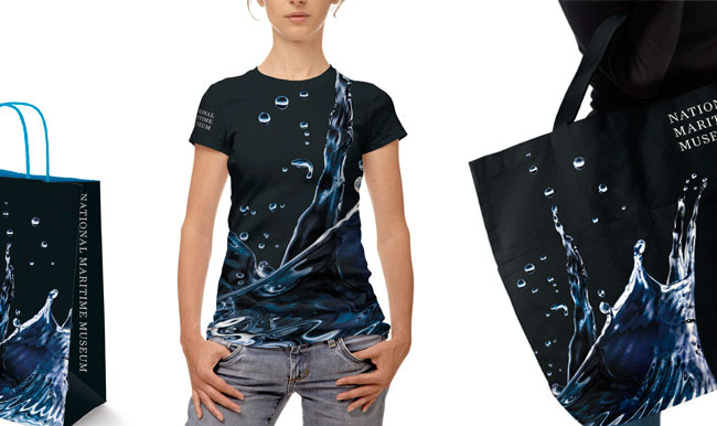
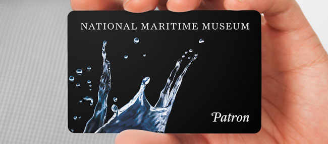
We wanted to make as big a splash as possible for the Museum, so we decided to create a 21st century image rendered entirely in CGI which would give us the opportunity to animate and light it, creating a flexible brand world that could evolve and adapt over time.


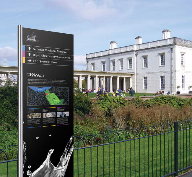
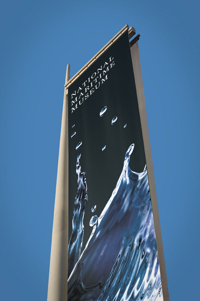
We created an entirely bespoke ‘splash’ that we then lit with different colours to make individual splashes for each of the three sites — sea blue for the Maritime Museum, gold for the Queen’s House and Royal purple for the Royal Observatory.
The best part is that people see different things in the splash — some see a crown, others see a ship, there’s even a star constellation amongst the droplets. We decided that it would be more reflective of the diverse offer of the group to keep these elements subtle, so you see a splash first and foremost, then maybe something else at a second glance — like seeing shapes in clouds.
Alongside this, we have employed the beautiful typeface ‘Farnham’ by Christian Schwartz as a group typeface family for all communications. It is a contemporary take on 1700’s punchcutter Johannes Fleischmann’s work. Known for its ‘sparkle’ on the page, Farnham has been designed for the digital age and for us really reflects the new directions of the museum as a whole whilst acknowledging the past.
As the identity rolls out, the splash will ‘come alive’ as the ‘liquidity’ brand world is further employed across digital signage and gallery projections.
Claire Hyde, head of communications at the National Maritime Museum said, “SomeOne has produced an inspiring identity for us which reflects the huge steps we are taking to engage with our visitors in a contemporary, more conversational way.”
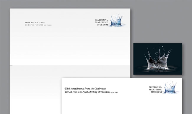
The brand world has been applied to all launch items from uniforms to tickets and merchandising and SomeOne is also retained as brand guardians as well as being tasked to create year one campaign advertising which will include exhibitions and installations by star designers, United Visual Artists and historian and curator David Starkey.
Key facts:
This was a two-year project to re-brand and re-name:
- The National Maritime Museum (the largest maritime museum in the world)
- The Royal Observatory (the Home of Greenwich Mean Time — GMT)
- Peter Harrison Planetarium (London’s only public planetarium)
- The Queen’s House (The birthplace of British architectural Classicism)
SomeOne — strategy, naming, branding and advertising
United Visual Artists — exhibition design
Clear — signage and wayfinding
Real Studios — gallery design
Plant — digital signage
BVA — digital and website
SomeOne elsewhere on Identity Designed: Eurostar.
More from SomeOne.


Comments
Wow. This is beautiful. Hat’s off.
That’s stunning!
I have the great pleasure of going into Greenwich Park most weekends with my kids, so I’m going to love seeing how this evolves. Farnham is a great typeface too.
It will also be interesting to see it sitting alongside the 2012 Olympic logo over the next year in the park.
Beauty and the Beast comes to mind!
Outstanding branding work, their portfolio looks great.
Although I like the identity for the Maritime museum, I feel that applying the same splash for a planetarium etc. seems a bit of a stretch.
I do like it but every time I look at it I see the Budweiser water drop that turns into a crown. I do have to say that Someone’s work is awesome, they always seem to put so much thought behind each of there projects.
Wow! Super inspiring to see the use of something so little as a water droplet become so big! The expansion of the logo on the signage, t-shirt and handbags really brings it to the next level while continuing to stay true to the brand and relevant.
I can’t deny it is an awsome image; but I don’t see the connection between the National Maritime Museum and a splash (other than the obvious: it’s water), let alone The Royal Observatory, Peter Harrison Planetarium or The Queen’s House.
Am I missing something? Or is it like those fantastic adverts you see on the TV where you think “brilliant”, but have no recollection of what it was trying to advertise.
I concur with Chris Shepherd – I’m not seeing the connection. And the commentary (by the creators) “Some see a ship, some see a crown…”” Really? Who, when where is that attributed to?
Stunning visually, but its complexity makes it pretty difficult as an actual logo I think. I almost think the typeface lock is the most recognisable thing and the splash is like a supporting imagery instead. Looks amazing on the t-shirt though.
Chris Shepherd +1. Beautiful, but other than the maritime museum I guess I lack the imagination to make the connection between the splash and the institution.
Aesthetically beautiful, but the explanation of ‘ripples’ is too intellectual and contrived for this identity package to convey immediate meaning.
I see a crown.
This is an amazing design!
I’m usually against anything that looks ‘photographic’ in logo design, but this has been done incredibly well and ‘works’ beautifully in some many different ways.
It feels modern and fresh but with a distinct flavour of ‘history’ and ‘heritage’ to it. Feels just bang on perfect to me.
I think it’s poorly thought out. I agree with several of the other commenters that the splash is poorly connected and that it’s inappropriate to be used for the Planetarium too.
It looks nice, but it just doesn’t work.
I’m with Luke on this one. I want the splash to do something exciting or different rather than just change colour or appear large and cropped on different things. It all feels a bit old fashioned in the way it’s used and somehow feels like it will date quickly. It’s neat and tidy, but not exciting engaging or clever in the way the identity designed by Minale Tattersfield for the Imperial War Museum is.
I agree with Luke and the others, personally this design just isn’t working. Sure it’s beautiful, the rendered splash is nice to look at and all, but it’s not the way to go when creating a logo. I can see this as a means of breaking away from the conventional ‘logo’, which in most cases use a solid (possibly vector) shape, with no gradients, and aim for legibility, but unfortunately this doesn’t tick any of those boxes.
I feel a logo should be a mark that sticks in your head, is legible or recognisable, has a good contrast of shape, size, colour, organic and mechanical forms, and good dynamics. It’s a shame that some of designs today completely lack in those principles, in an effort to break out of them, but I feel the principles can’t be broken out of, and shouldn’t, because they’re the reasons why a logo is defined as one that ‘works’ or ‘doesn’t work’.
It’s a no from me, this isn’t working, and in my mind can’t be defined as an identity. The splash would look great as a reoccurring background image or theme, but not as a logo.
If you look at SomeOne’s website they talk about how they want to create morethan just a logo for their clients.
Looks like they have done just that here.
It’s not a logo solution. But it does work as one where required.
Clever stuff and pretty progressive for a museum.
Evian? Gordons? Volvic? Could be anything but it sure doesn’t look like seawater.
Couldn’t help but see the resemblance to this stock photo of a water splash: http://www.istockphoto.com/stock-photo-3907033-water-splash.php
Oh yes, very similar, but I would have thought that there would be a fair number of crown shaped water splashes knocking around if one looks for them yes?
This is a great design and I feel works very well in practical application, but I don’t think it will win any awards for innovation based on the core principle of the design.
Must admit – I saw a crown. But stunning none the less. Great work.
Beautiful but ultimately pointless.
The problem is staring us all in the face. The monumental issue is that the brand they have designed (very nicely done, slap on back, give the 3D modeller an extra can of Monster®) is so stratospherically generic it’s almost a punchline to some sort of joke.
It’s too banal. It is’t memorable in any way. It looks like any splash. It could be any splash. I’t not a special splash that will stay with me forever. Did a designer actually come up with this or a marketeer?
Spot on there, Gareth. I agree, it doesn’t leave a strong impression on me, I just think of it as, ‘that logo that looks like a splash’, I don’t even think as far as ‘oh it looks like a crown’, or even ‘oh hey, isn’t that the logo of that museum?’.
I think they’ve missed the point.
Apart from that, I have to agree, the work put into the design is great, and I’m sure the designers/marketers spent many hours working on this, but it doesn’t seem to put across the intended ideas.
If your company redesigned the Maritime Museum you have a lot to answer for. How could you take such a wonderful collection and turn it in a cut price Lego land. What have you done to our history? Turned into a children’s playground. Shame on you.