
Since 2000, Nolla Nolla has created bespoke furniture and interiors for many of the most exclusive retail, corporate, and residential spaces in Finland. This year they plan to expand throughout Europe.
Nolla Nolla was undergoing a complete reinvention of its business model and product lines. They commissioned us to communicate this new direction with a bold, new brand identity. We needed to build an identity that can credibly offer a high-end alternative to premium furniture brands.
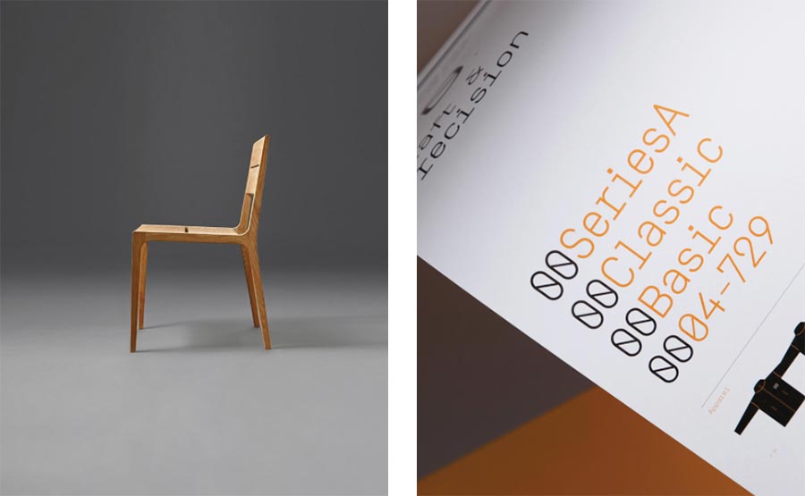
Having invented a new brand concept — the ‘origin of craft’ — we created a simple logo that plays on the letter ‘N’ and the number ‘zero’ — ‘Nolla’ in Finnish. The brand identity is made up of a clean, technical typography style, white space and rigid grid systems. We also directed their new product photography style.

The typographic identity system uses Simplon Mono from Swiss Typefaces.


A guideline poster outlines consistent use of the identity through livery, signage, and interiors.


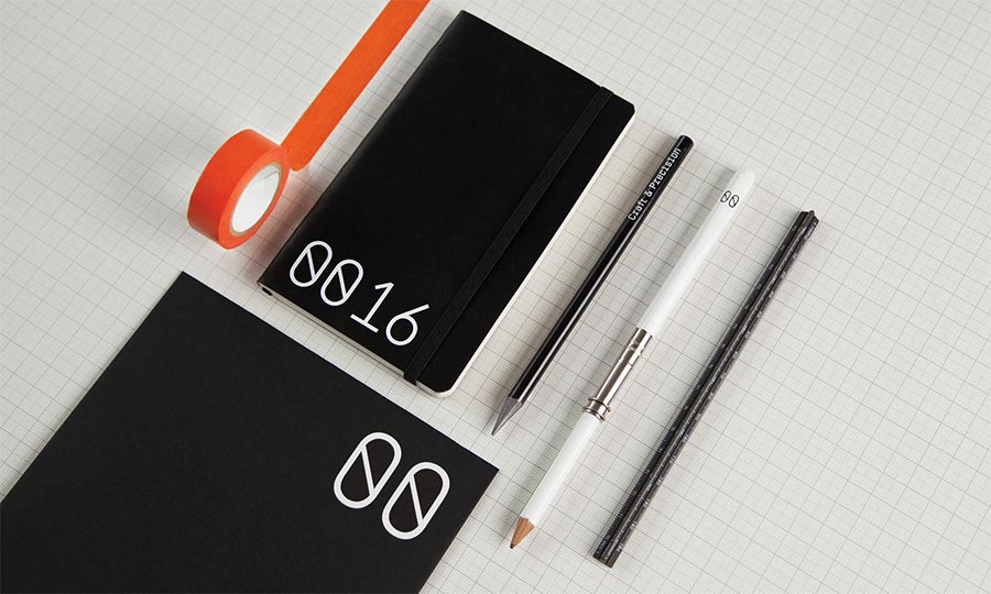
Stationery nods to architectural and carpentry heritage.

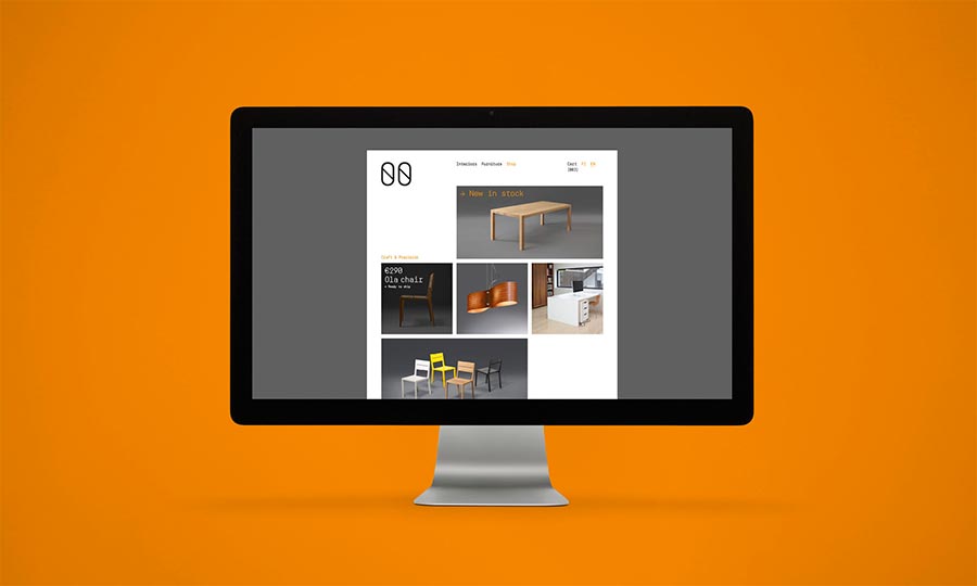
The website uses typography, a simple grid system, and product photography.

Retail signage and brochures bring the brand to life in trade shows and showrooms.

More from Proxy.


Comments
This is what happens when a brilliant name meets simple, effective design ideas. That’s also why I strongly believe that the best identity design is often based on strong naming, which inspires and guides the identity process to some extent.
Thanks Julian!