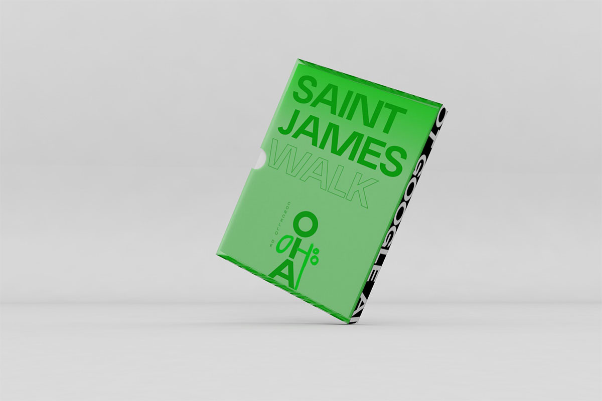
Oia is a small paradise town in Galicia, Spain, located on a mountain with breathtaking views of the Atlantic ocean. This area of Spain is characterised by its beauty, food, and beaches, but mostly, because it hasn’t yet been discovered by tourists. Oia Council approached us to design the identity for their tourist department, emphasising the potential of their outdoor activities (surf, St James’s Way, camping), gastronomy, traditions (seafood, marking of wild horses, food fairs) and historical spots (their monastery, castros, and thousands of prehistoric petroglyphs). They definitely wanted to put Oia on the map.
![]()
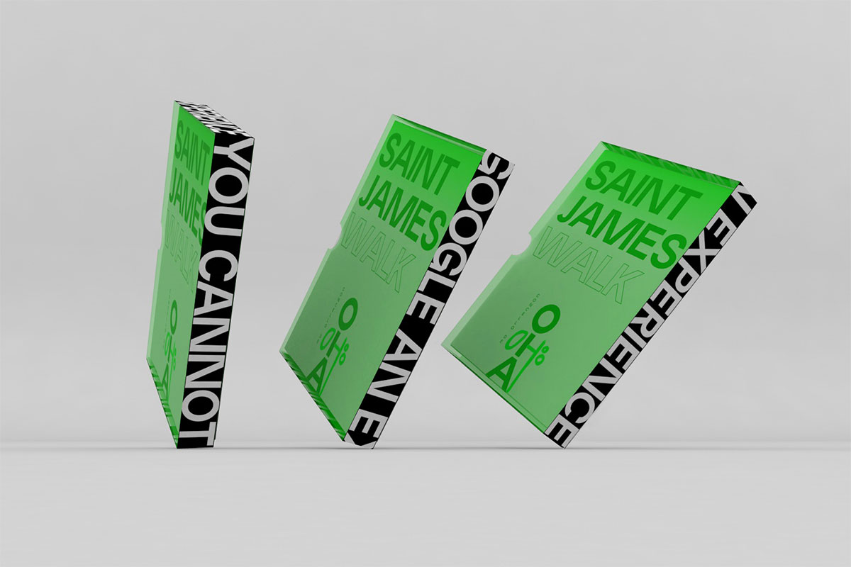
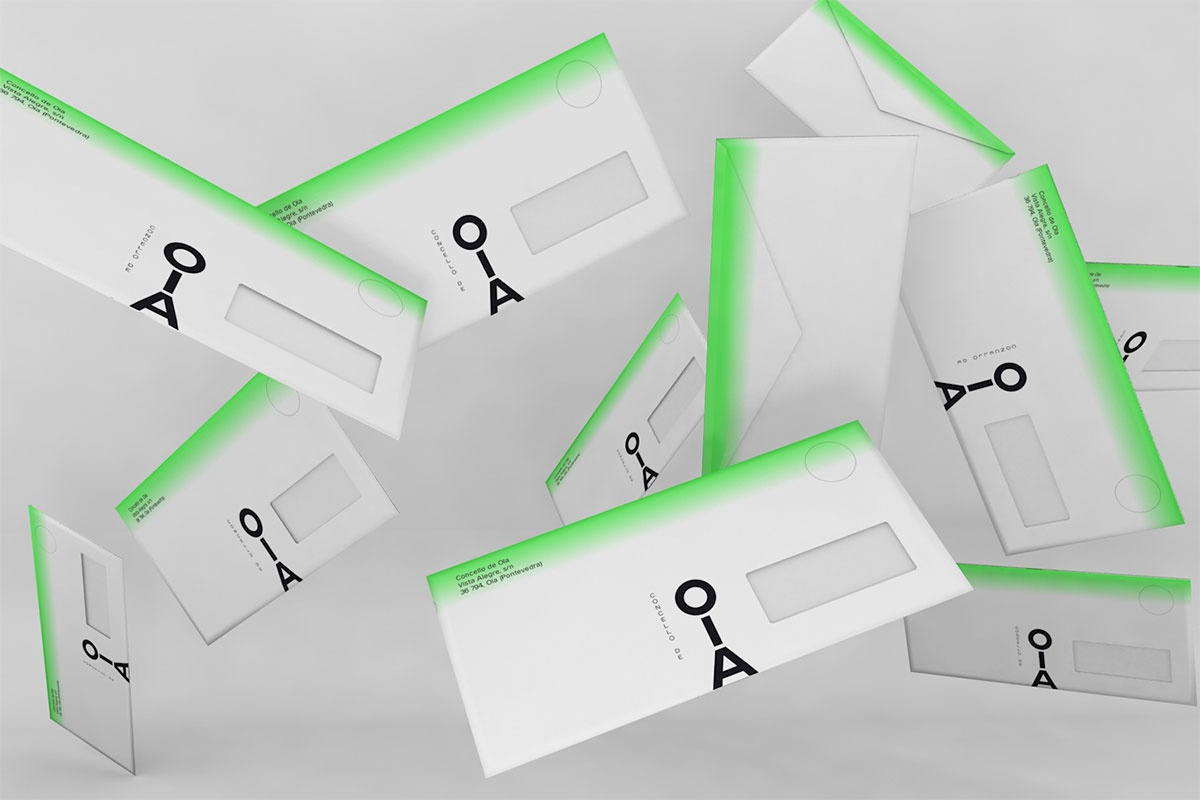
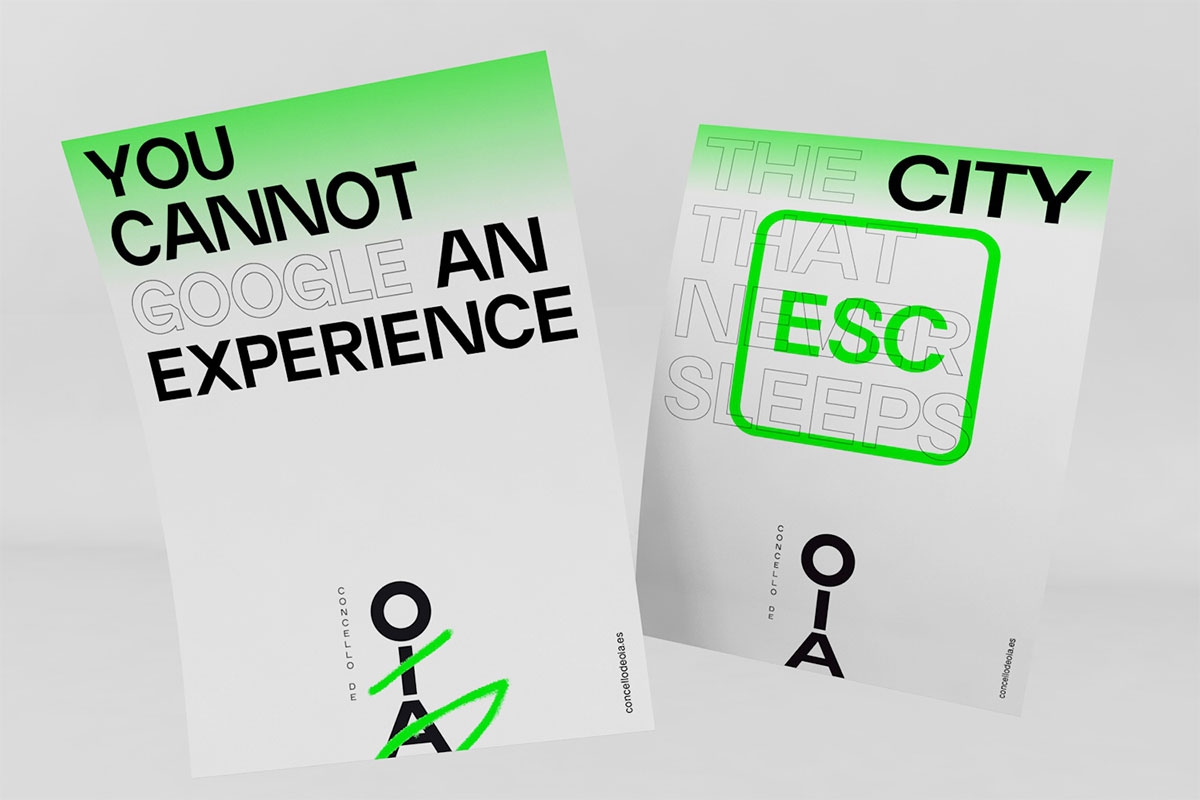
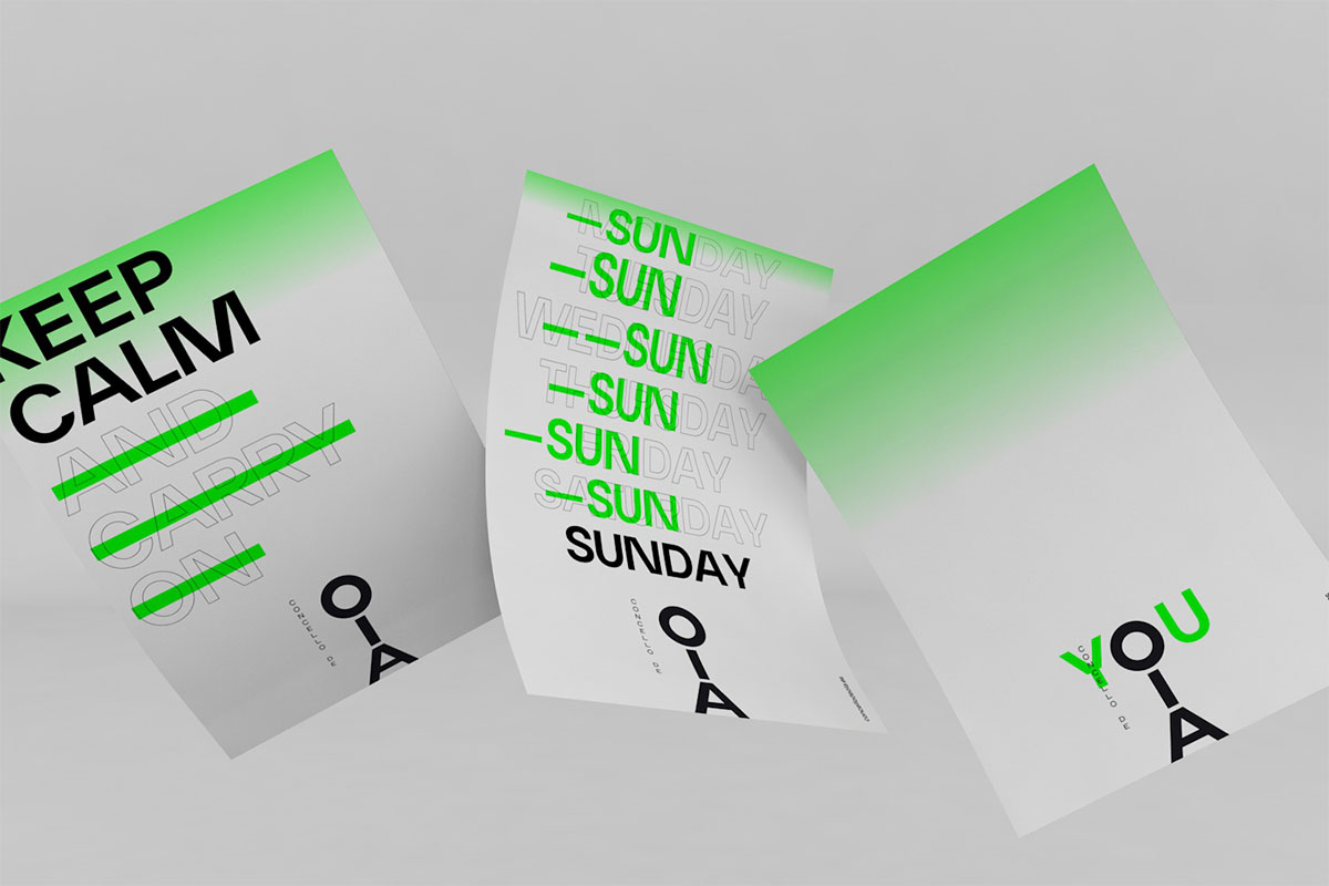
When creating the identity, we wanted to highlight that anyone can feel part of Oia when visiting, and so we stacked the name vertically and made the logo look like a rag doll that could be personalised by anyone and that could be transformed into the various activities in the area. We wanted to create a minimal identity to keep it in line with the fact that Oia is a very small town, and so, we limited the design elements to its essentials — the logo, the typeface (EH Normal, by Elias Hanzer), and the neon green that reflects the green beauty of this natural region.


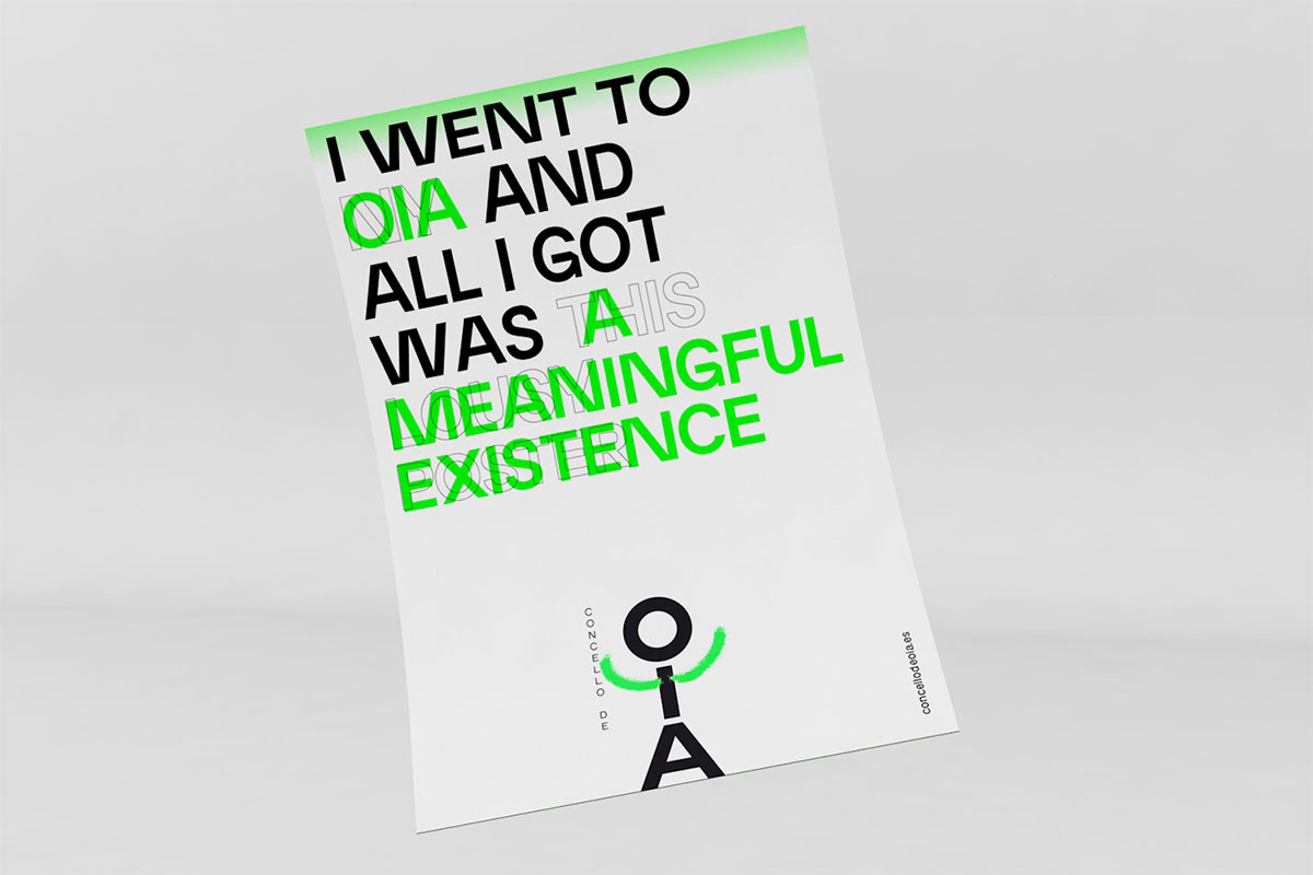
The copywriting takes iconic quotes from cities around the world and adapts them to a town that allows you to disconnect from the bustle.


More from Yarza Twins.


Comments
So interesting! We are from Baiona, close to OIA, and we know its necesary to upside down all taboos about how the brand design must be. Congrats Yarza!
“The neon green [] reflects the green beauty of this natural region”. I can’t relate to this, I am sorry to say. Minimalism combined with a strong focus on typography makes me think of a museum, gallery, or festival. It could work for a city but I can’t see any of “beauty, food, and beaches” in it. The internet page with its Swiss rigidness and absence of warm colours even in photos seems more descriptive than inviting. This definitely off the beaten path and a daring design.
hahaha, touché!
Hi Christian. Unexpected, different from the norm, with wit and flexibility through the layout of the town’s name. That’s what I’m keen on. There’d definitely be a lot of weight put on the chosen website photography.
I like the typographic approach to the name and do think that a lot of attention went into this. I just don’t see in it what I was supposed to see given the description – and I wanted to point out this disconnect. It feels to me that this is a great brand – but for something else.
Yes, totally agree…
Love Love Love this identity!
I really like the idea of drawing over the Oia Wordmark to make it into different people doing different things. I think that using the minimalism to showcase more warm and inviting photography could make the whole identity even better.
Overall, really well done Yarza Twins!
Absolutely love this.