
Outside Photographic is a photographic agency based in London. Its clients range from fashion to music, working with brands such as Jaeger, Nicole Farhi, GQ, Wondrland Magazine, EMI, Mercury Records and Warner Records.
When Outside Organization launched Outside Photographic, director Mark Ray-Jones commissioned me to create the brand identity. I wanted to create something that appeared to communicate the voice and ephemera of pop culture as it is captured through the lens.

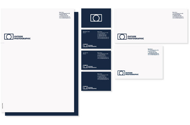
A strong, bold, and confident mark. The Outside Photographic logo is designed for creative application, be it digital, print, or motion. Whatever the message, the Outside Photographic frame is a simple graphic device that provides a platform for the company to communicate with variety in tone and personality.
The camera logo originated with typographic compositions of the company initials. I began to create camera symbols using the letters ‘O’ and ‘P’ (see below). Eventually I reduced the design to an ‘O’ within a frame — and arrived at the current symbol.

I originally designed the symbol to be accompanied by a title-case logotype.

The symbol is quite robust and intended to hold its own when used independently of the logotype. To this day I still feel the softer shape of the title-case logotype compliments the stronger shape of the symbol to better effect.
But uppercase was chosen to draw some parallels with the parent company Outside Organization, whose identity has since been redesigned (not by me).

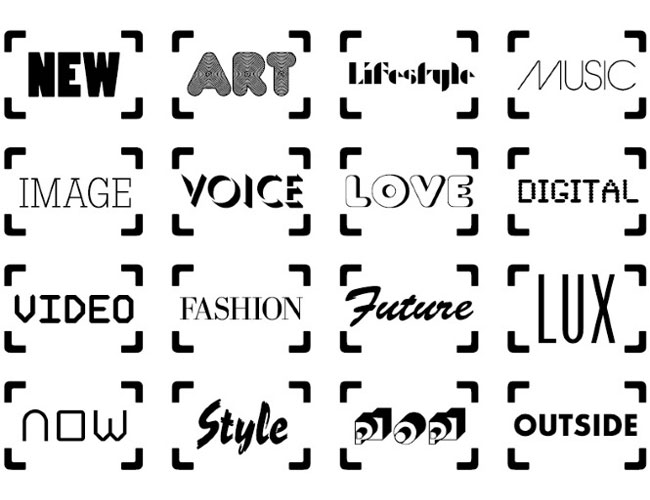
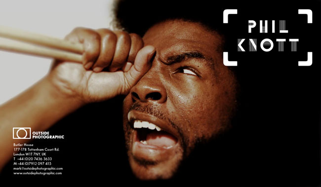
From the camera logo came the frame device, which is used to inject some editorial voice and offset other elements of the identity.


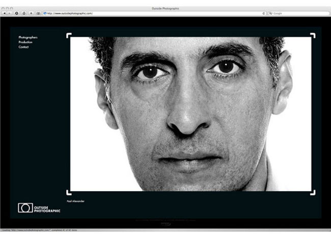
The website (built by Joseph Kyriakoudis) presented an opportunity to illustrate the role of the frame device within the identity by way of animation. The intro features a randomly generated sequence of brand words set in novelty typefaces creating an ephemeral effect. The frames also ‘frame’ the content throughout the site.


![]()

More from Andreas Neophytou.


Comments
I really like the application of the frame across the entire identity, links nicely back to the logo, beautifully done.
What I like best about this is you took this outside photography concept: looking into what they shoot such as; art, love, pop, voice and style, and then you beautifully executed it in a camera box. It shows the time you spend on this project and thoughtfulness oppose to just having things come “outside” the camera and break the box. I love this and I hope I made sense back there. :)
Nice logo, good branding. I do agree with Michaels comment, it is a nice concept to show what the camera shoots.
I also think the title case logotype works better than all uppercase. Its a better contrast, it is disappointing when a client wants to go down a different route.
This hands-on creativity is great, the execution is close to perfect.
Ian expressed my sentiments as well. As I perused your works this logo drew my eye to it with its compelling simplicity. Thanks for sharing your works.
Hi guys, thanks for your kind comments.
Very clever use of camera viewfinder and lens, I like this ultra simple but meaningful logo, it’s looks good on paper and monitor screen, really a nice work, and also the process of logo development is awesome too.
Love that frame device!
A simple but lovely logo. Thanks for sharing!