
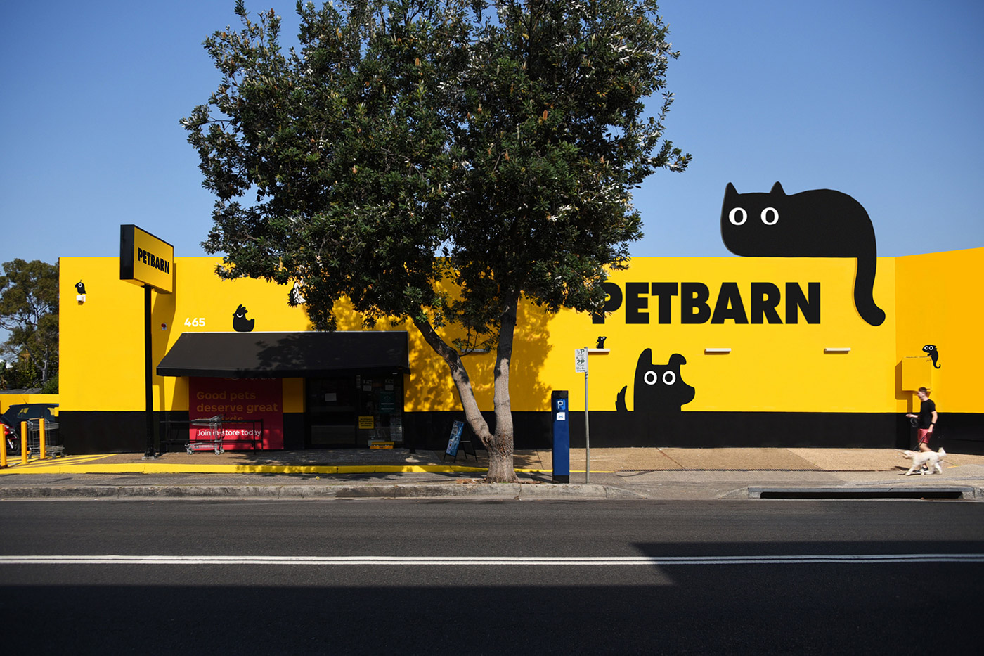
Petbarn has been delivering expert pet care in Australia for nearly twenty years and they know the importance of delivering the best for our pets. The rise of convenience supermarkets that now offer a diverse range of pet products was beginning to impact their business. Petbarn needed to deliver a differentiated brand experience to elevate the company above and beyond the cold, corporate, and value-driven face of the competition. We needed to remind consumers why they, and their pets, love Petbarn.
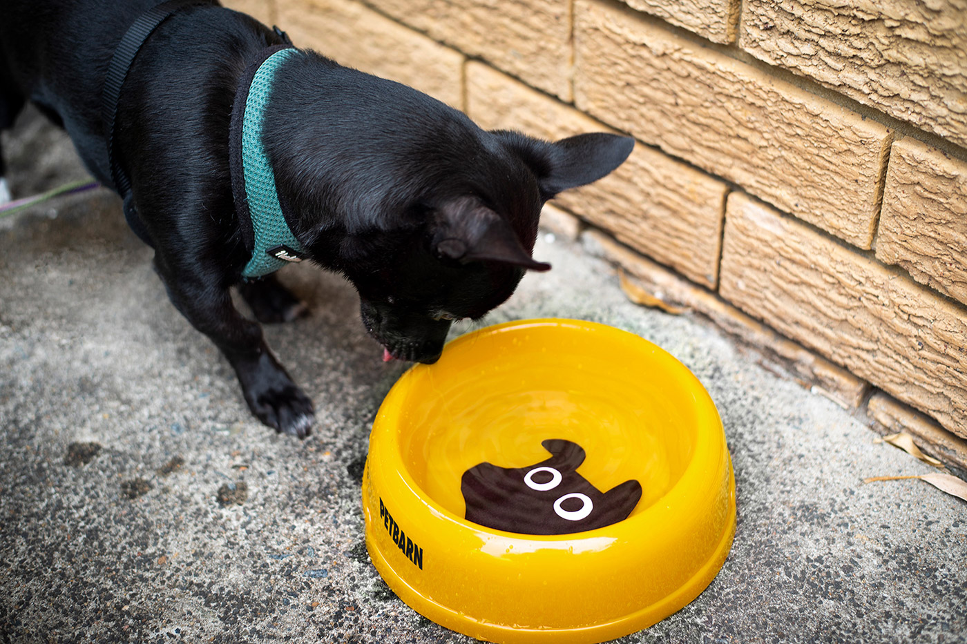
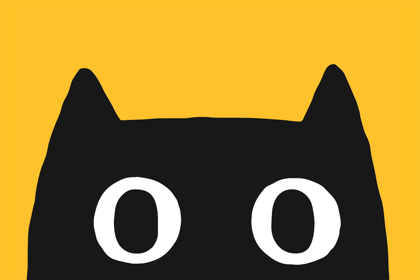
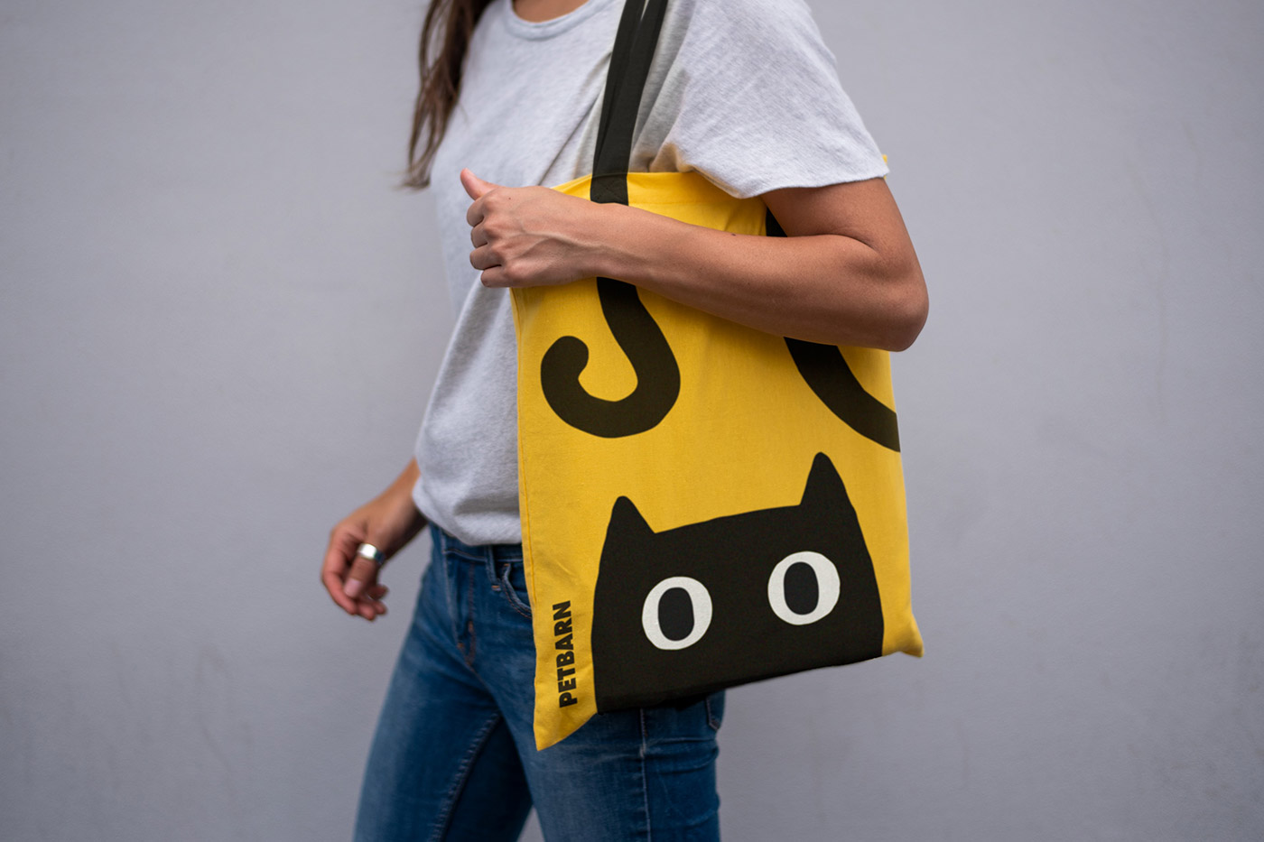
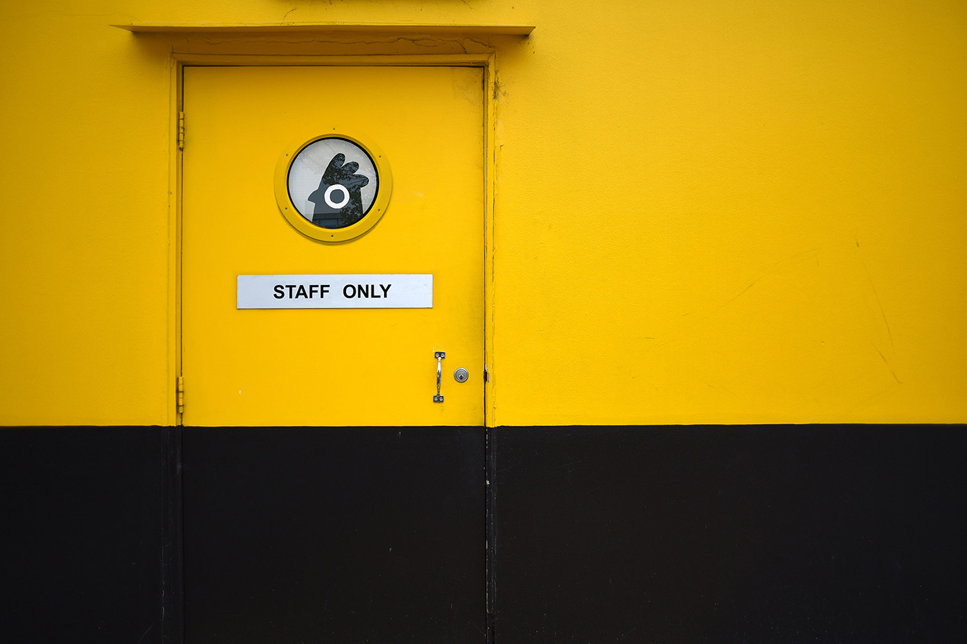
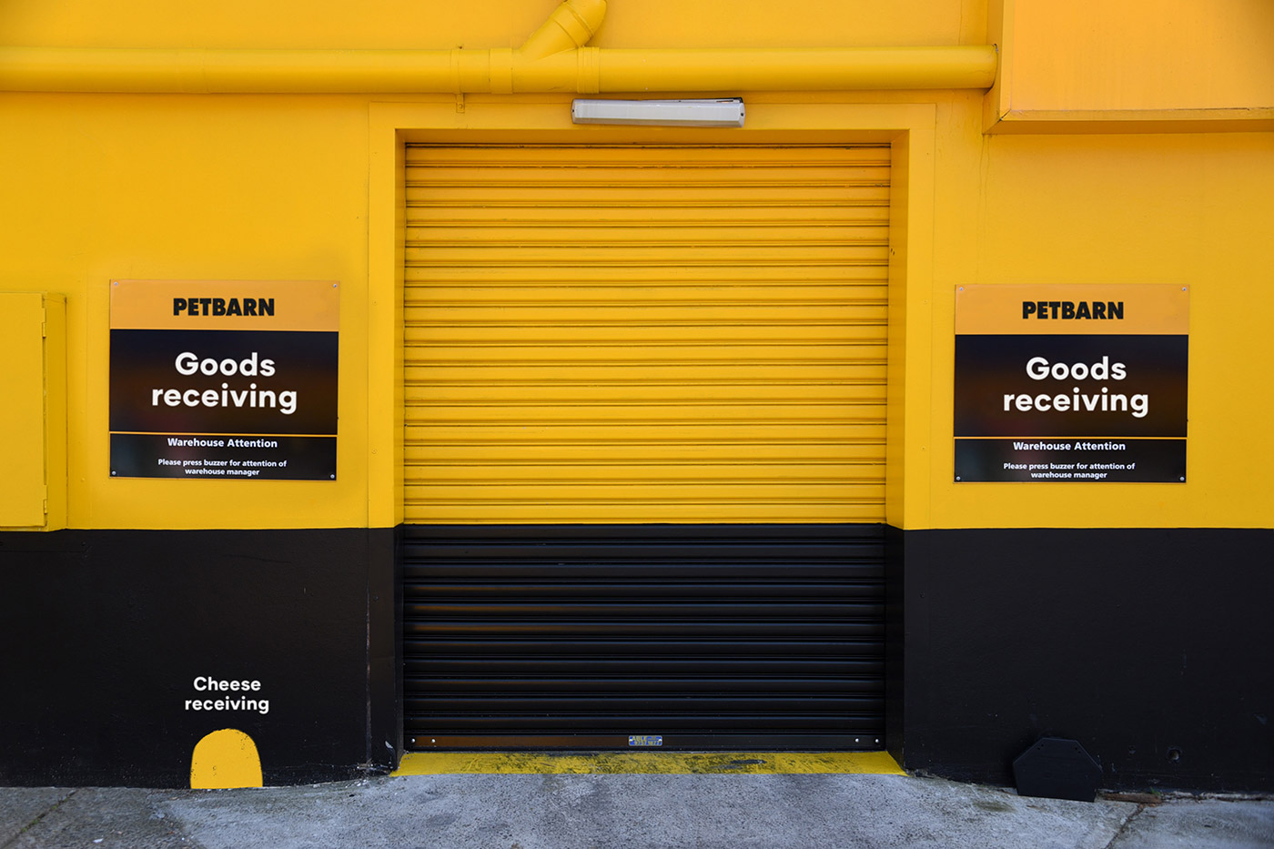
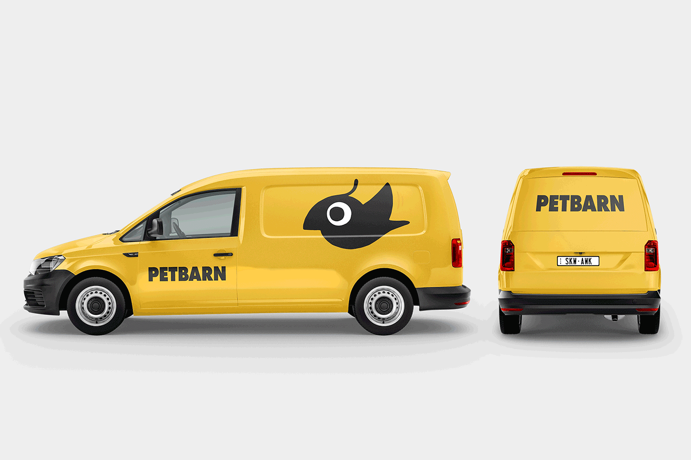
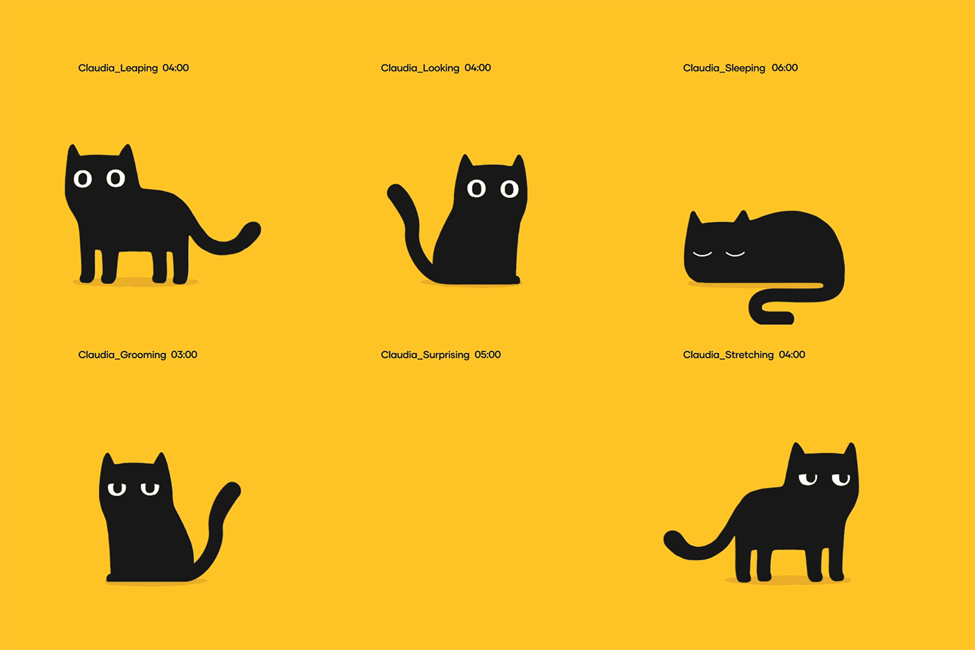
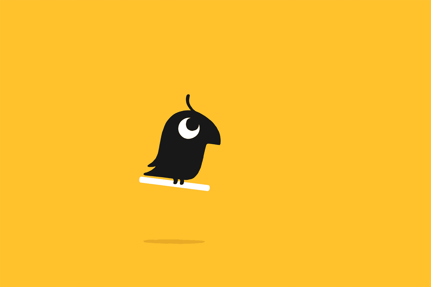
Inspired by the weird and wonderful personalities of the pets we care so much about, we helped transform Petbarn’s identity into a living, breathing, tail-wagging brand. We worked with Australian illustrator/animator, Marco Palmieri, to create the family of furry, feathered, and scaly friends who make up the new identity and reflect a business shift from utility to love and care.
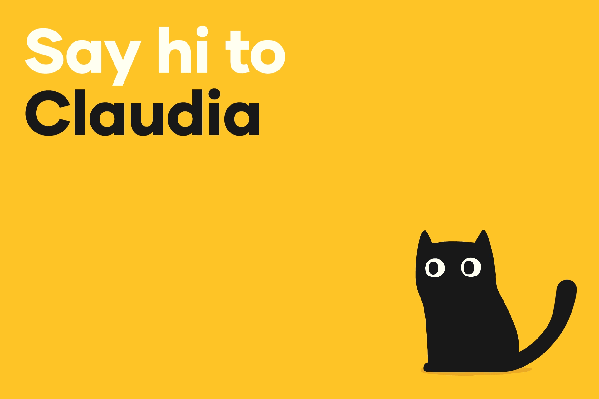
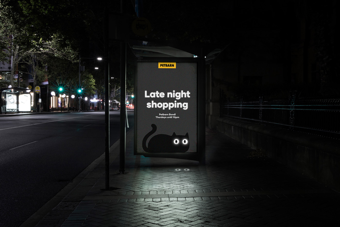
The new brand launched in February 2019 and has been rolled out across the website and social media channels. Petbarn have launched a campaign to name each of the pets in the family which has had high levels of engagement.


More from Landor and Marco Palmieri.


Comments
It looks a lot like this identity designed for a London ad agency about 5 years ago.
http://www.theadrianflores.com/evidently
The similarity is striking indeed… (as far as I’m concerned it’s a copy!) I wonder what Landor can say about this. David, what do you think? Wouldn’t it be better to display the Evidently identity instead of Petbarn?
Hi Bec, Paul, I’m a fan of the Evidently work, and featured it back in 2013: https://identitydesigned.com/evidently/
The colour plays a big part in the similarities, and Petbarn’s yellow/black combination was in place before Landor’s rebrand.
David,
Although there is similarity and inspiration is strong, I like your proposal much more.
This is awesome, because it´s so simple yet impactful.
Liking this identity, it’s fun and clean very welcoming, and fantastic application use!
Agreed! Simple but unique designs.
Absolutely love this, so thank you for sharing.
A few years back I had a more experienced designer mention to me that you can’t just design a logo, and that you need to show the client how to use it too… this is a great example of why that’s the case. Love the applications, and fun animations too. It’s superb!
It’s up there with the best identities I’ve seen this year. The star is Marco’s animations. Brilliant work.
I think the star is the client, brave enough to allow the team to achieve something so simple and iconic.
Petbarn definitely deserves credit.
So beautiful! :D
Does anyone know where can I make such animation? I’ve just started learning animation but in After Effects, and I don’t even know if it’s possible do like that in Ae.
Yes, its possible.
I make something like that in AE.
You should watch some tutorials on how to work with path. Good luck!
I’m always surprised how simple elements of color, shapes, and space can create a beautiful and memorable brand; simplicity is a gift. Brilliant work.