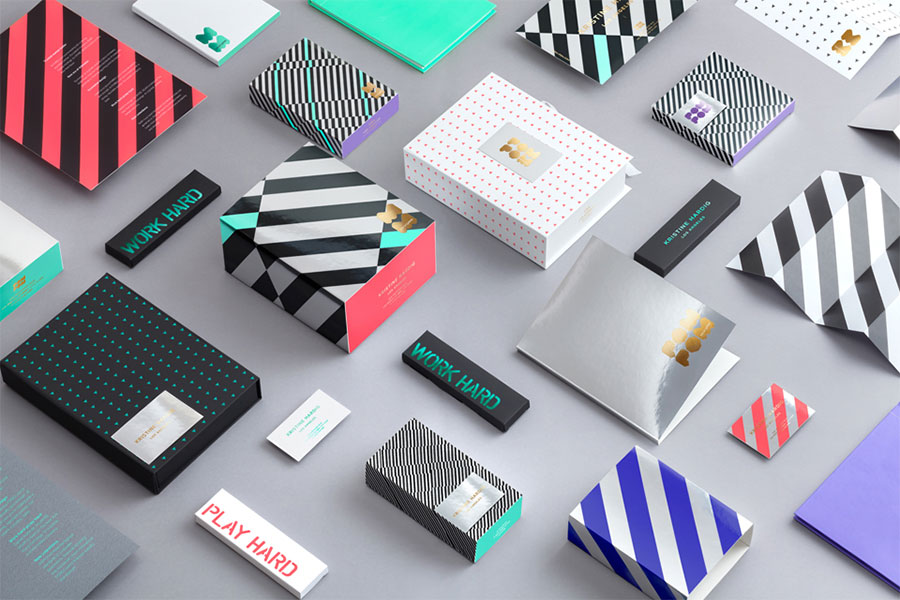
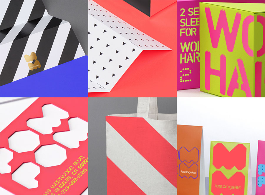
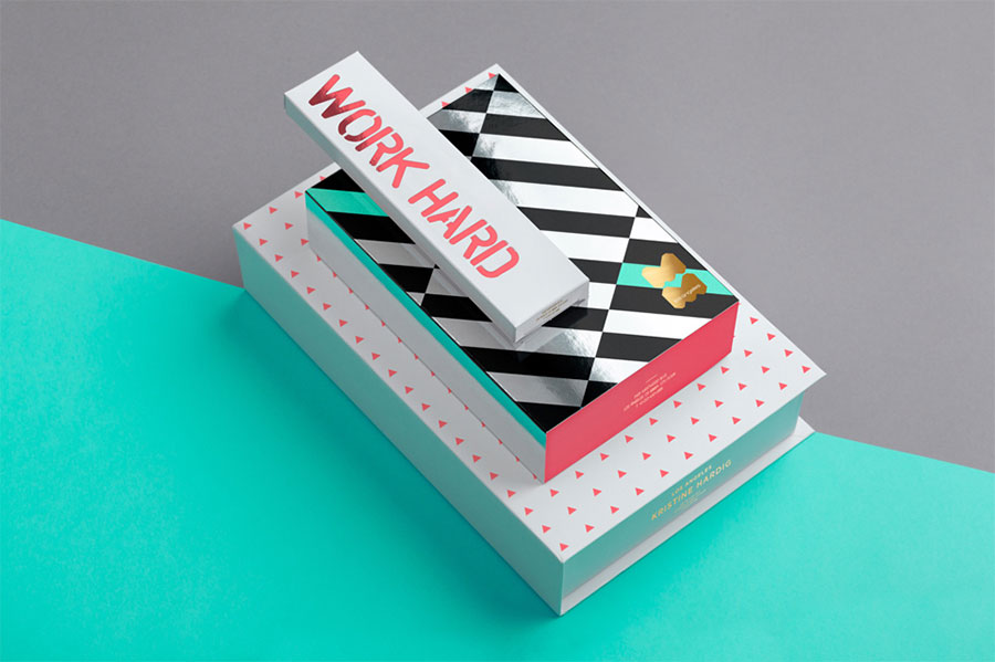
POM POM is a modern and stylish lingerie brand that we created for a Los Angeles-based fashion designer. In each set there are two kinds of panties packed in individual boxes that resemble diagonally-cut cubes in shape.

The first one is more comfortable and simple, for everyday use at work or fitness sessions, and the second box offers a more creative and interesting lingerie type for evenings and nights, parties and leisure. The 2-piece set is read not only in the packaging and the brand name, but also in the brand’s slogan “Work hard, play hard.”


The word “POM POM” means “a bob on a hat” in English. This term is also used by Americans to describe objects that cheerleaders hold during sport events, such as basketball or American football matches. Therefore, the name perfectly conveys the idea of lightness and brightness shown by these girls and a dual brand name refers to the idea of combining the two types of lingerie in a single set.
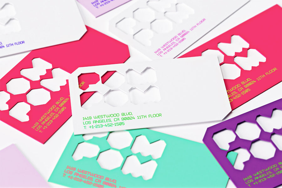
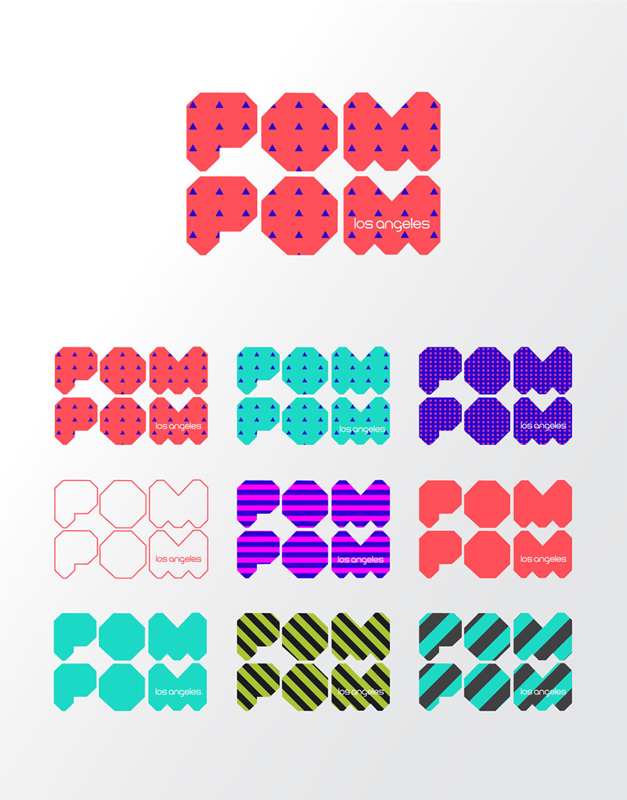
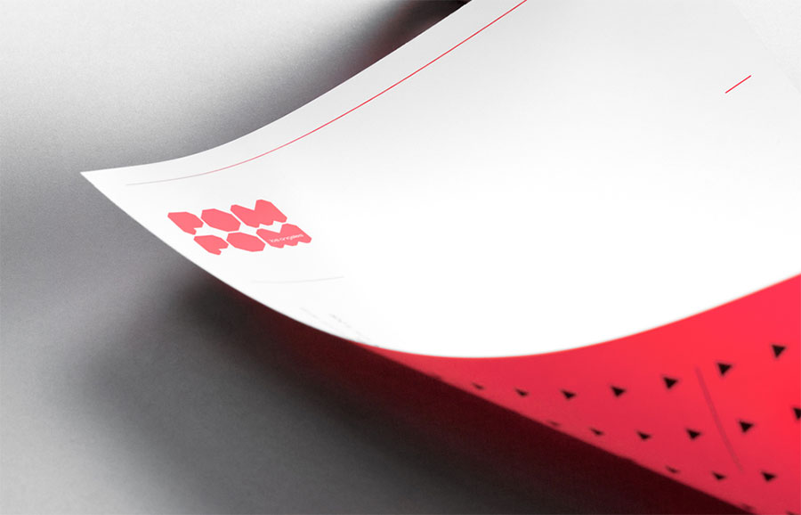
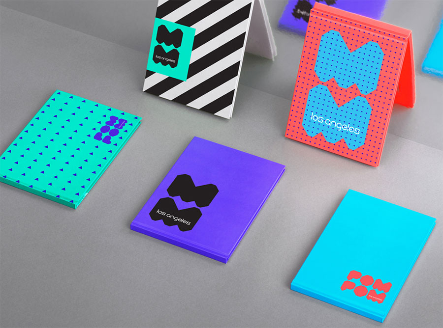
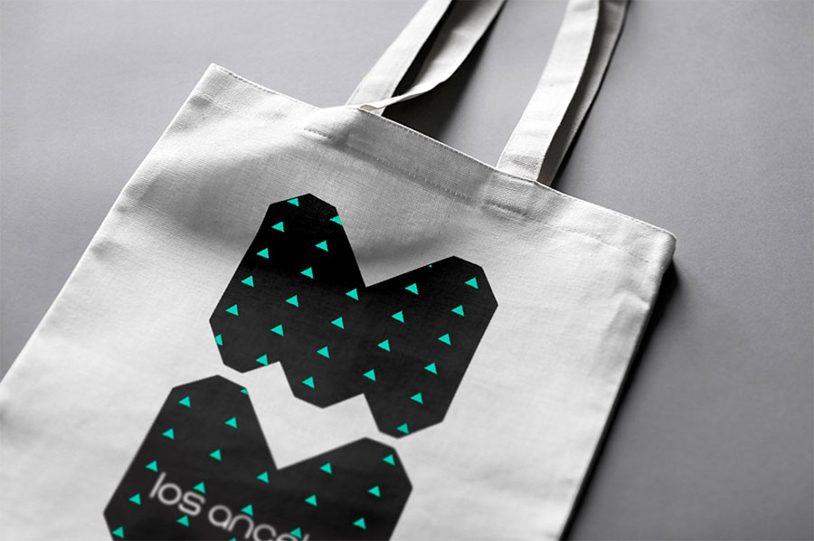
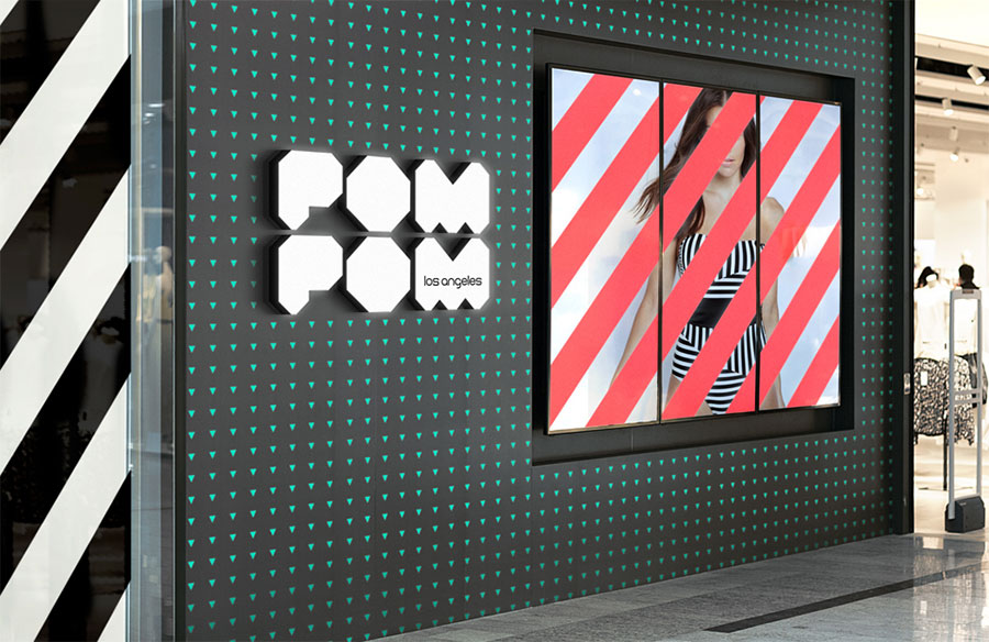
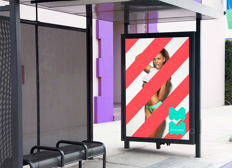
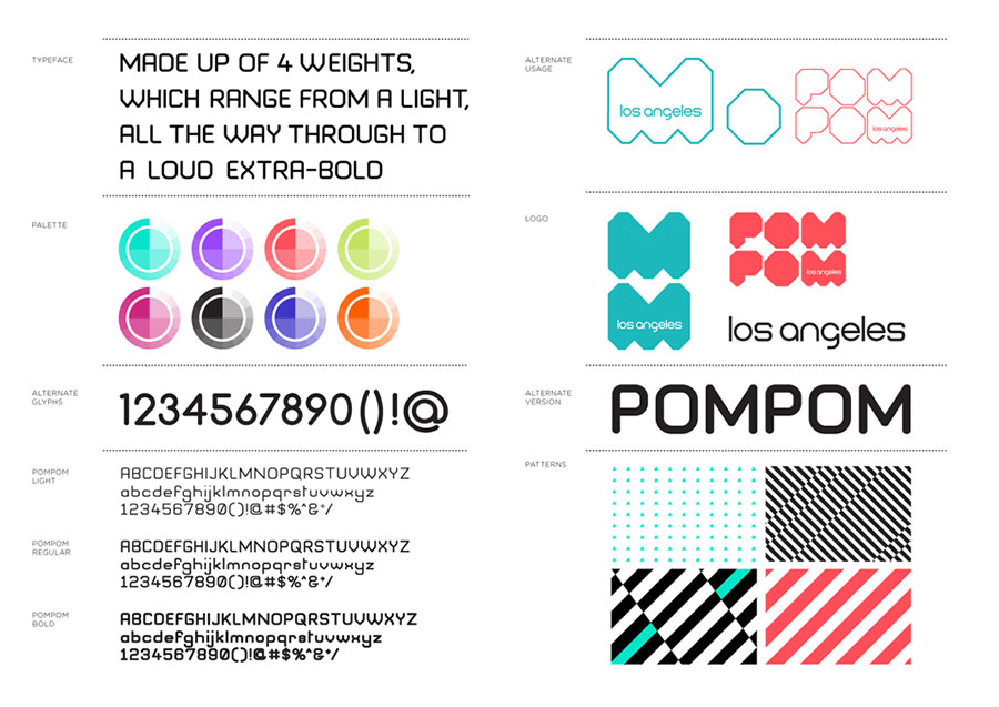
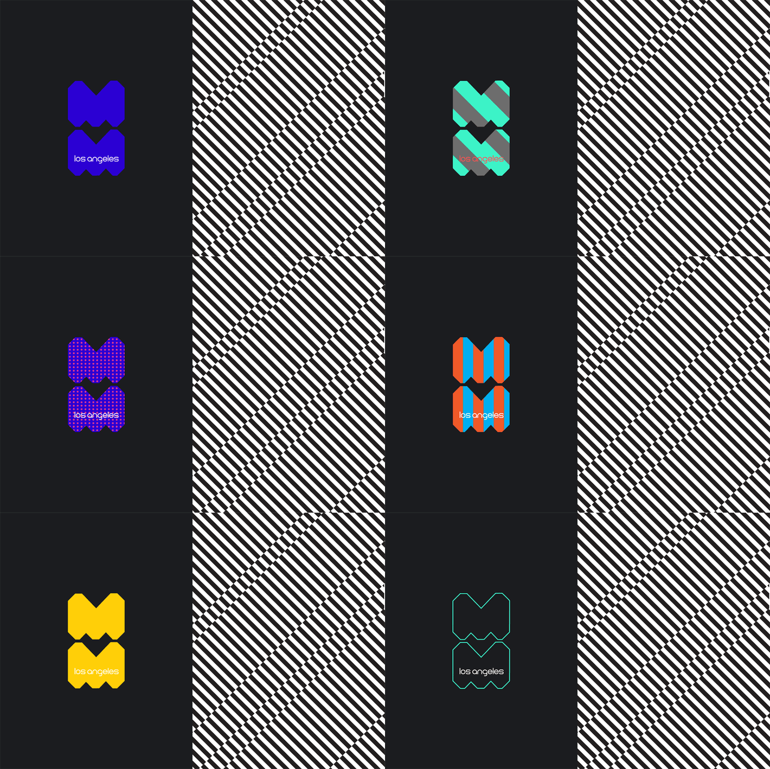
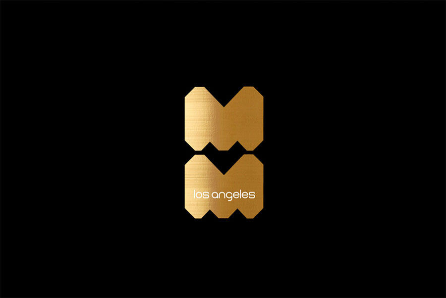
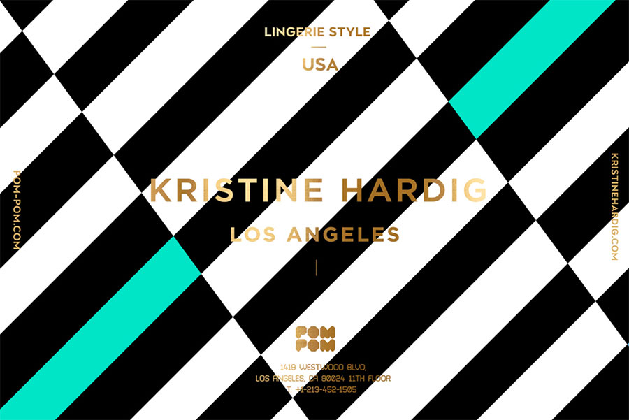
The client wanted a kitschy and playful, yet sophisticated design. At the same time she wanted the identity to be simple and bold, for easier recognition and usage. The simple logo makes it possible to create very creative plastic business cards, but simple logo itself looks kind of boring in isolation, so we had to create a sophisticated and unique feeling using colours and patterns. The direction of colours was given in the design brief as the client really likes our WTP project. The patterns are the result of the design process — when you work and feel that it just fits.
The target audience is fashion conscious, body conscious women, ages 18-40 (young 40) with a slightly narrower range of 22-35.













Reynolds & Reyner elsewhere on Identity Designed: Coffee House London, Liverpool English Pub.
More from Reynolds & Reyner.


Comments
Very nice. I can’t help but see a bit too much Melbourne City branding inspiration here however.
There’s no doubt in my mind how close this brand identity design comes to being kitschy, playful and sophisticated.
Every level is fully understood and well executed by Reynolds & Reyner.
The only thing I would say is the legibility of the type on the packaging is pushed a little too hard making it difficult to read in some places.
Overall I love the energy and vibrancy.
What I love MOST about this is the color palette. Really cool!
I think Ryan has been living in the dark ages… most brands are now adaptable, dynamic. Looks nothing like the Melbourne brand.
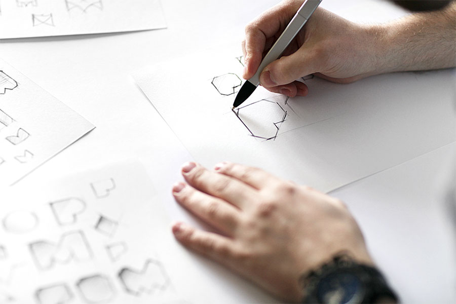
I’m not too crazy about the final logo. The edges are sharp when I’d like to see more of a circular style to soften it up. I liked the softer round look in the sketch better; why didn’t he use that instead?