
Based in the woodlands of England, Primal Roots is a pioneering fitness and wellbeing bootcamp rooted in a pursuit for external and internal strength, endurance and natural movement. Working closely with charities, they offer fitness services and training to help the recovery of people tackling homelessness, mental health conditions and those who wouldn’t otherwise have access to such services. The team approached Lantern to create a brand identity for the social enterprise, promoting their holistic approach to a broad audience including local authorities, healthcare commissioners and away-day organising HR managers – not to mention fitness fanatics.
Better outside, better inside
Come rain or shine, the key challenge for the brand was convincing people that exercising outside was an activity worth pursuing – thankfully, science was on our side; “Exercise anywhere is a good thing but exercise in natural environments has a greater benefit for physical and mental health. Woodlands and parks have the greatest effect” – Prof. Richard Mitchell, University of Glasgow. To further address the challenge, we suggested changing the original brand name of Nature’s Gym to something far more emotive – capturing the primitive, raw attitude of the workouts. From a long list of more than 100 names, Primal Roots was selected and the development of the visual and verbal identity began.
The identity was developed to reflect a drive and animal instinct present in all of us, when interacting and connecting with the natural world. Two sticks positioned as deer antlers, create a mark synonymous with the wild, the lower branches hinting at two eyes, poised to move.
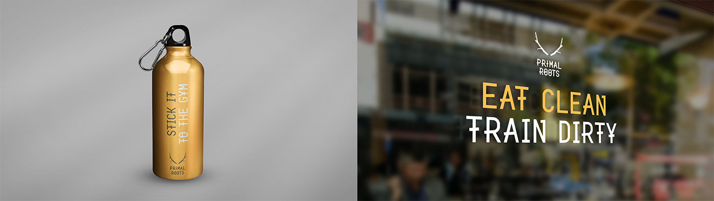
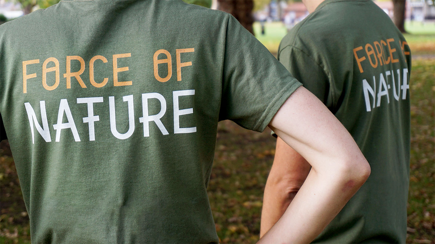
Photographic in form wherever possible, we also designed a vector version of the logo, to be used in single colour scenarios, such as when screen-printed on team t-shirts. This was complemented by a suite of icons and typographic statements, reflecting the core values of the brand.

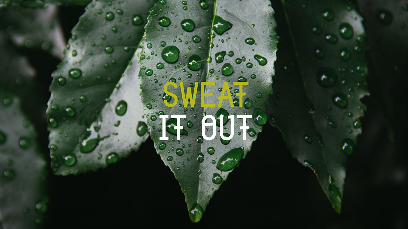
A manifesto for movement
At the heart of the identity system sits a verbal style designed to capture the spirit of outdoor fitness. We began the process of defining this attitude with a manifesto for natural movement, challenging the conventions of a traditional gym by subverting the monotony of indoor fitness and the magic of woodland exercise.


It was important to involve participants of the bootcamps as well as the key stakeholders of the business. We wanted to make sure the brand captured the attitude and passion that the fitness sessions evoked.
The social enterprise plans to offer employment opportunities as instructors once they have completed their journey to recovery through the bootcamp.
We helped to launch the new brand across team t-shirts, flyers, posters, social media, and a new website. The new identity couldn’t have gone down better. One member of the bootcamp has even had the logo tattooed on their leg.
The new identity has been unified in a comprehensive and easy to use guidelines document to ensure clarity and consistency on all future applications. Lantern continues to work closely with and support Primal Roots as they grow and expand.

Video by SuperReel.
More from Lantern.


Comments
Really liking this, there is something very fresh about it. Not too polished.
Beautiful and clean design for a rugged and dirty business, it’s a perfect match.