
Project Moon is a space advocacy group aiming to promote interest in contemporary space objectives through graphic design. Developed from a personal love of the space race era, the group was conceived during the final project of my masters in graphic design, in response to a self-initiated research brief that analysed the qualities of the existing space industry aesthetic.
The proposition was that the space industry had a clear interrelationship with graphic design in the space race of the 50s and 60s, and that it might be interesting to explore an alternative visual aesthetic for contemporary times, stimulating interest in space exploration.

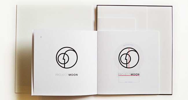
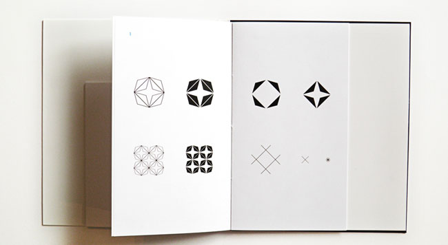
The development of the identity was based around creating a strong and recognisable logomark that was suitable for a variety of different applications and worked at a variety of scales. Additional visual language was developed in the form of a pattern and a family of icons that symbolised lines, arrows, and stars, representing movement and space without being explicit. The visual identity was created with adaptability in mind, but with a clear and unified tone of voice that expressed the determined and committed approach of the advocacy group.


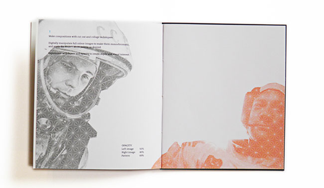
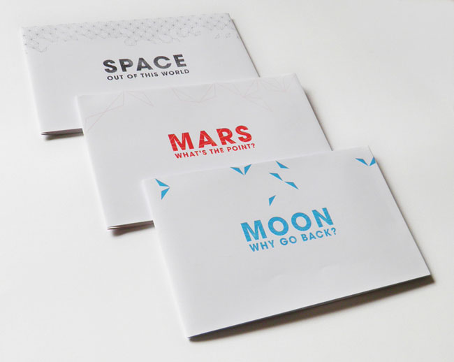
As part of the project, a logomark, visual motifs, typographic choices, colour palette and image treatment were defined for the brand, and presented in a style guide. Sample promotional and advocacy pieces were also designed to show the visual identity in practice. Conceived initially as a hypothetical venture, I intend to continue developing Project Moon as a collaborative enterprise and initiate further space-themed graphic design.


More from Emily Kane.


Comments
Absolutely beautiful! Very well done. Well thought out and excellent execution. I love seeing all the vintage patterns resurface throughout the brand.
I’m not sure I understand the goal / idea of this project, so it is hard to judge the appropriateness of the design.
Such a charming identity, puts a smile on my face. Love the retro-futurism look Emily has gone for on the booklets.
Great stuff Em! Really nice to see some sketch/concept work too.
Student project inspired by self initiated research, aiming to put a graphic style to the modern space race? Am I right?
Apart from the fact that I’m not too sure how useful it is to see this project on what is normally a strong identity and branding based blog, I can’t help but think that it is very limiting naming a project which is about exploring space, ‘Project Moon’.
I won’t even get started on the kerning of ‘Project’.
The designer states that:
“The proposition was that the space industry had a clear interrelationship with graphic design in the space race of the 50s and 60s, and that it might be interesting to explore an alternative visual aesthetic for contemporary times”
However the duotone imagery, typography, palette and overall aesthetic of the brand does not seem far removed from the original time period and is certainly not indicative of our contemporary era.
This project seems more like an exercise in aesthetics than communication design, which is fine, but I am not sure that the audience viewing this project would interpret this more as an artifact of this time period rather than an historical look at a bygone era.
Very pretty. Perhaps a bit feminine? Not sure about the proclivities of the target audience for this (hypothetical?) organization’s brand, though – maybe it fits.
On a side note, that’s a LOT of passive voice in the description. I’m not trying to be a grammarian on an identity-focused site, but it gives the impression (unintended, I assume) that not all of the work was done by Emily.
To be honest, I feel this is more of a design practice, it’s far from a ‘proper’ document to put it bluntly. Sure it’s fancy and includes all the obvious, predictable elements of ‘retro’ design: duotone images, old typefaces used in modern situations, etc, but one must ask themselves, is this truly representative of the 50s-60s era? Is it really meeting the required project goal?
I think not.
To me this is more of an exercise, just something to fill up a portfolio with, and to test out grid layouts, pattern overlays, popular colours, exclusion areas for logos, printing techniques, the whole lot. It doesn’t actually seem to convey the idea/goal behind this, it just seems to be a simple design test.
Some elements of this work, some do not, (like the black text on top of the black image) or the filler-patterns on the 4-page spreads (which just fills up the white space, it’d be better off without them).
Even the logo irks me, the ‘nose’ seems to get lost at small sizes, and the smaller circle and surrounding circle are bordering on getting too close together. What could be useful negative space has become squashed due to the thick border painting the outlines of the logo’s lines.
I’m not so happy with this, I mean sure some of the colours chosen are nice, and the column grid layouts (buried under pattern overlays and unnecessary flourishes/details) are, to a point, nicely laid out, but overall, this disappoints me.
A lovely project, intelligently approached with a coherent design throughout!
In contrast to the previous post, the logo is probably my favourite piece here. The nose is clearly visible at the smaller size and offsetting the balance of the two circles not only creates a more interesting and lucid negative space, but provides for a perfect narrative within the design (this I assume represents man, Earth and the Moon?)
This is a beautiful project with some great details. Not sure if it totally gets to the bottom of our modern day relationship with space. But if looking back can help us look forward and get us excited about space then in has some merit. None the less I love the aesthetics.
Very clean retro designs and a beautiful color palette. Simple yet intricate fold. Wonderful overall.