
Resonate is one of the UK’s leading PR groups.
Their expertise lies in their ability to take one idea, and magnify it across multiple media channels.
They get the many facets of a particular point of view across by taking the central idea and exploding it out to hundreds of smaller stories that connect to create the bigger picture.
We were approached to create an entirely new strategic visual brand identity for the organisation to signal their clarified position.
Too many PR groups rely on old-fashioned tactics to open doors and get stories out. Resonate offers a far more exciting prospect for their clients… they work as an integral part of design groups, advertising agencies and those involved in the creation and re-creation of brands.
This way they can ensure everything joins up and the big ideas created for brands are designed in a way that can be best communicated to the specific desired audiences.
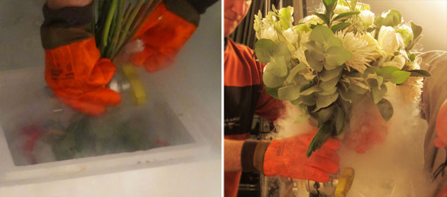
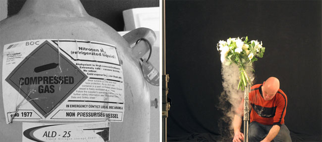
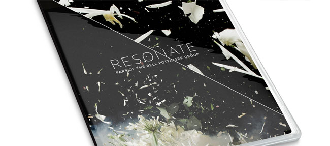
We took the metaphor of a beautiful flower to signify these big ideas. Then applied shockwaves to them after they were frozen in liquid nitrogen.
These shockwaves resonated through the frozen plants and shattered them, into a million pieces (we didn’t count, but we we think it was close to at least million!).


This radical creative approach connected directly with the process Resonate use to get under the skin of tough PR assignments (their work includes governments, the NHS and highly-sensitive clients).


Videos:
White roses
Red, green & white
White and pink
(For you photo geeks — here’s how we did it.)
- We shot the video on a Photron Fastcam SA1. The footage is Full HD at 2000 fps.
- We required around 60kw of light, as the shutter speed was so fast. This made it unbearably hot on set. It was like a furnace.
- We needed a set of fans to stop the ceiling from melting.
- We had a giant flask of Liquid nitrogen large enough to contain the bouquets of flowers.
- As soon as they were placed on set, we had very little time to detonate them, before the intense heat had thawed them out.
- The flowers had to be rigged with explosives before freezing.
- The explosives used were the smallest special effects kind that Pirate could find, so that they could hide them within the flowers.
- The charge was swapped to low-explosive, as the high explosive charges virtually vaporised the flowers.
- The stills were captured on a Canon 1DS mk 3 using a bank of Bron Colour High speed strobe packs.
- They were all wired to a trigger that fired the explosives first, and then the camera and strobes at a few thousandths of a second later.
- The studio floor became a carpet of soggy flower petals; very smelly, slippery and unpleasant!
“The PR sector is a crowded place, with an abundance of bland names and logo’s — SomeOne’s approach of creating a Brand World through a uniquely creative photographic system has given us something that both dramatises and explains our offer. I can’t thank them enough for it and our clients can’t stop talking about it.”
— Michael Frolich, Resonate

SomeOne elsewhere on Identity Designed: Eurostar.
More from SomeOne.

Comments
Wow — this is stunning.
Beautiful metaphor.
LOVE IT!
The split screen to show different scales of the image looks great.
Powerful branding.
“We needed a set of fans to stop the ceiling from melting.”
lol
Bet it was a lot of fun to do… blowing stuff up and all that!!
This is fantastic.
What a great way of looking at a brief. They developed a branding system that will be remembered for all the right reasons. The outcome looks fantastic!
This is INSANELY creative and unique, top quality work!
Brilliant execution, great story, wonderful result.
Can we get a few other non-SomeOne projects on this site though — there’s plenty of great work being produced outside of their walls ;)
Cheer up Matt!
(I’m sure it’ll be your turn soon.)
Beautiful concept, but it’s worth noting that this coffee-table book was designed two years ago:
https://www.robbell.com/work/index.php?main_page=product_info&cPath=1&products_id=4
Same concept, similar type and graphic language? Seems suspect to me.
Yeah Collin, there are some posts about that same book on CR
http://www.creativereview.co.uk/cr-blog/2011/may/someone-resonate-identity
Very suspect alright.
Hi Collin & Milo.
In the spirit of conversation — that thrives on this blog… I thought I’d add some clarity from the horses mouth so to speak!
I personally over saw the creation of the Resonate project with our Design Partner, Therese Severinsen & Designer Sarah Cuppit.
I can assure you there were no references to the Rob Bell book as we developed the identity. There’s nothing suspicious here!
It was actually created very much in conjunction with the client.
We started with the ideas of one story being exploded to tell the many facets (hence the detonate idea)
then the clients approach of stories beautifully told (which led to the metaphor of flowers)
The diagonal line then came from the idea of a connected approach to PR — so we added it all together and came up with these images.
I know what it looks like… it’s just one of those weird coincidences. I do agree it looks very similar!
Even thought the designs developed naturally and independent of seeing the Book Cover in question… Frankly I wouldn’t claim total originality on any project. I think original thinking is a bit of a red herring. We live in an age of mash-ups.
It really has all been done before…
Just not by SomeOne…
Yet…
Good spot though Collin!
Some of this looks great! I like the photos of the flying frozen pieces of the flower, its explosive! Though I’m against the overlayed text (with the subtle drop shadow). Also its very difficult to read, I think the type should be bolder, thicker, and should make a statement, and reflect the explosiveness of the photos.
In my opinion, the type is way too thin, and flimsy for this expressive branding.
Also, the diagonal line is so distracting to the eye, and does nothing to accentuate the design. Sorry, I just feel strongly against that element of the design.
Hi Simon,
Cheers for getting back to us. Great to hear you explanation, it does look very similar though. But in saying that I am sure there has been images of exploding flowers before the Rob Bell book was produced. And I am guessing the black background just works better than white.
Really nice identity and branding though. Nice work.
Really love this — so jealous that Someone had the budget to realise this great idea.
Great response from Mr Manchipp too — I’d never seen that book cover before either.
The system is extremely visually arresting, but maybe it’s a bit high concept for most buyers of PR services? It looks like something that would differentiate the company, but seems like it would take a lot of explanation to connect exploding flowers to good PR. A case of designers run amok? Seems a shame not to have done something that amplified the very powerful name Resonate a bit more…