
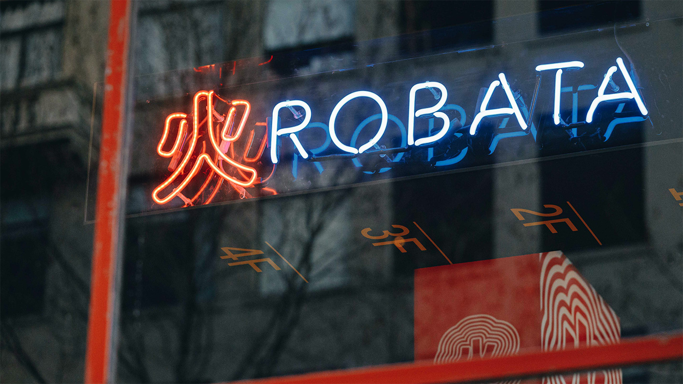
Robata is an izakaya-style restaurant located in the iconic Herald & Weekly Times Newspaper building in central Melbourne. The name is a common abbreviation of robatayaki, a Japanese charcoal-grilling technique that translates literally to “fireside cooking.” Much like sake, robata is embedded in Japanese culture where it has been a cooking tradition for centuries. The restaurant’s ambition is to deliver an interpretation of this unique style of cooking, informed by local culture and expertise, delivered in a relaxed ‘Melbourne’ style of dining.

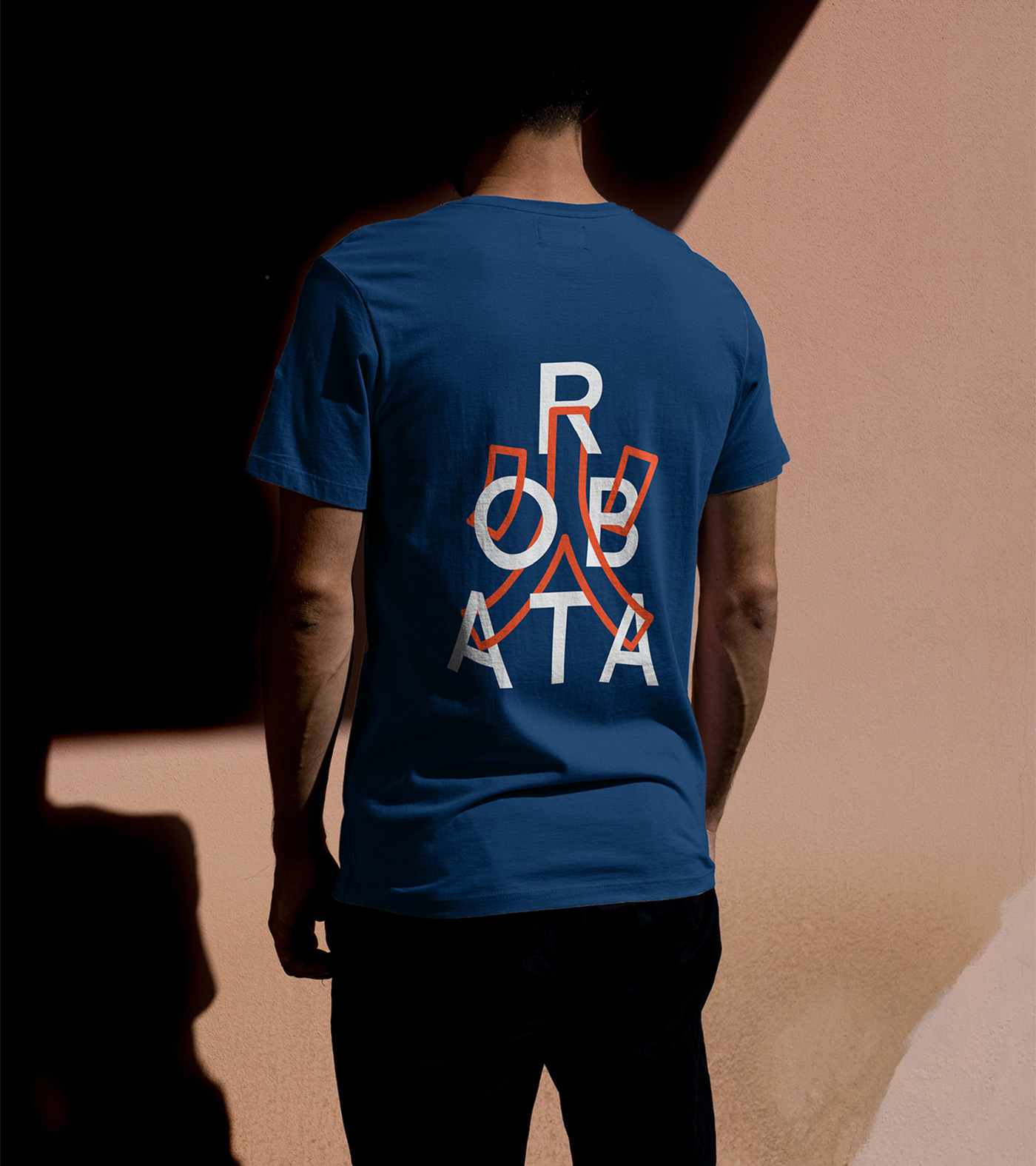
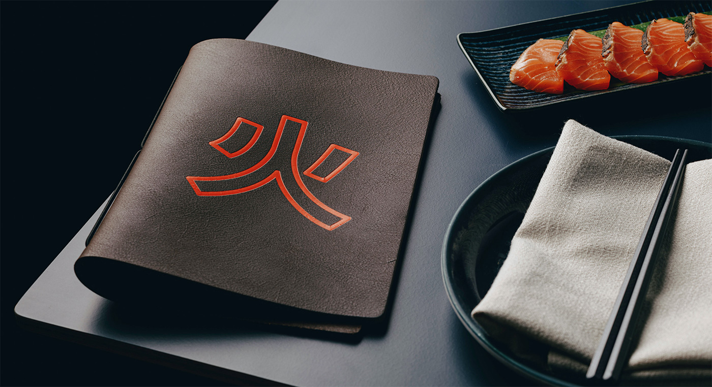
The Japanese kanji character for fire was adopted as a symbol for the restaurant’s identity, supported by bold typography and a playful visual language. Inspired by the neon glow of Tokyo’s night-scapes, the interior experience is futuristic and cinematic. A key component of our brief was the design of a dramatic lightbox installation that transports patrons to the streets of a Japanese super-city.


More from Mucho.

Comments
To me, a Japanese, it is fun that these retro signage designs can be seen anywhere in Japan and, actually, many people see them as dated but from the other side of the world it looks cool, which made me think about what could be Japanese unique design.
Brilliant. Excellent execution. Those lightboxes are like very modern lanterns. Love it.
Sometimes the same ideas and combinations come to people from all over the world:
Toyosu Sushi Market
Mega! It’s a shame there’s no shots here of the lightboxes in situ of a busy restaurant, where they really pop. Click through the the restaurant’s website if interested… the busy signage over busy tables do it a world of justice!