
The new zoo in Saint-Petersburg is a brand new approach to communication with animals. There will be no cages in the zoo — the first zoo of this kind in Russia. The animals will be separated from people with natural objects: water ditches, altitude drops, and land forms. This feature is the foundation of the visual communication idea for the brand: “The new zoo in Saint-Petersburg is a communication without barriers.”
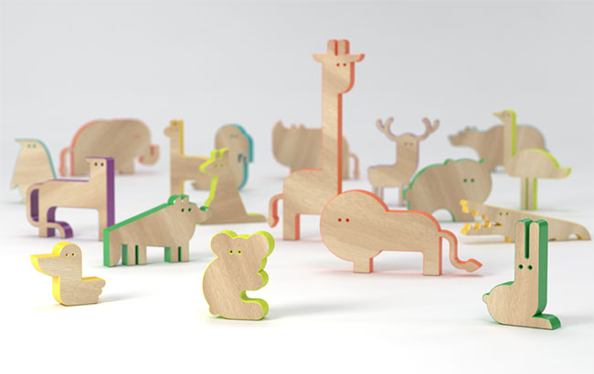
The zoo houses animals from every continent, with colour-coding used to identify the location. Each continent also has its own characters — bright, emotional and memorable stylized animals figures.
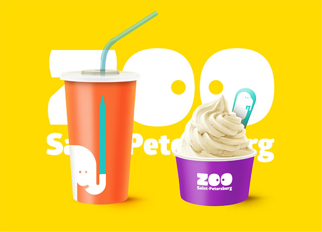
The identity is about evoking positive emotions. Friendly and funny characters play the main role in the zoo’s communication, each interacting with the visitors. Every element of the identity is individual and the characters play an inseparable role.
The new zoo in Saint-Petersburg. Bright emotions, exciting discoveries, a communication without barriers.


View more work on the Behance profiles of Anna and Vladimir.


Comments
I love this. Fun, playful, cute, colourful… It makes me smile. And there aren’t many designs that generate that emotion.
E X C E L E N T E !
Bellísimo, sobre todo las aplicaciones de los íconos y el colorido.
Just fabulous! Totally love it. What I specifically like the most is the bold use of block colours, beautifully simple.
The whole colourful/playful/bubbly approach has been done many times.
But hot damn, does it work so well here. Awesome!
The design in itself is well done but I find it too disneyfied for a zoo. At least from my perspective, a zoo entertains but also educates and tells stories. Many zoos also carry out research. I find these aspects not acknowledged at all by the design.
I’m not so keen on the character style. Feels a bit like a graphic style has been chosen for reasons other than to be appealing to families. The only connection with the logo it seems is the dots as eyes.
That aside, the rest of the identity has been executed very impressively. I think the colour scheme, the clever use of media, and how it has been applied to products and outdoor advertising is great! My favourite bit is the logo. The simple use of eyes in ‘zoo’ is quite charming. A fun wee project.
What can I say – Amazing! I think kids and adults will love it, and it presents so many different ways to engage with people. Thanks for sharing.
Loving this one! The seemingly endless possibility in the application is just awesome!
Bright and playful, brings a lot of colour to Saint-Petersbourg’s often cloudy and rainy environment!
I wish that a brand new zoo would develop in St. Petersburg some day on some 160 ha such as the one in East Berlin, you know, a themed one with wildlife from Africa, Asia, Australia, South America and the Polar regions!