
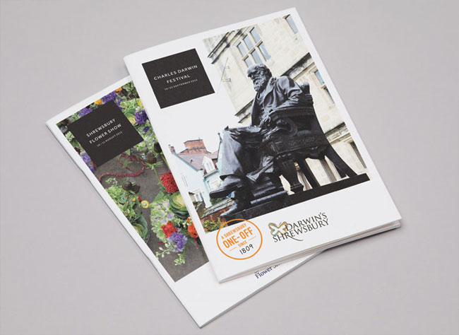
Shrewsbury. What does it make you think of? Destination Shrewsbury asked us and We All Need Words to create a brand identity that sums up what makes the town special and why people should visit it. The answer was ‘The Original One-Off’: a brand that showcases all the the town’s one-offs, big (Darwin was born there) and small (you can get a great loaf of bread near the station).
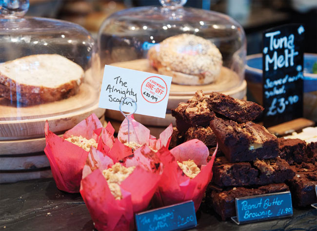
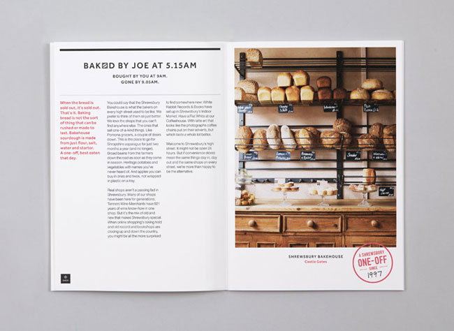
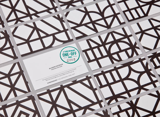
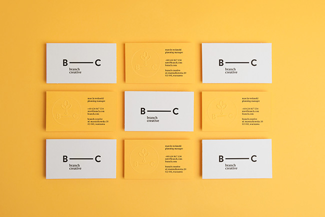
For the visual identity we created a ‘one-off since…’ stamp that local businesses could use to promote what they do.
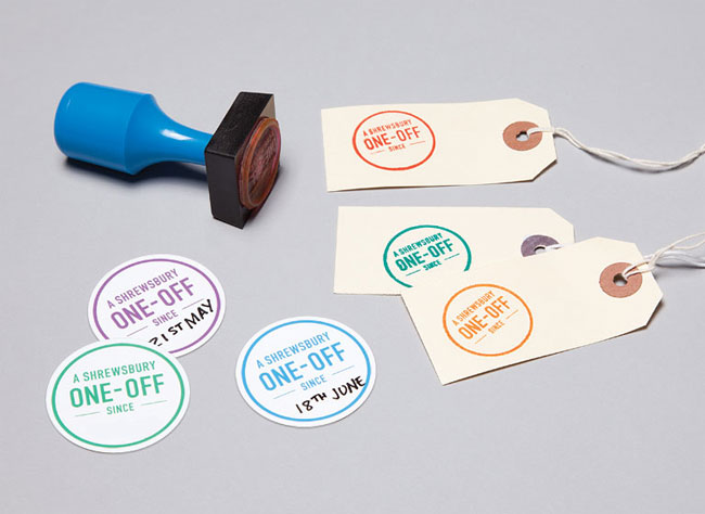
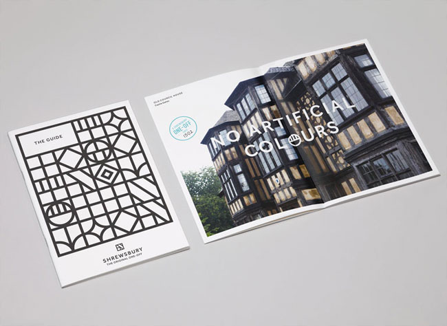
The line can be used to show how old something is: since 1586. To show that something is new: since 2012. Or to say that a cake was baked earlier this morning: since 6.30am.
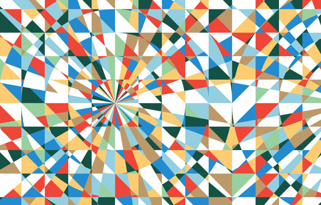
The black-and-white pattern, inspired by the town’s Tudor buildings, helps Shrewsbury stand out from the bright and breezy identities other towns and places use.

No two business cards have the same pattern on the back, so they’re all one-offs.
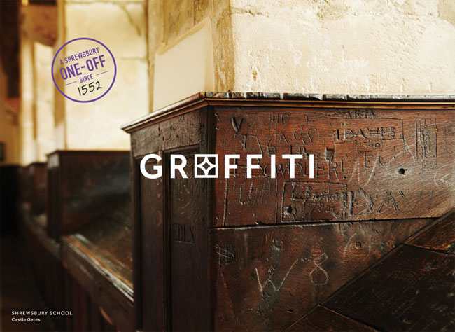
We All Need Words paired lines like ‘Chain Store’, ‘Graffiti’ and ‘Ready Meal’ with idyllic (but real) photos from Shrewsbury as a less obvious way to show off the town’s one-offs.


The identity was featured in Design Week, UnderConsideration and Fast Company. ‘A gem in the muddy world of place branding’ said Creative Review.

& Smith elsewhere on Identity Designed: SugarSin, Wild Lime Bar & Kitchen.

Comments
Great work.
Anything that promotes a destination’s individuality is great in my books. Nice to see a council/town planner/ tourist dept. stepping away from the foul logos and tacky slogans that many UK cities & towns seem so fond of.
Saw this in Creative Review, a very appropriate and astute design.
I think the captivating thing about this project is that when seen individually, all the elements – the photography, monotone pattern, stamps and typeface against a black background – look quite removed from each other, yet as a whole come together very cohesively. This approach allows a lot of brand freedom and keeps things visually interesting.
Awesome branding. My only comments are that in the first advertisement I read “quite” as “quote”.
^Yeah some of the use of the patterns do have some legibility issues, but they get away with it mostly…
I don’t get it. I really want to get it, but I don’t understand. Why are shapes replacing letters in the headline?
One of the best destination brands I’ve seen in a while. I hope they manage to control it. Very nice.
Great job. When all the elements come together it creates a really rich brand story. Who thought anyone could make Tudor look contemporary. Plus a worthwhile use of a rubber stamp for a change.
The concept and the design elements are brilliant.
My concern is that (in my opinion) a great brand identity needs to be backed by a great brand. Does this make you want to visit Shrewsbury? Anybody who lives in the UK, or was born there, will be able to tell you a few places which have all the things mentioned (except being the birthplace of Charles Darwin). Aside from being great copy, I’m not sure what makes Shrewsbury the ‘original 0ne-off’. I was born not too far from Shrewsbury, and I’m fond of the place, but…
I also agree with the legibility concerns expressed above, particularly as a tourism campaign would presumably also be targeting tourists whose first language may not be English.
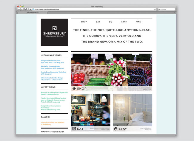
As I said, though, I think the identity itself is wonderful. I hope the website shown above goes live very soon because the current website is frankly horrible (http://www.shrewsburytowncouncil.gov.uk/2shropnet/AToZOfMini-sites/S/ShrewsburyTownCouncil/DestinationShrewsbury), although the Shrewsbury Tourist Information website is much more appealing (http://www.visitshrewsbury.com/)
In reply to Richard Knobbs – I definitely think it does it’s job. I’m from Leeds in the North and although I’ve heard of Shrewsbury, I wouldn’t be able to find it on a map. This campaign has a sole purpose of defining a brand image. The image I have of Shrewsbury after seeing this is a town full of indie coffee and tea shops, fresh food markets and rows of historical buildings that are home to all manner of ‘one off’ traders.
Wayne – I’m happy to hear that (not being sarcastic). I was simply sharing my thoughts, perhaps biased because I’m familiar with the area, and based on what I can see above. The full package may be just as good, and convincing, as the design.
I like your work, by the way.
I agree with Richard. Fantastic work and really has a brand presence… as long as it addresses issues, not ego’s. If it’s interesting AND communicates the brand / place / idea without that ‘ad industry insider’s’ back slap, then perfect.