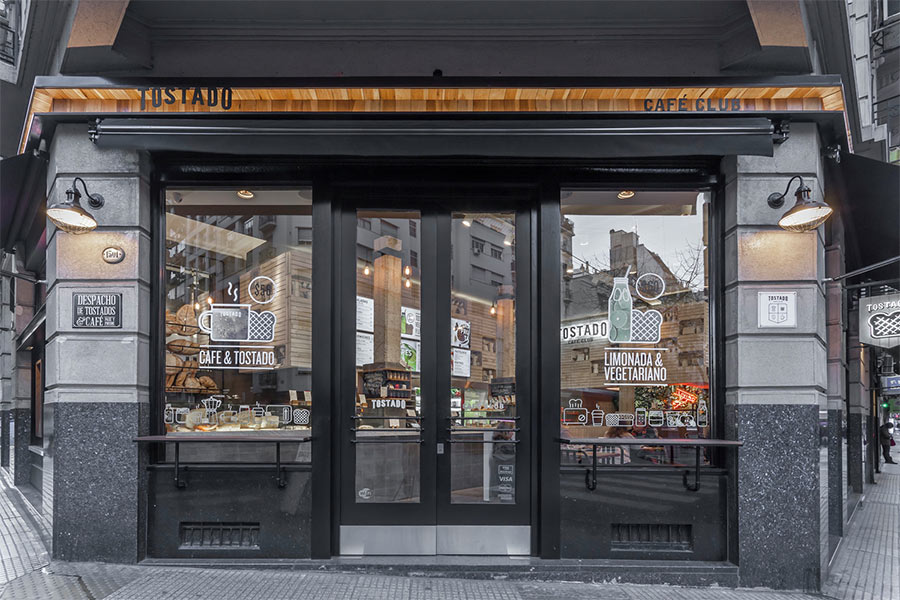
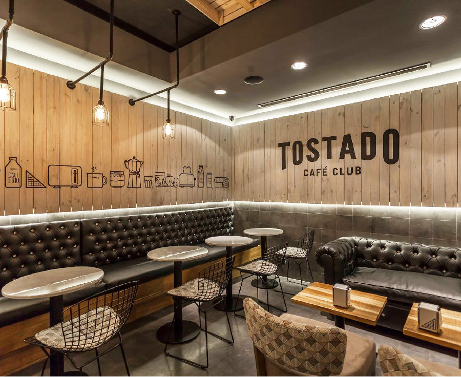
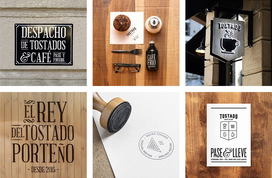
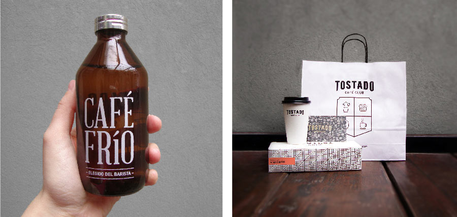
Tostado is a new take-away in Buenos Aires. We developed the full brand identity, from name to signage, packaging to ambience. Tostado is a unique place, a reinvention of the classic “tostado porteño” — simple, fresh ingredients always accompanied by the best coffee.


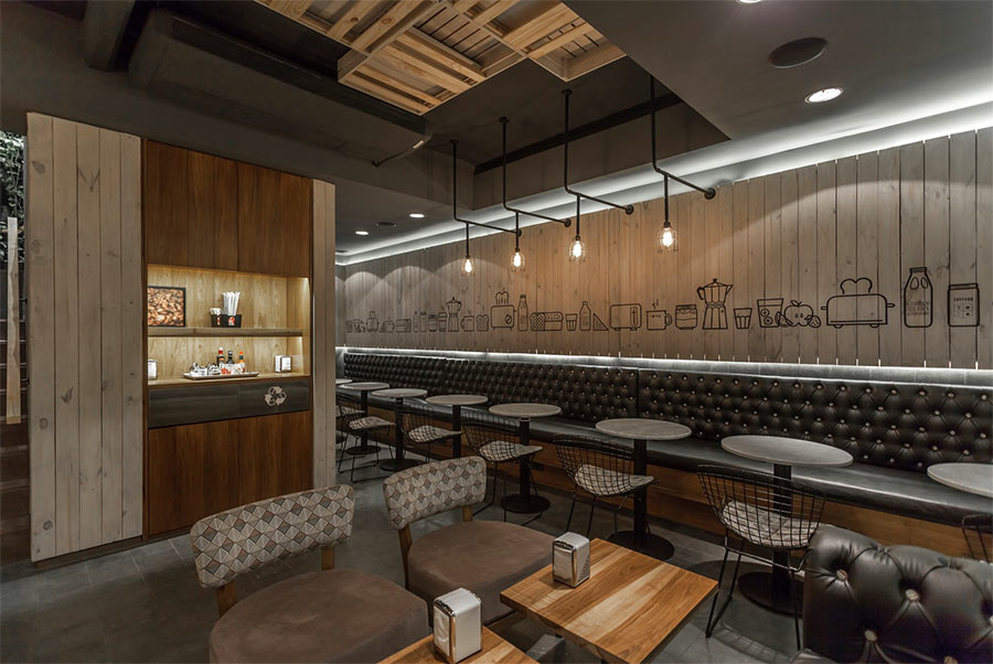
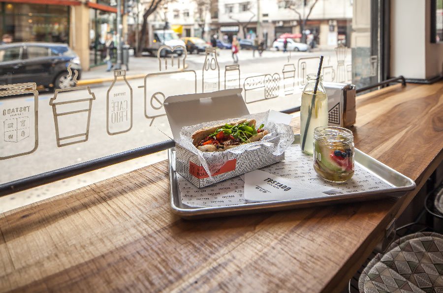
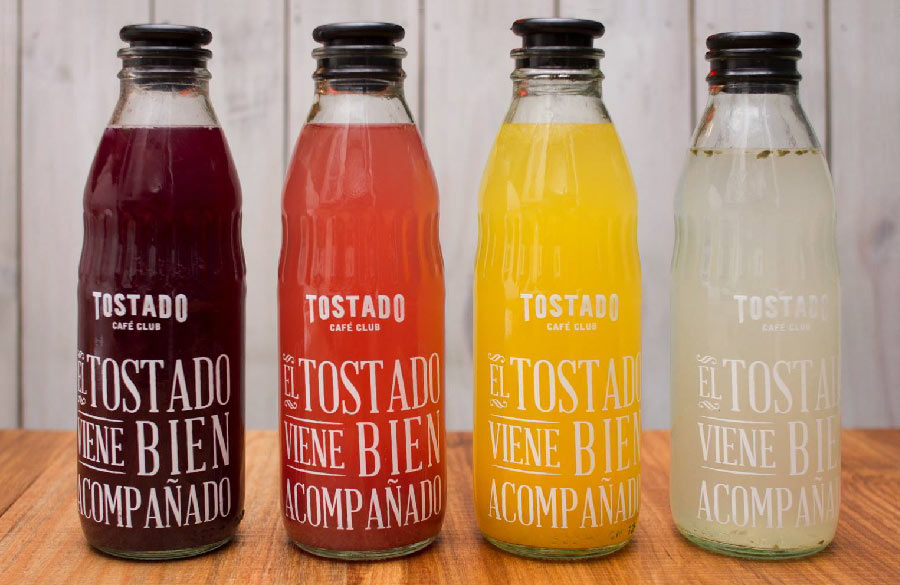
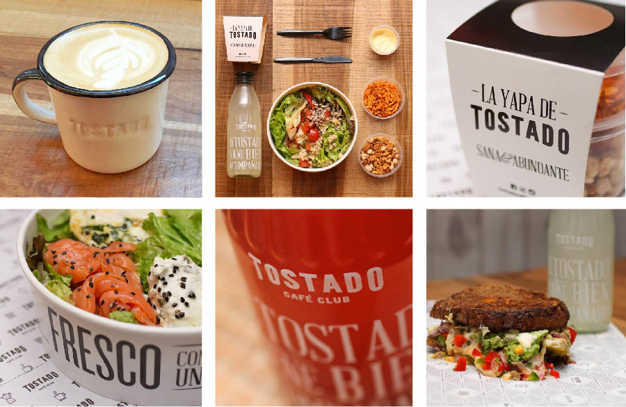
As well as the interior decoration, packaging, and signage, we designed the glasses, sandwich wrapping paper, labels for yogurt, seat upholstery, and applied screen printing to the dishes. An artist designed the camp-style cups, and we applied the Tostado wordmark in low relief.

We embroidered aprons and shirts for the staff, working with a palette restricted to black and white, with colour appearing as a way to identify product flavours.
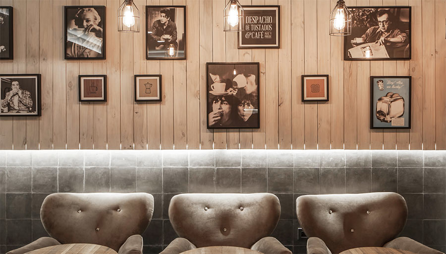
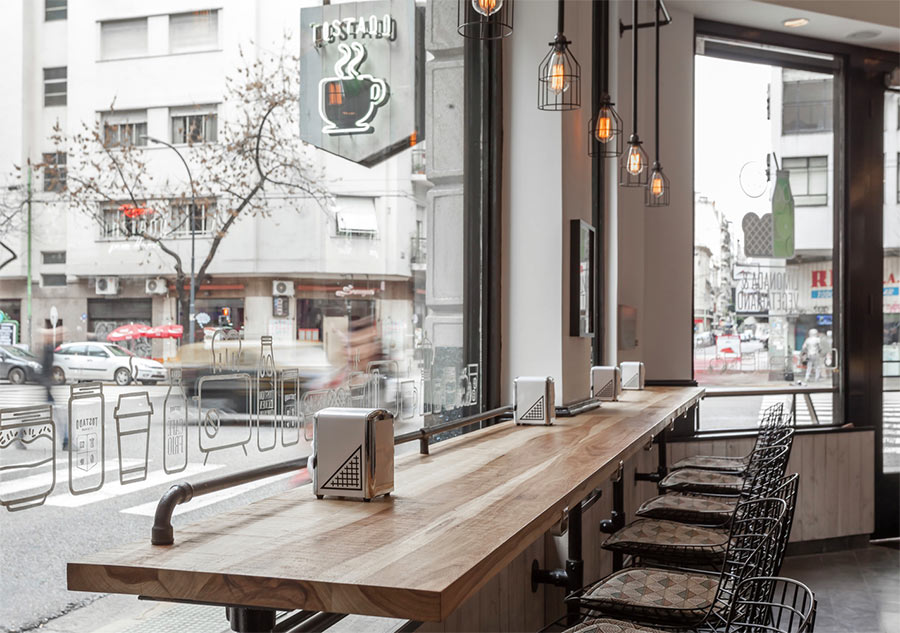
Hand-crafted icons were applied to the walls and the front window.

A craftsman painted glazed plates for the facade and to point out the ladies and gentlemen.
No complicated typography, with the emphasis on fast and easy, aided by screens for prices and ingredients. The overall aim was to develop a friendly and sympathetic language that makes the guest feel comfortable.

With Tostado we were attentive to every detail, and importantly, had fun throughout the process.


Brand identity: The Brandbean (Hilary Strong, San Spiga)
Art direction: San Spiga
Design: San Spiga, Juana Laxague, Santi Devalle, Seba Barrena
Architecture: HMA Fernando Hitzig & Leonardo G. Militello
Photos: Federico Kulekdjian, Cecilia Kelly
Location: Av.Córdoba 1501 Buenos Aires, Argentina
Website: www.tostadocafeclub.com

More from The Brandbean.


Comments
Hm. Maybe it’s just the photos but the grey doesn’t feel elegant to me but old, dusty, and lifeless. It gives the whole place a ghostly atmosphere that overpowers the branding which I would rather comment on.
I actually really like it grey, I think it matches the brand and makes it feel cosy.
I think it all makes sense together.
So detailed and controlled that it seems as a work of art. Love the grey color by the way, it gives the shop an air of modernism inside a vintage design.
A breath of roasty-toasty air! Nothing lifeless or dusty that comes to my eyes. Funky furnishings and finishes, love the decor and packaging – two words; big fan.
I like the “modern retro” atomsphere and I think grey helps make the food, drinks, and the menu pop out more in a colorful way. I love the wood wall with the icons lining up; it does pop up more against the grey. Great design overall!
I totally agree with Voxann. The colour grey really gives emphasis and lets the fresh ingredients stand out. That is what good food is all about.