
Undamentals is a premium underwear subscription service for men. We were hired to come up with the brand strategy, naming, identity, product branding, packaging, tone of voice, website, and communications.
![]()
Following a market audit and extensive positioning work, the new brand was built upon the central insight that underwear is a humble but fundamental part of our everyday life but is often overlooked. This informed a core proposition: as the item of clothing is so ubiquitous it deserves to be a considered, comfortable, quality, and stylish purchase. These foundations formed the central creative concept: Wherever you are and whatever you’re up to, your underwear is always along for the ride.
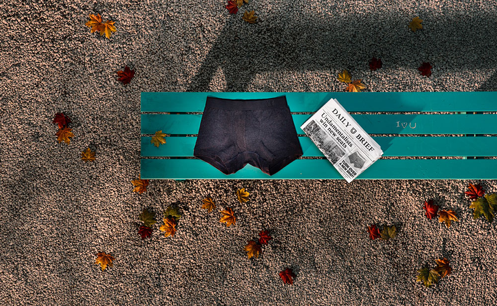
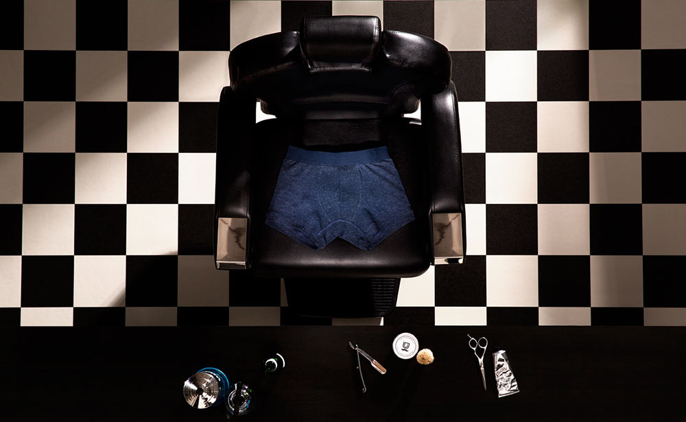
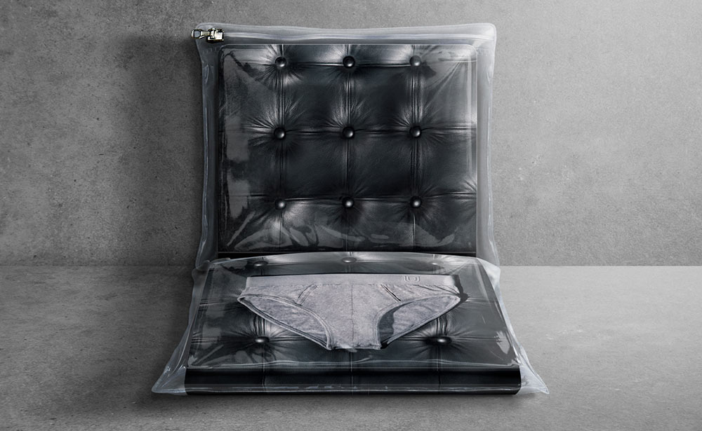
This idea is playfully brought to life through an approach to imagery that replaces the human presence in everyday scenes with the underwear, reinforcing the message that they’re always with you, whatever you’re doing. The art direction and graphics feature the chair in different forms to symbolise and track the underwear and wearer’s journey through everyday life.


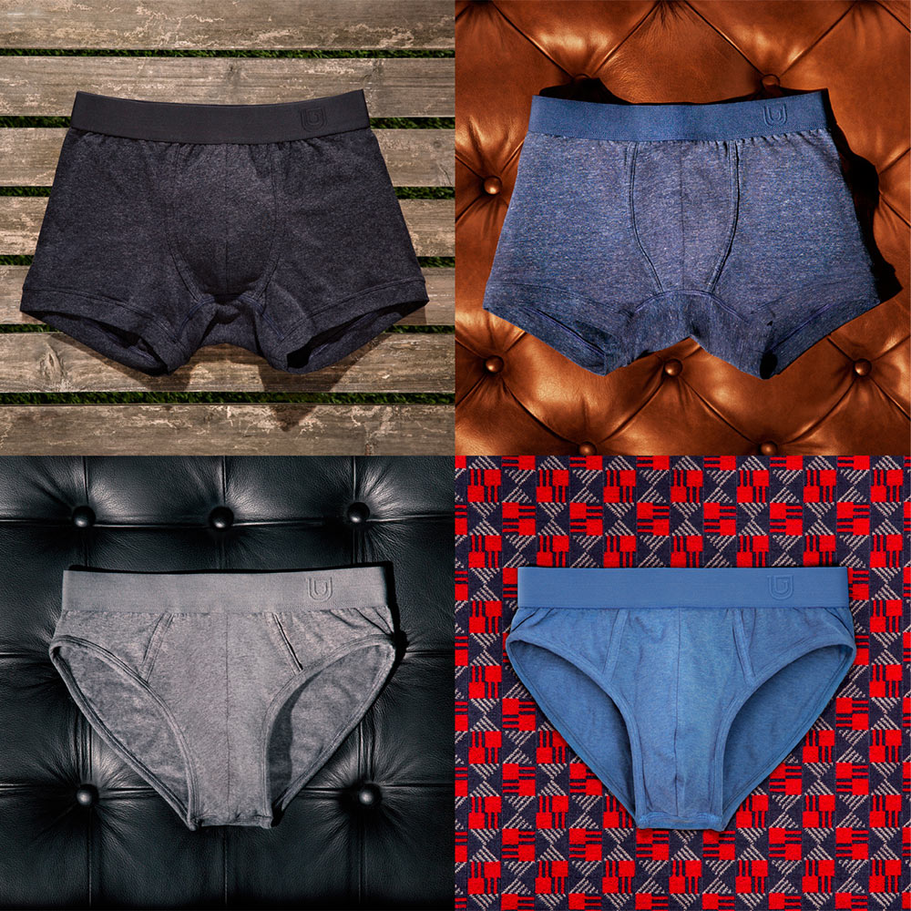
The concept informs every element of the brand: It’s name, the design of the underwear itself (subtle, understated branding with colours and textures inspired by jeans and jersey basics) to the tone of voice, packaging, and communications.
The garment labels feature a selection of inspirational quotes in which a reference to underwear has been playfully inserted into each thought for the day.

The subscription packaging comes in trial singles and quarterly three packs. These have been designed to create a sense of theatre and fun on opening: Packaged in zipped pouches with photography inserts to resemble a variety of seat cushions/surfaces from daily life.

These are sent with postcards designed to look like a folded newspaper just as you might read when out and about in these settings. This can be used to send personalised updates and news to subscribers.


The secondary graphics, materials, and overall feel of the printed collateral has a utilitarian and functional tone intended to reference the visual language of the public transport system supporting the bigger idea.


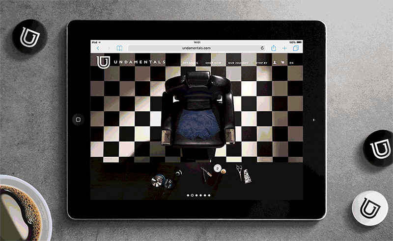
The typestyle used throughout is Gill Sans in various weights, and we worked with Photography by Anderson for all the product shots. Gecko Design developed the website, while SLP printed the packaging mailing bags, postcard and product tags — the stock for which is a G . F Smith grey board.

Afterhours elsewhere on Identity Designed: NB, Joyce Division.
Sadly, the Afterhours website is no longer online.


Comments
I simply love the nolling approach to the product photography. But the icon reminds me too much of Uber’s not-so-old yet icon.
There is a company already in this market, http://www.meundies.com, and they are making profit so it isn’t that bad of an idea people are buying into. I definitely prefer the branding of Undamentals.
Not sure of the business venture itself but the designs behind it are excellent.
A good attempt with the brand communication, packaging design, and website. The little uber resemblance with the Undamentals logo reminds me of mobility, on and off, everyday routine (also closely related to uber) which is a good idea for an undergarment brand… and that sticks, too. Nice one.
I picked up “The Package design book” today and came across this brand. Incredible packaging. It’s witty and funny yet gets the point across immediately. Loves xx