
The W&Cie agency, part of HAVAS DESIGN+, has been awarded with a Silver Lion in the design category at Cannes Lions Festival 2011 for its new visual identity and signage of its new Paris-based offices.
This new identity accompanies the philosophy of the agency, ‘What a Wonderful World’, and confirms its intention to support its clients with relevance, optimism, and strong strategic and creative exigency in all areas including design, advertising, editorial and digital.
The various areas and the walls, screens and stationery are used to create visual surprises and to emphasise, with a touch of humour, how much our people are dedicated to the brands they work for.
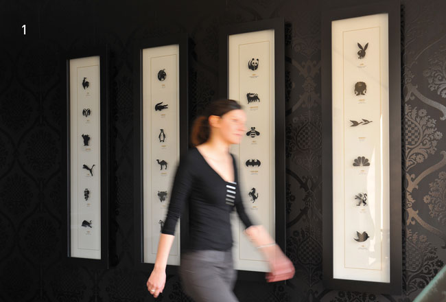
Near the entrance is a carefully framed and labelled “entomological” display. The collection of international brand specimens is a quirky tribute to the power of symbols.
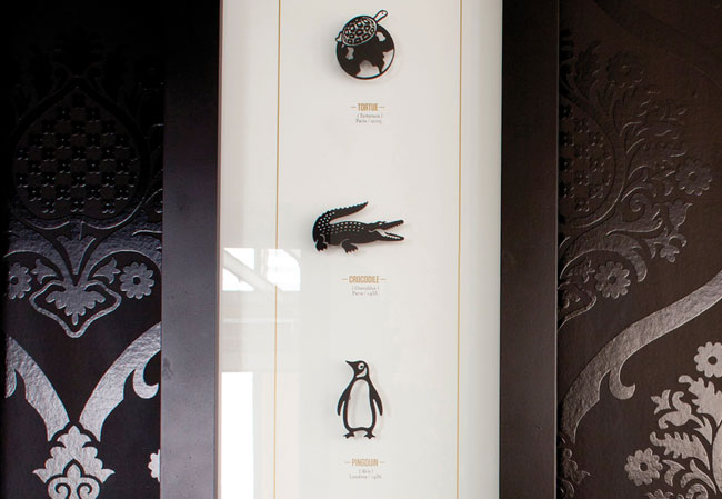
Like a never-ending story, a frieze of brands lines the walls of the glazed offices.
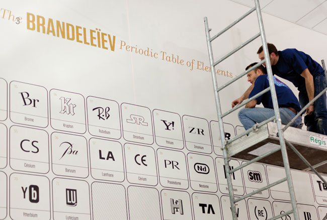
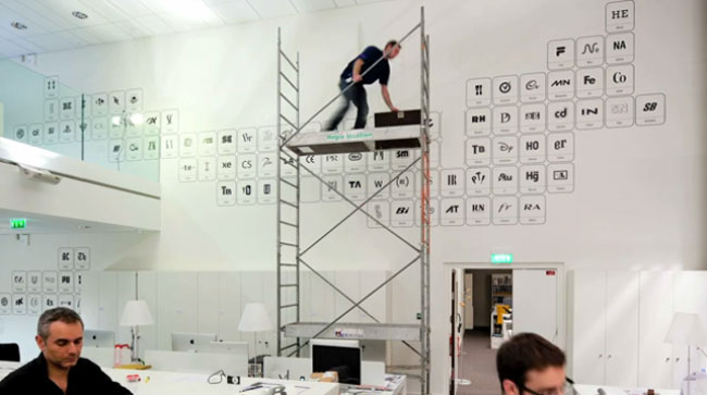
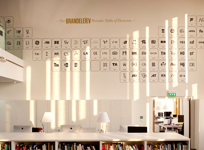
Our “Brandeleiev” table is displayed as a double-height mural. It is an interpretation of Mendeleev’s periodic table. Instead of the letters of the chemical elements, it features elements of major international brands.
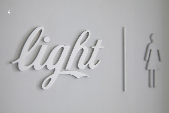
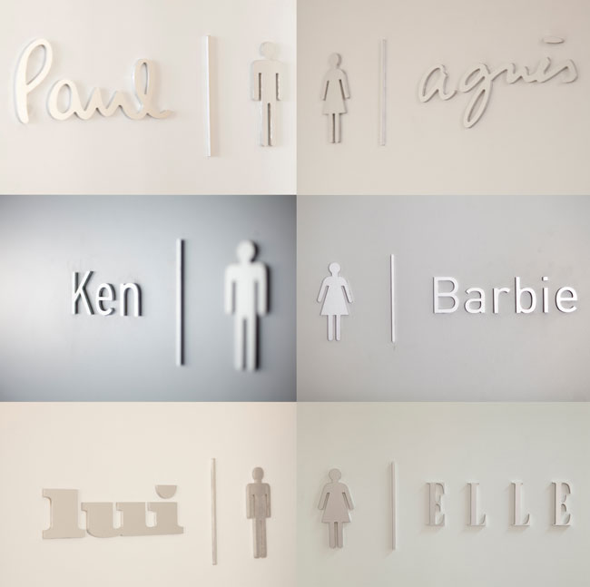
New brand couples serve as signs for the men’s and ladies’ toilets.
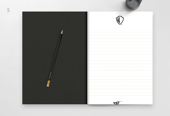
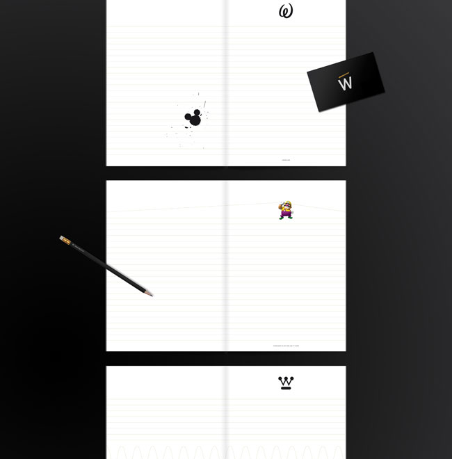
In this notebook given to visitors, the regular lines on the pages are liberated to follow the W of our brand name.
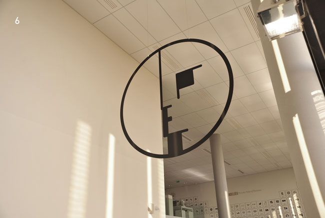
The logo of Bauhaus, “the brand of brands,” hangs at double-height mounted on the building’s ceiling.
More from W&Cie.


Comments
Gorgeous.
Very corporate identity focused, but then that’s right up my alley…
Wish W&Cie would apply the same level of effort to their own identity that they did to their interior of the Paris office?
Wow, that is seriously impressive stuff, the entomological display is a particular highlight for me.
I might be missing something, but this seems to be heavily showcasing – and riffing on – work done by other people. I’d like to see more of the agency’s actual client work. This “identity” doesn’t tell me much about W&Cie.
Much as I like the installations and the toilet signage, that is all they are. They aren’t the identity of the agency.
However, they do say something about the high regard with which the agency holds the visual representation of a brand and they display the agency’s branding ‘knowledge and expertise’ in a way that would both amuse and reassure current and potential clients.
But I wonder if they got permission from both the originators and the owners? Is it flattery for another agency to hang something you created in their foyer. I think I’d be quite chuffed.
Apologies for the addendum.
Not sure if I would award The Bauhaus with the “brand of brands”. I wonder what the benchmarks for measurement were.
If influence or legacy is the issue, might it not be a more universally recognised (or admired or feared) religious, political or cultural symbol that should be hanging there. Then again, perhaps a Bauhaus symbol comes with less negative baggage. It would be a brave (or foolish) agency that hung another early C20 German symbol from the ceiling of their studio.
The post inspired me to write though, so the work must be doing something.
Beautiful stuff. I particularly like the periodic table of brands. Love.
The concept behind this brand is awesome but still I have the same questions what Shaughn mentioned above -like many brands have been manipulated (in their W notebook) and showcased! How come W&Cie managed to do all that?
Wow…this is really gorgeous, the periodic table turned out great.
About “brands of brands”: Sure, it’s an interpretation. But, it’s a tribute to this amazing school borned in 1919 and always modern. Now in french: cette école est à l’origine de tous les métiers de la communication visuelle tels qu’on les pratique aujourd’hui. Elle est aussi aux sources de l’architecture contemporaine, du design et du développement des marques. C’est en ce sens que nous disons que c’est “la marque des marques”.
Par ailleurs, notre website est en cours de reconstruction. Rendez-vous en octobre sur http://www.wcie.fr
An entity using other people’s creative work to lead people to assume they are extremely creative themselves – it’s like a real-life Tumblr account!
I really like that they’ve taken the interior of their workspace and really turned it into a focused yet inspirational creative environment. It must be much easier to create brands when you’re surrounded by excellent visual examples all day.
I really love that they’ve allowed this to serve a function rather than being a boast to their awesome skills.
they are trading off other creative’s work. that is deeply uncool.
Great concept particularly the periodic table and entomological display but very very uncool if they haven’t worked with these brands.
An amazing execution of a questionable idea. I agree with Mr. Steel above. It seems dishonest for a design group to take the work of others and plaster it in their office space as if it was their own. It’s kind of like a Kia auto dealership hanging pictures of Mercedes and Porsches on their walls and photoshopping the logos off. I’m sure they get this question all the time, “Oh wow, you guys did that logo???” Must be an awkward moment when they say, “No, we just like it.”
I love it and want to work there.
First – I like that nice cocky concept!
But what about adding all the real credits next to each graphical loaning?
…