After a long day moving into our Old City design studio, we sat down to our first local meal at Wedge & Fig. The space was something out of a storybook, a secret secluded garden hidden away from the noisy city streets. Many glasses of wine and return visits later, we felt that we’d discovered one of Philadelphia’s brightest little gems, not to mention the best cheese shop in the area. While the ambiance and cuisine were well above par, our ambitious design-focused staff couldn’t help but notice the lack-luster, disjointed design materials.
Strategy and results
Push10 re-imagined the Wedge & Fig brand language and created a logo that reflects the vibrance and sophistication of the restaurant itself. We extended the new system to the handwritten chalkboard menus, stationery set and take-out bags. To complete the brand overhaul, we even created custom paper and stickers for the cheese counter, a responsive menu-focused website, and a clever outdoor advertising campaign.
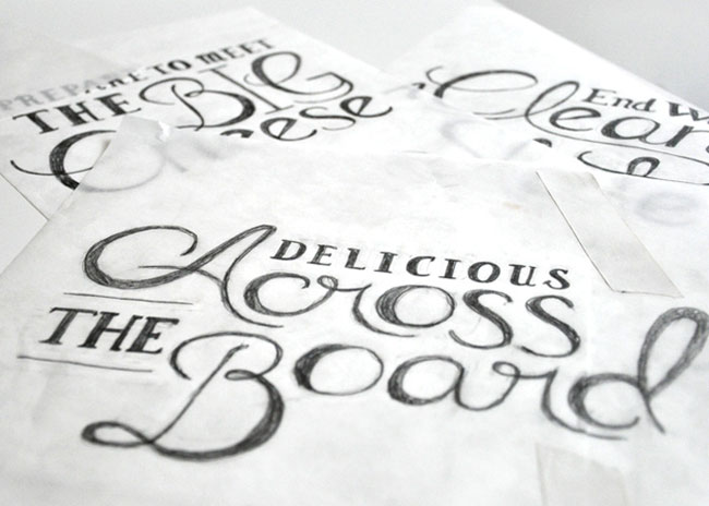

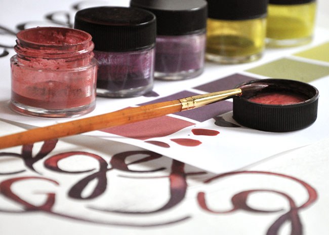
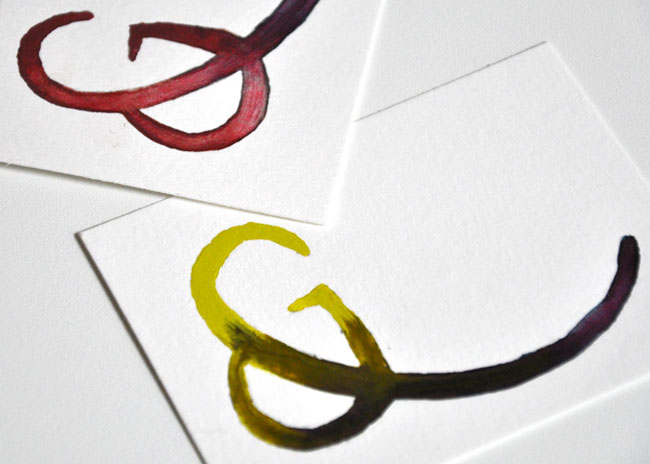
We began with the logo. We talked to friends, we stopped people on the street, and we gauged countless reactions. While the old mark wasn’t offending anyone, most thought that it was too sterile and a bit childish for such a vibrant, sophisticated restaurant. Our discussions proved what we’d known all along – that our explorations needed to start by capturing W&F’s unique European ambiance. Hours of research later, our team discovered a library of custom painted signs from Parisian storefronts. We decided that we could add a modern twist to the centuries old artform with watercolors, and the big idea was born.
![]()

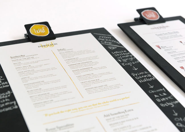
In order to accommodate the frequently changing specials, we developed a menu system that allows staff to handwrite updates and recommendations – a mini version of the restaurant’s existing chalkboard menus.
The stationery set and take-out bag were also re-thought using a library of complimentary watercolor patterns. We focused particularly on the business card, which was designed to be used as a hang tag on house-made products for an impromptu packaging solution.

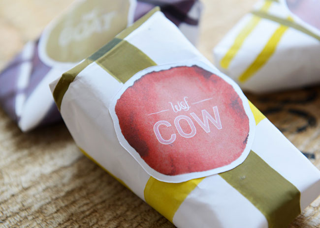
To complete the brand overhaul, we even created custom paper and stickers for the take-out cheese counter.

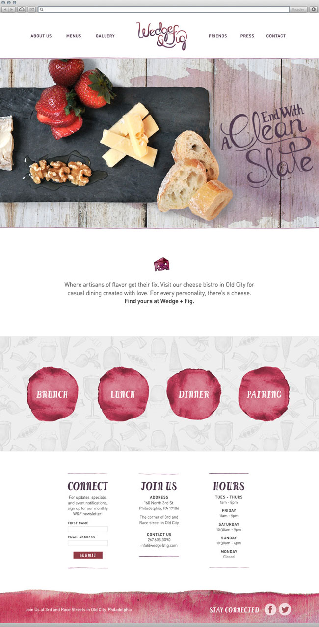
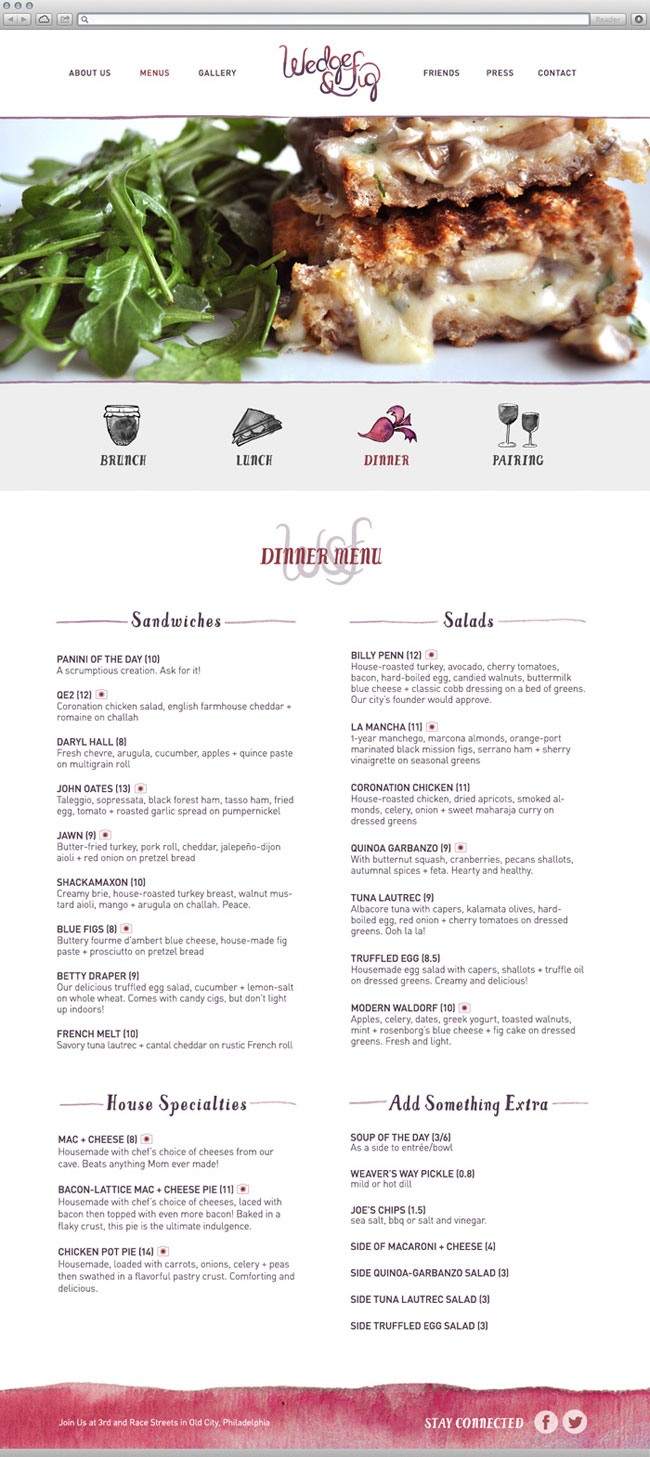
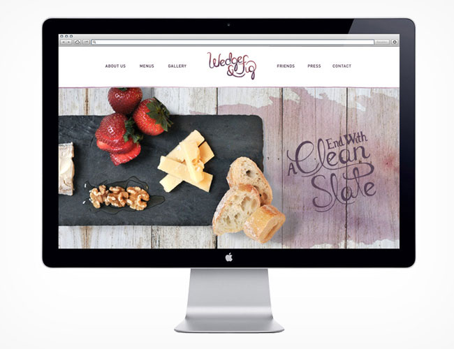
To bring the Wedge & Fig world online, we began with an in-house photo shoot. The food translated wonderfully to the screen, where we focused on crafting a responsive menu that was easy to access from any device. Small photo icons throughout the menu allow visitors to view each dish in advance, and a simple icon-based subnav makes switching between menus feel fluid and natural.

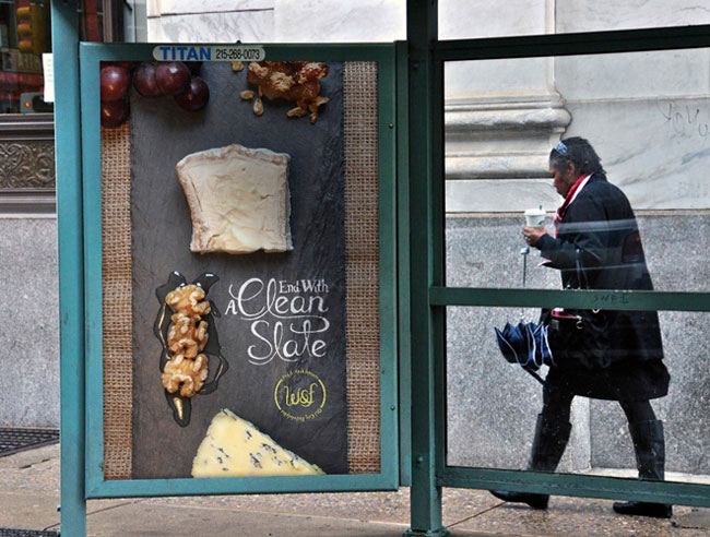
To give the new brand a proper send-off, the design and copywriting teams sat down to develop and execute a series of outdoor advertisements. Using clever copy, custom photography, and old-school sign painting techniques, we were able to devise a campaign that could redirect both foot and auto traffic to our favorite local cheese shop and byob.


View more identity design on the Push10 website. Follow Push10 on Twitter.


Comments
I believe they did an amazing job! I think the watercolor effect and execution was spot on. I’m a huge fan of watercolor sketches and when I saw how they explored it with type I thought that was a really awesome idea. Two thumbs up.
I find many things that I like. The photography is mouth watering. Two more thumbs up.
This is a very nice identity. The logo is has a hand-crafted & ‘painterly’ look & the ad painted directly onto the bricks (last photo) is very classy & authentic. All around nice job by Push10!
A lovely refreshing identity that invokes authenticity and a handcrafted element; key factors in the food industry. :)
Lovely delicate identity. Great photography, great palette and lovely type.
Great job.
I would like to ask about the brand of colours you used as depicted in the fourth picture. What kind of pigments did you use there?