We teamed up with YO! Sushi to refine their brand strategy and refresh their look and feel.
The idea
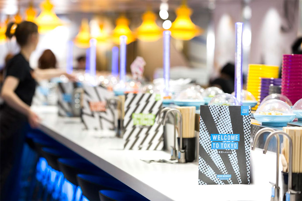
YO! Sushi is a place where people can experience a true taste of modern Tokyo. The brand idea and menu launch campaign centred around ‘This is Tokyo’ as a concept. So this meant…
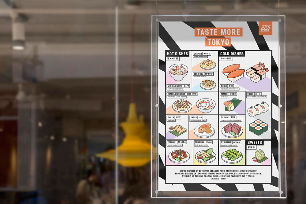
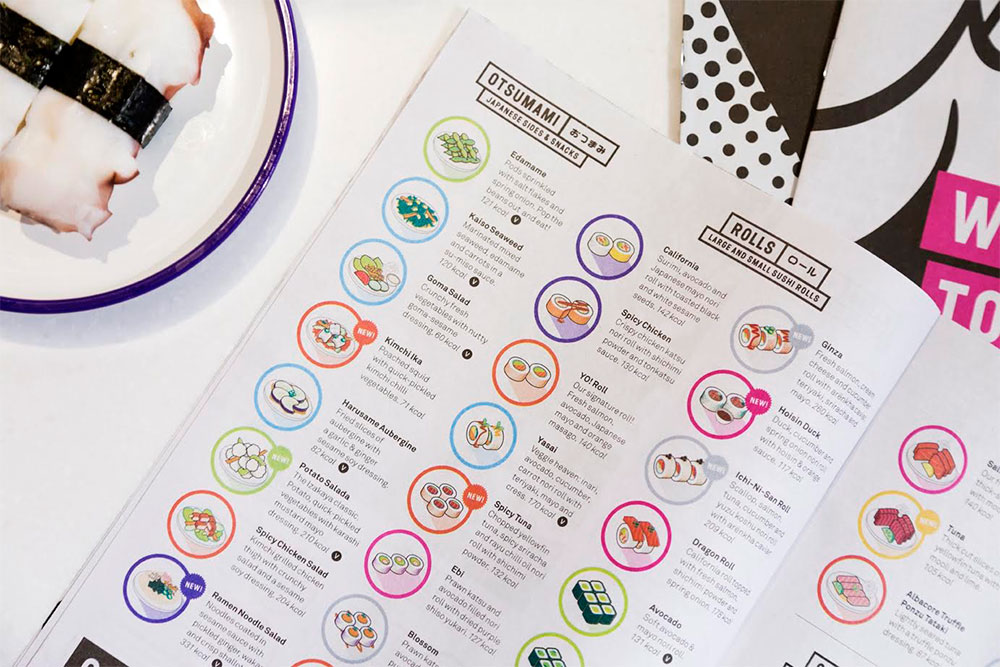
- We hero-ed the authenticity of the dishes on the menu. All YO’s food is inspired by Japanese classics, street food or home dishes.
- The design should take cues from anime / manga culture (but translated in a modern way).
- We didn’t have to dumb anything down. We introduced Kanji script to the menu and made sure all sections were named as they would be in Tokyo. The launch campaign leads with Japanese dish names so everyone can learn the difference between Takoyaki (octopus filled dough balls) and Okonomiyaki (street food pancakes).
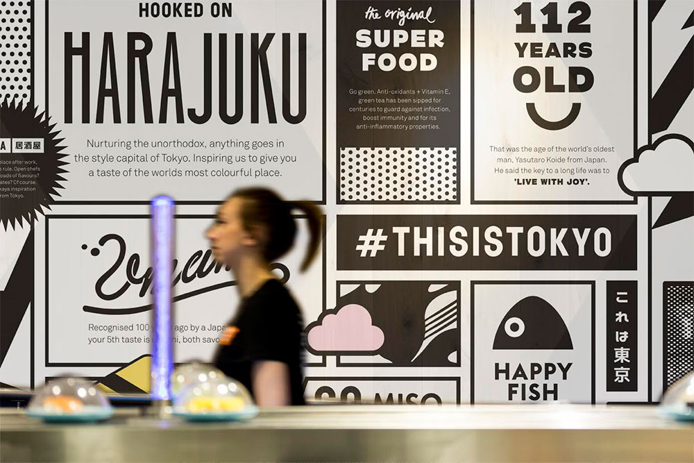
- YO! are the ears to the ground for what’s going on in Tokyo right now.

As soon as our director Dan Bernstein interviewed Mike Lewis (the executive chef) on day one, he knew our idea had to be centred around authenticity. Mike told Dan his tales of searching the streets, homes and restaurants of Tokyo hunting down the best recipes and ingredients to bring back to the UK. From then on it was obvious this was something we had to shout about.

We wanted to give everyone a taste of what’s going on in Tokyo right now. That’s where the zine/newspaper menu idea came from. It gave us the chance to show some nice snippets of art, fashion and music alongside their food. The idea is that the editorial content will change four or five times a year.

Other bits:
- The new design was rolled out across all 70+ sites in the UK over the last two weeks and is about to launch on all sites in the US later in the month.
- All illustrations were created in-house.
- As well as new menus, we created the launch campaign, A-boards, menu boards, interior graphics, and window wraps as a part of the refresh. There’s more to come over the next few months.


Other & SMITH projects on Identity Designed.
More from & SMITH.


Comments
This is great, but I don’t understand this:
“The design should take cues from anime / manga culture (but translated in a modern way).”
Why should it? What’s the rationale behind this move? I’m not saying it’s wrong, I’m just curious.
I love a lot about the rebrand, I think the colours, patterns and layout style are absolutely on point.
However after visiting my local branch I absolutely hate the illustrations of all the dishes.
The illustration style is beautiful and it’s clearly been done by someone with a lot of talent, I’m certainly not slating that. But the main purpose of the illustrations is to inform people, the majority of which are not neccessarily completely up on the nuances between the dishes, what the dishes going round on the conveyer belt are so you can make a snap decision whether to take it off or let it go. Me and the circle of friends I was with, despite being regular customers of Yo, really struggled with this as the illustrations were very uniform and did not really look close enough to the dishes to be able to determine what it was. We ended up ordering virtually everything rather than taking off the belt (5 of us, about 6-8 dishes each, so just the 30-40 dishes, then).
Honestly, if they sorted that out then I would love this. The photos of the dishes that were in the last one weren’t anywhere near as elegant or stylish, but they were infinitely more informative and fit for purpose, I’m sorry to say.
I’m a big fan of &SMITH’s work and this is executed in the same beautiful, professional manner you’d expect.
My only gripe is some of the Japanese used in the materials, which is incorrect. “Moshi moshi”, for example, is how we answer the phone in Japanese (correctly translated as ‘hello’), yet the Japanese reads “お元気ですか?” (o genki desu ka?) which means “how are you?” And in over 16 years of living in Tokyo I’ve never heard anyone order a beer in the way it’s written on the card (which literally translates as “one or more beers, please”).
This might sound petty, but a lot of my work is helping people to correct these kinds of errors as it can affect brand image. Checking the details shows you care as much about the cultural aspects you’re portraying – the “what’s going on in Tokyo right now” – as you do the visual elements.