![]()
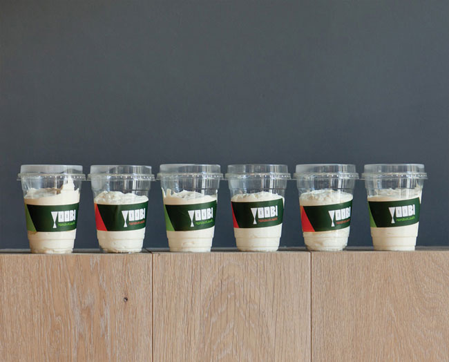
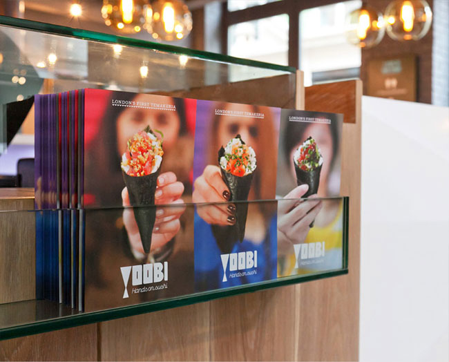
Yoobi is London’s first temakeria. The concept is an exciting new take on sushi: Brazilian-influenced temaki that are freshly hand-rolled to order in an informal, contemporary environment.
It was founded by two young entrepreneurs with ties to Japan and Brazil, who were inspired by Japan’s finest sushi and the vibrance of Rio’s temakerias. With Yoobi they have brought their own unique temakeria to Soho, London.

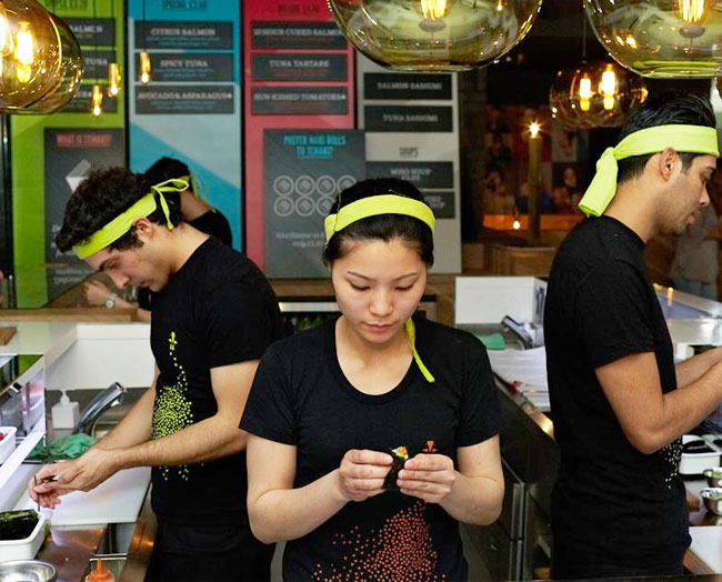
Healthy temaki (hand rolls) are freshly prepared and served in front of customers, never pre-made and put in cold fridges. Sushi rice should never be that cold, always room temperature.
To fulfil the long term ambitions of Yoobi, we created a robust brand strategy founded on four key values inspired by the geographical influences: ‘Respect’ from Japan, ‘Playful’ from Brazil, ‘Artistic’ from London and ‘Simpatico’ which is common to all. These values informed every expression of the brand; from the name and tone of voice to the graphic language, photography and distinctive interior.
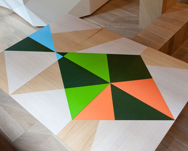
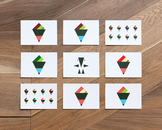
The name Yoobi is derived from the Japanese word ‘yubi’, meaning ‘fingers’, referencing the way in which temaki is prepared and eaten. The angular form of temaki and the three points of its gastronomic journey inspired a bold and playful graphic language that runs throughout all the printed and digital material and carries a bold presence in store, across bespoke-made stools and tables.
We partnered with London-based interior-architects Gundry and Ducker and Yoobi co-founder Carolina Rodrigues to create a contemporary interior using oak panelling punctuated with an inlaid brass line that playfully follows the contours over the walls and furniture.
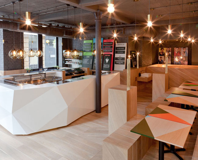

The main focal point of the temakeria is a pristine white faceted central counter that encircles the area where the temaki is prepared. Built with the influence of Japanese precision, it creates a strong visual contrast with the warmth of the oak interior. Behind it sits a series of overlapping colourful boards creating a functional yet striking menu system.

Yoobi’s menu boasts an exciting range of healthy, freshly prepared temaki and maki sushi, salads and soups. There are a variety of unusual recipes to choose from classed as ‘simple’, ‘special’ and ‘deluxe’, depending on how adventurous you want to be. Yoobi uses seasonal and sustainable virgin ingredients then adds an unexpected creative twist – such as the Spanish influenced Tuna Tartar or the Japanese pear mixed with 20-hour cured Salmon.


The Yoobi brand aims to demonstrate creativity through everything it does – delivering a complete brand experience, from the delicious food it serves to a memorable instore experience and playful, engaging communications.


Yoobi is located at 38 Lexington Street, Soho, London.

More from ico.


Comments
Wow! A very comprehensive brand development. I hope to check out this place the next time I’m in London. Exciting.
Quibbles: The website does not transpire the atmosphere as it is shown here and lacks the human touch from the photos. The language in the logo does not seem to match the language used for the signs on the windows. While I am excited about the place and find the photos inspiring I feel that the logo itself is on the weaker side. Are the stools just painted or do the different color reflect the construction? The latter would be clearly superior.
@ Christian
Agreed, the logo doesn’t seem to quite hit the mark. The whole project comes together as a system though, from the furniture, to print, to interior design.
The stools look (just) painted: the edges of where the parts meet can be seen through the green and the black paint. I imagine they’re sturdier & less expensive this way.
I love this refreshing take on sushi and how much flexibility this “origami” type approach gives the brand. The environment/space created for this restaurant is full of great details that tie everything together. The only assets that lack the same magic from my POV were the packaging for the bottles (just not as exiting).
Really enjoy this, thank you for sharing.
The whole brand compliments the temakeria very well, the angular shapes in the brand are replicated throughout. The multi coloured aspect is interesting as it reflects the fun aspect and the different price ranges of the products.
A cohesive identity design. I think one of it’s success is it avoids the usual japanese clichés that branding a food oultet of this type would descend into and the logo mark is distinct and intriguing enough to inspire further investigation by potential customers, which is especially important in London due to the choice that can be found in this food area.