The Red Pencil’s mission is to bring the benefits of art therapy to all children as a pathway to balance and wellbeing, with special attention devoted to children who face overwhelming circumstances in their lives such as natural disasters, conflict zones or long-term hospitalisation, when words are insufficient or simply incapable of conveying their pain, and yet, whose suffering requires attention, expression, release, relief and ultimately healing.

The Red Pencil’s partners include the Red Cross, Thomson Reuters Corporation, Faber Castell, the Singapore Government and the Kingdom of Belgium.
Challenge
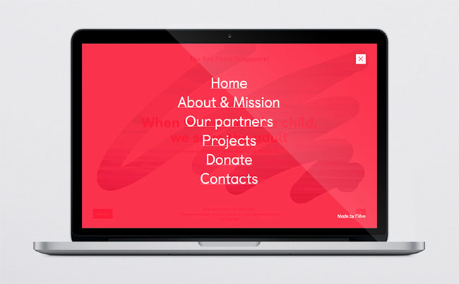
The Red Pencil approached Flëve Partners to lead a rebranding programme and to help them turn The Red Pencil into a more interactive, human and inspiring brand for the 21st century.
Solution
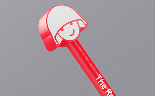
We decided to continue using the current symbol since it’s been around for a long time and has acquired a certain level of credibility within the target audience. We left the character as the main graphic symbol, but made it more interactive and suitable for the current times.


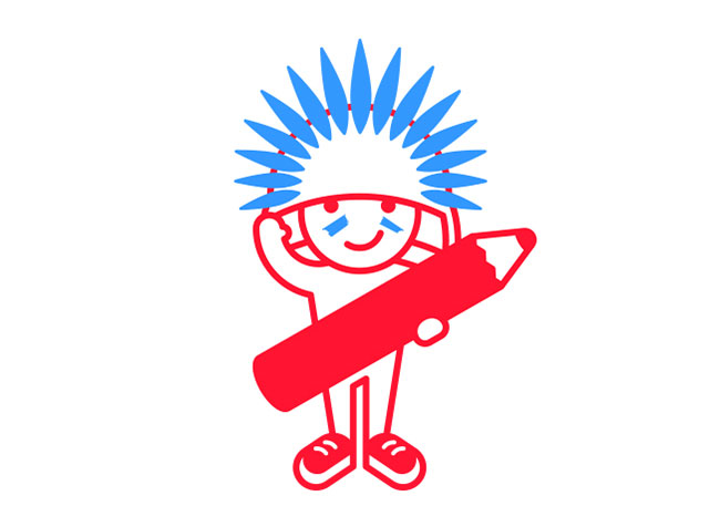

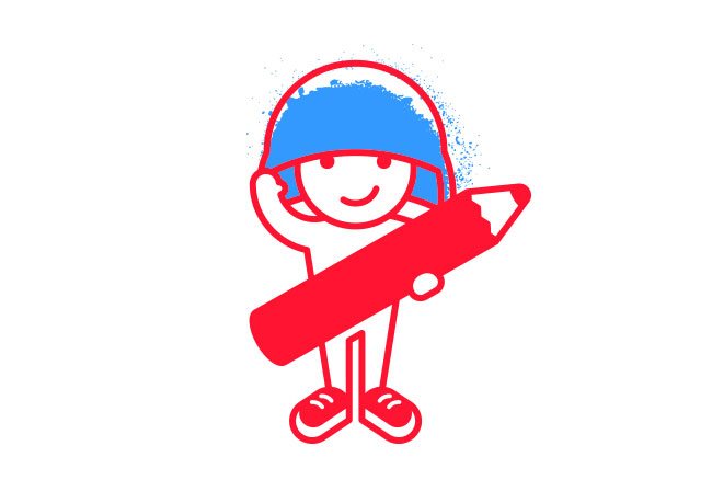

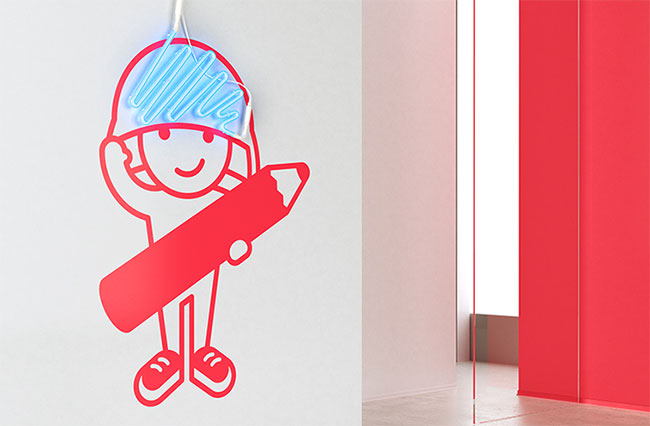
It’s become more than just a static symbol; now it’s a communication platform with lots of future applications that helps develop a stronger connection with donors, volunteers and other stakeholders much more quickly with a much longer lasting effect.
Inviting celebrities, famous artists, other high profile personalities and corporations to take part in colouring the new character allows The Red Pencil to build strong relationships with future donors and establish long-lasting partnerships all over the world.
It is also important that the new character doesn’t strongly convey war-related connotations, thus opening the door to a wider audience and sub-branding. It would be a huge plus if The Red Pencil decides to add music or dancing to the repertoire of their therapeutic tools. From an interactive point of view, it gives the brand a new level of flexibility in crafting digital products such as interactive applications.




More from Flёve.