
I Carpini is a winery characterised by a holistic approach. Their vineyard is located on the Tortonesi Apennines, in an uncontaminated context, where the winemakers take care of the ecosystem respecting the biodiversity.
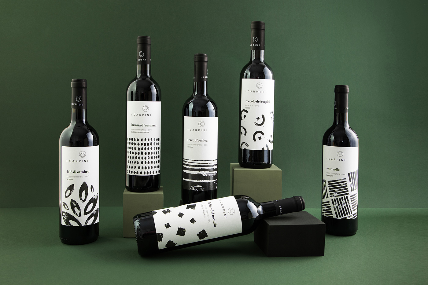
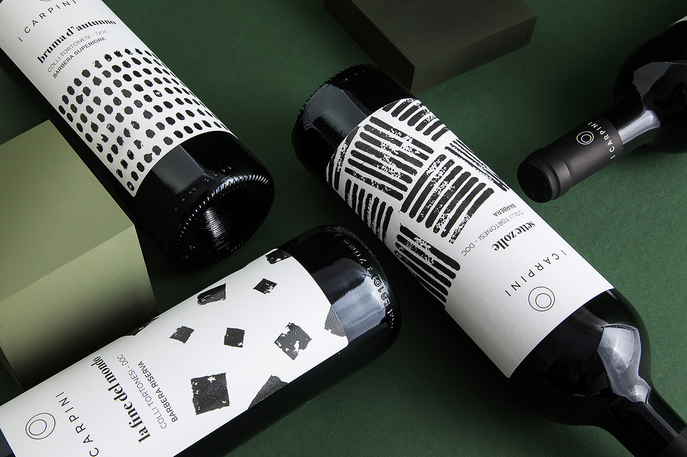
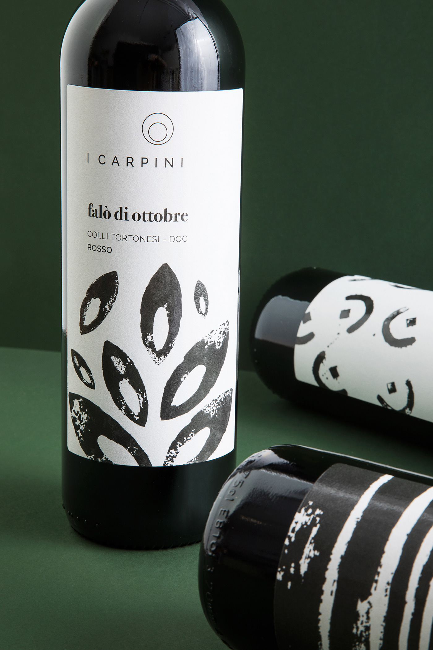
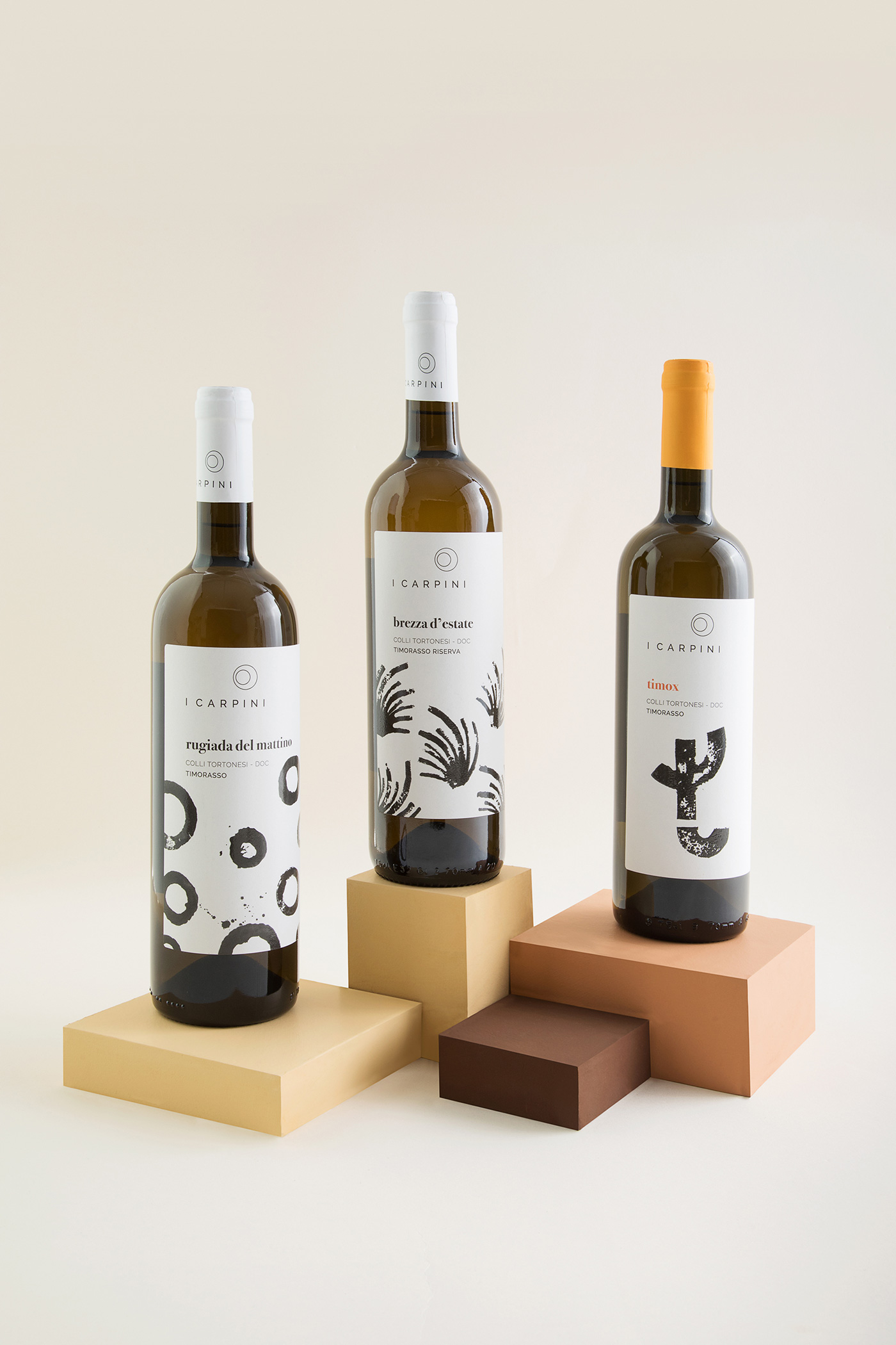
For our client, wine production means time, care, and closeness to the land, not following the standard processes. It is the winemaker that chooses the exact moment when the wine is ready. The visual identity we designed aims to communicate the poetry behind their wines, composed by patience, balance, and a respect for nature. In particular, each wine label is named after a poem that we interpreted graphically and recreated using handmade stamps to stay close to the earth-bound soul of the product.
Time is one of the essential aspects that characterises the production of I Carpini wine. A calm and constructive time where the spaces are important.
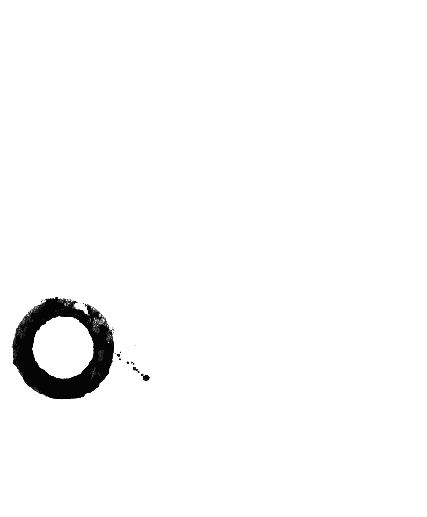
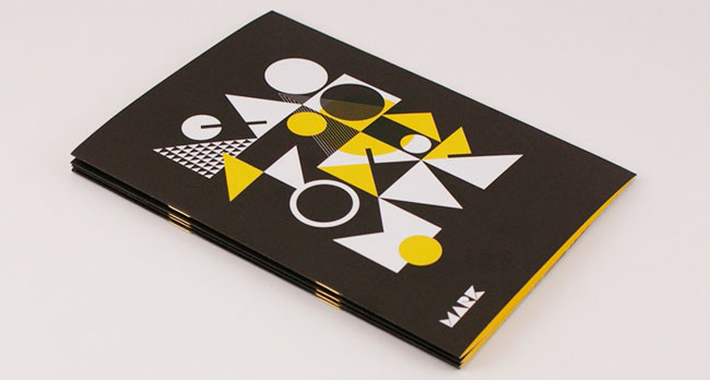
With this in mind, the logo, defined by two circles, communicates the rotation and the passing of the time required by the wine to find its perfection. The design can also be viewed as a glass seen from above.
![]()
It’s a dynamic logo that appears in four different rotations, one rotation for each vineyard. The variations are displayed on the relative wine labels, also simulating the concept of time and the lunar phases.
The labels have been designed using a stamp technique, and for each label, we designed a figure that illustrates the name of the wine and its history.
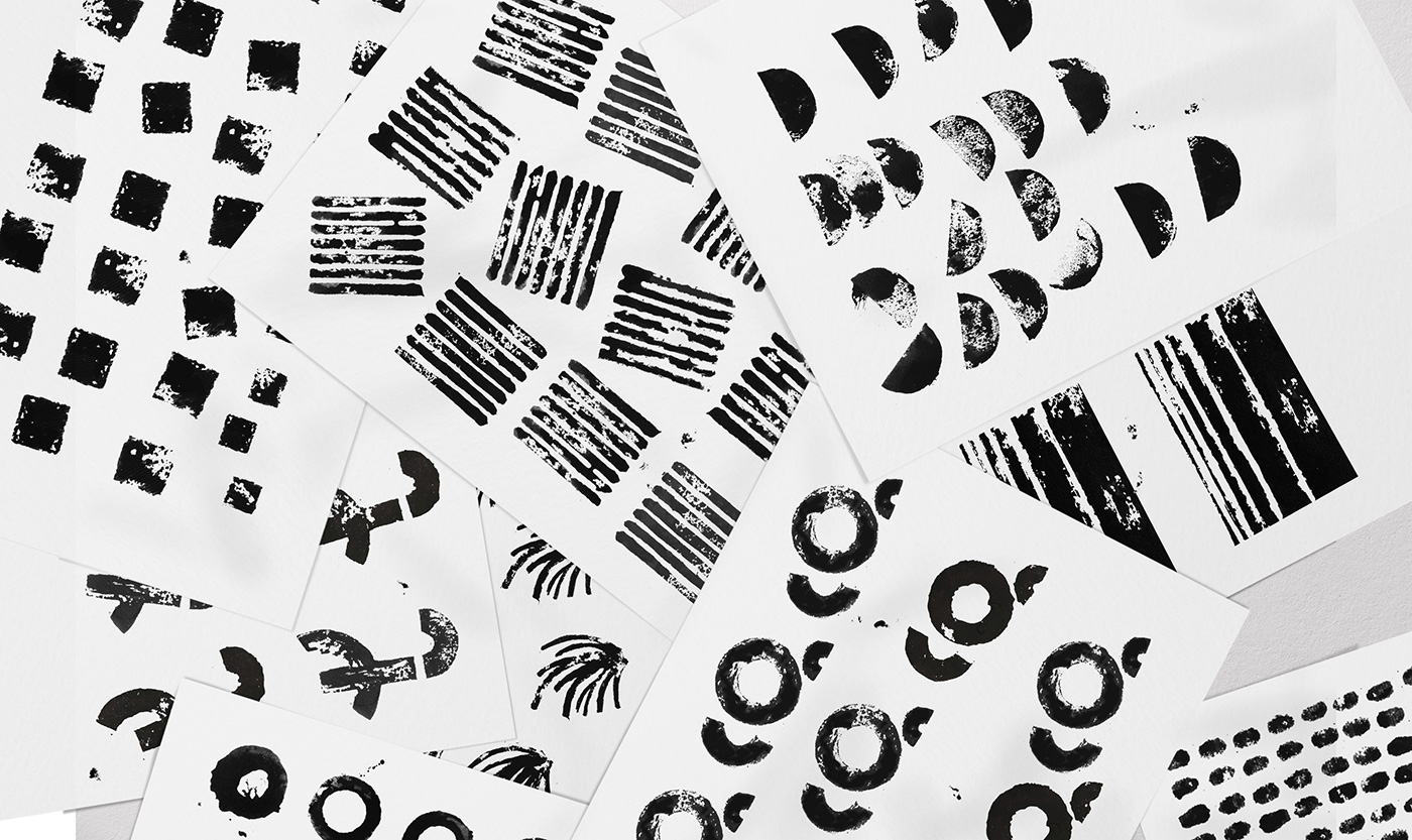
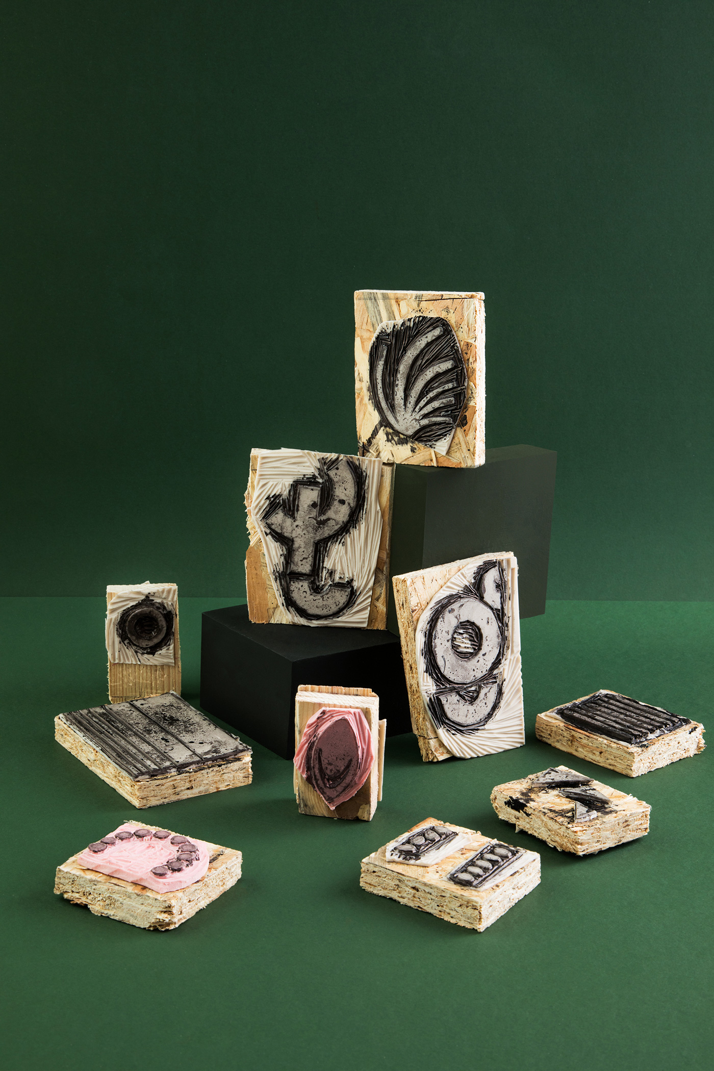
The names of the wines come from poems, so we wanted to visually describe all the romance behind them. These stamps were then inked and pressed on paper and then processed digitally, but without losing the material flavor obtained with this technique.


Credits:
Creative director: Luigi Durante
Photography: Carmen Mitrotta
Animation: Gianluca Santoro
More from Drogheria Studio.

Comments
Amazing!