
Anders is a growing St. Louis-based CPA and business advisory firm that serves privately held companies and high-net-worth individuals. Atomicdust was hired to modernize their brand with a visual identity that could speak to several different client groups.


The challenge? Practically every accounting firm offers the same services and uses the same language to describe themselves. It’s a crowded, competitive field, and companies traditionally struggle to stand out. We knew that the Anders difference was the high level of expertise they bring to every engagement. The brand needed a sophisticated, focused identity that spoke to that expertise.

We created a modern logo based on the “A” in Anders, using its angles and lines throughout the identity materials — like folders, stationery, and proposal templates — for clarity and consistency.
We recommended simplifying the firm’s name to Anders (formerly Anders Minkler & Diehl) and created a new tagline — “Always On” — a reference to the firm’s commitment to helping clients make the most of their money. It’s also a nod to how their clients think: as business owners, they’re essentially workaholics. Always working, always thinking about what’s next for their businesses.


We also designed the new Anders website, which is bright and bold to buck the expectations about what a financial advising site should look like.


We populated blog content across the site to ensure fresh content was always available, and pumped up the firm bios to demonstrate the expertise of their industry and service teams. We took new photos of every employee, replacing the previous static studio shots, which gave the firm a more approachable and personable feel.

The new visual identity is a more accurate representation of the Anders culture: professional, authoritative, and always in motion.

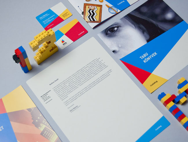
Atomicdust elsewhere on Identity Designed: Pastaria.
More from Atomicdust.


Comments
There is great consistency throughout. I think the shorting of the name Anders was the correct move, it has made it a stronger brand.
The use of the angles and lines of the letter A works very well, I love the brochure covers, and also the colours that are used. Site also looks very well, great use of the slider and the little touch of adding branded Resumes is a really nice touch!
All in all a great project, well done.
Hi, I really like the outcome, I’m just wondering how did you work on this, I mean, I see there you had a ton of logo options, do you usually work that way?
Bravo! Beautiful job!
I’ll confess that at first glance, the abstract textures and forms made me think of the typical corporate identity “art” from a few years back (credit cards and such). However, the difference with Anders is 1.) It is justified by the logo and 2.) The colors are bold and refreshing (as opposed to safe and generic).
Wonderful job breathing the core of the brand into its identity system!
Really Nice work. Great use of idea and it’s compatibility throughout branding.
Thanks for Sharing.
Everything about this brand identity is “on point” (no pun intended). The concept behind the company is what sets it apart for me, how business owners have the mentality that work never stops. Great way to connect directly to their target audience.
I love the consistency throughout all platforms and the refreshing colors that are used.
All in all, great work!
More brilliant work from Atomicdust. Not much to add, really. This is how it should be done.
Hi, this is Mike from Atomicdust.
Thanks for the all the comments about the work. We really appreciate it.
Franco, to answer your question about the number of logo concepts, I wouldn’t say there is a usual number of ideas we come up with. For Anders, we probably had around 30 quick initial sketches for the logos. We would discuss and review them internally with our team. From there we would refine and eliminate the concepts until we were happy with the direction.
After that, we presented only 3 logo concepts to the client.
Typically when we do brand direction, we only present 1 concept initially. But with logo marks we feel that’s a bit limiting, so we try to bring a couple of options to the table.
Hi Mike, thanks a lot for your answer, keep up the excellent work!
This does look really slick and the identity system is carried through really well giving a consistent and professional look. However I’m not sure I get the actual mark. Don’t get me wrong, it looks really elegant and professional – just also looks quite generic as well. Perhaps I am missing a concept on the mark here though… or maybe I am thinking too much and it being visually pleasing is enough.
Love the overall concept of ‘always on’ though.
From personal experience, I know how tricky it is to make any service-based organisation (and particularly financial services organisations) stand out from the competition – their “unique” service offering is usually anything but. And they have a habit of not wanting to look too dissimilar from their competitors.
This one raises Anders above the crowd though – well done!
Honestly I felt a lot of the work you did along they way was much more modern and elegant than what they ended up with; they’d have been differentiated much better had they chosen some of your preliminary directions instead of going to something that was far more “expected” for their industry. I think you did as beautiful a logo as you could have done given the limitations, though I felt a little of the heartache we designers feel as we do wonderful work that gets left on the “maybe” table.