D.Thomas is a London-based skincare brand specialising in problem skin. The clinic can alleviate and cure many skin issues, from acne to pigmentation.
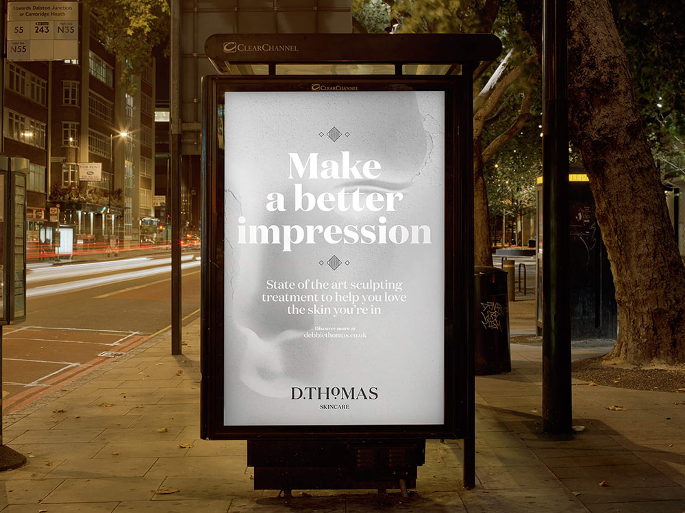
The primary reason for customers approaching the clinic for solutions is so they can improve the impression they give to those around them. This is not a vanity-led purchase, it’s emotional — in our research we heard people tell us of how they couldn’t bring themselves to meet new people, or face friends and family at seemingly kind and forgiving circumstances — one woman in particular spoke of how they couldn’t bring themselves to attend their 21st birthday party, for fear of their acute acne being laughed at.
The impression people give people is both surface-mounted and more deeply considered. The rebrand looks at both sides of this.
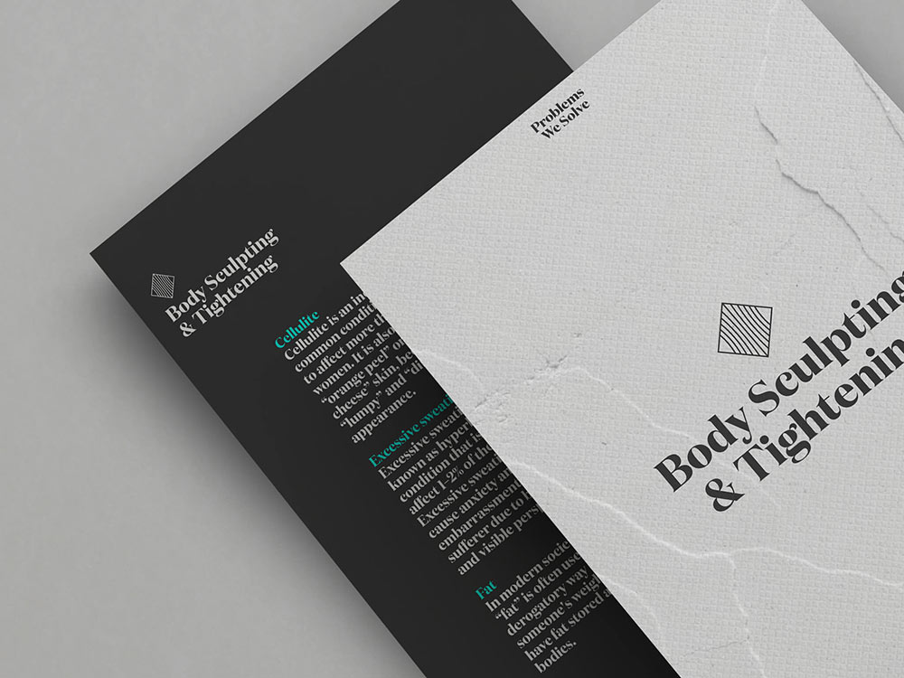
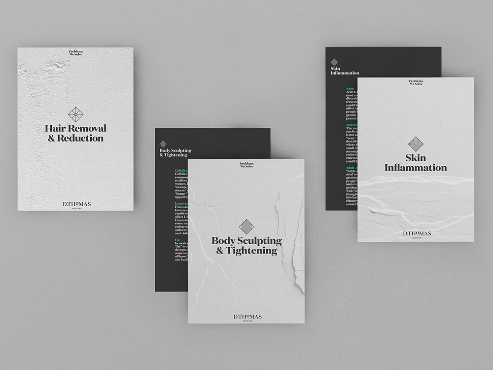
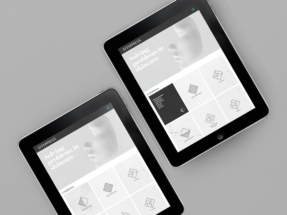
The more intellectual and technical descriptions have been entirely rewritten — the way each product or procedure is described is now simpler, clearer, and more swiftly understandable.
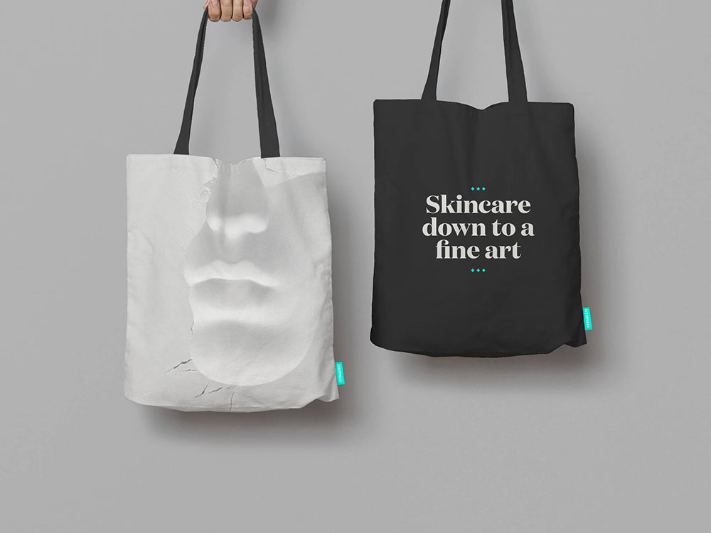
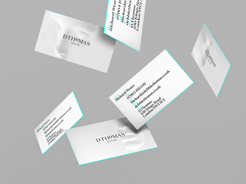
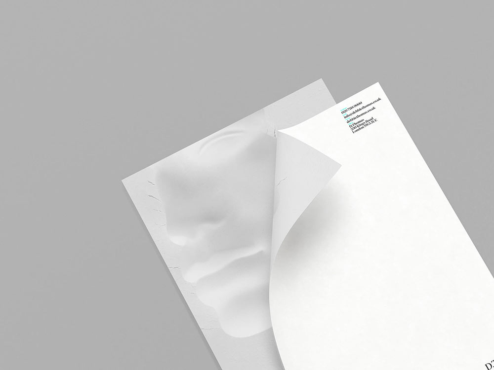
The entire customer journey has been reconsidered as has the visual brand identity that consists of an elegant set of graphics and typography — and is underpinned by a set of images that have been created to help showcase the key procedures and the areas of the face and body they are aimed at.
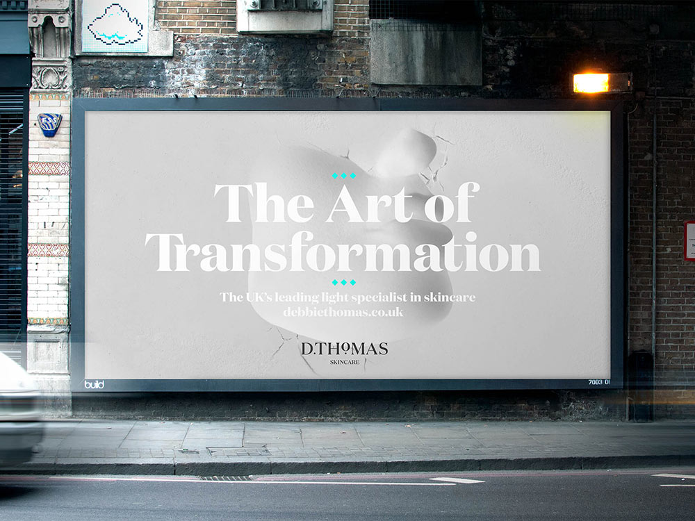
The idea of first impressions was taken to help create the brand images. We took 100 bags of white flour and set up “impression tanks” where we pressed mannequins faces, hands, and bodies.
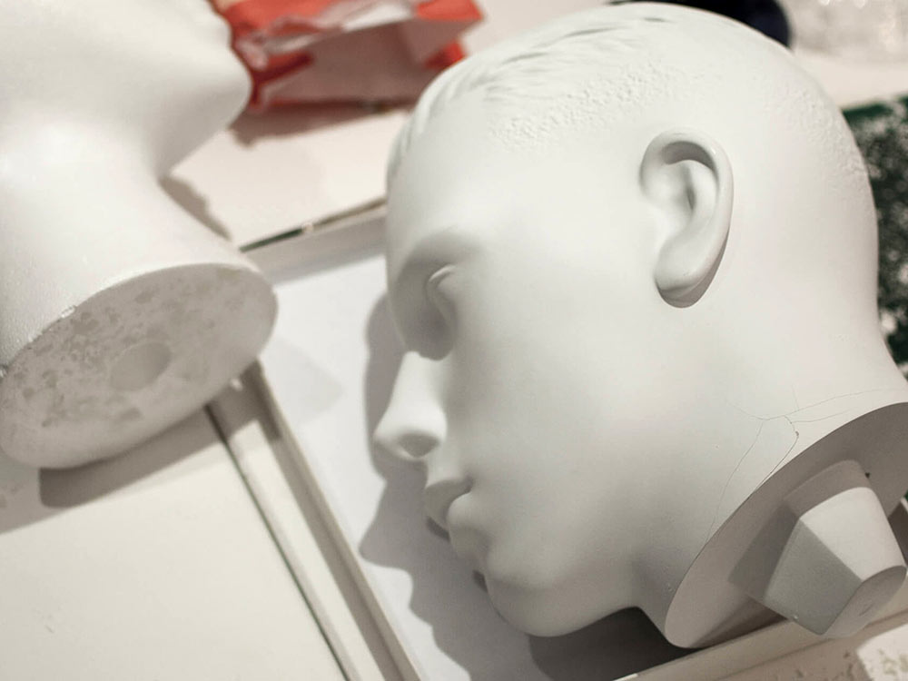
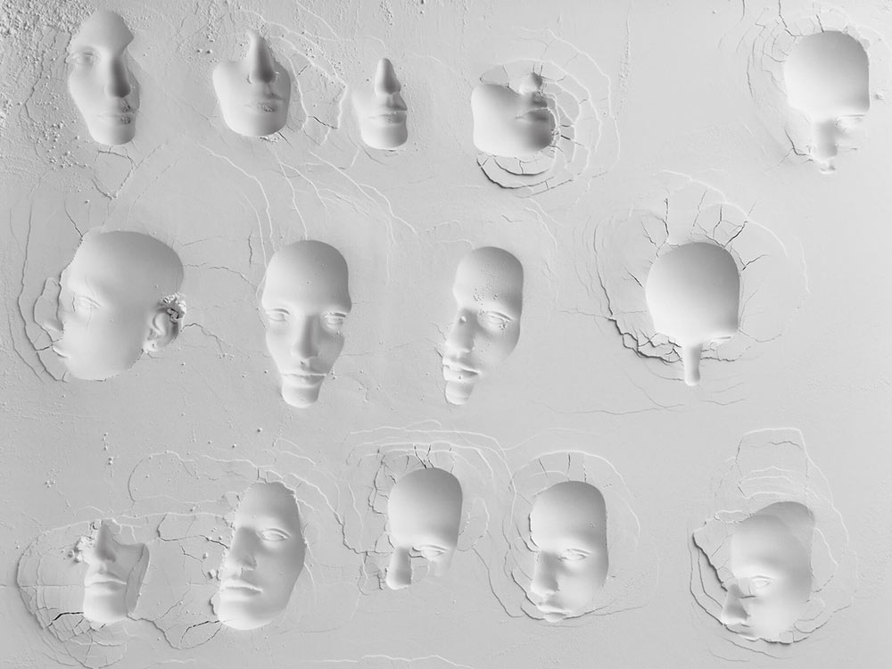
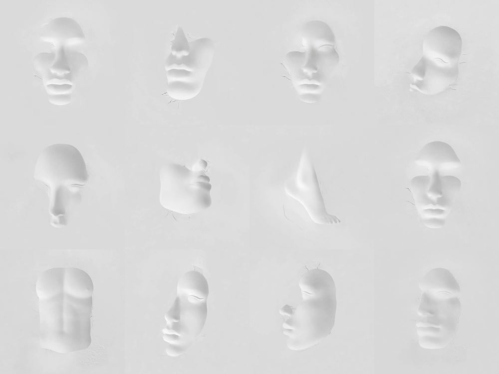
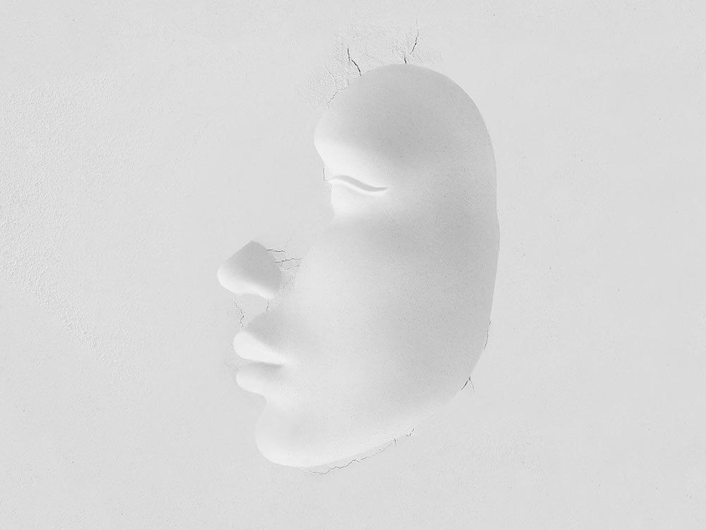
The resulting forms were photographed, culminating in the core brand photoset. The rebrand is a radical departure in the sector. No traditional “spa” images. No complex descriptions. Just the right impression.
Other SomeOne projects on Identity Designed.
More from SomeOne.


Comments
Beautiful.
Seems like a terrible, haunting image, especially on the cracks and wrinkles. It also has white skin, doesn’t seem like alive, and solved. More like a clay, only covering what’s broken, not fixing it.
Wow! Great job, SomeOne.
While this is visually refreshing in the world of branding, and I do appreciate the refinement of the work, it does look disturbingly haunting. Not sure this is the right message to convey…
After the first glance, the branding also fails to tell me what this is supposed to be about and why I should buy into it. The result keeps pushing me away from the actual purpose (or what I understand as the actual purpose). One could argue that the questionability might be intriguing enough to trigger a huge success (and why not, it really could!). I still can’t help but think about a dismembered body immaculately plastered in a white wall.
I have to agree with some of the other posters. The work is refined, artful and clever, that much is clear. Automatically, I wanted to know about the diversity of the users? Pure white sends a strong message, especially when pigmentation was mentioned as a concern in the brief (perfection = white as flour). The design seems isolating and homogenous. It might have been interesting to incorporate a dark skin tone and diverse sculptures instead of a single iteration of the bust. A beautiful extra dark teak color bust might add some contrast aesthetically and push towards inclusion. Of course, this would require some experimentation with the flour mold process. Maybe there are plans in place to do this, and perhaps the procedures offered are tailored specifically to light skin tones. Just some thoughts.