
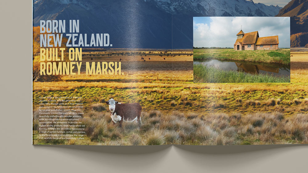
Growth Rings is a UK-based woodworking business that proudly brings almost seventy years of New Zealand saw-milling heritage to the Kent coastline, where they hand craft the finest oak flooring, furniture and homewares this side of Auckland.
As a social enterprise, their dedicated team also provide education and training for individuals who have otherwise been met with barriers to employment, including criminal records, a history of addiction, or low skills levels.
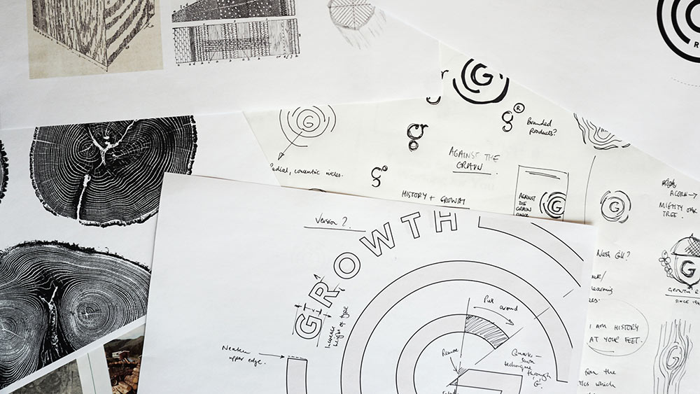 Reference material and sketches
We were approached by business partners Mike Managh and Carl Adams to provide strategic and creative thinking for the brand. We proposed that as their customers occupy some of the UK’s most iconic and historic properties, they begin to transition from a traditional woodworking studio into to an oak lifestyle business.
Following a series of immersion sessions, site visits, and interviews with the owners and trainees, we worked closely with the team to capture the pioneering character of the business. Two benchmarks for brand attitude were identified to guide the creative process: could we combine the spirit and passion of a brand like Nike with the authenticity and heritage of a brand like Jack Daniels, and bring it to the world of oak joinery?
Designing for wood and web
From the outset, it was crucial that the new identity could be physically cut into the company’s bespoke oak products as well as provide easy scaling for on-screen use — something that had proved challenging with the company’s previous design. Aside from functionality, it was essential that the form of the identity also reflected the precision, care, and craftsmanship of the business.

The resulting logo is designed to visually represent the concentric, circular growth rings found in timber, while metaphorically reflecting the growth of trainees in the business. At the heart of the design lies a capital ‘G’, angled to reflect the quarter-sawn technique often used to slice oak timber in order to maximise strength and stability.
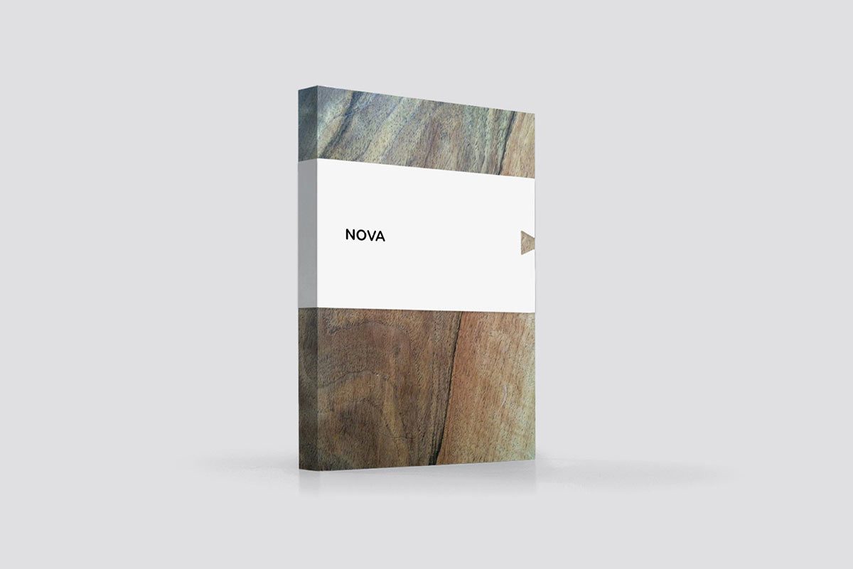
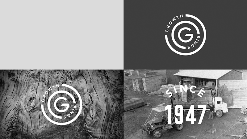 The new logo, designed to work in print and online, is complemented by a new heritage marque
Celebrating imperfections
The collaborative process allowed us to uncover some of the unique stories that helped shape the oak they use in their products. Hand selected from the forests of France, the surface of the wood acts as a rich tapestry of bullet holes, bomb damage, and storm weathering. This provenance — and an ability to find strength in the face of adversity — not only characterises the timber in their products, but also the company trainees, who, equally, have been shaped and strengthened by their often challenging histories.
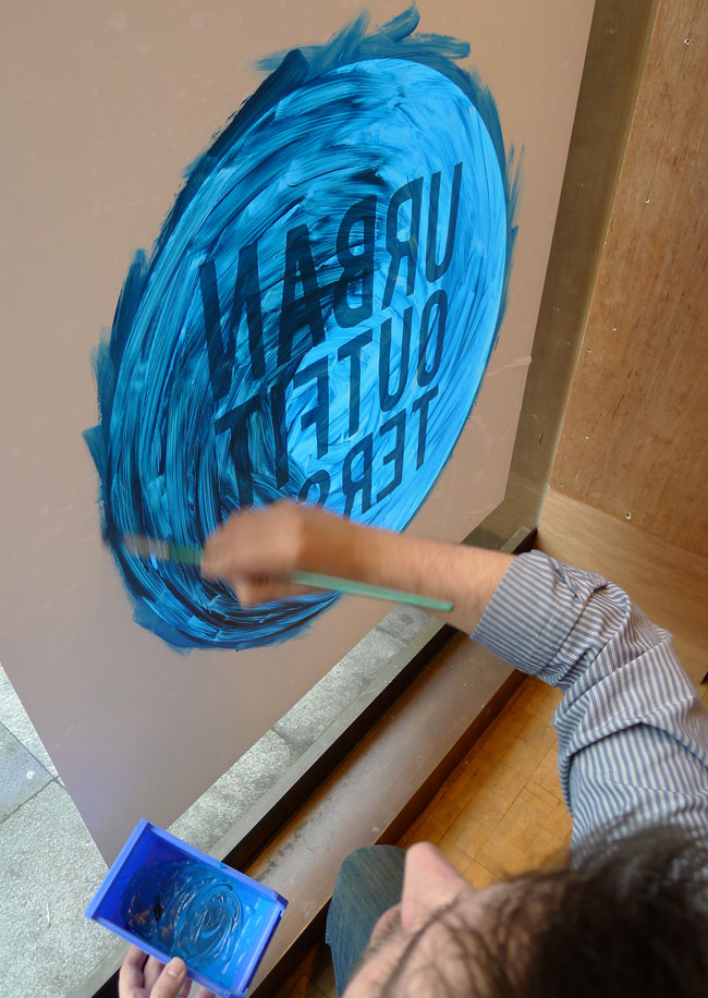
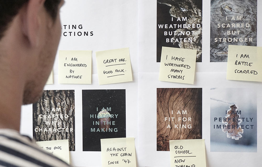 Early development of the messaging that sits at the heart of the brand
We celebrated the imperfections of the company’s oak, and its folk, through a suite of powerful creative headlines and textural photography, designed to personify the character and personality of their people and products. We told these stories using BIG — a raw, condensed display font developed by Bruno Rodrigues and João Miranda. Coming from a series of handprinted wood type specimens, the letterforms not only reflect the era of timber typesetting, but the angular forms also compliment the quarter-sawn styling of the logo.
 The BIG typeface available from YouWorkForThem
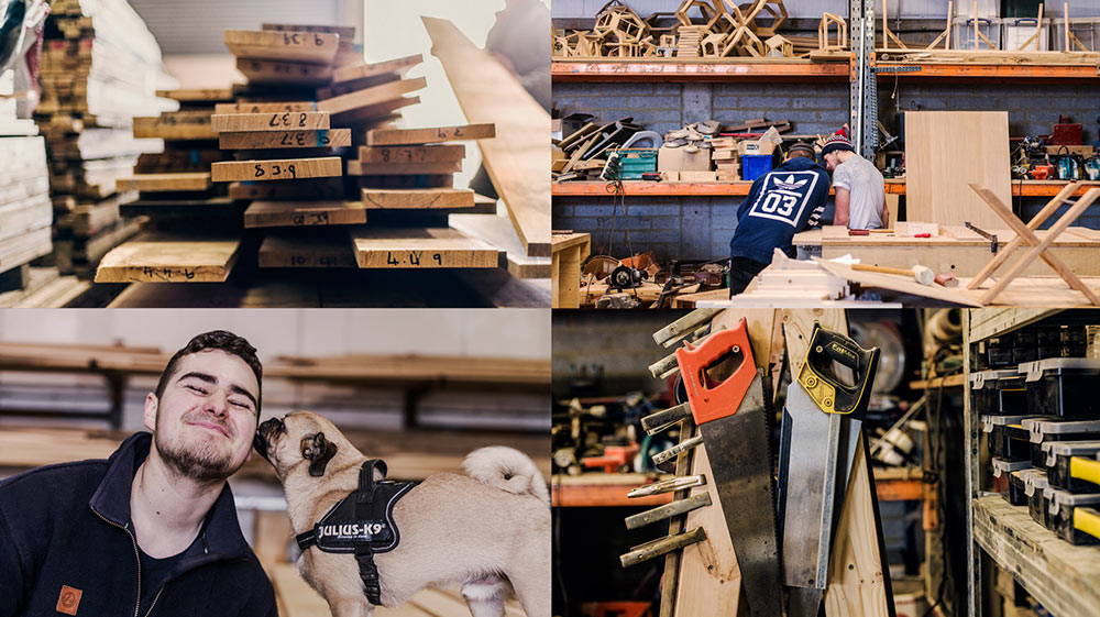
Capturing the stories of yesterday and the team of tomorrow
Alongside textural photography, selected to capture the beautiful imperfections of the wood, we commissioned lifestyle photographers Haarala Hamilton to shoot the people and places that make Growth Rings so unique. These visual assets are supported by a wealth of ephemera and heritage photography from the family’s saw-milling history, all designed to capture the authenticity of a brand that’s gone against the grain since 1947.
 The brand is supported by a wealth of historical photography
 Then and now: nearly seventy years of heritage


The visual and verbal assets of the brand come together across a range of printed materials. They’re aimed at clients interested in heritage oak products as well as organisations and public bodies looking for information on the community interest aspect of the business.
 We commissioned Haarala Hamilton to shoot the people and places at the heart of the brand
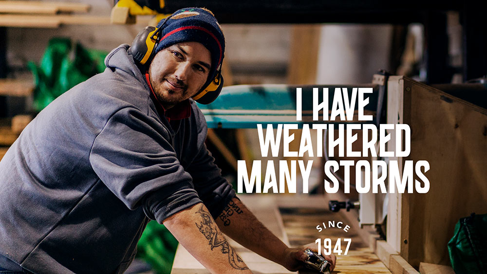

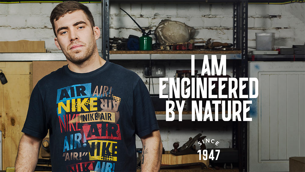 Portraits of the team are juxtaposed with the same messages used to describe the oak
 Labels for firewood represented another opportunity to tell the brand story
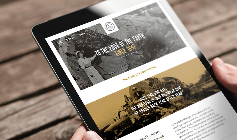 A new website launches this summer with a holding page current live at www.growthrings.net

More from Lantern.

Comments
Awesome branding that caught my eye.
My one thought is to remove the Nike shirt as it distracted from the message.
Love ‘travelling’ around the world and stumbling across another brand story — and particularly love it when NZ is mentioned. Beautiful story — thank you. [Kellie the Kiwi]
The tone of voice here is fantastic – inspirational.