![]()
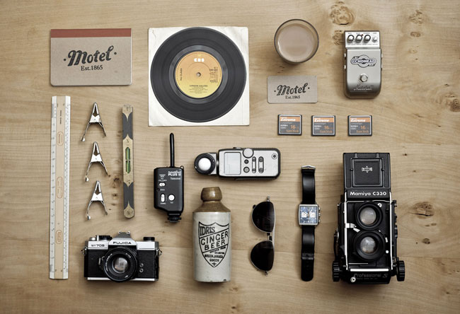
Motel is a boutique photographic studio in the heart of Shoreditch, East London. Located within a historical Victorian railway arch built in 1865, Motel offers a unique creative environment, retaining the industrial soul of the building but adding the luxurious necessities required to be a desirable location for creative professionals.
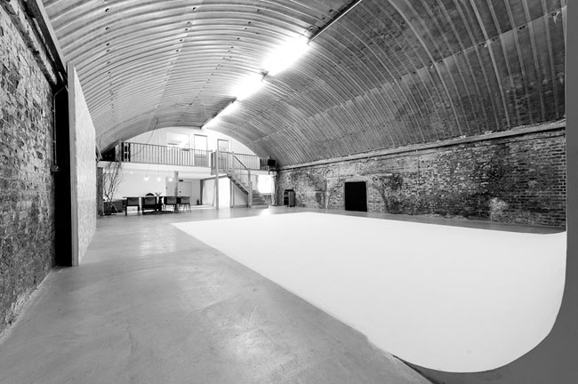
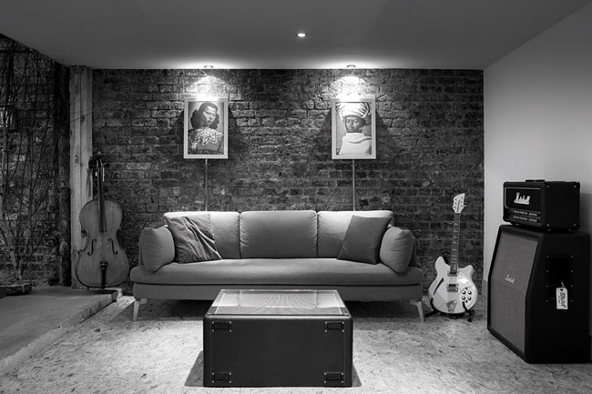

The studio asked for an identity that reflected the character of the local area but also positioned Motel away from the roster of London photographic studios. The primary concern was to maintain a balance between the industrial and the warm and approachable.

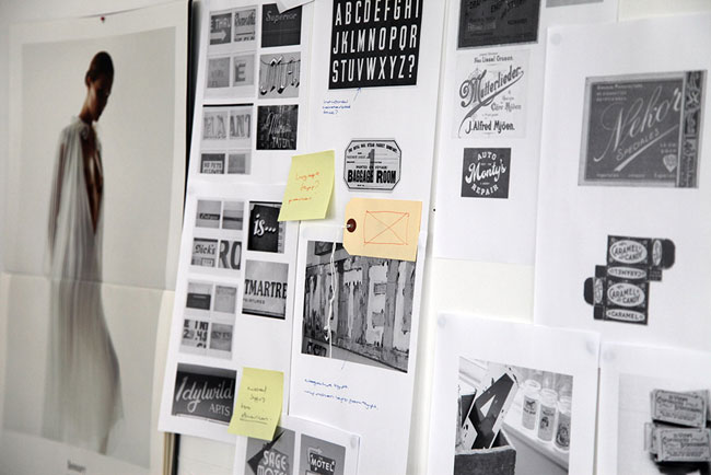
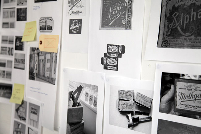
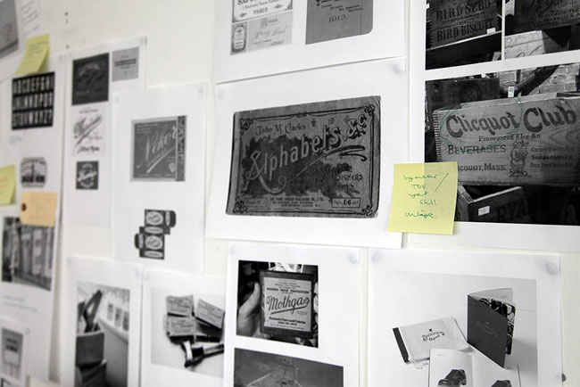
Inspired by old typography found on packaging and signage, the logotype uses a customised typeface that was applied to a stamp, allowing subtle differences in each print. We found the industrial edge we’d been looking for in the typeface Bebas Neue, used in tight typographic blocks to offset the free-flow form of the logo unit.
![]()
![]()
![]()

![]()


More from She Was Only.
Comments
I am in love with this identity set. Clean, simple, and wonderfully executed. A tip of the hat to She Was Only for such great work. Also, experiencing some major design studio and practice envy.