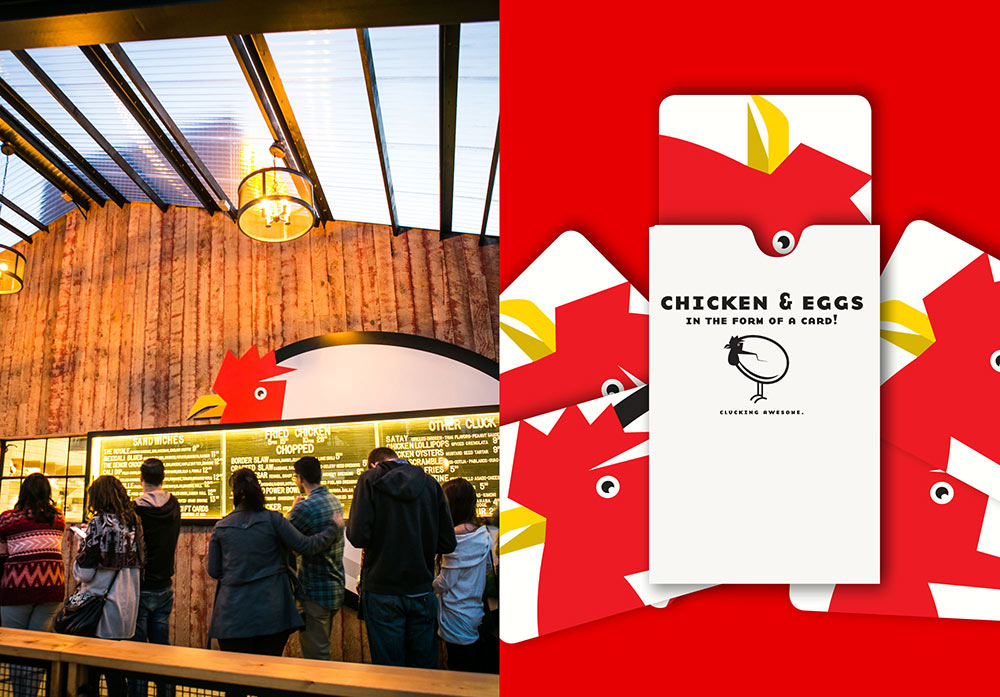
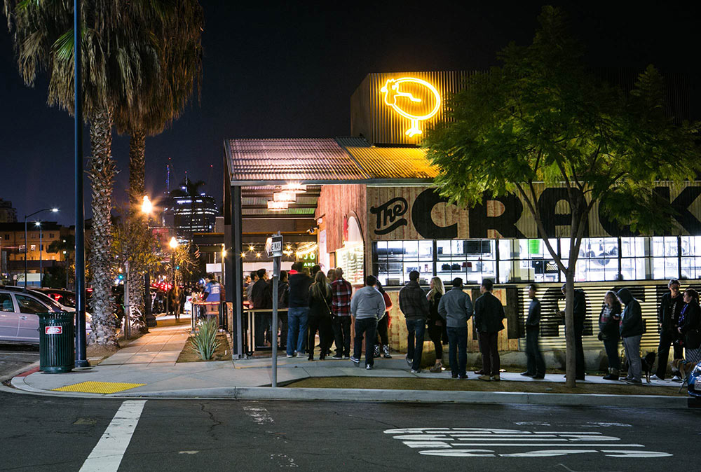
When you get a phone call from a client asking you to work on their new project called “The Crack Shack” it’s a bit hard not to gasp. Now that it’s all said and done there couldn’t be a more perfect name for this in-your-face yet elegant all day chicken and eggs concept in San Diego, California. Located in what originally was, for lack of a better term, a metal “shack” on the back lot of an existing property owned by Michael Rosen of Juniper and Ivy, The Crack Shack is the place we all wanted in our lives but maybe didn’t know we needed.
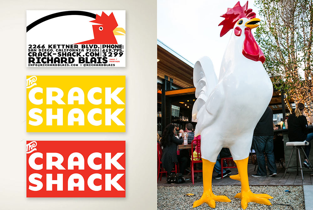
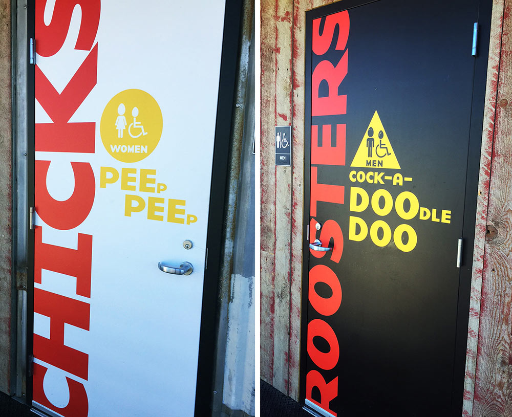
Having worked with Mr Rosen before, as well as Top Chef All Star Richard Blais, who is the chef behind the menu, we knew that nothing is too out there but everything would still be carefully considered. That combination is the perfect branding mixture for us to really have fun. Starting with such an aggressive name that is both fun to say and hear, we wanted to make sure the branding matched up visually to that tone. We chose the ultra thick, heavy letters of Base to capture the sound of the words while the big round shape of the letters gives it a certain eggy-ness. Not to be missed are the two cracked egg shells found in the negative spaces of the “A’s”.

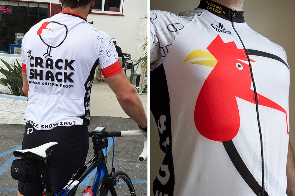
Paired with the logotype is our “chicken/egg — egg/chicken” icon. The goal was to create a logo illustration that answers the question behind the old chicken or the egg dilemma. From our perspective, we are suggesting they both happened at the same time. The final result is our bird-egg who’s staring you down. But in a nice “let’s clucking do this” sort of way that makes you want to eat egg and chicken sandwiches.

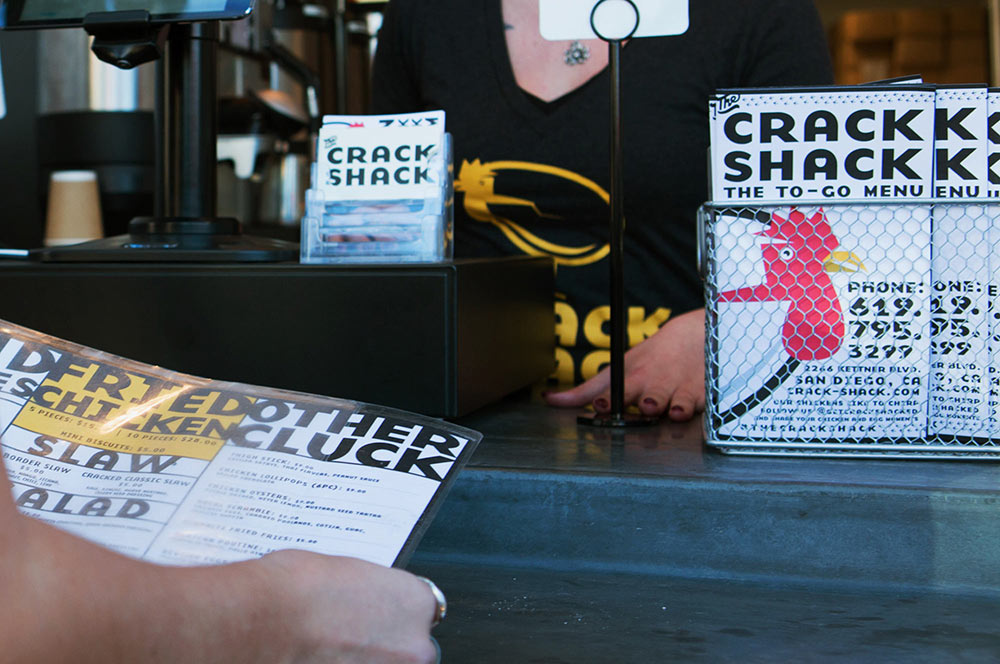
Having such strong character in our egg/bird we carried his face across much of the collateral from tray liners, to cups, to signage, even bike jerseys. His face is pretty much everywhere, making him hard to ignore.


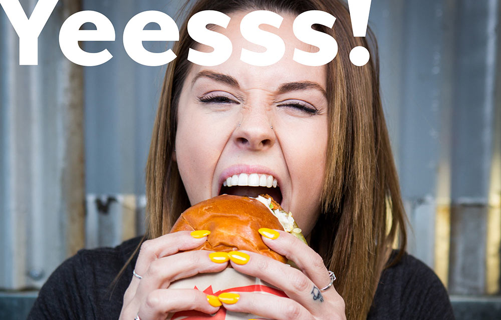
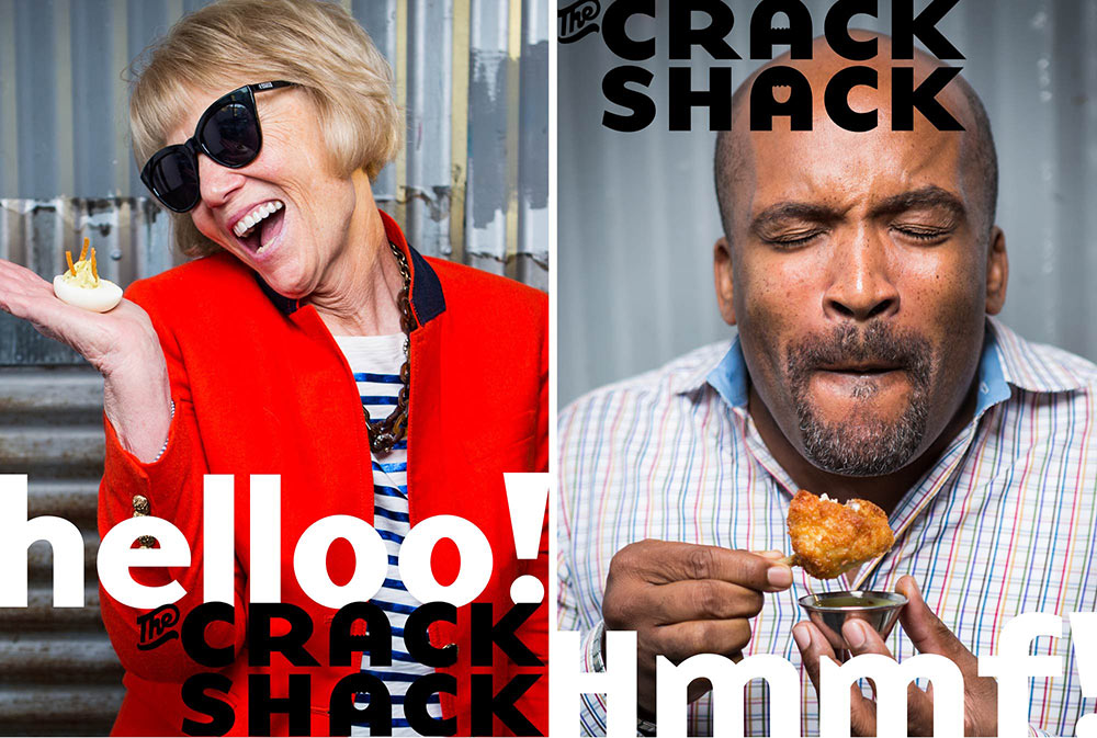
We also had a lot of fun developing a brand marketing campaign around a great photo concept of normal people of varying ages, gender, and ethnicity chowing down hard on some Crack Shack. There’s so much character captured in the faces of these people enjoying great food that we felt the only headline needed were non-words such as “MMMmmfff” and “MMyah!” with the occasional “Hey Now” thrown in for good measure. These relatable expressions, matched with those sounds we all make, quickly tell you more about Crack Shack then any mission statement ever could.

This is a brand that will continue to evolve and we couldn’t be more proud and excited to have been a part of developing their visual and written brand language. Make sure to check this place out, and bring some peeps along with you!


Photography by Monica Hoover.
More from BoyBurnsBarn.


Comments
So much fun!
Cracking job. Love it!
This is how you brand!