
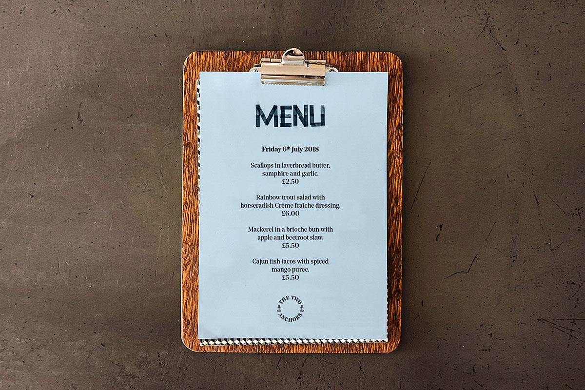
The Two Anchors is a new food concept created by Jonathan White and Phill Lewis. Experimental and ambitious, the duo create new menus every week using fresh, seasonal, and sustainable ingredients. Situated at Ogmore-by-Sea, it embraces the simple idea that everything tastes better outdoors. They take no bookings and have no tables, customers just rock up, buy their food, and enjoy it on the beach. They close for the evening when they run out of food, so the best way to ensure you get your Two Anchors fix is by following @thetwoanchors on social media, where they post their latest menus and opening times.
For all the hard work and creativity that goes on behind the scenes, the end product is really simple: Beautifully cooked fish by the sea. We love what they do and we can’t wait to see where they take their brand next.
![]()
![]()
![]()


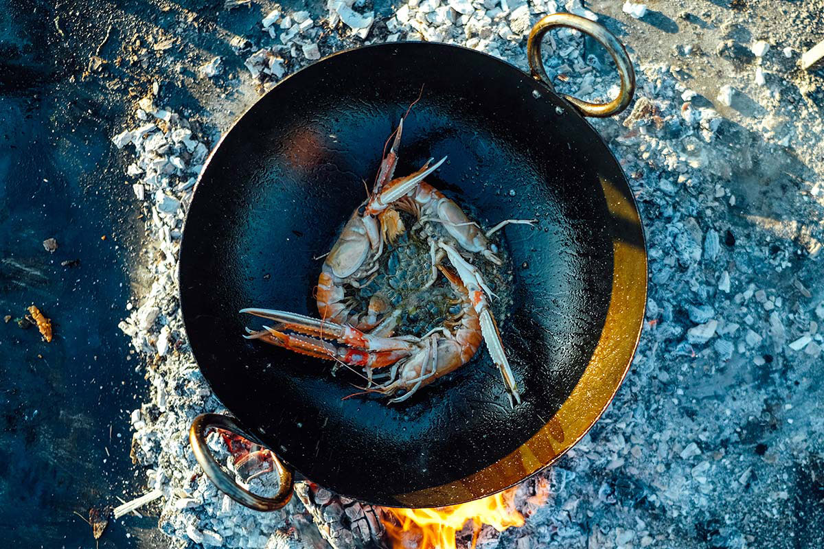
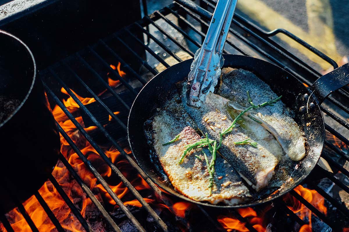
Photography
We had the pleasure of experiencing the whole concept at Ogmore-by-Sea while doing a photoshoot for them. We aimed to capture the fresh ingredients, the skilled cooking techniques, the personality of the people, and the sense of location. Here’s a small selection of the photographs we took on a warm summer’s evening (and more here).


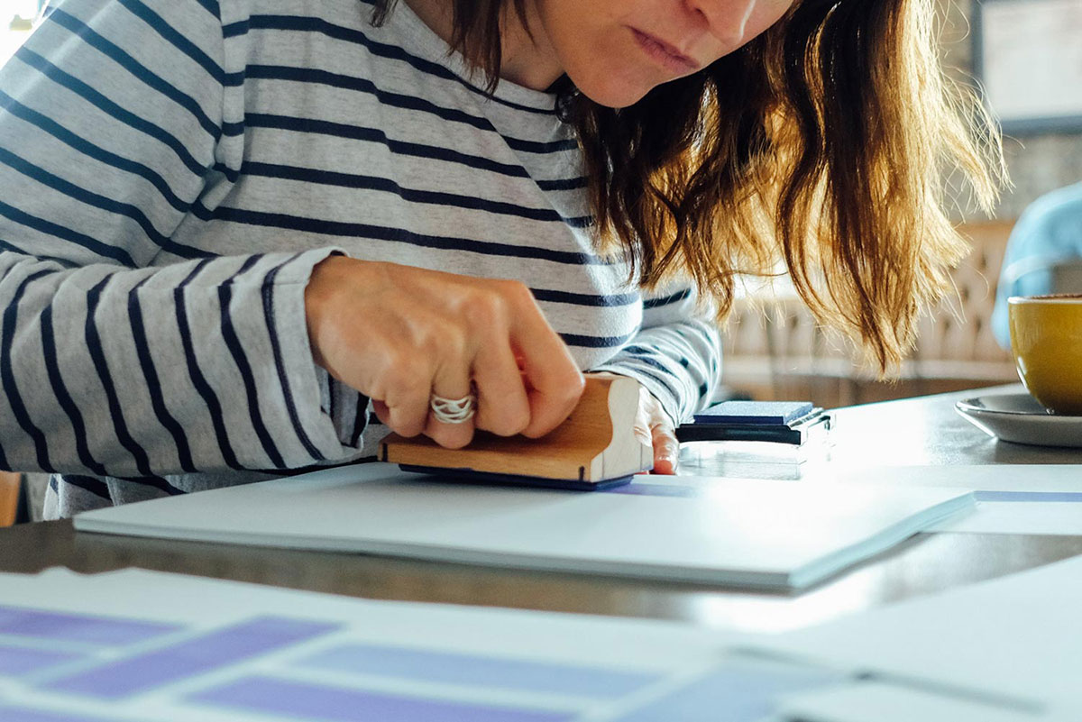
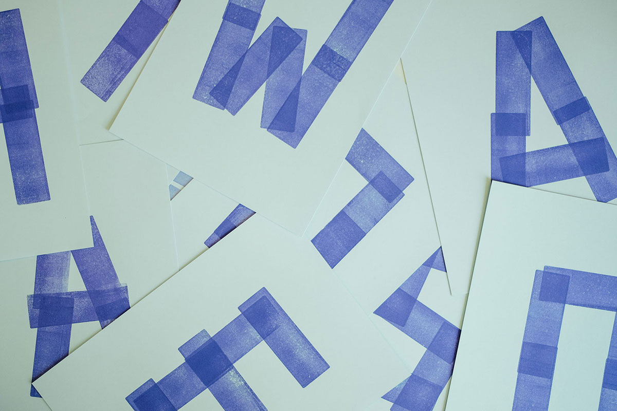

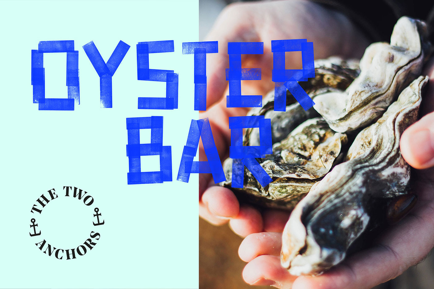
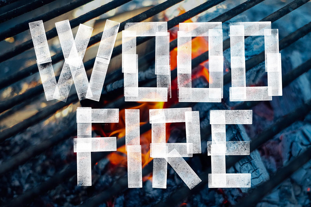
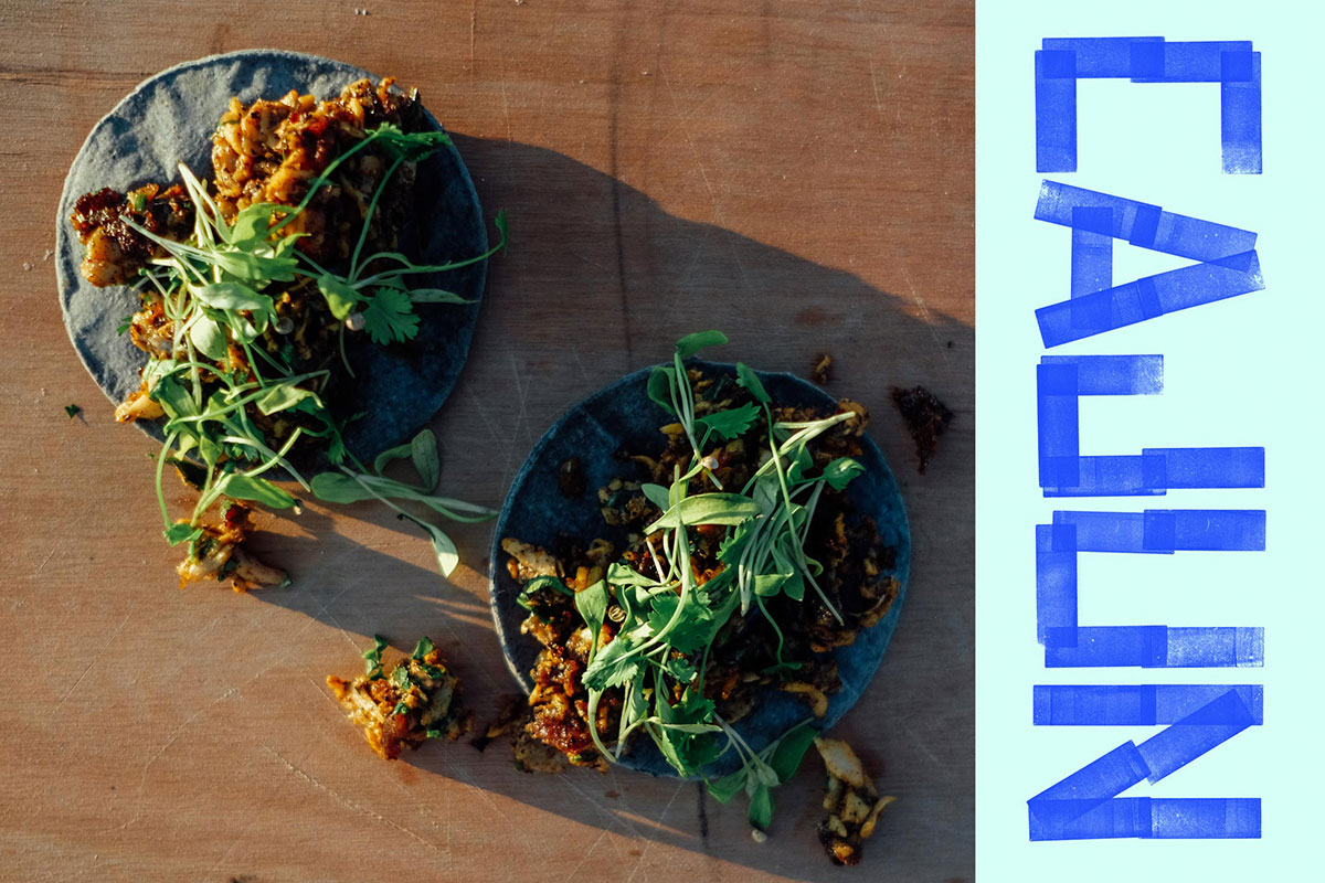
Creating a custom typeface
Inspired by our client’s picket fence set-up and the beautiful textures of their food and equipment, we created a custom headline typeface to help capture the brand personality.
We made a stamp in a similar shape to their picket fencing, and discovered that you could create almost any letterform with just a few prints. Combining the bold and unique lettering with the gritty textures from the stamp created a result that represented the sustainability and honesty of the food concept. We named the custom typeface Ogmore by Sea (after the beach at which the food is served), and paired it with Noe Display by Schick Toikka.


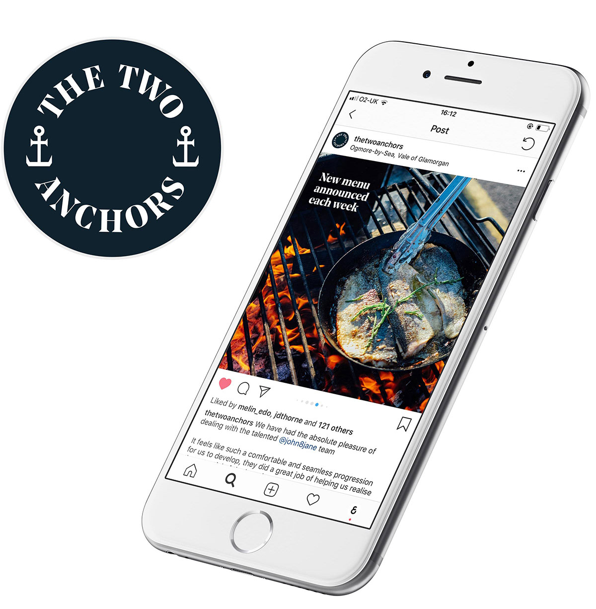
Social media
Apart from face-to-face, the way The Two Anchors communicate with their customers is through social media. So we wanted to ensure that the quality and personality of their brand was accurately and consistently represented through the posts on their social presence.


More from John & Jane.


Comments
Absolutely stunning, on every level.
Captivating typeface filled with personality and authenticity just like the brand and its identity.