
TypeCon, the annual convention of the American Society of Typographic Aficionados, is one of the largest and most significant events in the international design calendar. For its 2016 conference in Seattle, WA, we were invited to design the visual identity.
In response to the title of the event, Resound, our solution was to produce a modular visual system that would have both impact and coherence across a wide range of applications. Working with a deliberately restricted palette of typographic forms and colours, we developed an extensive series of visual hierarchies that were modulated as the direct result of differences in textual content. In individual applications, separate levels of information were emphasised or diminished as required within predefined constraints.
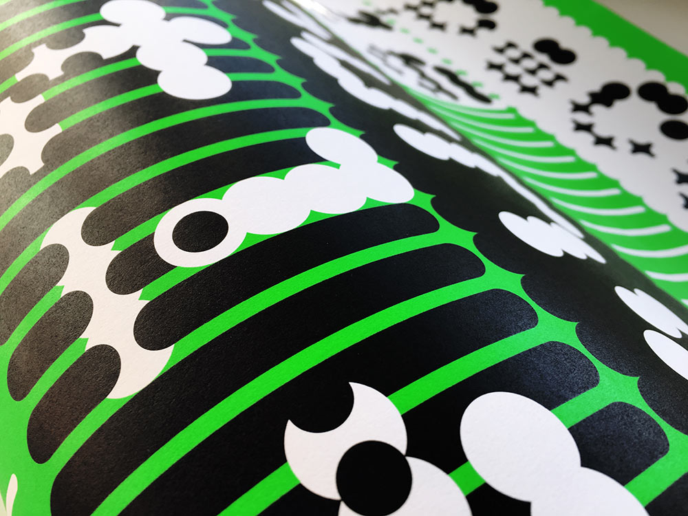
The visual system was generated from a set of typefaces and corresponding background panels developed specifically for the project. Our TwoPoint and TwoPlus type systems consist of 76 parametric base fonts that can be manipulated in layers to provide over 5,500 possible typographic configurations that are unpredictable and remarkably variegated in their appearance.
The result of their implementation for TypeCon 2016 was a flexible but instantly recognisable identity whose bright colours, clean geometries and ambiguous relationships of form and counterform playfully engaged with notions of legibility and taste while also reflecting on the modular foundations of traditional and contemporary typographic form-giving.
 Poster printed offset litho in black and neon green, 89x60cm.

 Programme printed offset litho in black and neon green, 254x110mm.
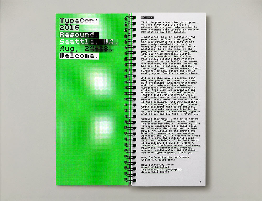
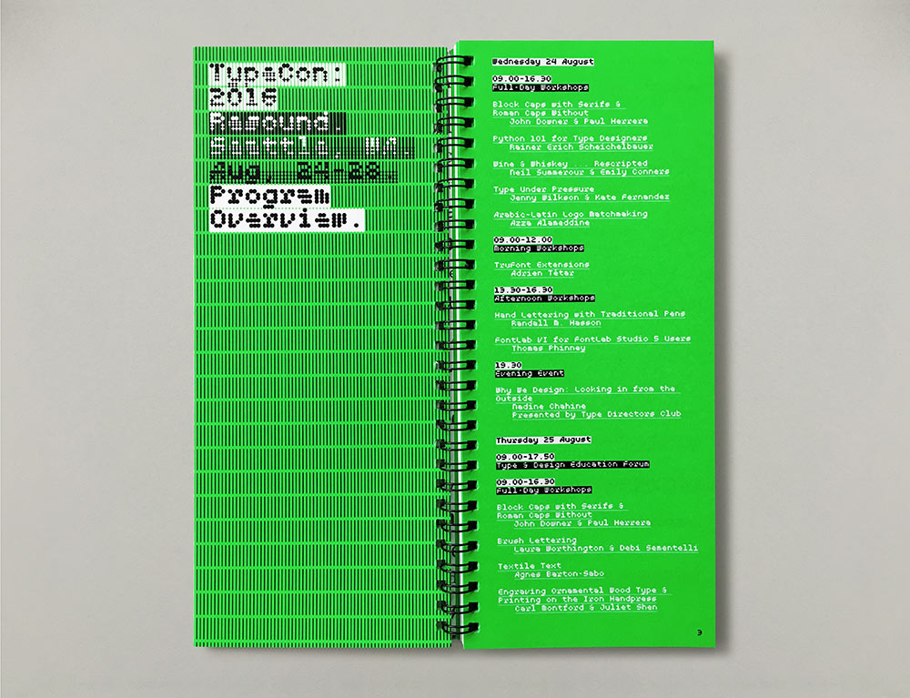
Using MuirMcNeil TwoPlus typefaces throughout, a consistent information hierarchy is applied at a macro level to the front cover and section divider pages and at a micro level in text.

The TwoPoint and TwoPlus type systems are available at www.muirmcneil.com/shop.

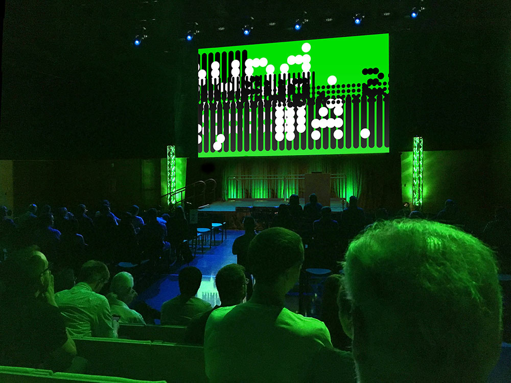
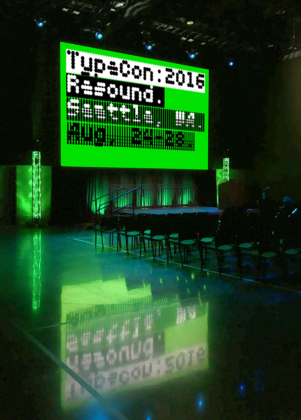 Conference title frame at the Amazon Doppler Tower, Seattle WA.
 Intermission video still.
The timing of frame motion for text elements, foreground panels and background panels is programmed in increments proportionate to the dot pitch for each font size used. As a result, the animation is a product of the text content itself.
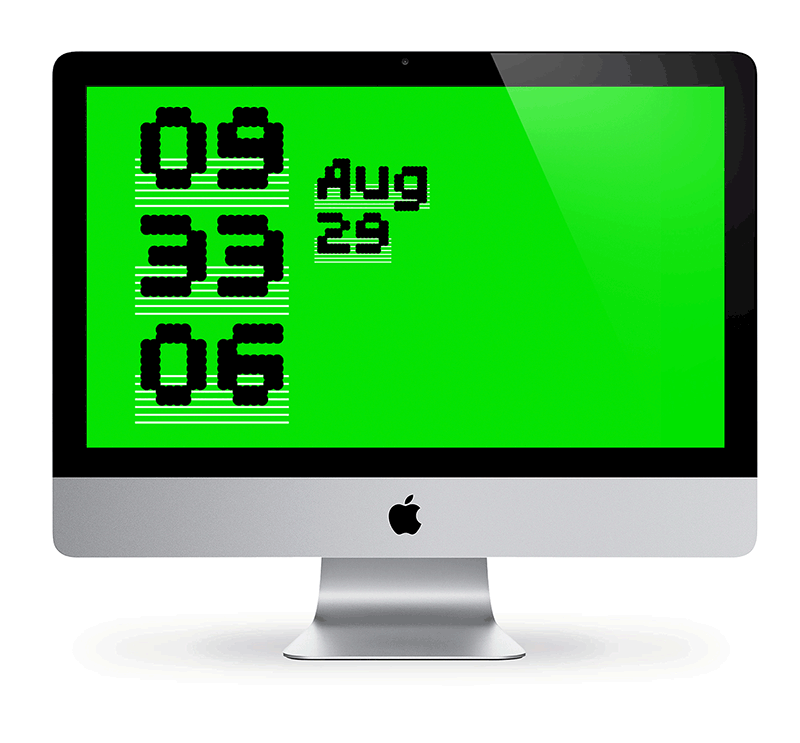 Desktop clock for TypeCon 2016 using 66 typefaces from the TwoPoint and TwoPlus systems.
In two precisely registered layers, fonts for time, date, and background panels are programmed to change randomly every minute. With layer colours reversing for am and pm, this results in over 8,000 possible overlay combinations.
 Gobo at the entrance to the auditorium.

 T-shirts for delegates (T) and volunteers(V).
The TypeCon 2016 identity uses a flexible visual system across all applications. Instead of employing a fixed logo, the typographic hierarchy responds to content, context and media. Visual emphasis is controlled through relationships of foreground and background elements across the identity to generate a rich and varied palette of weight, tone and texture. All visual components are constructed with glyphs from our monospaced type systems, where a common grid determines the shapes of all letter contours, background panels and spaces, allowing every form and counterform to align precisely.
![]()
See more from MuirMcNeil.


Comments
I would expect a conference like this to celebrate the future. Instead, I see a design akin to Wired magazine in 1995: neon colors, overprinting, buttons, “digital” fonts. This is how the future looked 20 years ago and it fails to inspire me.
Christian, TypeCon celebrates the past, present, and future of typography, type design, and all of its related crafts and arts. Developing a singular identity to encompass all of those aspects accurately would be a folly at best and next to impossible, regardless. While I appreciate that MuirMcNeil’s identity did not “inspire” you, it absolutely captured the energy and dynamism of Seattle’s creative community.