The old XL Group Plc identity didn’t reflect their new purpose: to unleash the world’s capacity to advance. As XL CEO Mike McGavick puts it:
“There is no progress without risk. In an environment where change is accelerating and risks are multiplying companies need strong, innovative partners to help manage their risk. We tackle risk, unleashing our client’s and thereby the world’s capacity to advance. Our brand clearly sets XL apart as the strong, innovative partner needed in today’s market.”
We do a lot of work in media, which always seems sexy. Insurance? People in the studio weren’t exactly fighting to get on the case. It took only very few conversations, however, with some extraordinarily imaginative and gracious people at XL to realise we were working with a super-smart, tuned-in and truly progressive group of people. These people aren’t just trying to predict the future. They’re shaping it.

We quickly got to know the XL spirit, daring and client-devoted attitude and summed the XL brand up in one line: “Make your world go.”
“Make your world go expresses our passion to help our clients deal with the increasingly complex and fast changing world.”
— Mike McGavick
‘Make your world go’ is a statement and a promise from the XL Group companies to their clients. Because the biggest changes in the world, moving things from ‘stop’ to ‘go’, often involve the biggest and most complex risks: the XL Group companies’ forte. As the planet looks to find new technologies, sustainable energies, faster, more efficient ways to do business, XL Group companies are asked to cover risks that no one has ever covered before.
Standing out in a world of blue
Although the XL group stands out through quality and responsiveness, their historic brand, built around size and stability, was in danger of blending in. In a world of risk, it was time to take one themselves.
It’s a risk to change and stand out. But the biggest risk would be to stand still. We didn’t just want to make XL stand out from their competitors though. They deserved to move to a whole new neighbourhood: the activist and thought-leading brands that are changing the world. When it came to the visual identity, we wanted to stay away from the staid grey, blue and burgundy of the insurance colour palette.
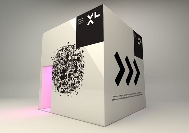
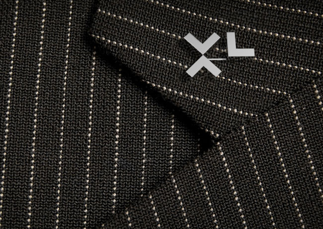
In a nutshell, we focused on making everything bold, pure and cool. The new logo and identity positions XL as a company not just ready for change, but leading the way.
XL celebrates its 25th anniversary this year. Looking to the past, there’s a great deal to celebrate and take pride in. Looking to the future, there are plenty of exciting times ahead.
What did we do?
First, we investigated and articulated what the XL Group companies do for the world.
We pinned down an exciting and truthful position that truly reflects XL, and distinguishes them from the competition. From this, we developed ideas to change the business.
- Like consolidating the different areas of the business, including insurance and reinsurance, so that they felt like one solid brand.
- Writing, designing and animating a four minute movie encapsulating the history of insurance, its importance to the world and showing how the XL Group companies are placed to create new history, now.
- From industry experts to the biggest thinkers of today, the XL Group companies should be the place where all these minds come together.
- Pinned down a tone of voice to make sure that the words used were as distinctive and positive as the new look and feel.
We created an identity to make it live.
- A powerful bold, cool and pure look that sets them apart.
- A new logo that stands for new ideas, precision and constant movement and dynamism.
- An advertising campaign to launch the new brand.
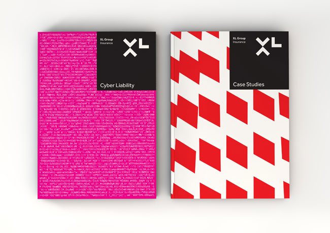
- A literature system, including product sheets for more than 60 different products and services.
 Old XL logo (above left) and new (right).


We built a platform for launch.
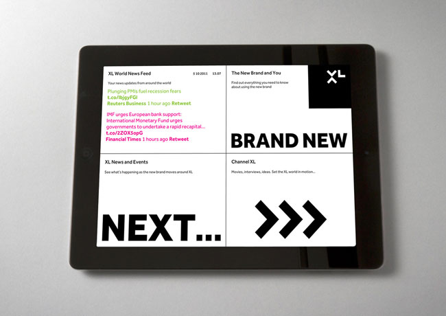
- We built a microsite for the internal launch that holds all the information about the new brand: movies and interviews, toolkit and ‘how to use’ information, as well as details on the events that were part of the rollout.
- Wrote and designed an online and print ‘brand book’ for everyone within the XL Group companies to share.


venturethree elsewhere on Identity Designed: Little Chef.
More from venturethree.

Comments
Job well done, very nice indeed.
I saw this on Brand New and absolutely loved it. Such a bold mark that definitely leads the way in the sea of competition. Very serious and trustworthy. Nicely done!
Just a comment that might surprise you: I recognize this as a british design: geometric, bold colors, clean sans-serif typography. Being from Germany, I admire the cleanness I find in packaging and print (in general) when I visit Britain and this design definitely has these qualities, too.
Grand brand work. Bold and intriguing.
Now this is stunning. I love design like this that just goes ‘BAM!!!’ and gets you then and there, no questions asked, and this does it for me. Sure, I wish the ‘X’ arrows crossed over to make a conventional ‘X’ glyph, and yes the ‘L’ could be a little taller, but that doesn’t matter. It’s all about it being a strong mark, and being such a strong one like this, its bold and straight-up about things, kicking aside the conventional glyph shapes we’re used to. Almost abstract in a way too.
Excellently executed, and like @Christian has said, very British, very clean and well thought out.