
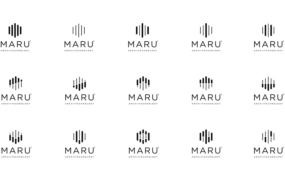
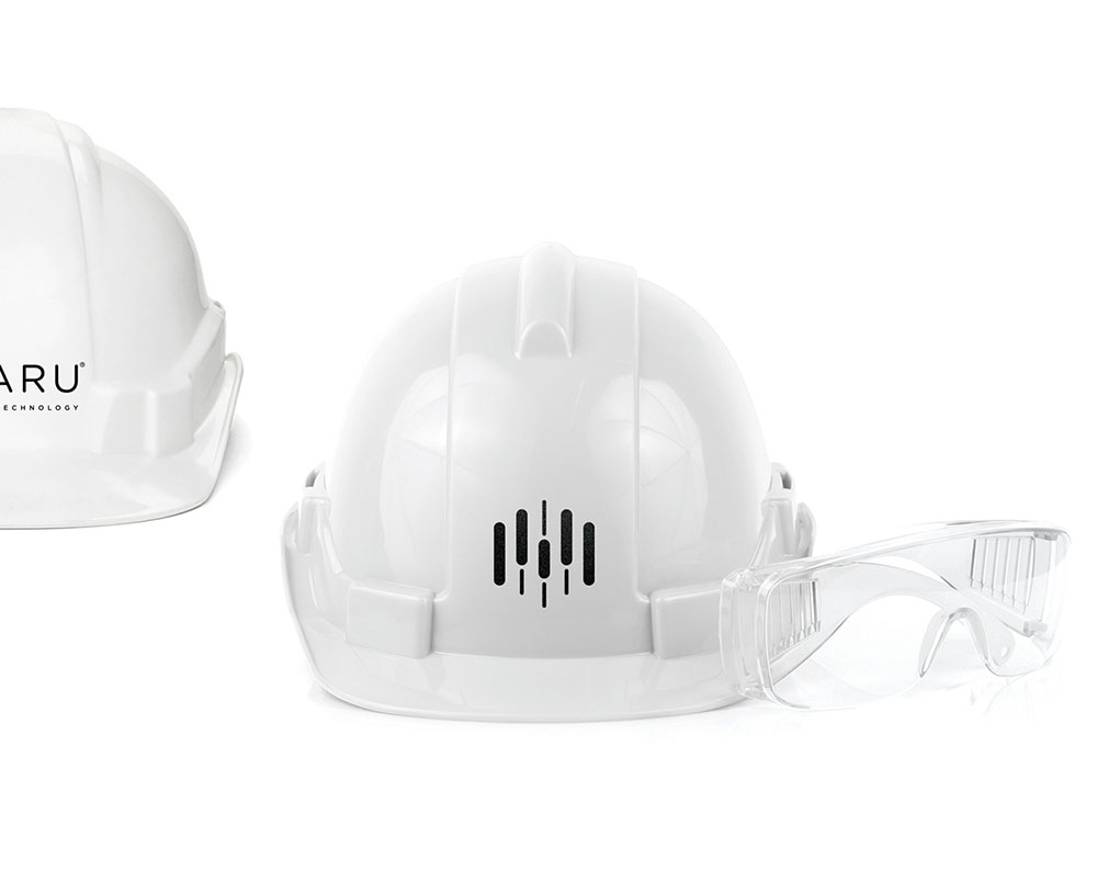
Maru means “perfection” in Japanese, and the architectural firm that adopted the Maru name is out to do nothing less. Maru offers a new perspective on how we look at the structures we live in. Ultimately, this notion was reflected in the branding work, too. A look that is modular, simple, and applicable was created to live up to its name.
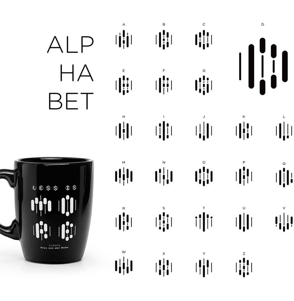
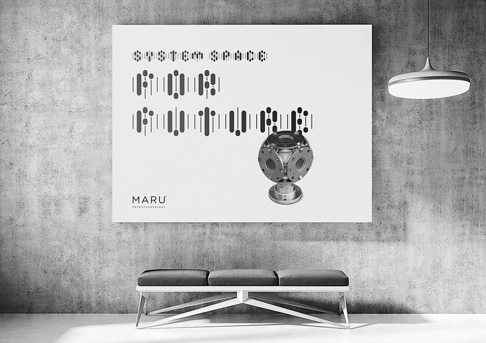
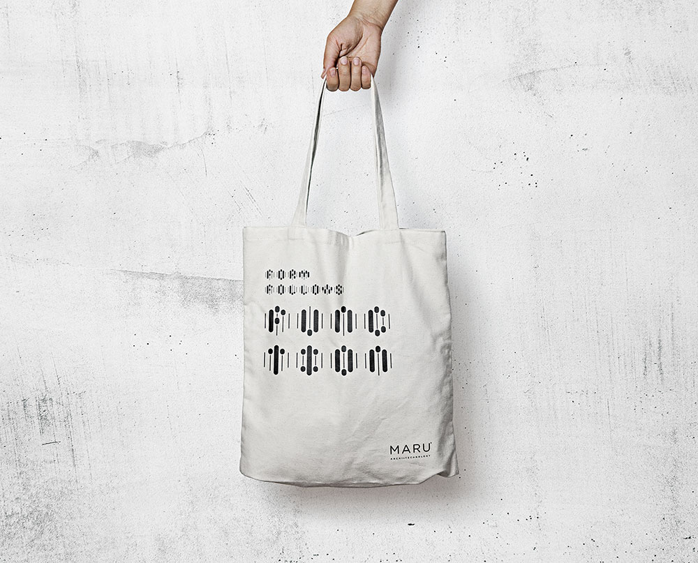
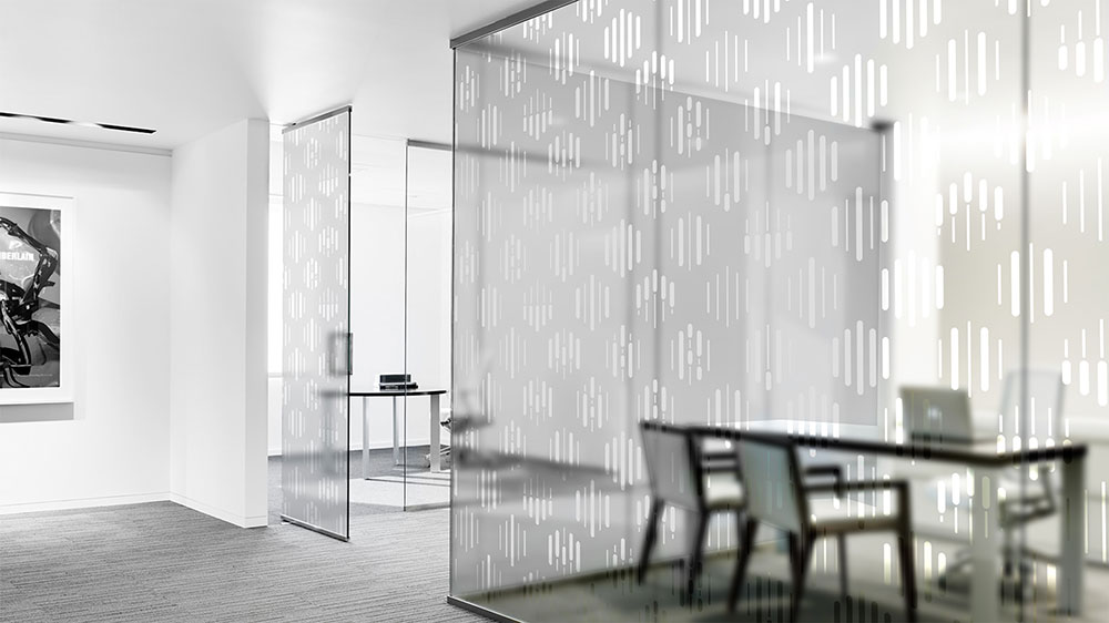
A five-piece isometric grid creates a legible typeface including numbers and infographic icons. And a mobile app that reads various shapes created within the system was developed to enrich the experience for architects.
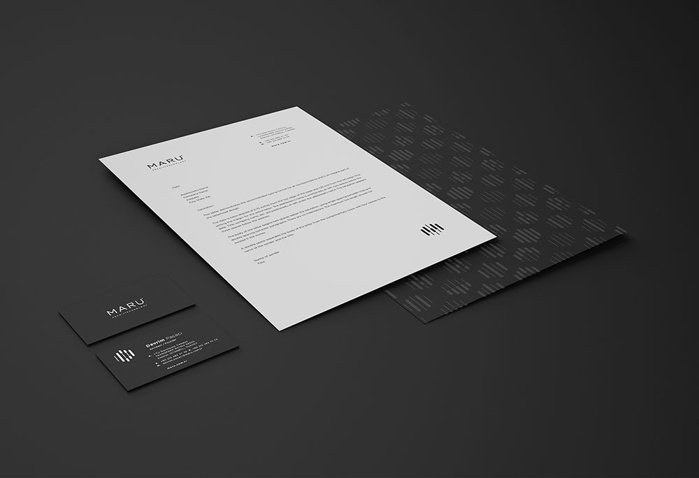
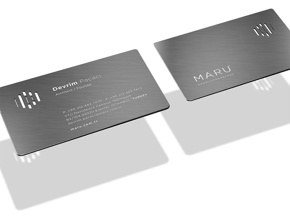
After settling on the grid, we realised we could create a legible alphabet and numbers within the isometric system. That, of course, gives room for further personalisation and customisation of stationary assets such as business cards and name plates, shown further below.


 Mockup design by Damjan Stankovic


More work on the Ogilvy website.

Comments
Brilliant work! A brand language design that can extend and create great customer interactions. I love it!
The legibility and versatility of this system is impressive. So much is possible within the confines of these lines! It’s both elegant and industrial.
This is ridiculously brilliant! Agree with Tori, the simplicity and versatility is incredible! So good, and so well done.
This is absolutely great — smart, flexible and powerful!
Amazing work, I really like how bold, clean, and mysterious the brand is.