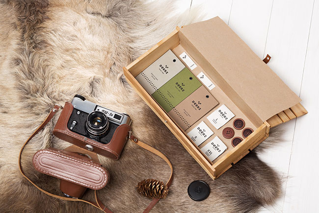
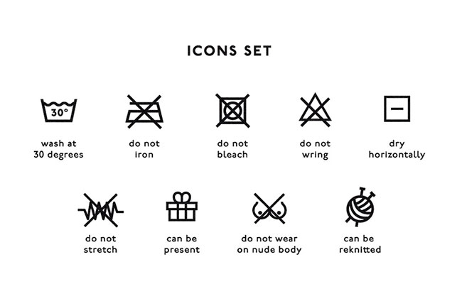
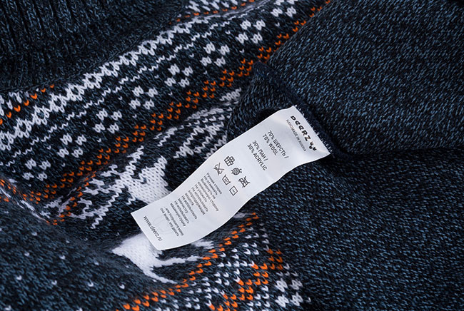
Our rebranding for the online store Deerz. The main range of goods are sweaters and pullovers with Scandinavian patterns. Our task was to create a monochrome logotype with a unique symbol and typography, able to adapt for a wide variety of goods. The project also included the creation of the cloth tags and buttons, etc.
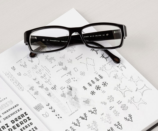
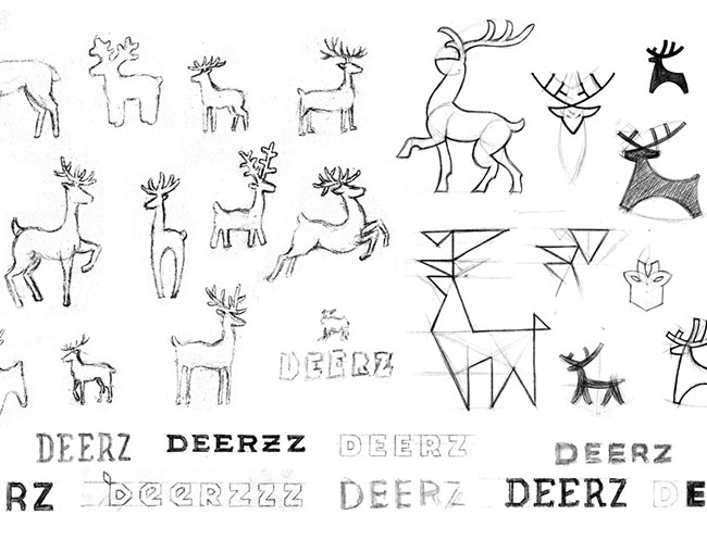
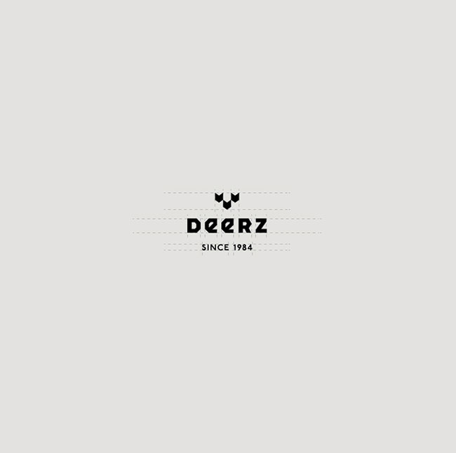
Work began with a search for the graphic style of the logo. Detailed versions didn’t initially meet the task at hand. So the search concentrated on more simple and significant forms. As a result, the symbol is a deer head made of three pairs of stitches. An additional element (a deer hoof) has the same graphic as the main symbol and can be used in different situations.

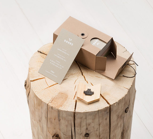
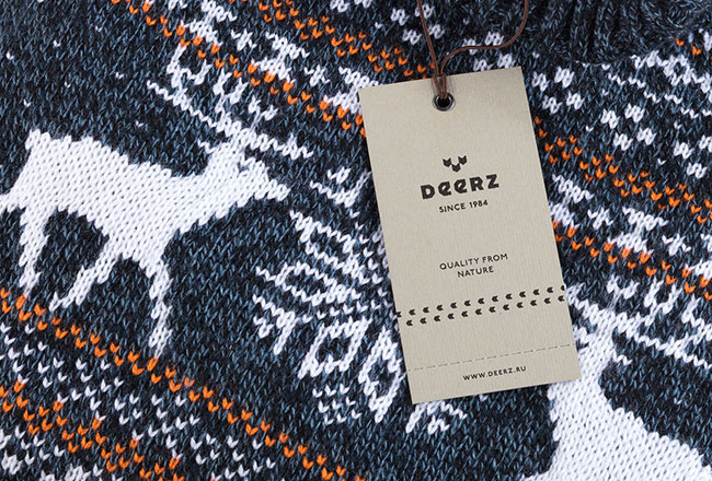
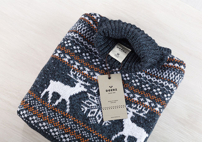

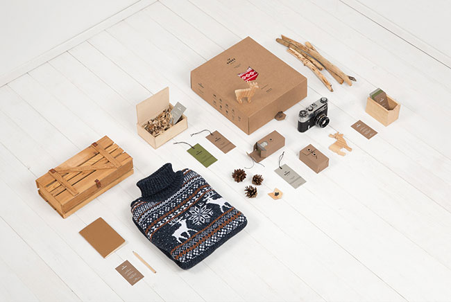


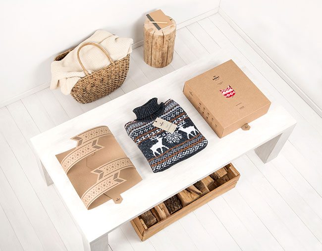
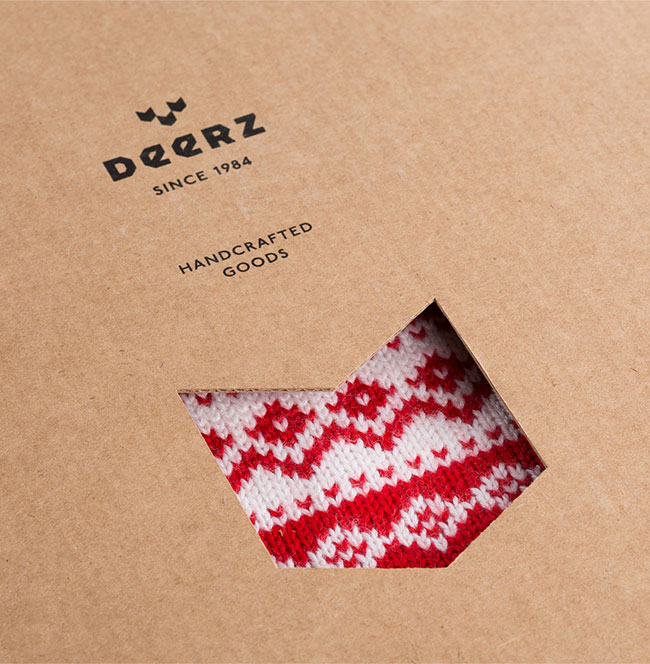
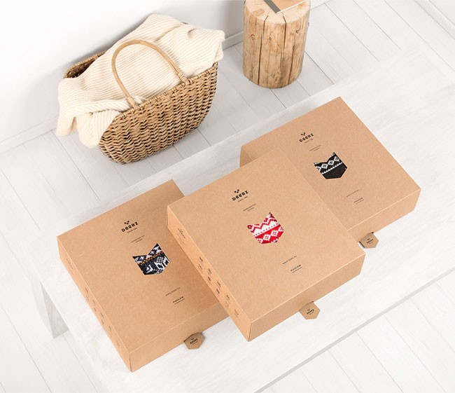
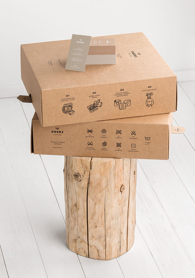
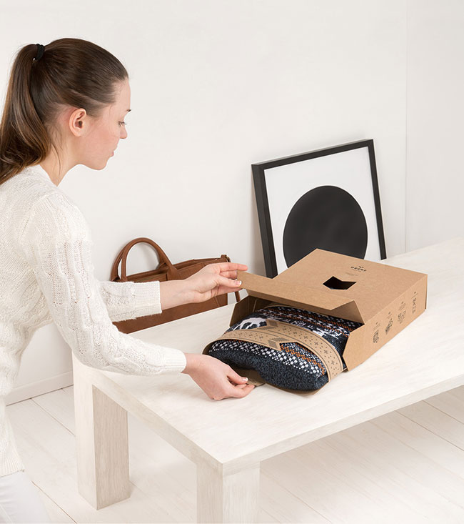
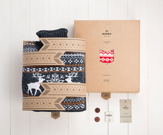
The packaging is made of micro-corrugated cardboard with a die-cut hoof, through which you can see the goods. The inner part is without glue due to the dovetail partition, and looks like the deer is hugging the sweater. To extract the inner part you just need to pull the “deer” by the tail.




Printing by F61 Work Room.
Paper stock
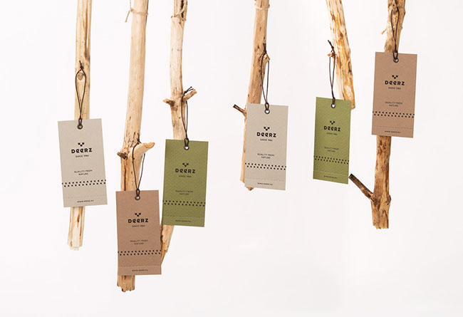
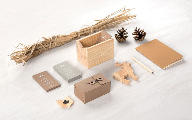
Labels: Murillo 260gsm paper Brown, Medium Grey and Olive green.
The package box: micro corrugated cardboard.
Inner part: uncoated cardboard.
Credits:
Eskimo design studio
Art director: Pavel Emelyanov
Manager: Denis Gluschenko
Photographer: Anatoly Vasiliev
Photo set: Pavel Emelyanov, Maria Sinutina
Deer photo by Ray Hennessy.

Eskimo elsewhere on Identity Designed: Monster Milk.



Comments
Beautiful, but too much package for a simple sweater.
At the end you finish with a cardboard box that goes to heavens trash!
Looks more like the designer really wanted to make the box, just for the pleasure to do it rather than real functionality.
That package design… wow.
I really like the final logo for this brand. Using shapes to represent a deer is great. I also really like how detailed the logo concepts were with the sketching and it makes me want to step my sketching up a bit. The overall look and feel of this brand is very welcoming and makes me want to buy a sweater.
Beautiful! Just beautiful! But agree with David here, too much packaging which is going to be trashed!
Super slick presentation, the art direction is great! It certainly gives an impression of high-end Scandinavian design. I’m in agreement with the comments above though, it does seem a bit indulgent on the packaging front.
The remarkable amount of effort that went into art directing these images overcompensates for what is a actually very nicely executed identity.
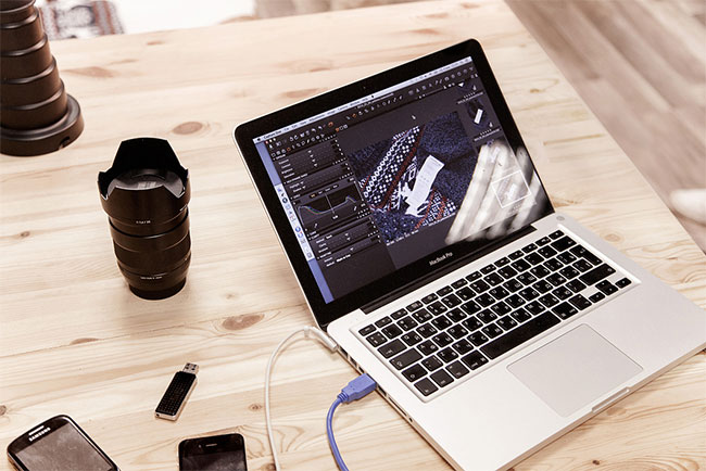
Straw bundles, pine cones, random buttons (for jumpers?), cameras, lenses, pencils, glasses, logs, crates, baskets, deer hide, headphones – and we’re now photographing ourselves photographing our work? Beautifully done, but it hides the actual work.
Love it, love it, love it.
This work is exactly what I think of when I think ‘branding’ and the reason I love to take on branding briefs myself – here is a product or a service and the brand is a perfectly harmonious extension of it.
In terms of the presentation of the work on this site, it’s always really nice to see the thought process and initial sketching.
Wonderful, especially the sketching and packaging.
The way the logo and the typography use the same kind of shapes is brilliant, ties the logo and the word mark together nicely. Great overall feel to the branding with some beautiful photos.
Although that sketch book looks far too neat to be the genuine brainstorming outcomes, looks more like a staged sketch book for the sole purpose of keeping all these photos neat, so I wouldn’t get too hung up about it Josten.
Awesomely done. I disagree with the comments about the packaging mind. I feel the idea behind the packaging is that it’s more of a gift box than waste, and it’s card so I’d like to think people aren’t silly enough to avoid recycling.
Very well put together, and the shapes mix well with the product.