
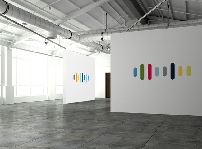
A reductive identity indulging texture to express the name, mark and family history of one of the preeminent, modernist architects in Austin.
Clean-lined and carefully tooled, the work of Michael Hsu’s office appears [to us] to rely heavily on pitch-perfect texture and material decisions rather than grand geometric gestures. This identity echoes his style and principles.
There is almost always an economy of form — like a minimalist — in Michael’s work, coupled with a sense of judgment about color that is geared to be memorable. Therefore the identity is as reductive as possible, indulging texture in a way we’re rarely allowed. This was an opportunity to express his name and mark in the same way Michael expresses his client’s needs and desires. Double and triple letterpress, raised form and highly-structured typography, relying on minute descriptive tags, allowed us to speak with his tone, but in a much smaller amount of space.
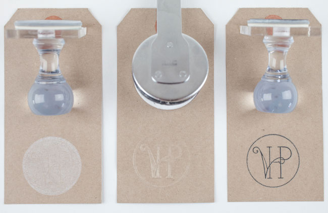
 The seal [or yìn] is his family name, from a marble block given to him by his father. The Hànzì characters in this worn marble, while beautiful, were updated in a clean and completely redrawn logogram.


We connected Hsu’s modernist underpinning and apparent lack of dogma with Tschicold and the Sabon typeface. Tschicold understood that the real value in modernism was structure, hierarchy and repetition and did not simply endorse the style and trappings.
It’s paired with Minuscule, designed for uses below 6 points, which was the only way we could create matter in the system that would establish order and hierarchical relationships and remain legible.
Contrast of a roman face with chinese yin. We chose to follow a traditional western typographic motif and press the traditional eastern yin to be as modern as possible, reveling in the dichotomy.

Graphic yin is carefully crafted on a rigid structural system based on the original marble stamp yin. The system is rigorous, with clear rules about when to radius an intersection and when to pass the form along and through another line/figure.
Yin is always treated as a physical object. it must be created with thickness, mass, or material, never simply inked or painted onto a surface. This was a self imposed rule that we felt honored the physicality of the original marble stamp. The stamp itself is far more interesting than the mark it leaves behind, and we felt the graphic yin should honor this idea.
A rigorous grid controls each element of the system, which in turn allows the pieces and lettering to float.
 The print matter runs a double letterpress with only one yin inked, the rest left pressed for the sake of texture.

Equity — the yin identity was placed on a graphic equity scale, helping us explain to the client visually what we hoped to achieve, and where we believed we had to be the most protective of the yin and where we could afford to play with it and experiment.


Sissy designed a custom “ffi” ligature, which does not exist in the Sabon typeface family.
The client entered into the project leaving the choice to use or delete the yin open to dialogue. We fought for it’s value, seeing its unique qualities and cultural cache as an asset in a Texas marketplace and the US in general amongst architects.
A second version of the yin was developed, using the traditional Chinese form but rendered in roman characters.
Dozens of versions of the yin were drawn and redrawn, to get the form as accurate to the original as possible, yet as contemporary and reductive as possible.
The blind letterpress pattern in the brand announcement is mirrored, flipped, and offset to create the most richness and diversity possible.
All the pieces of the Hanzi yin, executed in a thick styrene plastic, were documented loosely like building blocks before incorporating into the actual job signs.
The red/orange value in the original identity system was resurrected only in the brand announcement envelope. This is also a pleasant cultural reminder of the red envelope tradition in Chinese culture. A sign of good luck, this is traditionally used only for weddings, new years, or gift giving.
This project was a rich and unique opportunity, and we’re very grateful to have clients with such intriguing personal histories and narratives to build upon.
 Arguably one of the cleanest, most delicate site signs to come from our office, 8’x4’ in scale.
Creative director: Jett Butler
Design team: Jett Butler, Sissy Emmons and Emily Sawtelle
Letterpress by Sarah Wymer at Studio SloMo
View more brand identity work on the FÖDA Studio website. Follow FÖDA on Twitter.

Comments
A very clean and simple look yet the design is quite sophisticated… nice.
Love the logo design and the work/detail gone into the stamp and preservation of Yin.
Furthermore the font is very suitable and certainly strikes me as one great for people who like order/OCD, i.e. (most) architects. The ‘ffi’ ligature also offers some uniqueness to the brand.
All in all, I think it was a good job, although, seemingly, they didn’t have too much to work with.
Very beautiful. Ridiculously clean and minimalist. I think the write up is just a little inaccessible. The story of the whole project is lovely, especially seeing how the seal manifests throughout the forms; very thoughtful. But unfortunately the explanations become overly trivial and consequently seem contrived.
The ‘ffi’ ligature is a nice idea but it feels much “tighter” than the rest.
Exquisite, impeccable, intelligent, beautiful.
When I look at something like this, I feel that
everything is ok!