
Goshen Coffee is a 100% organic coffee company. At its roasting facility in Edwardsville, Illinois, Goshen uses a unique process in which a hand-built machine bounces small batches of beans on cushions of heated air, rather than bouncing them off of the walls of a steel drum.
When new owner Jay Beard took over the shop’s daily duties, Goshen asked Atomicdust to re-imagine its product packaging and website to better reflect its colourful attitude and commitment to unique, bohemian java.
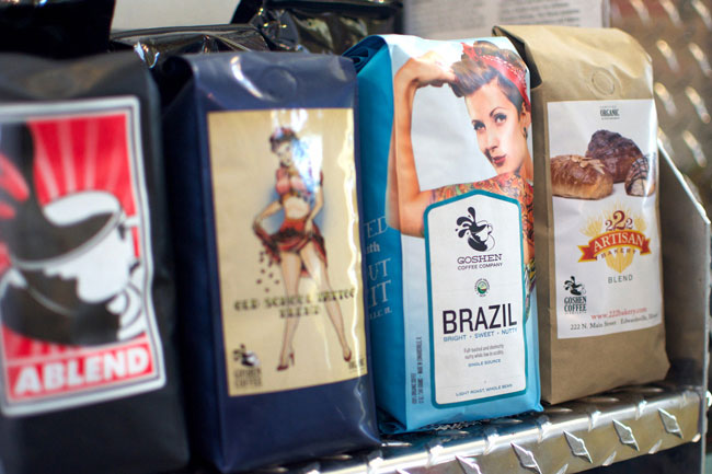
The Atomicdust team visited grocery store coffee aisles throughout St. Louis to get a sense of the packaging landscape — which packages stand out, and which don’t. The coffee market is crowded, but there’s a lot of visual homogeny. Goshen had an opportunity to make a big impact.
Our branding focused on Goshen’s friendly but quirky personality, without straying too far from the company’s important commitment to the local community and global sustainability. We also knew that the bold packaging shouldn’t eclipse the fact that Goshen’s beans are truly gourmet.

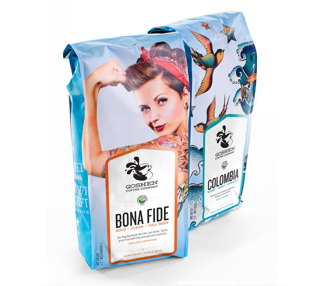
We found the perfect image in Michaël Fournier’s Contemporary Rosie photograph. The strong, tattooed woman and her smirk match the strong, independent attitude we felt was the perfect embodiment of where Goshen had been as a company and where it was headed.
There are two variants on the final packaging, with custom labels for each of Goshen’s 25 coffees.


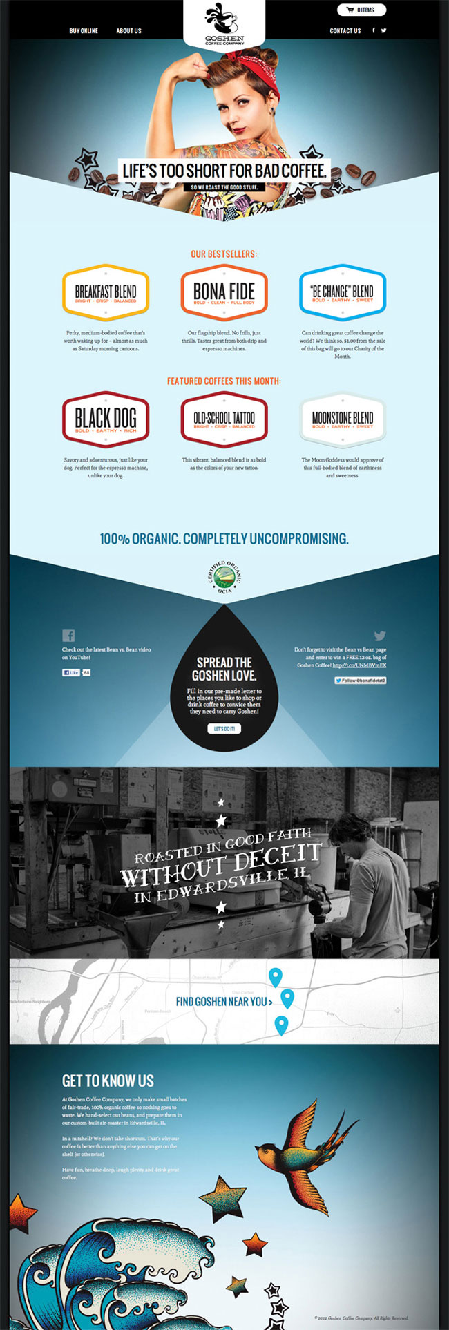
The new website serves as a fully functional online store, with Rosie front and center. Goshen fans can fill in pre-made letters to send to stores to convince them to carry Goshen.
Elsewhere on Identity Designed: Pastaria.
More from Atomicdust.
Comments
Simple, powerful and consistent.
Makes me want to buy this coffee!
This brand succeeds to “reflect [a] colourful attitude and commitment to unique, bohemian java”. In other words, it seems to be targeted at a hipster demographic that considers itself artsy yet fails to realize its many cliches. “Life is too short for bad coffee.” Really? It was funny when phone D2 company claimed this 1996 but now it doesn’t sound “completely uncompromising”, or fresh. Is the “perfect image” not a bit too familiar for an “independent attitude” and uniqueness? Maybe these are all meant to be ironic post-modern references but they invoke a feeling of staleness here. Having gotten this out of the way, I believe the brand doesn’t do the product justice and I would visit the place given a chance.
@Christian said it. Pretty face, but a little uninspired overall I think.
I like it. I don’t mind the “hipsterness” and I think the website looks great.
1. Ray Larabie
2. Lost Type
3. Hipster cred!
I like it, too. Along with the recent Pastaria brand identity, Atomicdust are producing some great work recently.
I don’t feel the need to dissect it because I think it’s lovely and it works. Does it make me want to buy the coffee? Yes. This would definitely stand out on the shelf for me and, once I read a bit more, I would probably choose it over other brands (depending on price and taste, naturally).
At the risk of repeating myself from other comments, that’s what a good identity should do. There’s no point in people thinking it looks nice if nobody’s buying it.
I like this approach to a coffee brand, makes a change for the standard natural/organic feel that seems to be the standard idea for this type of product.
I think the labels look good and like the way they transfer over to the website.
Just a shame I prefer a good old fashioned cup of tea!
I love it, I like the hip and cool story, packaging is memorable and nice – I would love to have that kind of coffee on my shelf, so everyone could see it, and I really appreciate it, when the product has this ‘show-off’ character.
Maybe the slogan is poor, since it was heard so many times before, it’s just to cliche, but for ‘promoting’ reasons, it probably works fine.
The website I also find very nice, clean and brand consistent… only the logo of Goshen doesn’t suit the whole package in my opinion, but that’s a whole different discussion. :)
Is the coffee good, organic, fair trade? Yes. Does the new packaging get your attention in the coffee isle? Yes. Are they local folks? Yes. What the hell else do you need!
Give them some support.