We recently completed the identity for a brand new co-operative; The People’s Supermarket.
For the people, by the people
Set up in Spring 2010 by chef Arthur Potts-Dawson, retailer Kate Wickes-Bull and an army of others, The People’s Supermarket is a community-based shop that’s managed and owned by members and open to all. It’s based just around the corner from Unreal’s studio, on Lamb’s Conduit St, London WC1 and takes its format from the popular co-operative ‘Park Slope’ in Brooklyn, NYC.
In addition to the membership scheme, much of the produce in the shop is locally sourced, seasonal and sustainable, meaning they stock the best food at the lowest possible prices. The story of the supermarket will be broadcast in its own Channel 4 documentary, due to air in early 2011.
The People’s Brand
After approaching the supermarket to design some launch posters, we were tasked with developing the brand, which needed to reflect the co-op’s core values of being communal, affordable and democratic without appearing too virtuous or elitist. A full identity programme was required including logo, stationery suite, advertising, packaging and brand guidelines.

As the organisation is not-for-profit and production budgets are consistently low, the designs needed to be simple to implement. As a result, much of the packaging and print material needed to be produced in-house.
The help of a hole-punch
In researching and developing ideas for the branding, we stumbled upon a potential icon that we felt was instantly recognisable, basic, honest and utilitarian. The ‘Euroslot’ is the hole punched at the top of numerous packaged products around the world. This handy little device goes un-noticed in day-to-day life despite being synonymous with retail. We decided it was time for the slot to have its day and purchased the hole-punch below.

The Euroslot hole-punch was purchased from eBay for £12.50.
The slot can be easily cut through anything from letterheads to in-store packaging, creating a simple, clever and cost-effective branding device that can be consistently applied across all communications. It has the ability to evolve from a decorative feature on letterheads and business cards through to forming the handle of bags, or a tab device in in-store signage.

The stationery suite was short run, laser printed in-house at Unreal on GF Smith Colorplan Pristine White.

Brand guidelines were printed in-house at Unreal, then packaged in brown paper bags that we also hand-made

The People’s Colour
The completed project is friendly in its look and utilitarian in approach, being applied in a bold, straightforward manner and always appearing in two colour. The strong use of yellow represents the colour of t-shirts which members are given when they join.
The People’s Produce
The supermarket has its own range of products made by sourced suppliers, such as The People’s Loaf and The People’s Wine. These items needed consistent labelling and the Euroslot device allowed this to happen easily.
![]()
Labels were printed in-house at Unreal on GF Smith Colorplan Pristine White, 120gsm.
The People’s Kitchen
Finally, in recent weeks the supermarket has also opened its own in-store kitchen — The People’s Kitchen. This serves up food cooked by chef Potts-Dawson, using ingredients from the supermarket itself. Unreal were tasked with creating a sub-brand identity for this, whilst retaining much of the features of the original logo. A range of kitchen utensils was added along the lower bar, and the fonts tweaked to form the mark seen below.
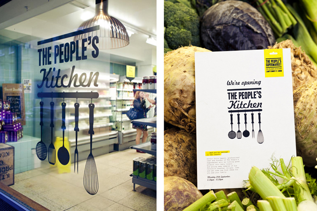

The window decal was printed digitally on clear self-adhesive vinyl, by c3imaging.
All photography shot on location by supermarket members Liz and Max of Haarala Hamilton photography.
More from Unreal.


Comments
Wow, very nice design. The idea is exclusively executed with a ‘hanger’ that make the design very unique. This is a simple and very pleasant design. Love it anyways :-)
My favorite part is how the name allows for additional brand names to be built in, The People Supermarket, The Peoples Kitchen, The Peoples White/Red Wine, and the execution of these additional elements is very nicely thought out.
Using the hole punch as a way to have a low cost die-cut effect is very smart. It elevates the level of quality without adding much cost.
I wish we could see inside the brand guidlines book.
This is brilliant. I wish we had done it, it’s right up our street. Great business idea too. The guy behind it has a ted.com talk worth watching: http://www.ted.com/talks/arthur_potts_dawson_a_vision_for_sustainable_restaurants.html
This is the best job (in my view) that has been posted on this blog so far. Not just for the design, but for what it is. Hopefully there will be more businesses like this in the future.
twitter.com/goodpeopleweet
Great strong brand identity and great execution of bright colour with clever use of illustration. Has a very friendly and approachable feel.
Really nice job, and well executed . Clean and minimal but with the use of the euroslot hole punch, it makes it very memorable. I think the Peoples Kitchen logo is just great, really fun and friendly.
Unreal did a brilliant job using the basic elements from the The People’s Supermarket logo to create The People’s Kitchen logo. The idea to use the hole punch is also a very clever and cost effective solution. Job well done!
Really fantastic job, clearly defined branding and execution. The ‘Kitchen’ extension feels natural and accessible.
Smart identity system. Well done. The community grocery store is a compelling concept, it would be great to see them down the street from everyone’s home. Wondering if larger chains such as Whole Foods, Safeway, Albertsons, etc. would benefit from opening smaller “pop-up” stores to service more remote areas and offer more personalized service.
I really liked this project. I think it was really well-done, with a strong conceptual resolution. The best part of it is that it looks great and beautiful without extra-high costs.
It is very pleasant to see projects running with smaller costs with a sucessful implementation, indeed. All the stationery and applications look great!
Congratulations for the designers, and congratulations for the blog, David!
What a clever application, I really like it. Shows how a small budget is not a wall for a nice branding process.
Excellent work, I think what really makes this is the extension across different media, really smart design.
They could have gone a step further and introduced other colours but I understand that they probably wanted to establish the yellow as their colour. Great work.
Thanks very much to everyone for their kind comments on this project – we’re really pleased the design has gone down so well. As many of you point out, the concept of the Supermarket itself is fantastic, so it was great to be able to get involved.
Gareth – you’re right regarding the colour scheme. We wanted to establish yellow as their colour and at the same time keep to a limited palette to keep printing costs low.
Thanks again guys and also to David for featuring the project!
WOW! great design. hands down. But we’re forgetting the most important perspective, it doesn’t look appetizing for me as a consumer. I’m not a graphic designer at all, so I’m speaking from a consumer perspective. It looks like a specialty store or boutique rather than a market.
Love the designs, the Brand Guild lines book is my favorite!
Thank you for your time.
Brilliant! Love the ID, love the business idea!
i think its brilliant and would love to be a big part of it.i live in crawley w sussex and its a busy area because of gatwick and i think it would go really well.i would quite happily commit all my time to a project like this free of charge.well done and hope to hear from you soon mrs j thomas
I saw The People’s Supermarket on telly on Sunday night, great idea for a supermarket and nice publicity for Unreal too on an absolutely a brilliant job well done! @C L Jones, I agree – would love to see inside the brand guidelines book too.
Peoples was done in 1987 in Houston, Texas. There was Peoples Garage and Peoples Used cars and Peoples records and tapes and Peoples Grocery store, it was owned by a Jamaican man and he hired only people from the town and there motto was the same. Glad to see another different but similar store with the people in mind!
wow! really nice! it’s perfect! really! couldn’t be otherwise, because J&B has been using it as corporate identity for their “Start a Party Campaign” since a loooooog looooong time ago
http://adsoftheworld.com/media/print/jb_start_a_party_4
http://www.coloribus.com/brands/j-b,products-j-b-whisky/
thumbs up for the naming though…