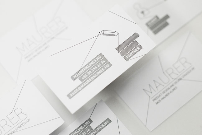
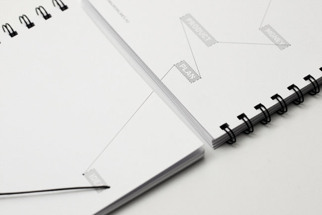
Ákos Maurer Klimes is a Hungarian product designer and design strategist. While creating the identity, we regularly talked with Ákos over a cup of coffee. On one of the first occasions he counted how many people he had contacted and worked with on various projects. This link between two points, between people, was our very first source of inspiration.

Visual language
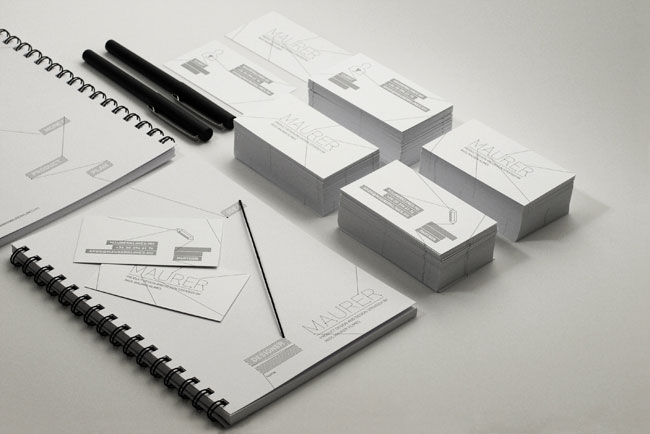
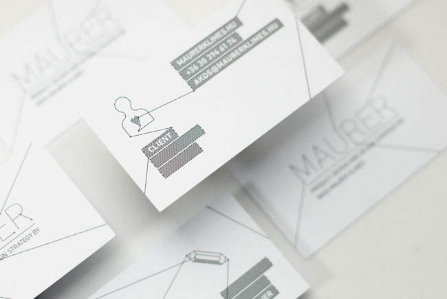
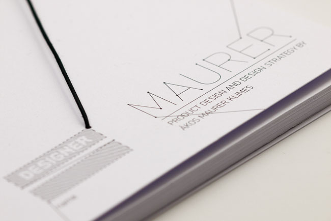
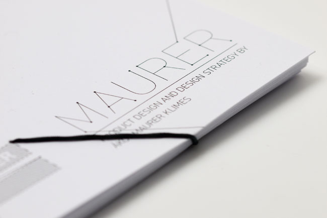
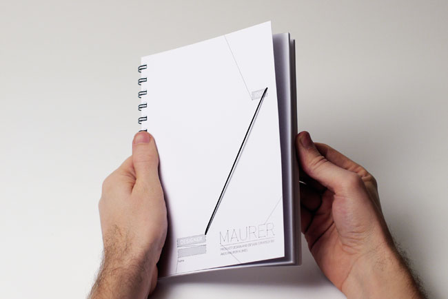
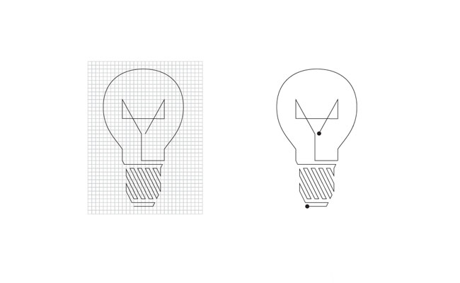
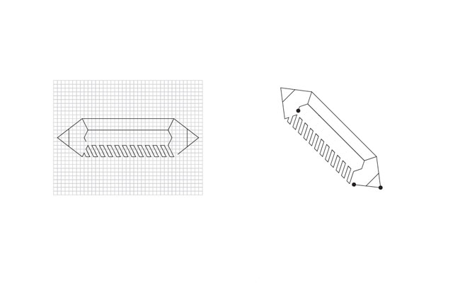
The visual language is based on Ákos’s sketches. We studied his sketchbook and extracted our ideas. Lines, oblique hatches, and simple drawings are the fundamentals of the final identity.
Super Normal
Ákos named Naoto Fukasawa’s and Jasper Morrison’s Super Normal, as important and influencing design philosophy in his latest works. He wanted it to be a leading principle for us to simplify the visual language, to exile the colours.
Personalisation
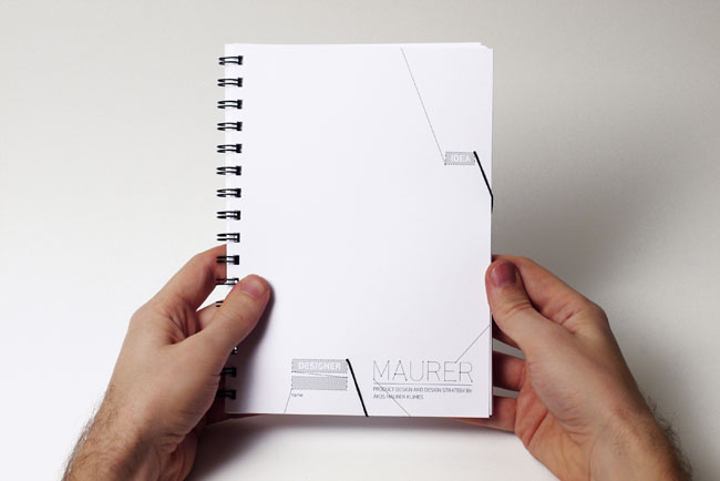
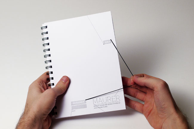
The philosophical objective of the identity was to be a very personal and interactive system, to be just like a nice and polite gesture, a friendly handshake.
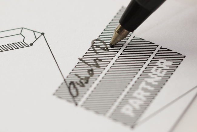
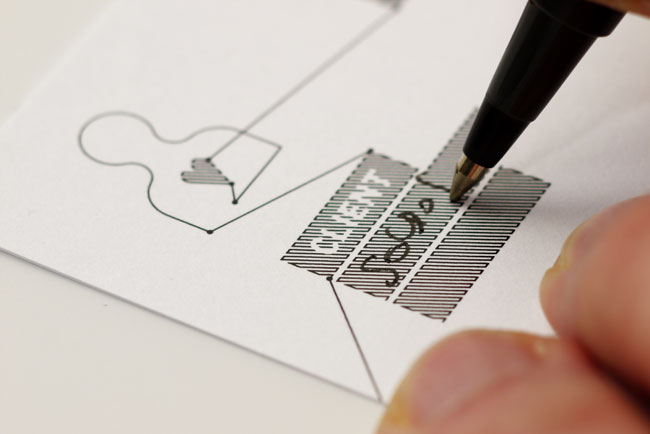
To reach this goal, our main idea was to create more personal elements than ever before. The business card for example has many different versions similar to the relations between the designer and his client or fellow designer. What is more, Ákos can write the name of the one who recieves the card, thus creating a more personal and direct relationship.


Sketchbook


Website
ActionScript developer: András Polgár
Visit the site
The design of strategic thinking, contrary to product design, cannot be told with the help of pictures and spectacular videos, but this is an important guideline in Ákos’s works, so we tried to make this as significant as possible. The solution is an interactive game which is available on the website. The user, whether he/she is a client or a fellow designer, can set up the equation from the specified components, and as a result receives a message, Ákos’s answer.

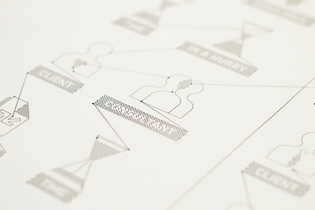
Pictograms


More from Hidden Characters.


Comments
Smart stuff, and great way to get Maurer’s craft and character spread across different media.
What caught my eye was how interactive the print work feels. The interactions are small and nothing new of course: writing, pulling. But they make so much sense with the rest of it: the visual language, diverse customisation, and concept, make pulling on that elastic and getting your name written on a business card, seem unique experiences for sure.
Relevant and engaging work, avoiding trends and conventions. Interesting to see how a designer from another field sees the value in employing a visual designer for their brand identity. Graphic design can occasionally be trivialised or undervalued by clients, who quite often have no valid experience or knowledge of the profession. In this project, the client being a designer himself, understands first hand that collaboration through a careful design process is vital to creating a unique and effective outcome.