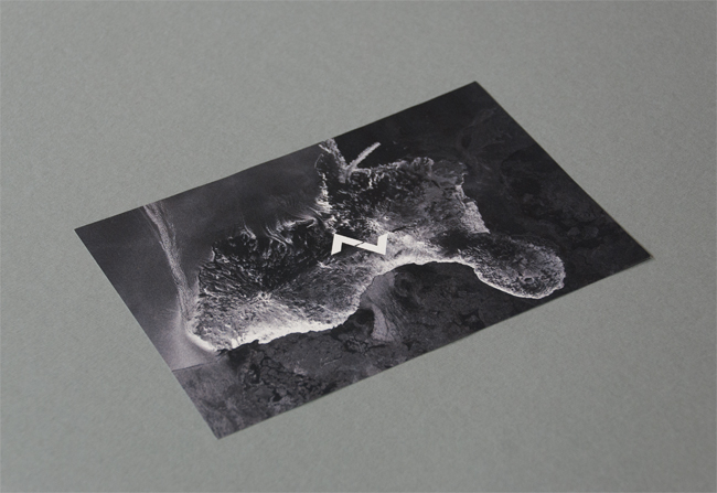
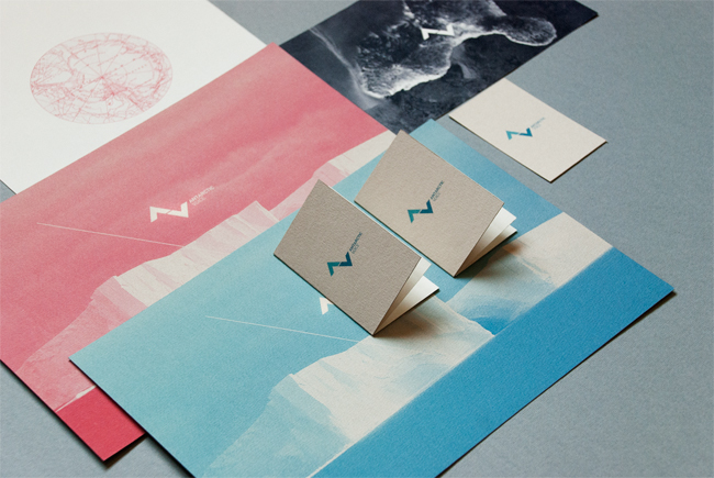
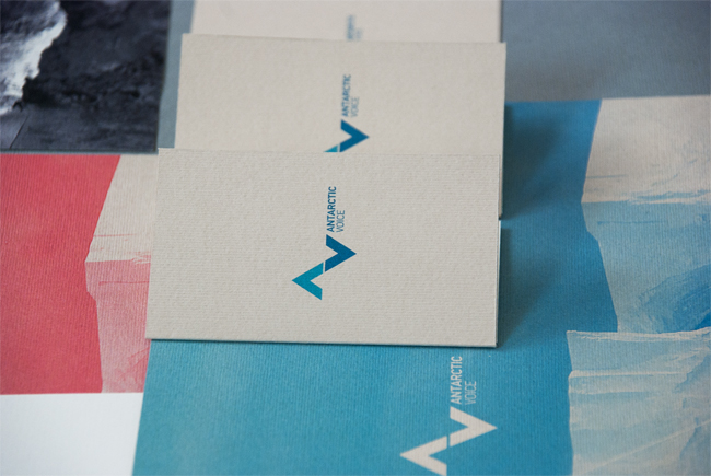
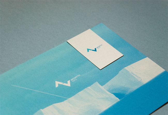
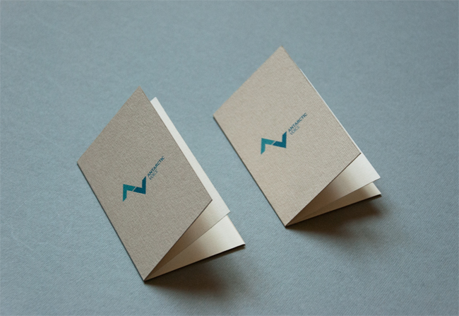
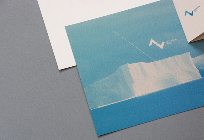
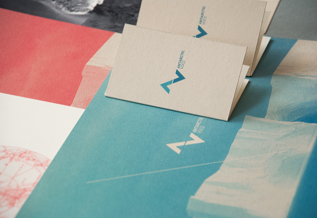
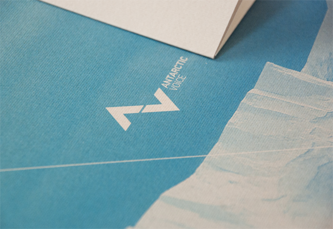
Antarctic Voice is a project that aims to express the voice, the silence and the magic of the unattainable continent, Antarctica.


More identity projects on the Astronaut Design website.
Designed by Astronaut Design, Kazakstan.
Antarctic Voice is a project that aims to express the voice, the silence and the magic of the unattainable continent, Antarctica.
More identity projects on the Astronaut Design website.


Comments
Very attractive identity, seems to fit Antarctica well; simple, beautiful, silent but bold.
The beauty of this identity lies in the –
Symbolic representation of the Iceberg ( the peaks above and below a base level ) and the Voice ( the wavelength ) – both at a go, Simple yet outstanding!
What a way to start the new year, love this no frills but powerful identity.
Amazing. I love the simplicity of the AV logo, how simple the shapes are but how powerful and effective they are. The colour scheme looks fantastic, I’m digging the blue (because when I think of Antarctica I think of white and blue), and the magenta is a nice refreshing colour to add to the palette.
Overall, I think its a great identity, Astronaut Designs have truly served up a great identity, well done!
This is a very nice logo. My question to you: Is this a real company, or a logo designed just for fun? I can’t find a company website or any company info online.
I agree with Josh, this is a really nice logo, but what/where is the story behind the project? Is it student work or a real client?
very nice work. the simplicity, colors and execution… very successful.
Lots of depth to a simplistic logo, fantastic result.
Wonderful mark, and it all feels very “antarctic” (which feels silly to say having never been there, but it seems like the sentiments are shared.)
I question the change of the weight of the type between “antarctic” and “voice”. It doesn’t make sense to me.
The simplicity keeps it memorable and iconic. Love the color palette and photography as well, these elements are quite successful at visually interpreting the “voice” of the Antarctic.
Absolutely beautiful. I see a glacier for the “A” and the “V”as the corrresponding reflection from the ocean. At least that’s what i see. I love this.
I love the simplicity of the identity that is complemented so well by the colour and image treatment. I can really feel the Antarctic! Great work.