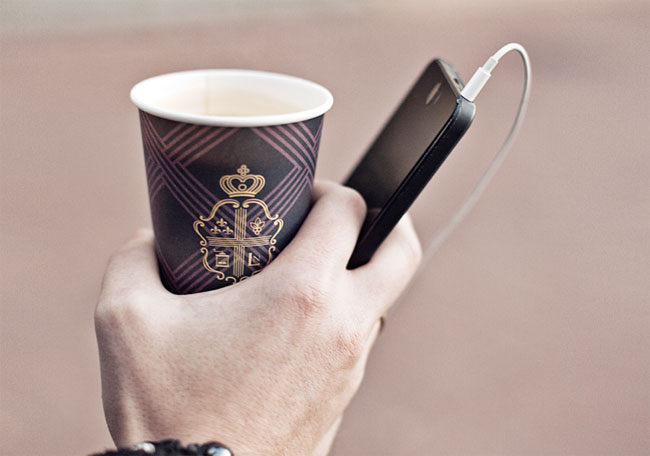
Launching a new coffee brand in today’s competitive market is hugely challenging. You have to offer something truly unique, of the highest quality, along with great atmosphere.
You really have to stand out in a crowd.
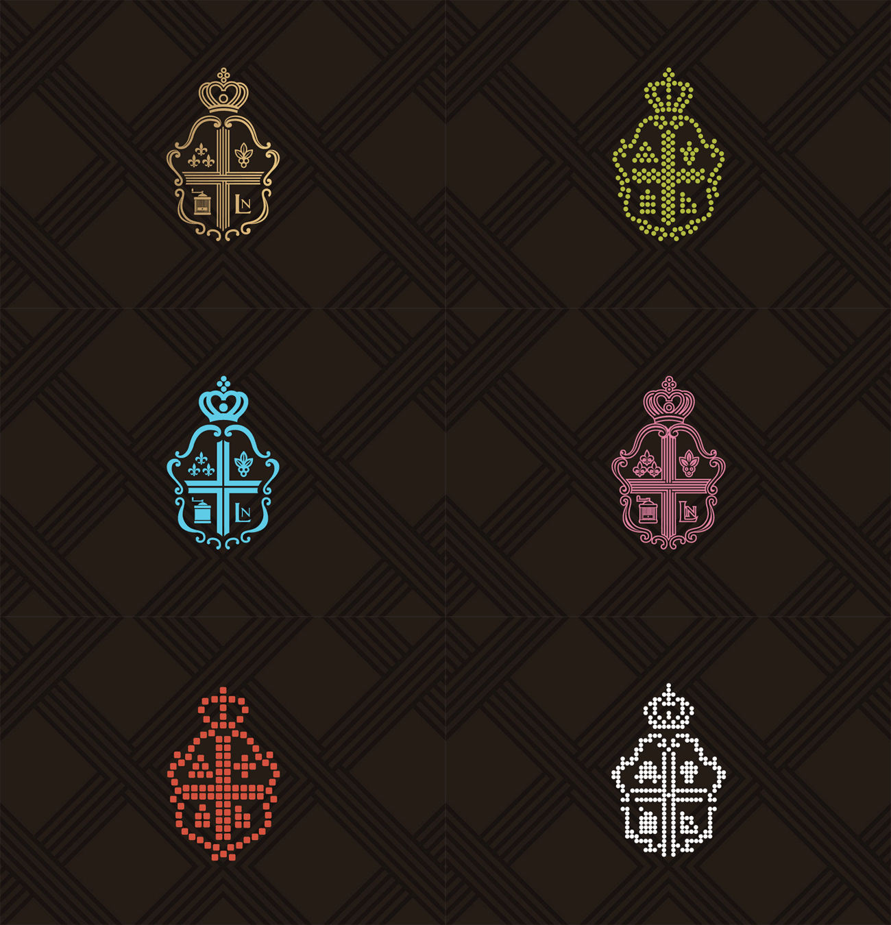
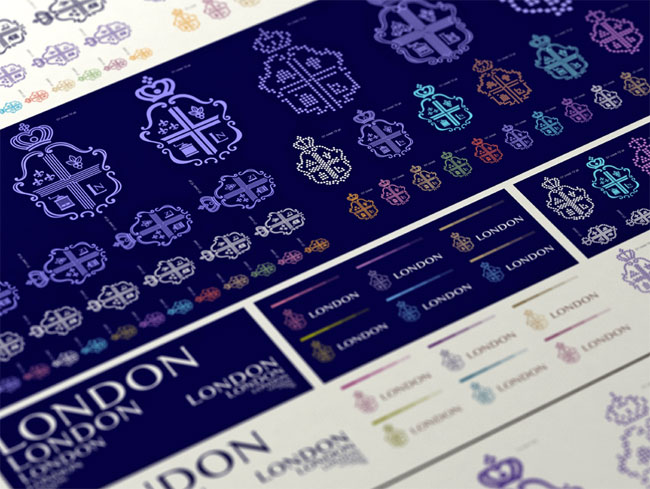
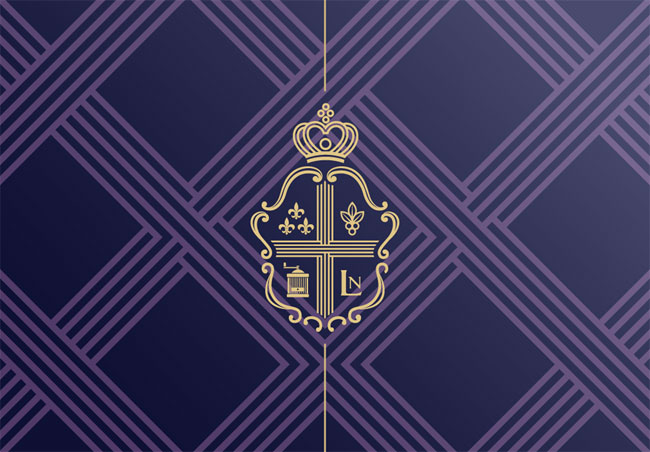
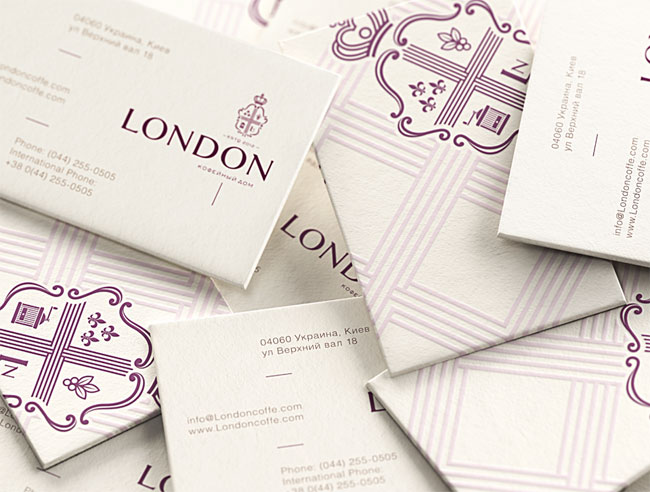
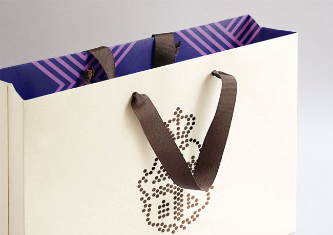
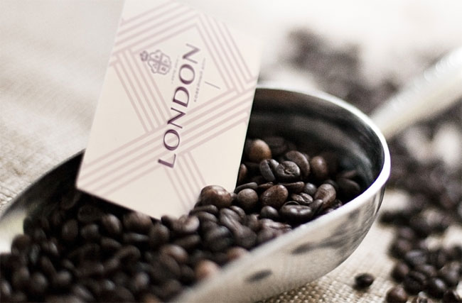
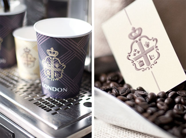
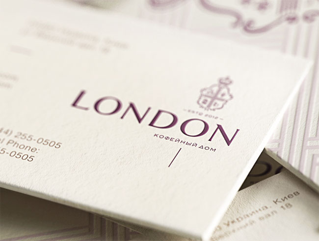
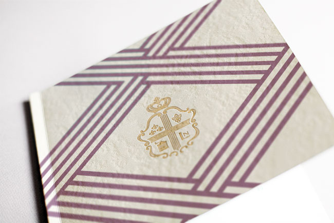
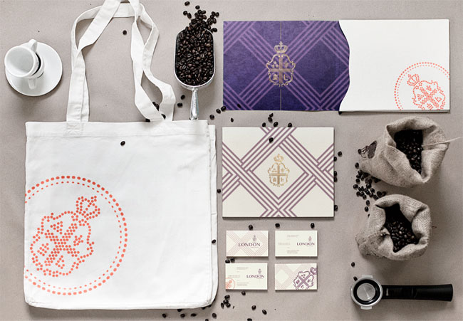
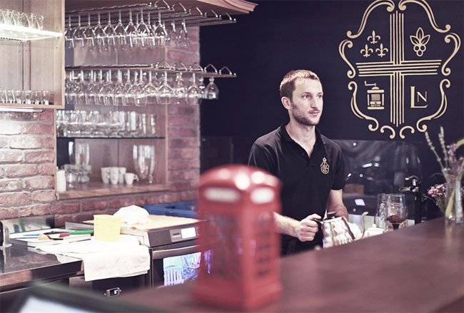
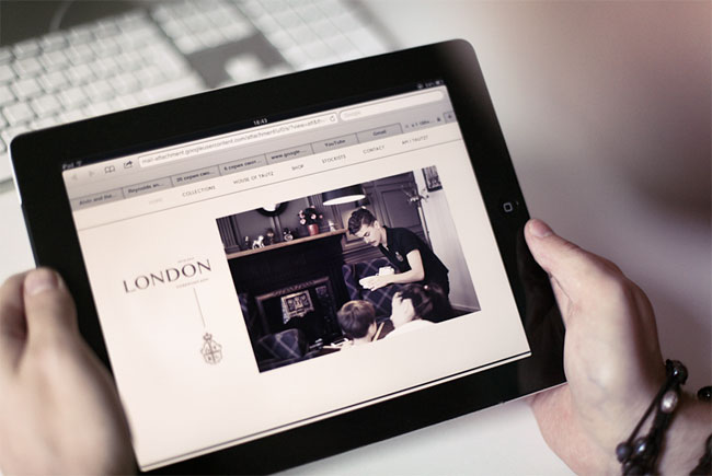
London is a city deeply rooted in its traditions, history and architecture. Loyalties are formed in childhood and honoured for a lifetime. So our task for this Kiev-based coffee shop was not just to show the outstanding benefits of the product but to weave these assets into the larger culture and themes of London, combining the heritage of coffee drinks with the distinctive, one-of-a-kind pleasures of London house coffees.
















Reynolds and Reyner elsewhere on Identity Designed: Liverpool English Pub.
View more identity work on the Reynolds and Reyner website.



Comments
A very nice identity. Much more serious-looking than the typical lower-case, “funky” cafe logo. Classy.
This identity shows a lot of passion and attention to detail. It’s hard not to be impressed by it. But I also notice a certain irony in that this identity would not work as well in London today where it claims to be rooted at it alludes to a past that doesn’t exist. It probably will work for the client but it makes me a little uncomfortable unless there is really a story the company could tell.
Starbucks also alludes to an Italian tradition of coffee. I don’t know the details but I find it a bit more plausible given the many Italian immigrants in the US.
Starbucks avoids using Italian symbols by just using photos and is therefore perceived as truly American despite the allusions.
Absolutely brilliant. Very inspiring this.
This is the second project from this agency that has gone all out to create an ‘authentic’ British environment / experience and can see why they’ve been picked up to it again. It’s incredibly well rendered with lots of detail. I don’t have a problem with the appropriation of what might be perceived as London/British aesthetic, there are plenty of foreign themed bars and restaurants in London that are far from authentic. There’s clearly a superficiality and ‘staged’ quality to it that wouldn’t work so well in the UK, but outside I’m sure it’s pretty persuasive.
Reminds me of my old secondary school uniform.
Where is this ‘London’ they speak of? I must go.
Excellent work, I must head off to Kiev to find the ‘real London’.
Beautiful work indeed, very well executed, but surely reminiscent of Claridge’s?
http://www.creativereview.co.uk/cr-blog/2010/may/claridges-rebrand
Fantastic work. First class design that demonstrates an extreme level of attention to detail. Five stars.
It’s been done and put together very well – design-wise – so I’m guessing it’ll go down well with the intended market.
My problem is with the completeness of the whole thing. This website discusses brand identity so, looking at the whole, I can’t overlook the spelling and grammatical mistakes. Considering the attention to detail that has gone into the visuals, I would expect the same attention to extend to every aspect.
It would be nice to see the entire identity, website and all, rather than mock-ups.
Certainly not ‘real’ London. More of a pastiche. Masterfully executed though, across such an impressive raft of applications to boot. Rather I say!
Excellent execution! I salute both client and agency.
One addition: The card that announces “recipies” sticks out and compromises the classy look of before by using a variety of fonts, underlining that strikes through descenders, and using “exclusive” three times in the copy.
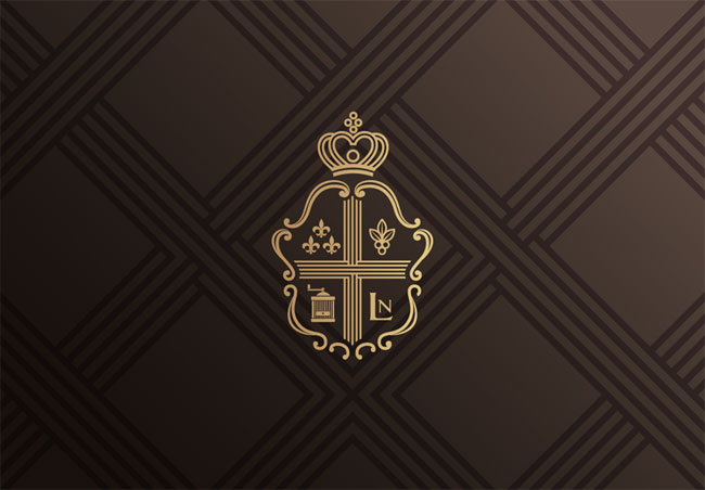
Looks very close to the Claridge’s logo. I can’t believe no one else has mentioned the similarities yet.
Beautifully crafted. A great standard to aspire to! I think it’s an elegant solution to the usual coffee shop styles you see in central London.
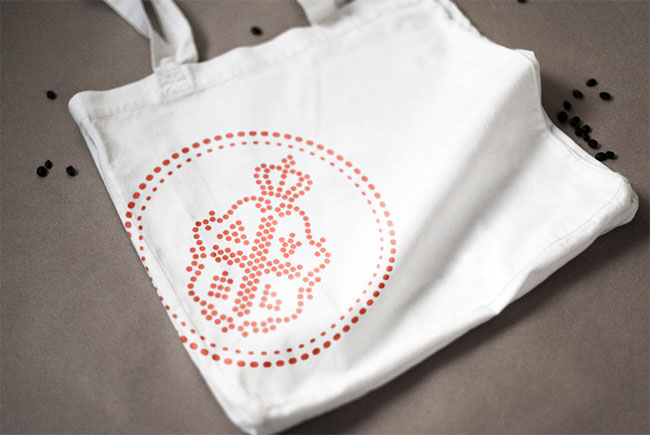
I love the work. However, my main question was, why was the color palette not limited a bit more? I love the color scheme shown, however I see 3-4 possible different schemes here. I think any would work beautifully. I agree with one of the previous comments that the red text that appears on some 2-D design elements and the bags is distracting — I think it could be changed to fit with the color scheme for a more cohesive brand identity.
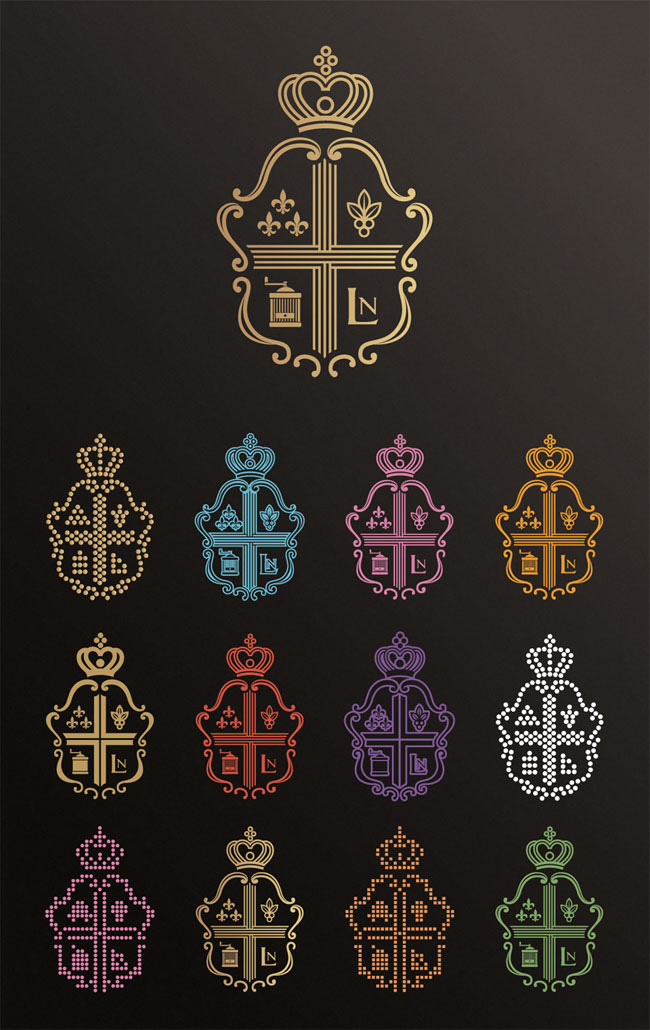
One more thought — I absolutely love the logo variations, and the simplified logo. Very nice. However, I think since you are playing with so many variations of the logo, it would be nice to keep the font limited. I see a few random fonts thrown in, and I think it would be better to use just one primary font, and perhaps a very simplistic secondary font for any small copy text.
Overall, great work!
A clumsy imitation of Claridge’s logo. Overall, it’s all a bit too pretentious!
This is a complete rip-off of my Claridge’s brand identity I did at Construct London. How can people be so blind? Poor taste. Please be more original next time