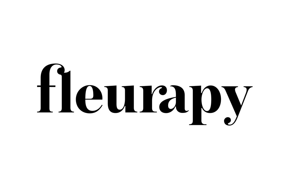
Specialising in floral arrangements and installations, Fleurapy administers “flower therapy” through their wonderful creations. A new wordmark serves as the centrepiece of this branding adventure, with pressed flowers and pastel colours completing the entourage.
The blind embossed wordmark on the stationery is evocative of the therapeutic nature of Fleurapy.
 Business card being embossed
 Pen markings on the block allowed consistent alignment across different items

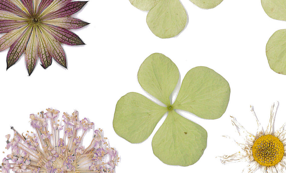
Various flowers were pressed and scanned before inclusion in the stationery design.


To add more personality, we even tapped the lady boss’ awesome calligraphy skills for the business cards and website.
 Owner’s handwriting


Design direction: Pepper & Cinnamon
Art direction: Fleurapy
Coding and development: Natalie

More from Pepper & Cinnamon.

Comments
Lovely designs! This is my favorite ID so far!
So different from the thousands of identities for floral shops out there. Subtle work, beautiful business cards.
Well done to Pepper & Cinnamon!