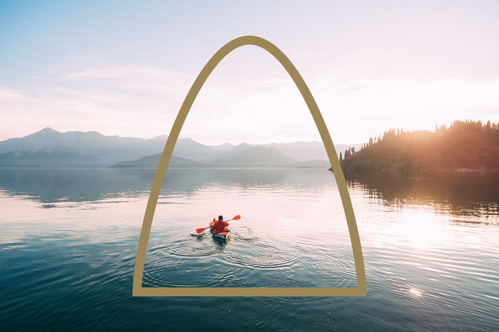
Fri is an annual camping and outdoor expo held each year at the Bella Center in Copenhagen. We where tasked with naming and creating the tradeshow’s flexible identity. Rather than have a system led by a typographical mark we set ourselves the challenge of creating a visual language that puts the outdoors at the forefront.
Based on the view when you look out from your tent we created a series of ‘Frames’ to contain sections of the identity visuals. As well as merchandise and wayfinding for the event we also produced a poster campaign that can be seen around the streets of Copenhagen.


More from Double.


Comments
Hm. I think the framing puts the emotions from the photos into a box and thus diminishes them when the poster would rather evoke them. I like the photo with the frame as a line on top for that reason.
On the contrary, it acts as a graphic cue for the brand and ties the emotional response the photo demands with the creative, beautiful, and graphic approach of the identity. Job well done, Double.
I’m torn with this. The concept is very very strong, I love the idea of escaping out of the confines of a tent into the landscape. However, I wonder if the viewpoint shown in the photo from inside the tent looking out defines it better. My concern is that many people may miss the idea completely when using some of the more generic frames, presuming that its just a simple way of framing the image. Some of the frame devices work better than others though. For example, the idea will almost certainly get lost in the simple ellipse/arch but only if the poster was shown in isolation.
The trekking/climbing posters seem to be another idea to me. Nice organic shapes but seem separate from the tent concept.
I don’t think that good ideas need to be immediately apparent. I get the most awesome feeling when I think a design is a bit bland and then learn the meaning behind it, it makes me appreciate it all the more.
The arch may be a little generic on its own, but it doesn’t stand alone. It makes up one part of the brand as a whole and together it’s incredibly strong. I feel that emotion and sense of wonder whilst camping that they’ve tried to capture with the frames and I really like this identity! The font is whacky and fun too.
I imagine the excitement when the frame idea came, it must have felt inspiring; an excellent identity throughout different mediums.