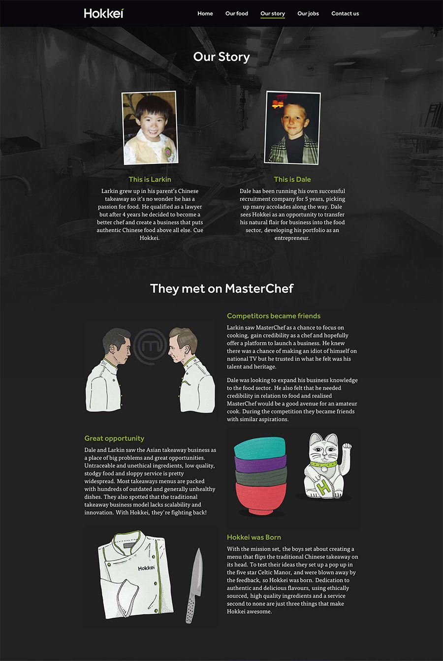
In 2013 amateur cooks Dale and Larkin took BBC One’s Masterchef by storm, reaching the final and cooking up some incredible food. During their time on the show Larkin, a lawyer, told Dale, a businessman, about a dream he had — to revolutionise the Asian takeaway industry.

The guys asked us to help them realise this dream. From brand strategy and art direction to content and tone of voice, and from typography and illustration to interior and website design, we’ve been involved throughout.

Our process started by really getting to know the market. We did extensive research into Asian food, culture and traditions, and looked in-depth at disruptive brands shaking things up in the food industry.
Throughout the project we helped Hokkei develop their business and brand strategy. We led the brand positioning, messaging and market analysis.
To design the best customer experience we ran interactive persona workshops where we tested menu concepts, ordering procedures and pricing options. Testing these options early helped Hokkei create their menu based on valuable insight and feedback.
To keep things on track we provided consultancy for the planning, management and delivery of the project. We worked closely with partners such as the interior contractors, architects, printers and IT specialists to make sure everything was in place.
To allow for flexibility in the future we developed a simple, customised wordmark. A mark that can sit in different environments as the overall brand develops.

The slanted ‘tittle’ on the letter ‘i’ is a nod to the traditional Asian chefs knife and the method of ‘bias slicing’ ingredients on a 45° angle, often used in oriental cooking. It also represents the forward thinking concept behind the brand.

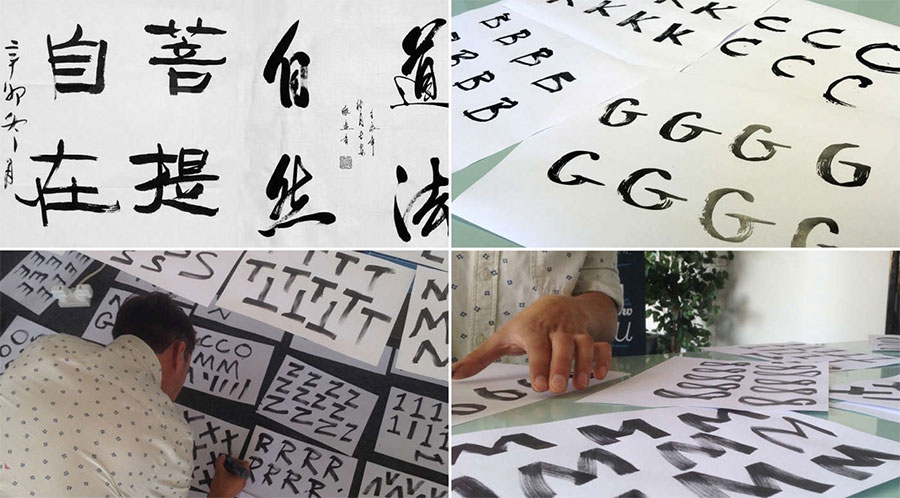
To help link the Hokkei brand to its Asian roots we looked to traditional Chinese calligraphy as a basis for a bespoke typeface. Using brush pens we hand-rendered multiple versions of every letter, number and punctuation mark to create a flexible and variable brand font.

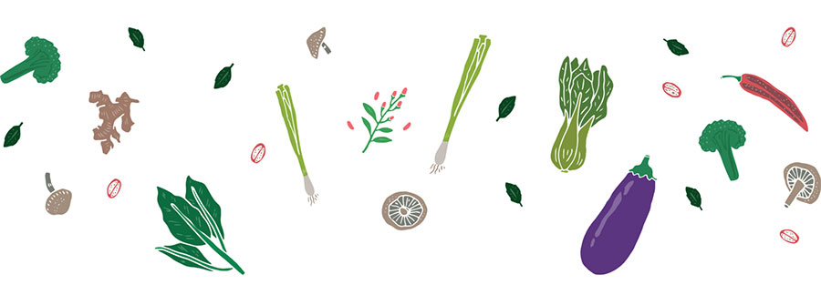
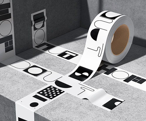
In order to bring the brand to life we developed an illustration style based on lino cut printing. This technique created a textured, hand-rendered quality that suited the brand perfectly.

In the planning stages it became clear it wasn’t just the food that was different about Hokkei. The guys had a vision for the Hokkei Box which would be a defining part of the experience. We developed a range of packaging design, menu designs and promotional materials for the launch.

We worked with the brilliant food photographer Huw Jones to create a library of beautiful photographs that have been used in marketing materials, social media campaigns and email marketing.

We think how a brand ‘sounds’ is equally as important as how it looks. We worked closely with Hokkei to develop a brand language, tone of voice and messaging that is engaging, quirky, and represents the people behind business.

We’ve developed a range of promotional campaigns, including a ‘taster menu’ launch campaign, special offers, seasonal events and marketing messaging.

Our vision for Hokkei didn’t stop at the front door. We worked with the interior fitters to art direct the interior design. From finishes and materials, to internal graphics and messaging we ensured the brand was central to the whole customer experience.

We manage a social media strategy for Hokkei, developing a vast range of promotional social marketing graphics, creating ongoing marketing plans and we even managed the team’s social accounts during launch.

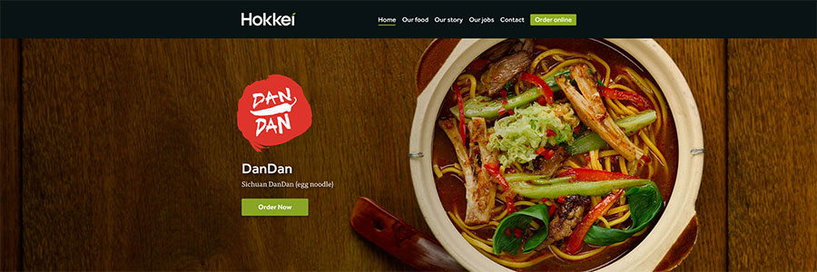
For any brand it’s essential that the customer experience is consistent and memorable across every medium. We developed a bold and beautiful website that tells the Hokkei story, focuses on the quality ingredients and unique techniques, and showcases the amazing food.
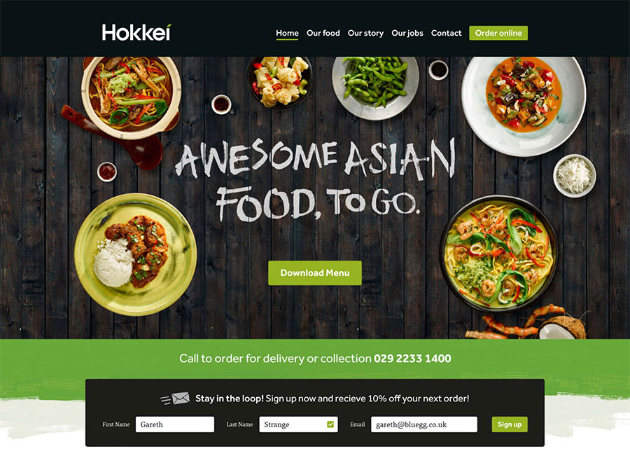
The website utilises the brand design style, custom typography and illustration, photography, tone of voice and language, and strategy we’ve developed across the brand.
More identity work on the Bluegg website. Follow Bluegg on Twitter.

Comments
Comprehensive is overused as an adjective in branding but very fitting here.
An inspired bit of brand design and story telling. Great work!
Beautiful bit of branding, really captures the spirit of Asian street food. The colours and photography feels spot on.
My only issue is the Hokkei wordmark. I like what they’ve tried to do but all together it feels awkward to look at. The ‘e’ is top heavy and looks like it’s about to roll over and the joints on the ‘k’ seem too harsh compared to the smoothness of the ‘o’ and the ‘e’ that surround them. Also the original narrower ‘H’ balanced the wordmark much better and I can’t really understand why that’s been changed.